110+ CSS box-shadow Examples
Shadow dictates hierarchy. The CSS box-shadow Examples in this updated collection remove the flat barrier between user and screen, creating tangible depth. A well-placed shadow communicates elevation, focus, and interactivity without adding visual noise. Utilizing these curated snippets replaces manual trial-and-error with precise, logic-driven lighting.
Technically, these examples rely on stacking multiple shadow values to simulate realistic diffusion. The code utilizes inset shadows for inner depth and pseudo-elements to handle complex hover effects. While animating box-shadow can trigger costly repaints, these snippets often animate transform and opacity to leverage hardware acceleration, maintaining a locked 60fps performance on the rendering thread and ensuring high layout stability.
Every free demo is fully responsive and cross-browser compatible. Users can instantly download the raw code or fork a specific interaction on CodePen. These assets are strictly optimized for accessibility, delivering a fast, frictionless experience across all modern HTML interfaces and UI design systems.
Examples
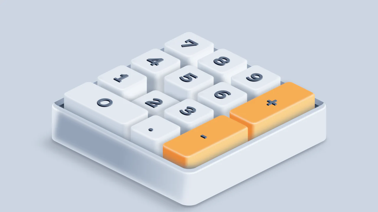
Isometric 3D Mechanical Numpad
An interactive 3D mechanical numpad built with React and SCSS. The component utilizes CSS preserve-3d and isometric rotations to render realistic, elevated keycaps with complex drop shadows and gradient highlights. Pressing physical keys on the user’s keyboard triggers synchronized visual depressions on the virtual numpad, accompanied by satisfying mechanical switch audio feedback via the HTMLAudioElement API. (Requires: react.js, react-dom.js)
 Chrome 53+
 Edge 79+
 Firefox 51+
 Safari 10+
See the Pen Isometric 3D Mechanical Numpad.
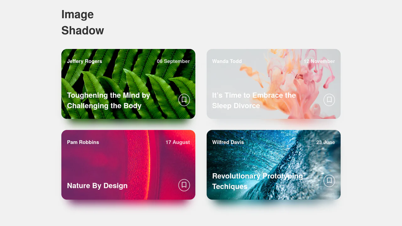
Dynamic Image Drop Shadow Cards
A responsive grid of article cards showcasing a dynamic, color-matched drop shadow effect. Built entirely with HTML and SCSS, the trick involves duplicating the card’s background image into a lower z-index container, shifting it downwards, and applying a heavy CSS filter: blur(). This creates a soft, glowing shadow that perfectly matches the hues of the original photograph.
Chrome 57+
Edge 16+
Firefox 52+
Safari 10.1+
See the Pen Dynamic Image Drop Shadow Cards.
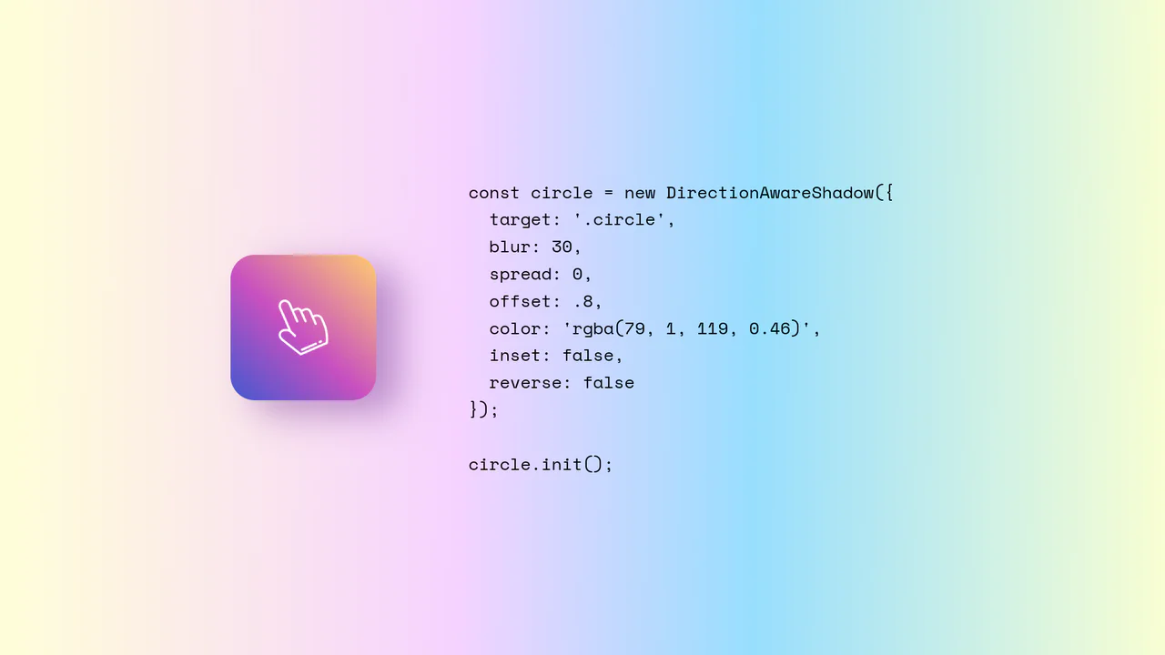
Direction-Aware CSS Box Shadow
Direction-Aware CSS Box Shadow provides a reusable JavaScript class (DirectionAwareShadow) that calculates the mouse’s offsetX and offsetY relative to an element’s center. It then dynamically updates the element’s inline box-shadow property to cast a shadow in the opposite (or same) direction of the cursor. The class is highly configurable, allowing developers to easily adjust blur, spread, color, and offset intensity.
Chrome 4+
Edge 12+
Firefox 4+
Safari 3.1+
See the Pen Direction-Aware CSS Box Shadow.
Interactive CSS Tear Strip Animation
Interactive CSS Tear Strip Animation simulates the satisfying physical action of tearing open a cardboard package. It cleverly uses an invisible <input type="range"> linked to the CSS Scroll-Driven Animations API (animation-timeline: --thumb). As the user drags the slider, CSS variables dynamically update clip-path, box-shadow, and transform properties to reveal the content beneath while curling the torn strip. A JavaScript fallback ensures compatibility for browsers without native scroll-timeline support.
Chrome 115+
Edge 115+
Firefox 110+
Safari 16.4+
See the Pen Interactive CSS Tear Strip Animation.
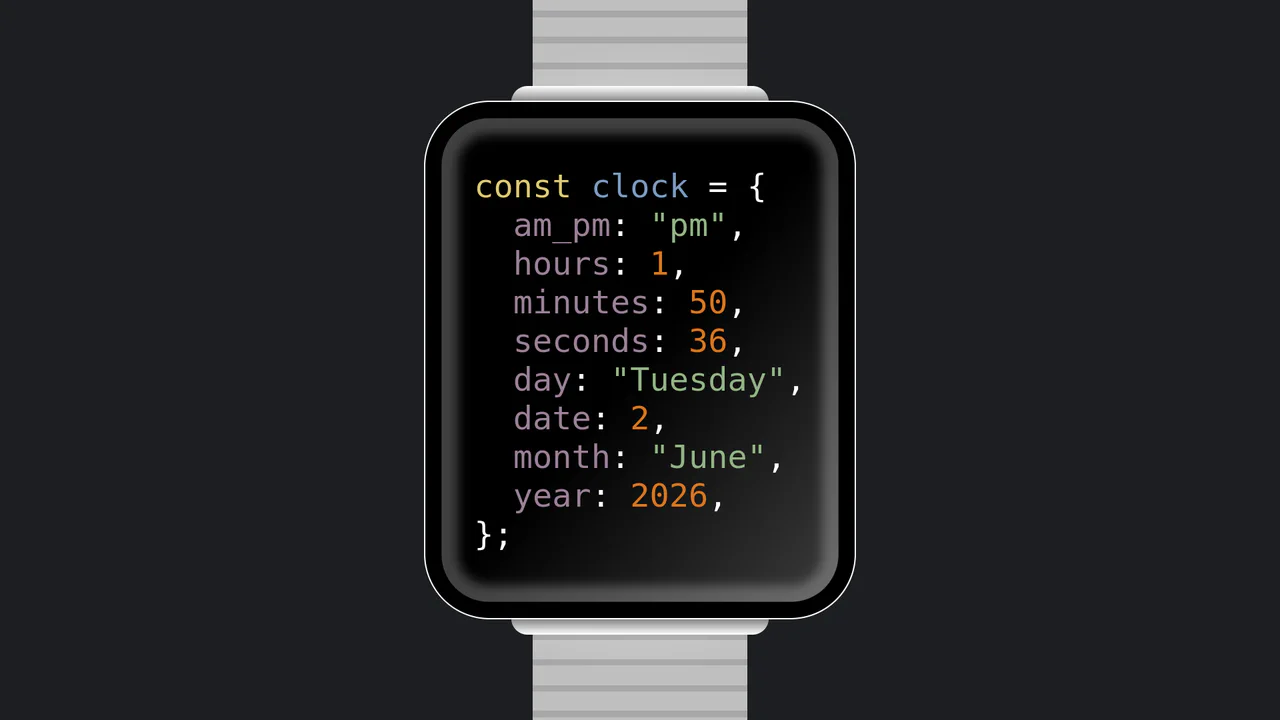
JavaScript Object Smartwatch Concept
JavaScript Object Smartwatch Concept turns a standard digital clock into a clever developer joke. The UI mimics an Apple Watch using pure CSS (box-shadow for the bezel, linear-gradient for the strap). Inside, JavaScript’s requestAnimationFrame continuously updates a formatted string, rendering the current time and date as a syntax-highlighted JS object. A fun, lightweight snippet for developer portfolios.
Chrome 4+
Edge 12+
Firefox 2+
Safari 3.1+
See the Pen JavaScript Object Smartwatch Concept.
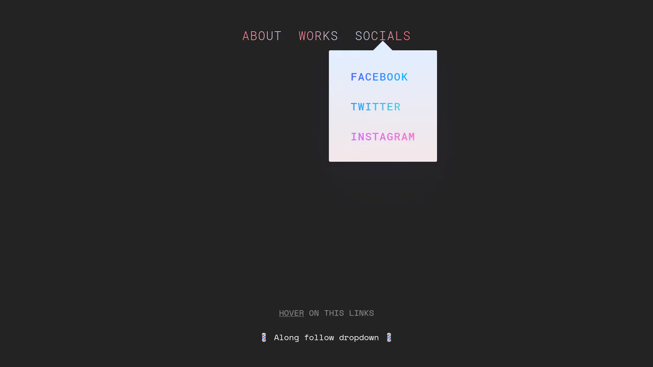
Morphing Stripe-Style Dropdown Navigation
“Morphing Stripe-Style Dropdown Navigation” replicates the famous Stripe header effect. A single background element dynamically resizes and moves behind the active content. JavaScript calculates dimensions using getBoundingClientRect() and updates CSS properties to animate the panel. This approach keeps the DOM clean and ensures smooth transitions between menu sections.
Chrome 48+
Edge 15+
Firefox 48+
Safari 10+
See the Pen Morphing Stripe-Style Dropdown Navigation.
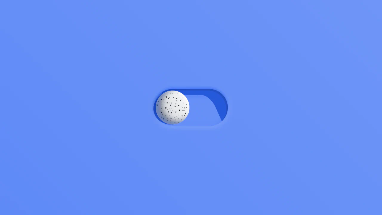
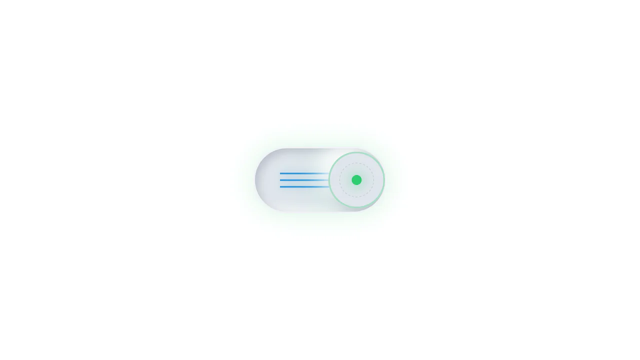
Rollback Ball 3D Toggle Switch
Rollback Ball 3D Toggle Switch is a highly tactile, skeuomorphic switch concept. When clicked, a textured 3D ball realistically rolls across the track, cast-shadows shifting in unison. An ES6 JavaScript class dynamically reads the CSS animation duration, disables the input during the roll, and automatically resets the toggle state once the animation completes. A stellar example of interactive micro-design.
Chrome 55+
Edge 79+
Firefox 54+
Safari 10+
See the Pen Rollback Ball 3D Toggle Switch.
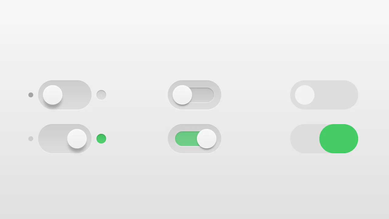
Realistic 3D CSS Toggle Switches
“Realistic 3D CSS Toggle Switches” showcase three distinct switch variations using the classic checkbox hack. Built entirely without JavaScript, they rely on CSS box-shadow and linear-gradient to create tactile, 3D inset depths. State changes are smoothly animated via transition on pseudo-elements. A lightweight, robust solution for adding polished micro-interactions to forms.
Chrome 26+
Edge 12+
Firefox 16+
Safari 6.1+
See the Pen Realistic 3D CSS Toggle Switches.
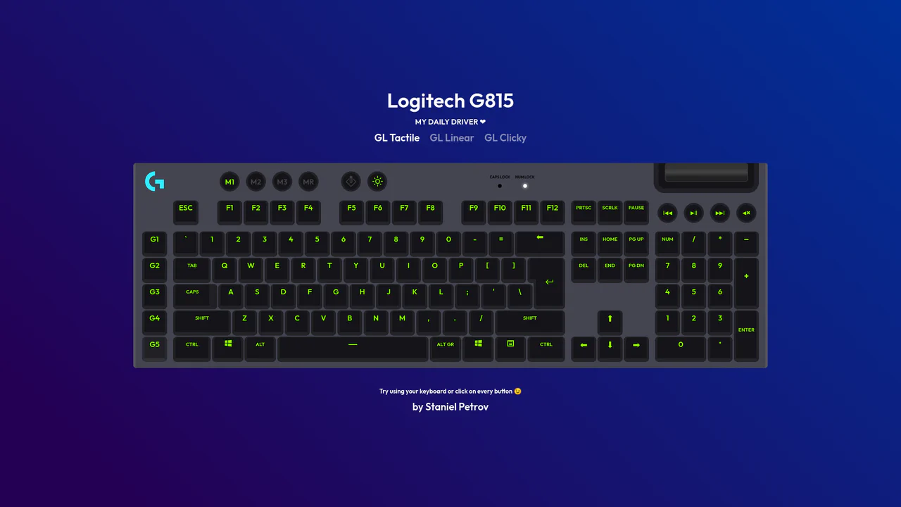
Interactive Mechanical Keyboard Audio Simulation
Interactive Mechanical Keyboard Audio Simulation utilizes a highly detailed CSS grid structure to align complex multi-row vector keys and simulate a physical G815 layout. A central event listener handles key interaction by mapping event.code to correspond with data-key attributes on target DOM nodes, simultaneously triggering dedicated audio samples of tactile, linear, or clicky switch sounds. While the visual depth is elegantly achieved with layered CSS shadow offsets and custom hex shading, firing unthrottled HTML5 audio playback on rapid typings can lead to output buffer congestion or slight audio delays on standard browsers.
Chrome 57+
Edge 16+
Firefox 52+
Safari 10.1+
See the Pen Interactive Mechanical Keyboard Audio Simulation.

3D Neumorphic Pill Toggle Switch
This is a 3D Neumorphic Pill Toggle Switch. It replaces the default browser checkbox with a tactile, extruded slider mechanism. Its function is to govern binary states (on/off) while providing physical, hardware-like visual feedback to ground the digital interaction in reality.
Chrome 87+
Edge 87+
Firefox 66+
Safari 14.1+
See the Pen 3D Neumorphic Pill Toggle Switch.
Neumorphic Mechanical Toggle Switch
This is a Neumorphic Mechanical Toggle Switch. It replaces the default browser checkbox with a tactile, extruded hardware-style button. Its function is to govern binary states (on/off) while providing strong physical visual feedback through inverted shadows, glowing indicators, and spring-loaded motion.
Chrome 80+
Edge 80+
Firefox 70+
Safari 14+
See the Pen Neumorphic Mechanical Toggle Switch.

Sci-Fi Glowing Triangle Loader
This is a Sci-Fi Glowing Triangle Loader. It animates three spheres along the edges of a neon-lit geometric path while rotating in 3D space. Its function is to serve as a high-fidelity visual placeholder during asynchronous data fetching, establishing a strong thematic aesthetic immediately upon application launch.
Chrome 104+
Edge 104+
Firefox 104+
Safari 14.1+
See the Pen Sci-Fi Glowing Triangle Loader.
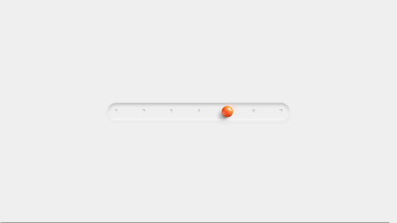
Neumorphic 3D Range Slider
This is a Neumorphic 3D Range Slider. It replaces the default browser input track with a recessed tactile trench and a volumetric, glassmorphic sphere. Its function is to provide highly physical, stepped input selection, making data entry feel like interacting with premium hardware.
Chrome 88+
Edge 88+
Firefox 80+
Safari 14+
See the Pen Neumorphic 3D Range Slider.

Draggable Grid Sorting Interface
This is a Draggable Grid Sorting Interface. It allows users to physically rearrange a 3x3 matrix of cards using fluid drag-and-drop mechanics. Its function is to provide an intuitive, visual method for reordering data sets, replacing static input fields with direct spatial manipulation. (Requires: GSAP.js, Draggable.js)
Chrome 60+
Edge 79+
Firefox 55+
Safari 11+
See the Pen Draggable Grid Sorting Interface.

Semantic Grid Bar Chart
This is a Semantic Grid Bar Chart. It translates raw HTML data-* attributes directly into visual grid spans using bleeding-edge CSS functions. Its function is to render accessible data visualizations without relying on heavy JavaScript charting libraries or complex canvas setups.
Chrome 57+
Edge 16+
Firefox 52+ (via fallback)
Safari 10.1+ (via fallback)
See the Pen Semantic Grid Bar Chart.
CSS Pixel Art Animation
This is a Pure CSS Pixel Art Animation. It renders a multi-frame character sequence (Guybrush Threepwood) using a single HTML <div>. Its function is to demonstrate extreme CSS capability and provide lightweight, scalable retro graphics without requiring external raster images or canvas rendering.
Chrome 26+
Edge 12+
Firefox 19+
Safari 6+
See the Pen CSS Pixel Art Animation.
Glowing Chasing Squares CSS Loader
This is a Glowing Chasing Squares CSS Loader. It visually communicates background system processes through continuous, cyclic motion. Its function is to reduce perceived wait times by providing a predictable, rhythmic focal point during data fetching.
Chrome 53+
Edge 79+
Firefox 35+
Safari 9+
See the Pen Glowing Chasing Squares CSS Loader.

Dynamic Neon Glow Range Slider
This is a Dynamic Neon Glow Range Slider. It re-imagines a standard HTML range input as a high-fidelity, skeuomorphic control with interactive lighting. Its function is to provide an immersive user experience where the slider’s track illuminates with a neon glow that intensifies, and its drop shadow physically shifts, based on the thumb’s position.
Chrome 111+
Edge 111+
Firefox 113+
Safari 16.4+
See the Pen Dynamic Neon Glow Range Slider.

Neon Glow Toggle Switch
This is a Neon Glow Toggle Switch. It replaces a standard HTML checkbox with a highly tactile, skeuomorphic control. Its function is to provide satisfying visual feedback for state changes, utilizing a “filling” neon border and a sliding, textured handle to make binary selections feel like engaging physical hardware.
Chrome 85+
Edge 85+
Firefox 128+
Safari 16.4+See the Pen Neon Glow Toggle Switch.

Skeuomorphic Snowball Range Slider
This is a Skeuomorphic Snowball Range Slider. It re-imagines the standard HTML range input as a photorealistic physical object. Its function is to provide a highly tactile and playful interface where the slider’s thumb appears as a snowball, complete with a dynamic snow texture that seems to “roll” and cast realistic environmental shadows as it moves along its track.
Chrome 60+
Edge 79+
Firefox 55+
Safari 11+See the Pen Skeuomorphic Snowball Range Slider.

Skeuomorphic Egg Toggle Switch
This is a Skeuomorphic Egg Toggle Switch. It transforms a standard binary input into a playful, highly tactile 3D object resembling an egg sliding in a frying pan. Its function is to inject personality and physical weight into a micro-interaction, replacing flat state changes with an immersive, multi-layered physics simulation entirely rendered in CSS.
Chrome 105+
Edge 105+
Firefox 121+
Safari 15.4+See the Pen Skeuomorphic Egg Toggle Switch.

Skeuomorphic Retro Casio F-91W Watch
This is a Skeuomorphic Retro Casio F-91W Watch. It is a hyper-realistic, digital-first recreation of the iconic 1989 timepiece. Its function is to demonstrate the power of modern CSS and vanilla JavaScript for high-fidelity modeling, combining 3D depth illusions, custom fonts, and a live clock to create a fully interactive desktop widget.
Chrome 60+
Edge 79+
Firefox 55+
Safari 11+
See the Pen Skeuomorphic Retro Casio F-91W Watch.

Skeuomorphic 3D Elastic Toggle Switch
This is a Skeuomorphic 3D Elastic Toggle Switch. It utilizes multi-layered shadowing and complex keyframe sequences to mimic a physical sliding component embedded in a technical grid. Its function is to transform a standard checkbox into a high-fidelity micro-interaction that emphasizes physical mass and momentum.
Chrome 43+
Edge 12+
Firefox 16+
Safari 9+See the Pen Skeuomorphic 3D Elastic Toggle Switch.

Skeuomorphic Lunar Desk Calendar
The Skeuomorphic Lunar Desk Calendar is a digital recreation of the traditional “Hardware Store Calendar”. It bridges the gap between physical paper textures and dynamic digital logic, providing users with both Gregorian and Lunar dates. Its function is to serve as a high-fidelity desktop widget that celebrates heritage design through modern CSS geometry.
Chrome 80+
Edge 80+
Firefox 75+
Safari 13.5+
See the Pen Skeuomorphic Lunar Desk Calendar.

Iridescent 3D Neumorphic Button
This is an Iridescent 3D Neumorphic Button. It pushes CSS styling to the limit, using stacked gradients, oklch color spaces, and advanced blend modes to create a button that feels like a piece of polished, translucent hardware. Its function is to serve as a high-fidelity “Hero” element, delivering a tactile, light-responsive experience that feels alive under the cursor.
Chrome 105+
Edge 105+
Firefox 121+
Safari 15.4+
See the Pen Iridescent 3D Neumorphic Button.

Neumorphic Drag Dial Thermostat
This is a Neumorphic Drag Dial Thermostat. It provides a tactile, skeuomorphic interface for setting numerical values (like temperature) through rotational dragging or keyboard input. The dial dynamically reveals cool-to-warm gradient colors based on the current value, enhancing the physical “feel” of a smart home control panel. (Requires: GSAP, Draggable)
Chrome 60+
Safari 11+
Firefox 55+
Edge 79+See the Pen Neumorphic Drag Dial Thermostat.

Skeuomorphic Reversi Radio Buttons
This is a Skeuomorphic Reversi Radio Button component. It overrides standard browser inputs to create a tactile, three-dimensional interaction mechanism. Its function is to replace flat state changes with physical motion, animating the selection exactly like a two-sided piece flipping over on a board.
Chrome 43+
Edge 12+
Firefox 16+
Safari 9+See the Pen Skeuomorphic Reversi Radio Buttons.

Pure CSS Retro Arcade Machine
This is a Pure CSS Retro Arcade Machine. It constructs a highly detailed, nostalgic gaming cabinet entirely out of HTML nodes and CSS styling. Its function is to showcase the power of CSS as an illustrative medium, replacing static raster images or SVGs with resolution-independent, scalable code.
Chrome 69+
Edge 79+
Firefox 83+
Safari 12.1+
See the Pen Pure CSS Retro Arcade Machine.

Pure CSS Animated Coffee Cup Loader
This is a Pure CSS Animated Coffee Cup Loader. It transforms static loading screens into an engaging, playful visual loop. Its function is to provide delightful feedback during wait times, utilizing the classic animation principle of squash and stretch without relying on any JavaScript.
Chrome 88+
Edge 88+
Firefox 84+
Safari 14+See the Pen Pure CSS Animated Coffee Cup Loader.

Skeuomorphic Chess Pawn
This is a Skeuomorphic CSS Chess Pawn. It replaces static raster images with a resolution-independent, pure code illustration. Its function is to demonstrate high-fidelity rendering capabilities within the DOM, utilizing native styling properties to fake three-dimensional geometry, light, and mass.
Chrome 26+
Edge 12+
Firefox 16+
Safari 7+
See the Pen Skeuomorphic Chess Pawn.