110+ CSS box-shadow Examples (Page 2)
Examples

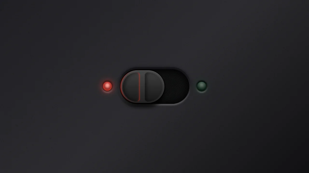
Industrial Ember Glow Toggle Switch
This is an Industrial Ember Glow CSS Toggle Switch. It uses layered box-shadow properties and complex radial gradients to simulate a physical, heat-emitting mechanism. Its function is to handle binary states (On/Off) while providing intense visual feedback. The effect relies completely on CSS, bypassing JavaScript to manage its interactive state and idle animations.
 Chrome 88+
 Edge 88+
 Firefox 84+
 Safari 14+
See the Pen Industrial Ember Glow Toggle Switch.

Hand-Drawn Retro Radio Group
This Hand-Drawn Retro Radio Group injects personality into standard forms with a nostalgic, sketchbook aesthetic. It combines a “neo-brutalist” shadow style with subtle animations - like text jitter and a bouncing selection dot - to mimic the imperfection of hand-drawn art. The background features a CSS-generated paper texture and scanline effect, making it ideal for indie game interfaces, creative blogs, or retro-themed landing pages.
Chrome 60+
Edge 79+
Firefox 60+
Safari 12+
See the Pen Hand-Drawn Retro Radio Group.

Animated Futuristic State Button
This Animated Futuristic State Button is more than just a clickable element; it’s a self-contained micro-interaction. Designed for actions like “Generate” or “Processing,” it features a idle flicker animation that transitions into an intense, glowing state upon focus. The text cleverly swaps from a call-to-action to a continuous verb (“Generate” → “Generating”) using purely CSS animations, providing immediate visual feedback without JavaScript.
Chrome 80+
Edge 80+
Firefox 75+
Safari 13+
See the Pen Animated Futuristic State Button.
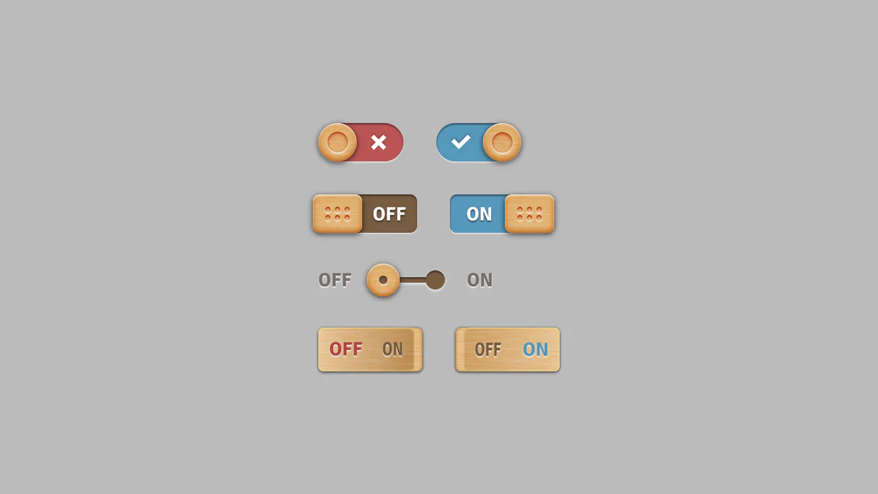
Skeuomorphic Wood Texture Toggles
This collection of Skeuomorphic Wood Texture Toggles brings a tactile, nostalgic feel to digital interfaces. It showcases four distinct variations of toggle switches (sliding, dotted handle, separated track, and embedded text), all unified by a realistic wood grain texture and intricate lighting effects. The implementation demonstrates the power of modern CSS features like :has() to control complex state changes without a single line of JavaScript.
Chrome 105+
Edge 105+
Firefox 121+
Safari 15.4+
See the Pen Skeuomorphic Wood Texture Toggles.
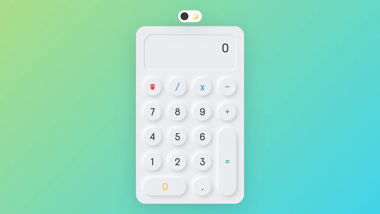
Neumorphic Dark Mode Calculator
This Neumorphic Dark Mode Calculator brings the “Soft UI” trend to life with a fully functional mathematical tool. It features a realistic, extruded plastic look achieved through complex CSS box-shadows. A prominent toggle allows users to switch between a clean light theme and a high-contrast dark mode, instantly updating the shadow physics to maintain the illusion of depth.
Chrome 60+
Edge 79+
Firefox 55+
Safari 11+
See the Pen Neumorphic Dark Mode Calculator.
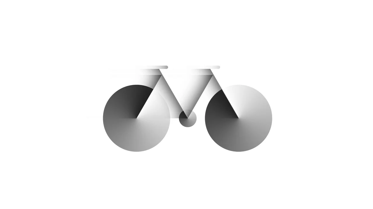
Bicycle
A pure CSS bicycle illustration constructed from geometric primitives using absolute positioning and vmin units for responsiveness. conic-gradient simulates wheel spokes, transform: skewX shapes the frame, and inset box-shadow adds depth, while pseudo-elements efficiently duplicate components like wheels.
See the Pen Bicycle.

Dipper Pines from Gravity Falls
A pure CSS character illustration of Dipper Pines, constructed from geometric primitives using absolute positioning and vmin units for responsiveness. The design leverages border-radius, transform, clip-path masking, and pseudo-elements to shape detailed features like the signature pine tree hat and hair, all styled with CSS variables and a custom web font.
See the Pen Dipper Pines from Gravity Falls.
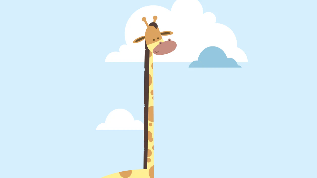
Giraffe
A pure CSS cartoon illustration of a giraffe constructed from geometric primitives using absolute positioning. It leverages box-shadow for efficient pattern repetition (spots, clouds), clip-path for complex shapes like the mane, and CSS variables for a consistent pastel color palette.
See the Pen Giraffe.
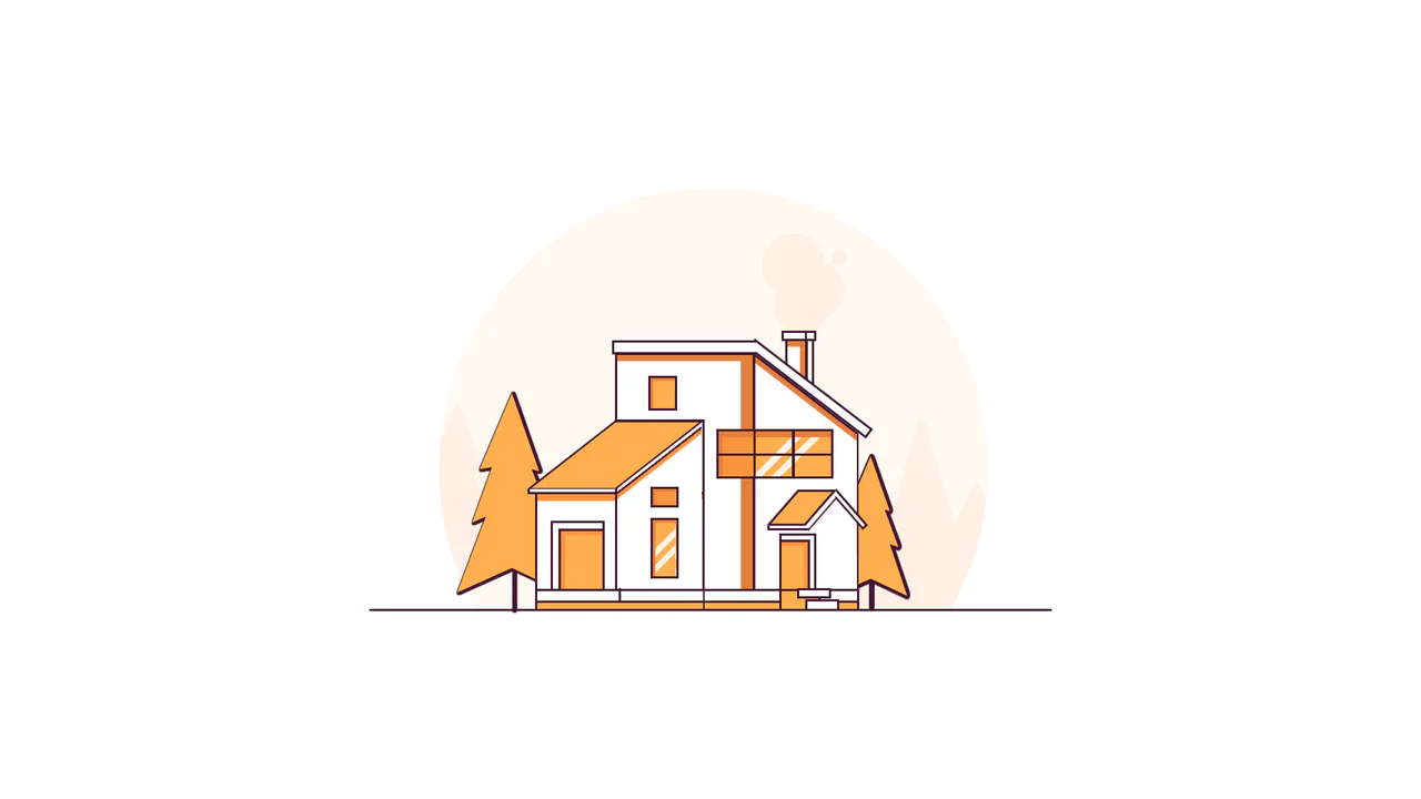
Line House
A pure CSS illustration of a house constructed from geometric primitives using clip-path for complex shapes and transform for perspective. It features a warm color palette managed via CSS variables, extensive drop-shadow usage for foliage density, and linear-gradient for detailed window reflections.
See the Pen Line House.

Warrior
A pure CSS illustration of a knight constructed from geometric primitives. It employs repeating-linear-gradient for shield textures, clip-path for armor shaping, and extensive box-shadow duplication to render limbs and details efficiently, creating a stark, high-contrast monochrome aesthetic.
See the Pen Warrior.

Neumorphic Loader
A tactile Neumorphic progress indicator where JavaScript drives the animation state by updating a custom property --progress. The visual logic relies on CSS conic-gradient utilizing calculated color stops to dynamically render the filling arc, while complex layered box-shadow creates a soft, extruded 3D aesthetic.
See the Pen Neumorphic Loader.
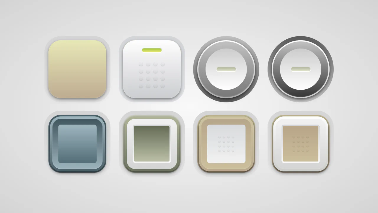
Soft Button Styling
A collection of skeuomorphic buttons rendered entirely in CSS using complex gradient layering and calc()-driven geometry variables.
See the Pen Soft Button Styling.
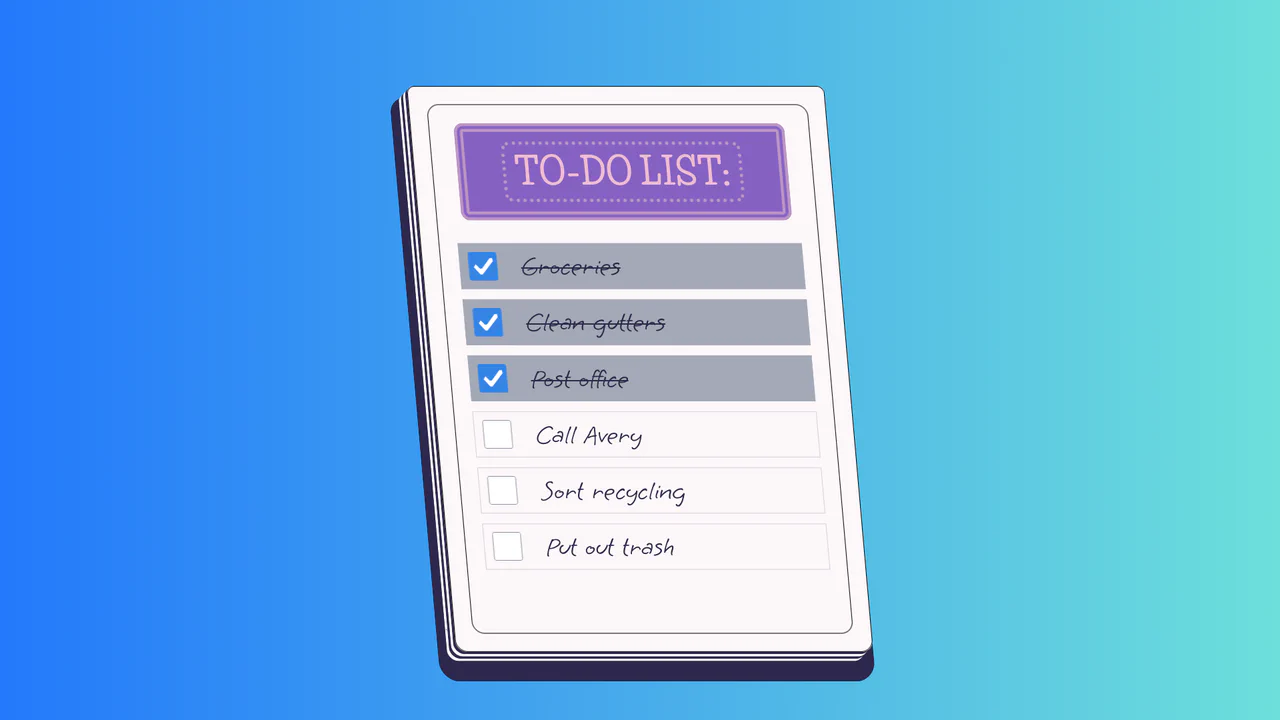
To-Do List
A stylized paper notepad To-Do list featuring a skew transformation and stack-effect shadows. Clicking checkboxes toggles a strikethrough style on handwritten list items via JavaScript class manipulation.
See the Pen To-Do List.
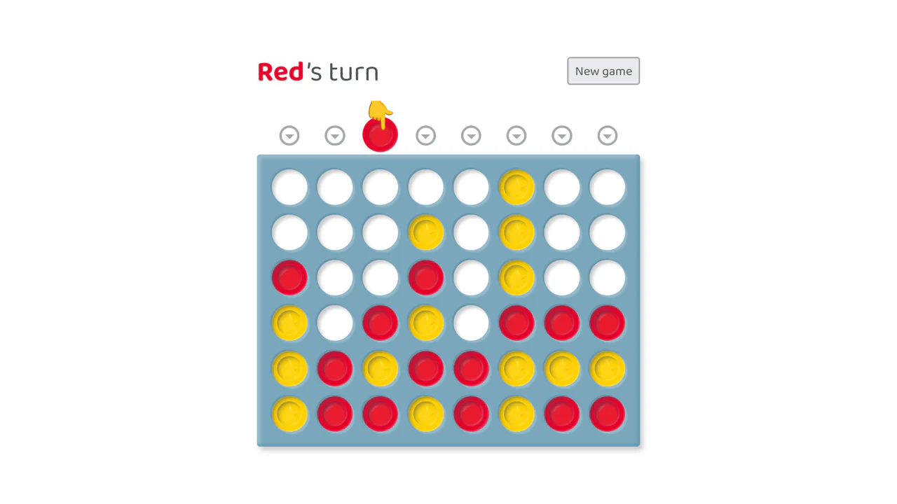
Connect Four in Vue and CSS
A full-stack, reactive implementation of Connect Four built on Vue.js, featuring complex game logic including victory checks across four axes and keyboard accessibility.
See the Pen Connect Four in Vue and CSS.
Ergonomic Toggle (CSS)
A hyper-realistic skeuomorphic toggle switch crafted entirely in CSS using advanced box-shadows and gradients to simulate depth and lighting.
See the Pen Ergonomic Toggle (CSS).

Range Slider
A highly stylized range slider utilizing box-shadow on the slider thumb to render the track, masked by a clip-path polygon on the parent container to create a unique slanted aesthetic.
See the Pen Range Slider.

React Radio Player
A tactile, interactive player that looks and behaves like a real gadget, featuring smooth power-on animations and live audio streaming.
See the Pen React Radio Player.

Creative Section Design
A visually rich, animated section with cards that respond to hover (a colored border appears), creating a sense of interactivity and depth.
See the Pen Creative Section Design.

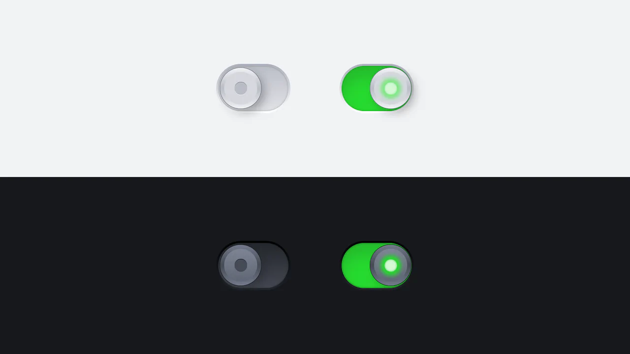
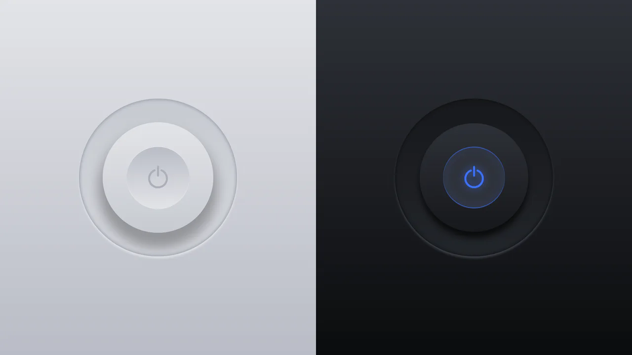
Pure CSS Dark Mode Toggle Switch
This is a toggle switch that allows selecting between skeuomorphic and neumorphic design styles. It also features a dark/light theme change triggered by toggling the switch itself.
See the Pen Pure CSS Dark Mode Toggle Switch.
Metallic Skeuomorphic Toggle Switches
A skeuomorphic toggle design achieved by combining multiple linear-gradients for the body and box-shadow to create a volumetric effect. The smooth switching animation and “glow” in the active state are implemented via transition with a custom cubic-bezier curve.
See the Pen Metallic Skeuomorphic Toggle Switches.

3D Neon Toggle On/Off Switch
An advanced 3D toggle switch simulating a physical button with a neon glow. The effect is implemented in pure CSS using an <input type="checkbox">, and the state transition (ON/OFF) is achieved through a complex interplay of box-shadow and 3D transforms.
See the Pen 3D Neon Toggle On/Off Switch.
3D Toggle On/Off Switch v2
The use of gradients to create a realistic metallic effect and highlights on the button. Various types of linear-gradient and radial-gradient are applied to create a multi-layered background, and clip-path precisely clips the shapes of the pseudo-elements.
See the Pen 3D Toggle On/Off Switch v2.

Checkbox Hamburger Menu Animation
A demonstration of step-by-step CSS transformation to create a cross effect: on :checked, the middle bar either gets opacity: 0 or scales down, while the top and bottom bars simultaneously rotate and translate.
See the Pen Checkbox Hamburger Menu Animation.
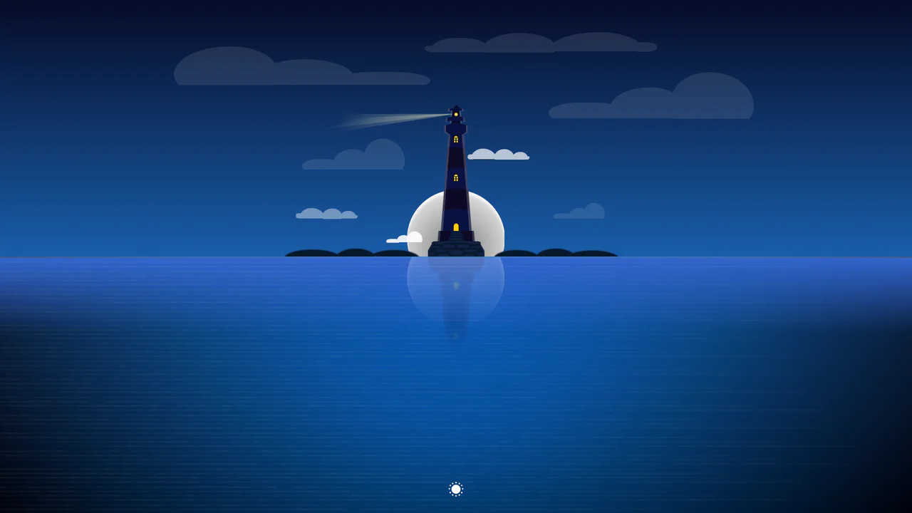
CSS Day/Night Lighthouse Illustration
A purely CSS rendering of a complex lighthouse scene at sunset/night. The “checkbox hack” is used to toggle between day and night modes. All graphics - from the lighthouse itself to the sea, clouds, and stars - are created exclusively using CSS gradients and box-shadow.
See the Pen CSS Day/Night Lighthouse Illustration.
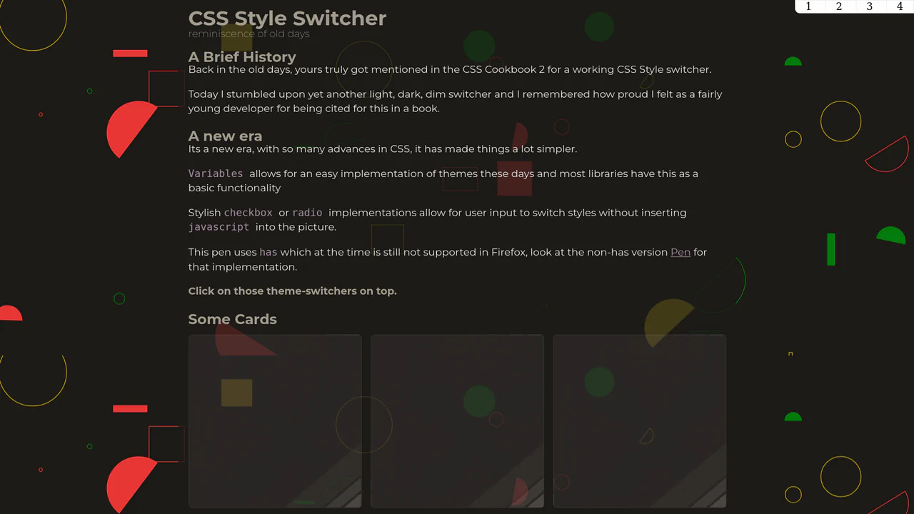
CSS Style Switcher with :has()
An example of powerful reactivity with :has() - theme switching not only changes colors but also radically reworks the layout, adds stylized shadows, and even changes fonts and background SVG patterns.
See the Pen CSS Style Switcher with :has().
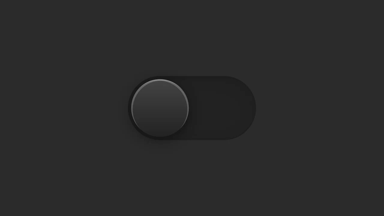
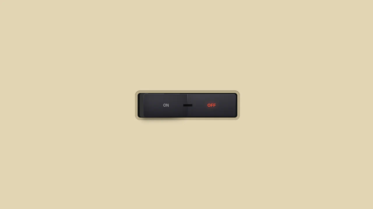
Dark Mode Toggle Switch
A toggle switch implemented using a single <input type="checkbox"> and pseudo-elements. The “button” effect and its movement are achieved through complex, multi-layered box-shadow and the shifting of the ::before element.
See the Pen Dark Mode Toggle Switch.
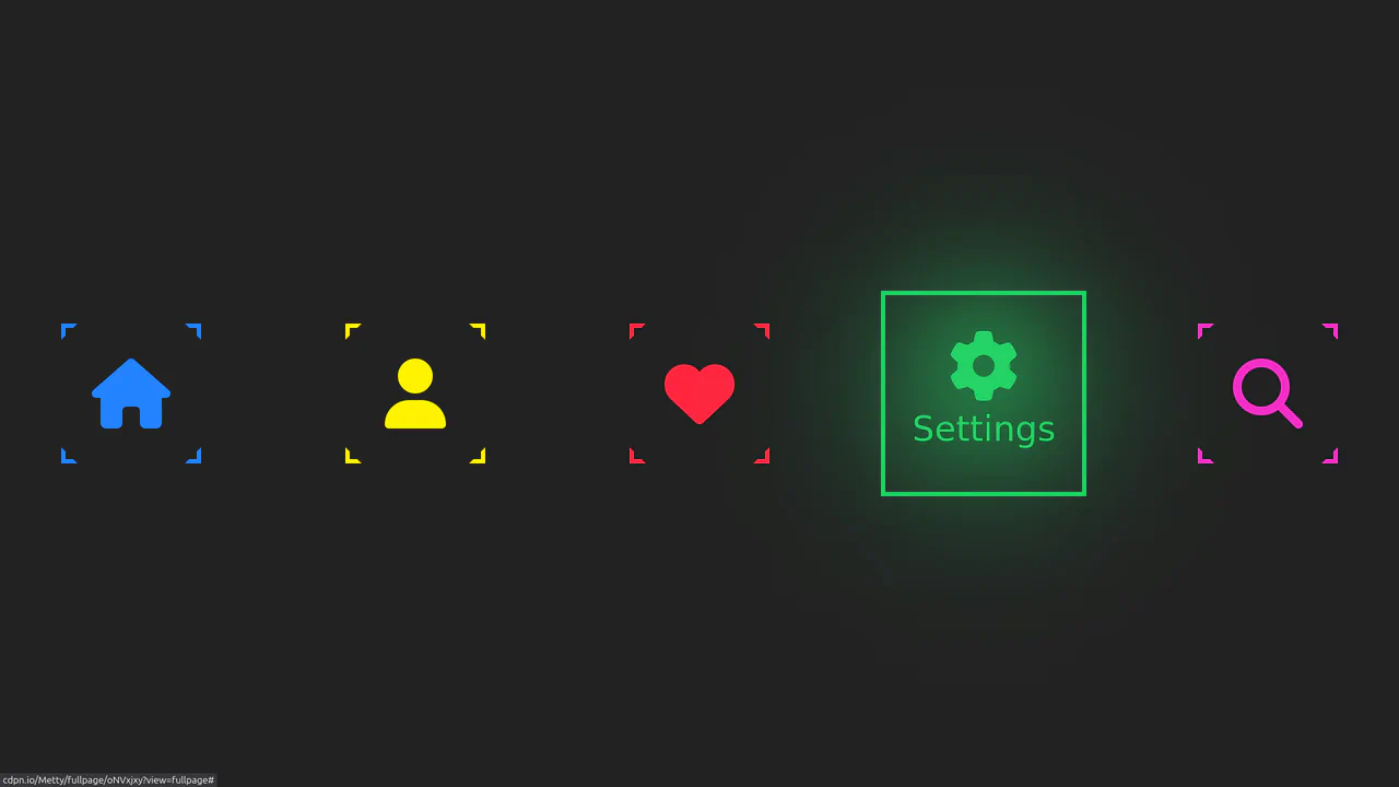
Neon Icon Hover Effect
A navigation menu with a neon glow and a complex hover effect. Icons and text use the CSS drop-shadow filter to create a glow effect, while the element’s color is controlled via an inline CSS variable --clr.
See the Pen Neon Icon Hover Effect.

Single Div CSS Computer
A demonstration of pixel art creation using only CSS gradients and box-shadow animation, without a single image file or extra HTML elements.
See the Pen Single Div CSS Computer.
Glowing On/Off Buttons
A skeuomorphic toggle button where the entire press effect is implemented in pure CSS using box-shadow and transform: scale(). JavaScript is only used to toggle the WAI-ARIA attribute aria-pressed on click.
See the Pen Glowing On/Off Buttons.

3D Capsule Slider Button
A combination of the ‘checkbox hack’ and 3D transforms to create an interactive neumorphism-style switcher. JavaScript only adds classes, while the entire transform: rotateX() animation and complex box-shadow are controlled by CSS.
See the Pen 3D Capsule Slider Button.