110+ CSS box-shadow Examples (Page 3)
Examples
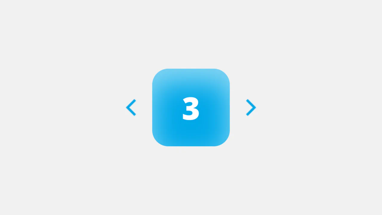
FAQ Accordion with Font Awesome Icons
The “Accordion/FAQ” functionality is implemented using pure JavaScript, which handles the click on the parent element and toggles the active class on the FAQ container. The visual highlight is the icon change via CSS display: none/block properties.
See the Pen FAQ Accordion with Font Awesome Icons.

Neumorphic Multi-Buttons with CSS Feedback
An effective button group where the hover effect is created via inset box-shadow - and the click confirmation animation is implemented using transform and opacity on the ::after pseudo-element.
See the Pen Neumorphic Multi-Buttons with CSS Feedback.

Realistic MPK Mini MIDI Controller in Pure CSS
Pure CSS skeuomorphism in action - a complete replica of a MIDI controller where every knob, pad, and key is drawn by layering dozens of gradients and shadows.
See the Pen Realistic MPK Mini MIDI Controller in Pure CSS.
Soft UI Counter Component
This simple counter demonstrates clean vanilla JavaScript functionality: counter management, class switching for instant color scheme change based on the number’s sign. The stylistic focus is on “Soft UI” aesthetics.
See the Pen Soft UI Counter Component.

Neumorphic Soft UI Radio Buttons and Checkboxes
This demo explores the Neumorphic or Soft UI design trend, implementing a complete set of custom radio buttons, checkboxes, and toggle switches using only pure CSS box-shadow properties to achieve the signature concave/convex 3D-like effect, while a concise Vanilla JS script manages the dynamic background gradient on state change.
See the Pen Neumorphic Soft UI Radio Buttons and Checkboxes.
Button with Animated Gradient
Achieve a premium, vibrant glow and pulsating background with this component, which utilizes high-performance CSS animations and dynamic box-shadow effects, all orchestrated by TypeScript and the GSAP library.
See the Pen Button with Animated Gradient.
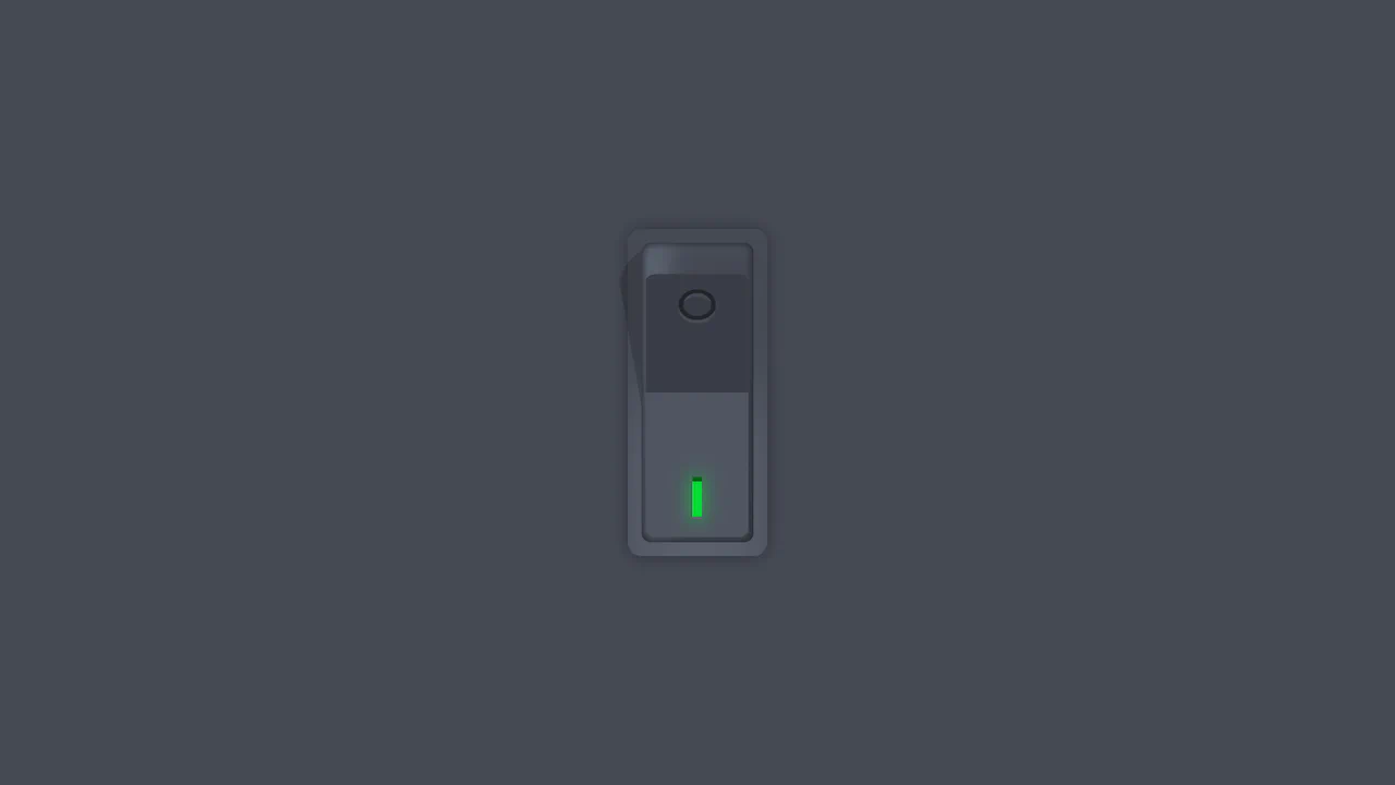
Vertical Rocker Switch
A tactilely realistic vertical toggle, created using advanced CSS variable techniques and multiple box-shadow layers to mimic three-dimensional depth, combined with smooth cubic-bezier animations.
See the Pen Vertical Rocker Switch.

Neuomorphic Fingerprint Scanner
A complex 3D effect with a deep glow, achieved by combining multiple box-shadow and radial-gradient styles. Key feature: layered fingerprint scanning using two SVG elements and the clever application of mix-blend-mode.
See the Pen Neuomorphic Fingerprint Scanner.
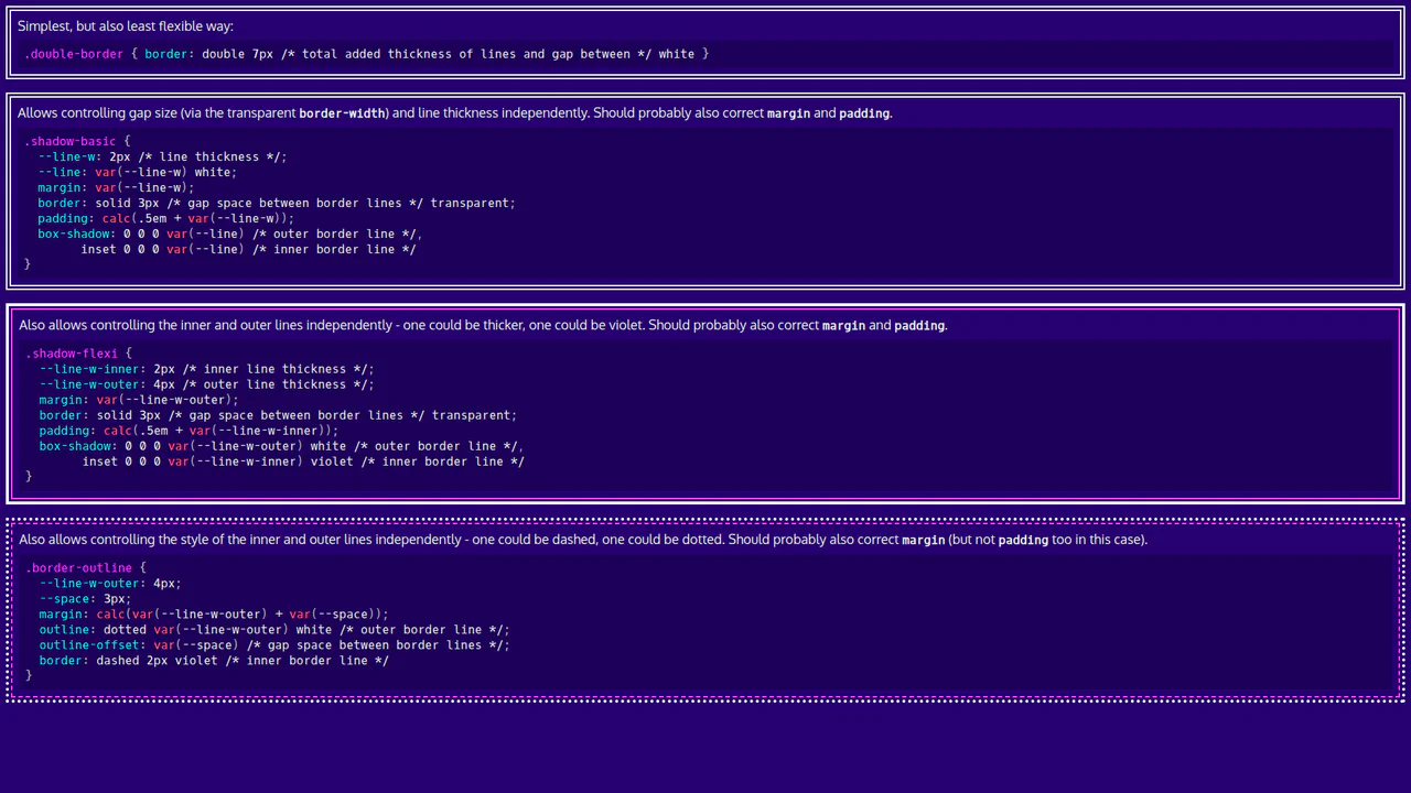
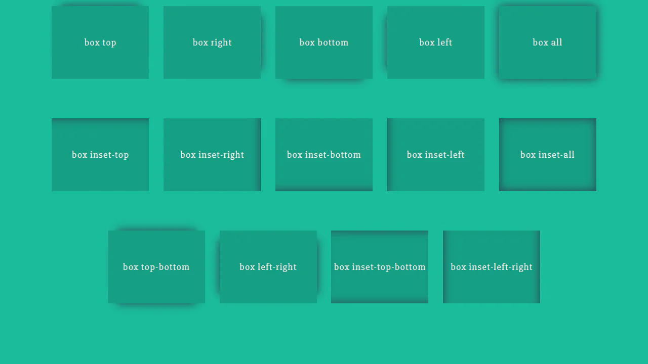
Basic CSS Snippets: Double Borders
This demo is a visual guide to creating double borders and frames using pure CSS. It showcases elegant and flexible approaches with box-shadow, outline, and CSS variables, making the code clean and easily customizable.
See the Pen Basic CSS Snippets: Double Borders.
Striped Box Shadow Effect
The demo focuses on using CSS gradients to generate background patterns. Instead of relying on images, it creates a complex, repeating design with linear-gradient and background-size, which ensures high performance and flexibility in resizing the pattern.
See the Pen Striped Box Shadow Effect.

Earth with Pure CSS
A showcase of advanced CSS capabilities for creating stunning 2D animations. It uses CSS @property for smooth property transitions, allowing you to animate box-shadow and other elements without compromising performance.
See the Pen Earth with Pure CSS.
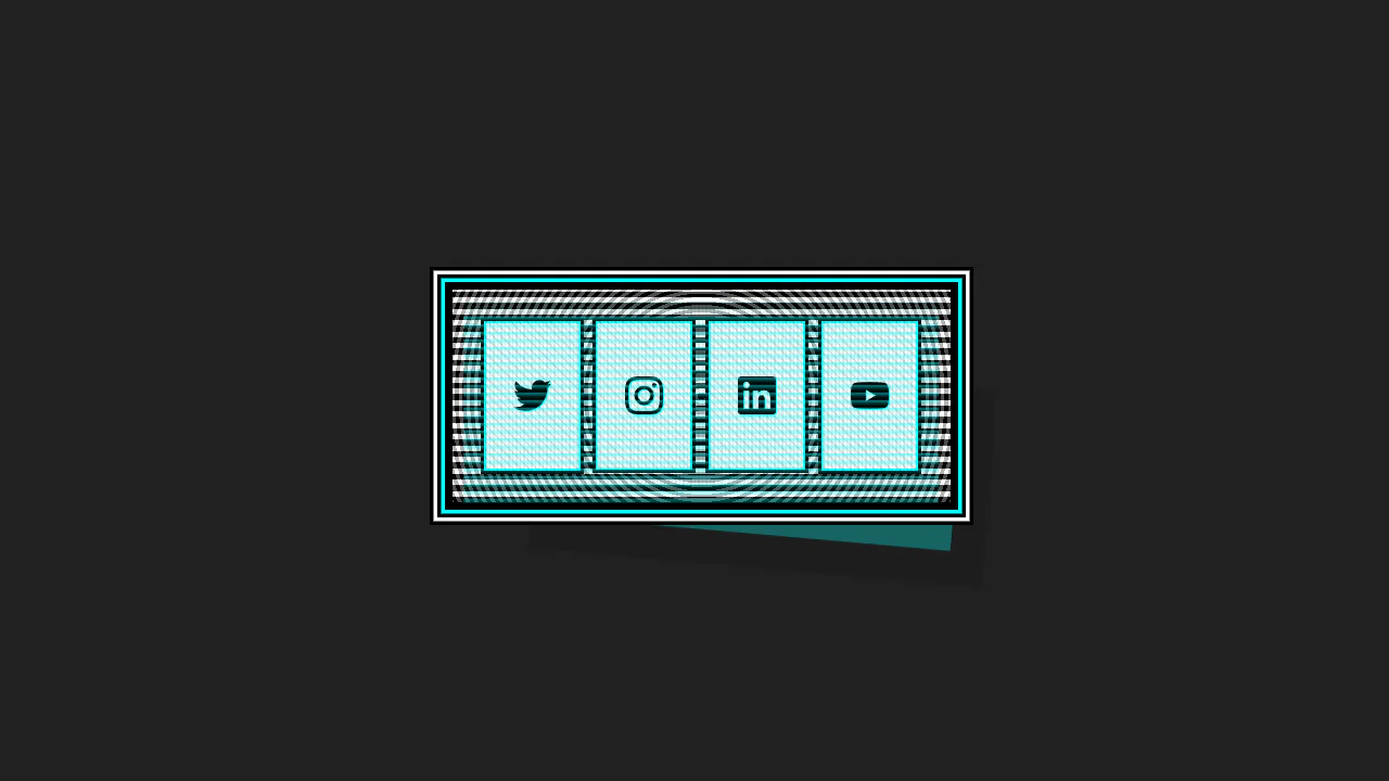
This Cyberpunk-inspired card features a complex box-shadow offset and text-shadow for the core CRT aesthetic, paired with a dynamic :hover state that uses transform to instantly swap the terminal view for a social icon grid.
Glass Effect UI
An elegant UI element using the “frosted glass” effect (backdrop-filter), enhanced with complex box-shadow and pseudo-elements for depth and a realistic, shimmering glare.
See the Pen Glass Effect UI.
Climbing Cube
An illusion of an endlessly rolling 3D cube, achieved by synchronizing two @keyframes animations for rotation and sliding with an offset transform-origin. The complex rotation animation uses intermediate steps for a “bounce” effect, while a neon glow and -webkit-box-reflect complete the futuristic look.
See the Pen Climbing Cube.
Push Button (CSS 3D Button)
A skeuomorphic 3D button created with multi-layered box-shadow and linear-gradient to simulate volume, highlights, and shadows. On :hover, the box-shadow styles are animated, creating a “pressed” effect.
See the Pen Push Button (CSS 3D Button).
Inverted Border Boxes
A demonstration of a non-trivial technique for creating inverted rounded corners using ::before pseudo-elements and box-shadow. This trick allows you to “carve out” complex shapes from parent blocks, bypassing the limitations of standard border-radius.
See the Pen Inverted Border Boxes.

Bootstrap 5 Accordion Example
A customized Bootstrap 5 accordion that visually elevates the active panel using the modern :has() pseudo-class. By detecting the .accordion-button:not(.collapsed) state, it applies a bold border and hard shadow to the parent container, creating a distinct “pop-out” focus effect.
See the Pen Bootstrap 5 Accordion Example.

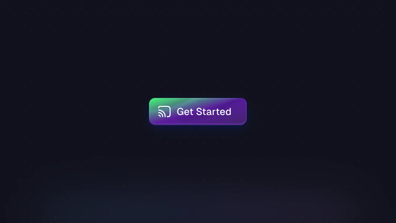
Eye-Catching Bootstrap 5 Button
A vibrant CTA button featuring a neon linear gradient and a continuous ‘shine’ animation implemented via a moving radial gradient on the ::before pseudo-element. On hover, it scales up and intensifies its colored drop-shadow for enhanced interactivity.
See the Pen Eye-Catching Bootstrap 5 Button.

ctrl+c ctrl+v Keys RGB
A decorative keyboard with a realistic press effect and dynamic, iridescent RGB backlighting, reminiscent of gaming keyboards.
See the Pen ctrl+c ctrl+v Keys RGB.

Neuromorphic Keyboard
A sleek neuromorphic keyboard UI crafted entirely with CSS Grid and Pug. The design leverages layered box-shadow properties to create the signature soft, extruded button effect, while :hover and :active pseudo-classes simulate tactile key presses.

Credit Card Checkout
This JS-free form component achieves a distinct “neo-brutalist” aesthetic by pairing a solid border with a hard, offset box-shadow, creating a tactile, pseudo-3D effect. This visual system is applied to a modern Flexbox layout and is enhanced by polished micro-interactions, including a unique box-shadow outline on :hover and a clear background change on :focus for a cohesive user experience.
See the Pen Credit Card Checkout.
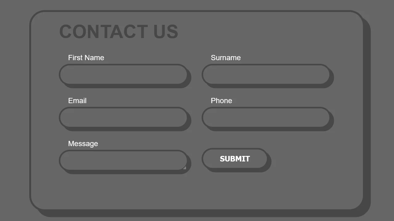
Border Form
This demo blends a modern, adaptive layout powered by CSS Grid with a striking visual style. The fluid grid structure is populated by chunky form elements, whose pseudo-3D depth is crafted by pairing a thick border with a solid-color box-shadow, demonstrating a complete UI solution in pure CSS.
See the Pen Border Form.
A collection of high-performance CSS hover effects built entirely with the box-shadow property, requiring no extra HTML markup. These snippets utilize Sass and CSS variables to create modular transitions (fill, pulse, slide), ensuring fast rendering and easy customization of UI components.