110+ CSS box-shadow Examples (Page 4)
Examples


Animated Weather Icons
A lightweight, scalable, and visually pleasing set of weather icons that can be easily adapted to any website color scheme.
See the Pen Animated Weather Icons.
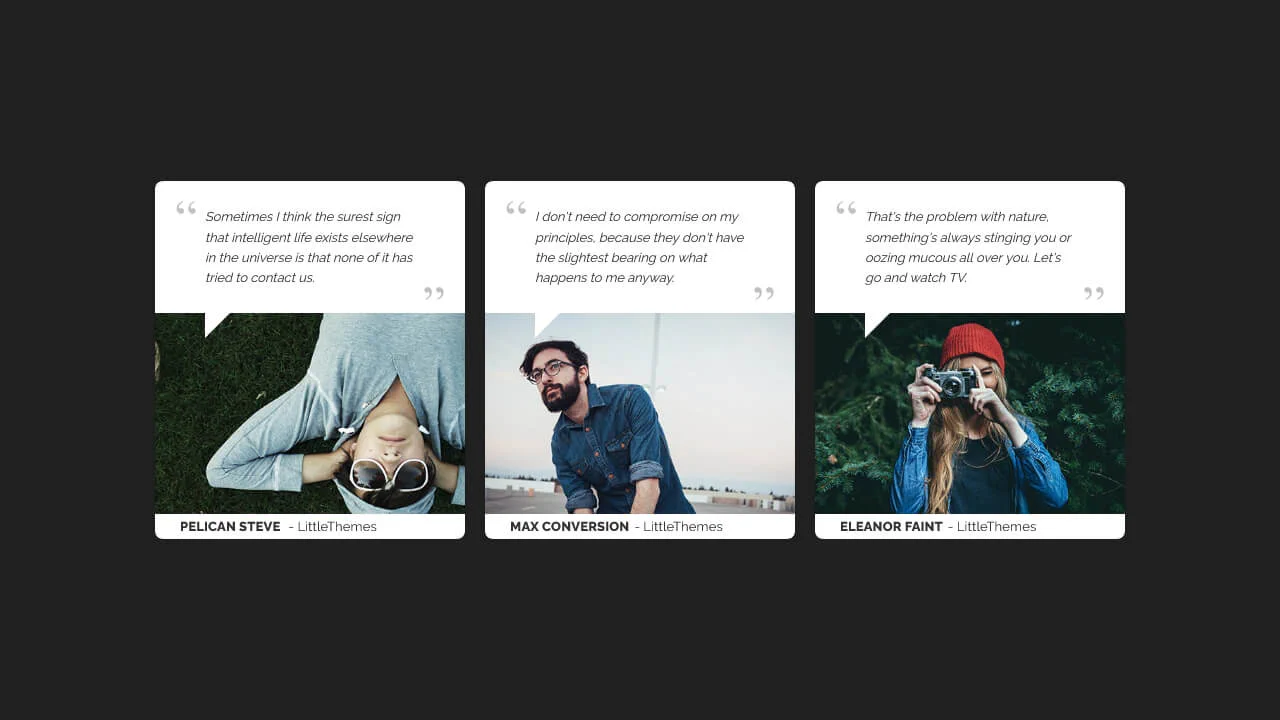
#1139 - Testimonial Card with Image
A speech-bubble style testimonial card constructed using absolute positioning for layout layering.
See the Pen #1139 - Testimonial Card with Image.
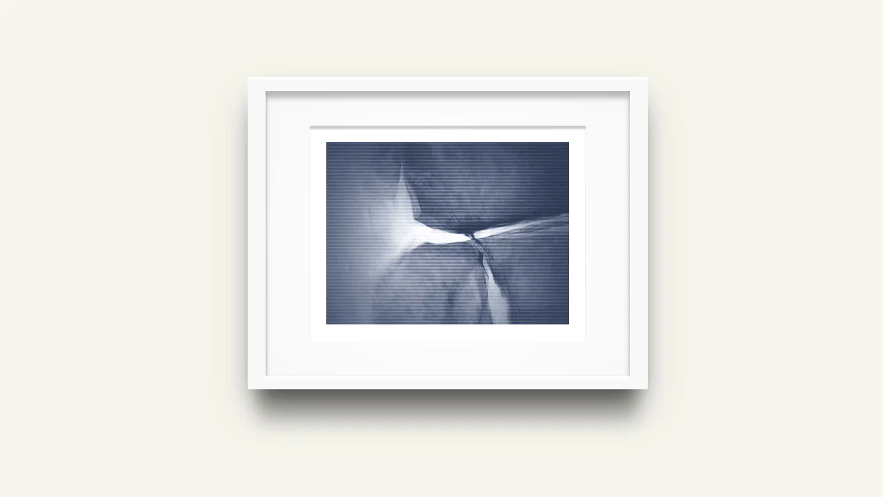
CSS3 Picture Frame
A pure CSS image styling technique that creates a realistic framed effect using concentric pseudo-elements.
See the Pen CSS3 Picture Frame.

Calculator
A modern, visually appealing calculator interface that looks like a native application but is implemented using web technologies.
See the Pen Calculator.
A stylish “hipster” image card featuring a lifted paper effect created with rotated pseudo-elements and shadows.
Progress Scrollbar CSS Only
A scroll progress indicator effect created with a clever CSS trick - a massive box-shadow with a negative offset on ::-webkit-scrollbar-thumb creates the illusion of filling the traversed track as you scroll.
See the Pen Progress Scrollbar CSS Only.
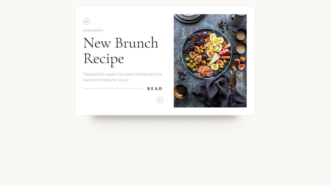
Recipe Card
A clean and minimalist card design implemented using the box-sizing: border-box property for simplified layout; the “Read” heading is styled using a pseudo-element :after, which creates a decorative horizontal line running behind the text, demonstrating fine positioning work.
See the Pen Recipe Card.
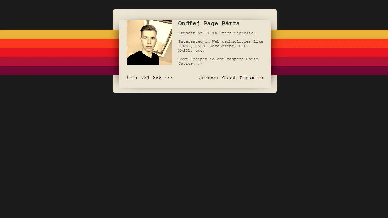
90's Profile Card
The business card design showcases pure CSS, utilizing linear-gradient and a pseudo-element to create a multicolor gradient background, alongside absolute positioning for layering; it also applies the CSS filter sepia(1) to the image and a box-shadow for depth, with all text styled in the monospace font courier.
See the Pen 90's Profile Card.
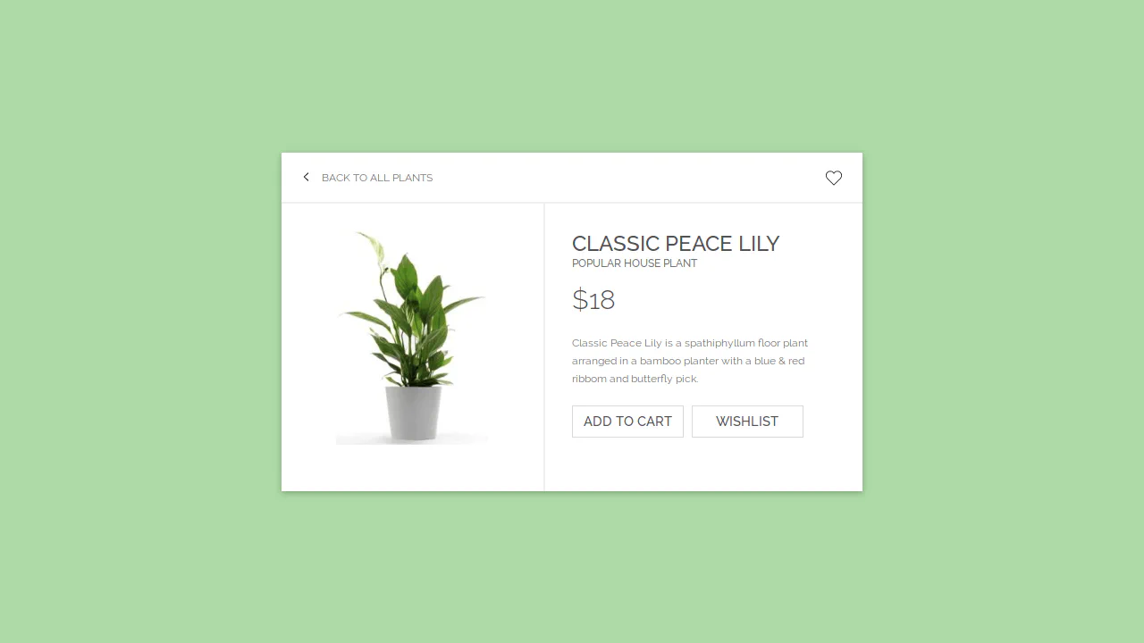
E-Commerce Card
This interactive card template, built with Sass/CSS, showcases a clean and flexible layout centered using transform: translate, focusing on smooth transition effects for box-shadow and detailed styling of interactive elements like buttons and SVG icons using the :hover pseudo-class.
See the Pen E-Commerce Card.
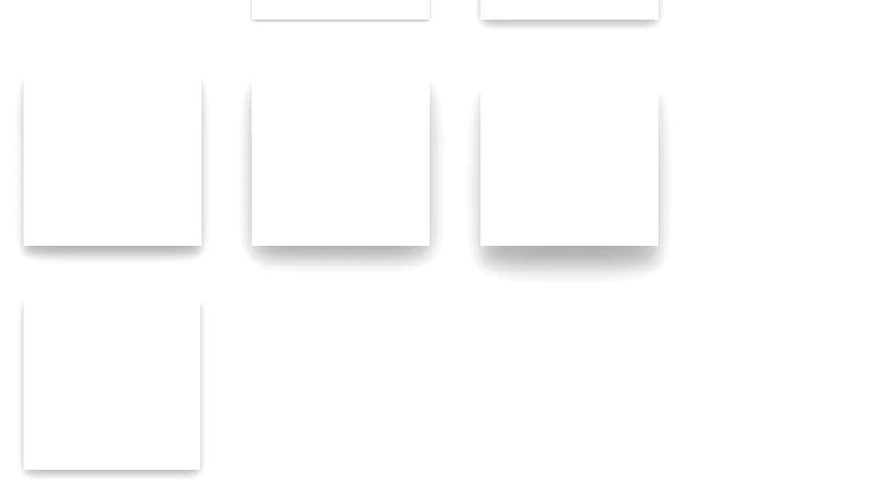
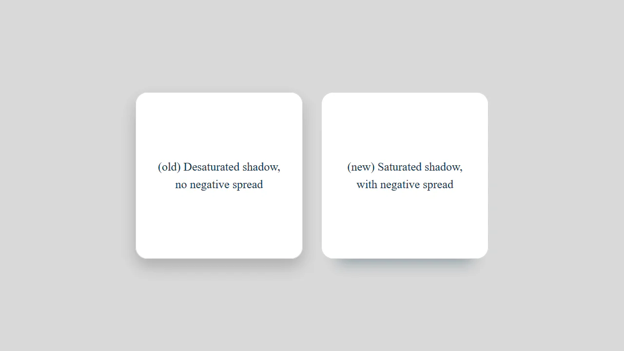
Material Design Card Effect
A flexible SCSS system for generating multi-layered, Material Design-style shadows - all logic is built on @functions and accessing list values with nth().
See the Pen Material Design Card Effect.
Material Cards
A responsive card grid on Flexbox, using SCSS with variables for easier style management. A complex transition effect fires on :hover, synchronously animating the box-shadow for a “lift” effect, text colors, and the width of a dynamic header underline.
See the Pen Material Cards.

HTML and CSS Credit Card
A pure CSS illustration of a credit card, where the entire structure is organized via LESS variables and mixins, and complex visual effects - from background curves with asymmetric border-radius to the embossed text using content: attr(title) - are implemented exclusively with pseudo-elements.
See the Pen HTML and CSS Credit Card.

Blog Card
A multi-layered card that combines a classic float-based layout with position: absolute for offsetting elements, while multiple box-shadow properties create a depth effect - plus, an elegant image centering trick using transform: translate(-50%, -50%).
See the Pen Blog Card.
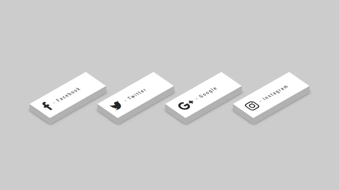
3D - CSS Social Tiles
A set of isometric social media buttons created purely with CSS transforms.
See the Pen 3D - CSS Social Tiles.
George Orwell 1984 Book Cover
A stylish 3D book effect with a realistic cover, created purely with CSS. Interactive page-flipping (rotateY) is activated on hover, demonstrating a masterful use of transform-style: preserve-3d and shadows.
See the Pen George Orwell 1984 Book Cover.
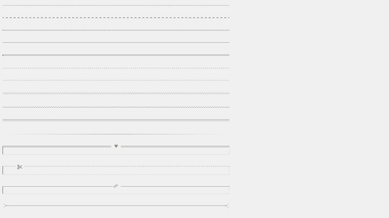
Simple Styles for Horizontal Rules
An extensive set of styles utilizing border-top with various line types (dashed, dotted, double) and clever tricks with box-shadow: inset to create an indented line effect. It demonstrates how to achieve complex visual variety by manipulating only basic border properties.
See the Pen Simple Styles for Horizontal Rules.