20+ CSS Breadcrumbs
Navigation requires absolute structural clarity. Pure CSS Breadcrumb Navigation Examples remove the friction of heavy JavaScript libraries, creating a direct path for the user to understand their site position. This collection provides essential blocks for modern UI design, organizing hierarchy into digestible sequences. Utilizing these curated snippets replaces bloated scripts with raw, functional logic. No latency.
Technically, these examples rely on CSS Counters and pseudo-elements (::after, ::before) to generate separators and numbering automatically. The code utilizes Flexbox or CSS Grid for precise horizontal alignment. Transitions for active states leverage hardware acceleration, animating properties like transform and opacity to ensure a locked 60fps performance on the rendering thread. The HTML structure remains strictly semantic, maintaining high layout stability and preventing expensive browser repaints.
Every free demo is fully responsive and cross-browser compatible. Users can instantly download the raw code or fork an updated interaction on CodePen.
Examples
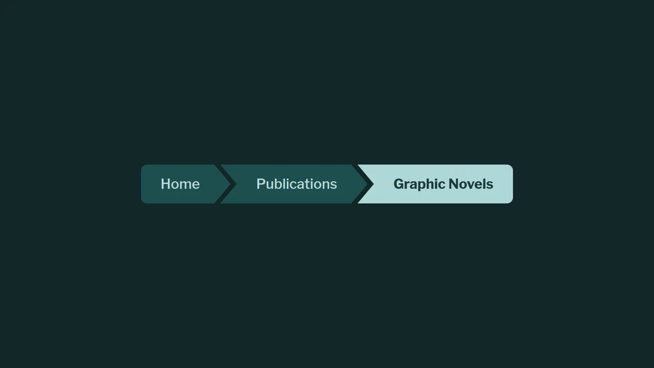
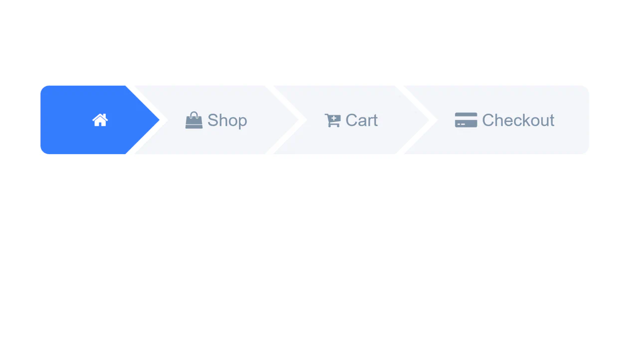
Beveled Chevron CSS-only Breadcrumbs
A highly experimental, CSS-only breadcrumb navigation component styled with geometric chevron shapes. By overlapping adjacent elements and applying a polygonal clip-path mask, it creates continuous, interconnected markers. The visual styling leverages CSS relative color syntax, relative color-mix() mixing, and experimental corner beveling properties.
 Chrome 119+
 Edge 119+
See the Pen Beveled Chevron CSS-only Breadcrumbs.

Breadcrumb Separators with :has()
This component showcases a modern and efficient way to style breadcrumb separators using the powerful CSS :has() selector, allowing precise placement of ::after elements only between active links, thus eliminating the need for JavaScript.
See the Pen Breadcrumb Separators with :has().
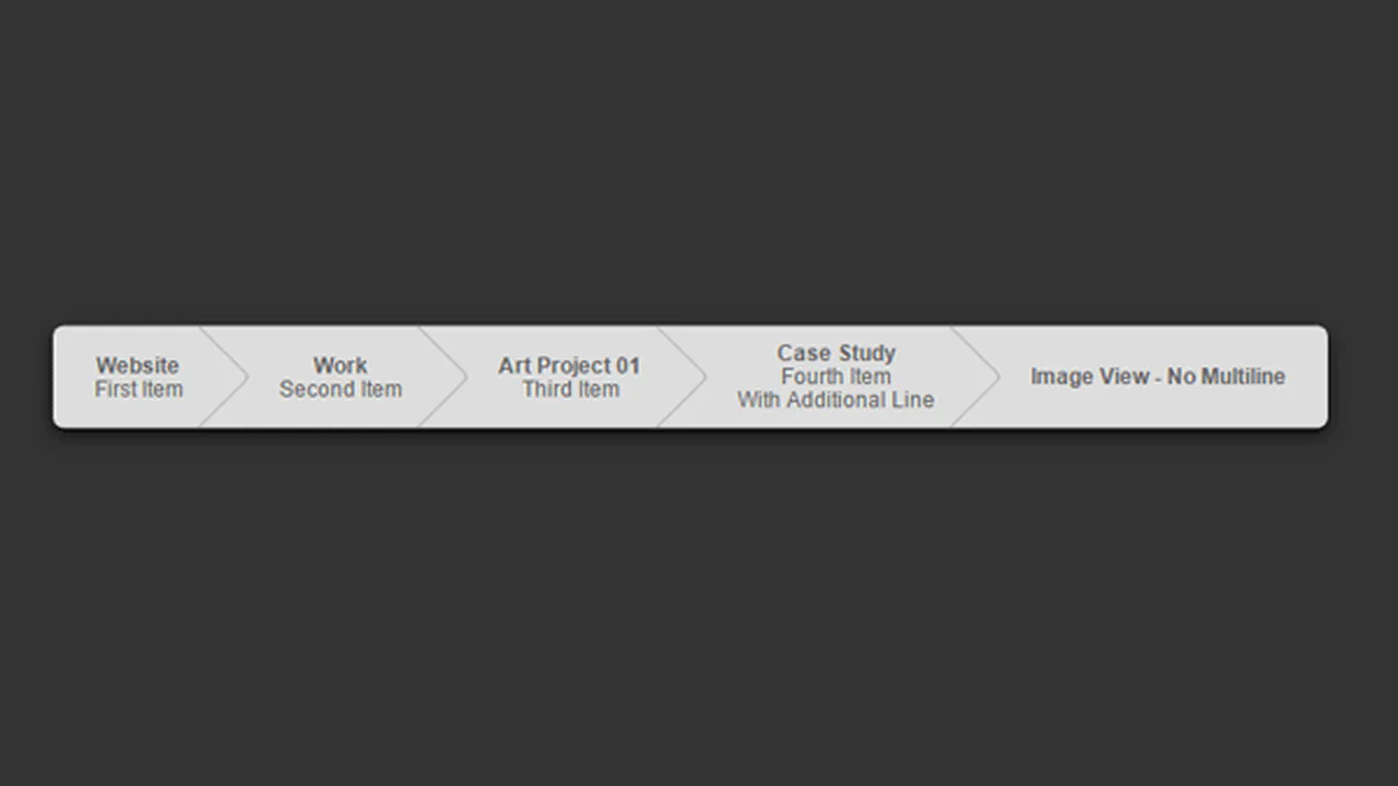
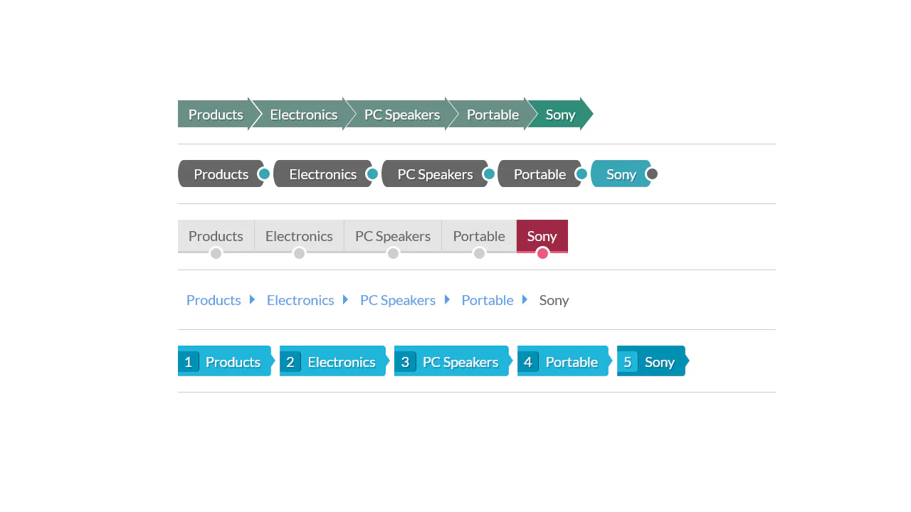
Breadcrumbs are built with a single element and a complex clip-path to create the angled notches. Geometry is controlled by CSS custom properties: angle, border thickness, colour. First and last items have special rules to round the outer edges. No images, just pure CSS.
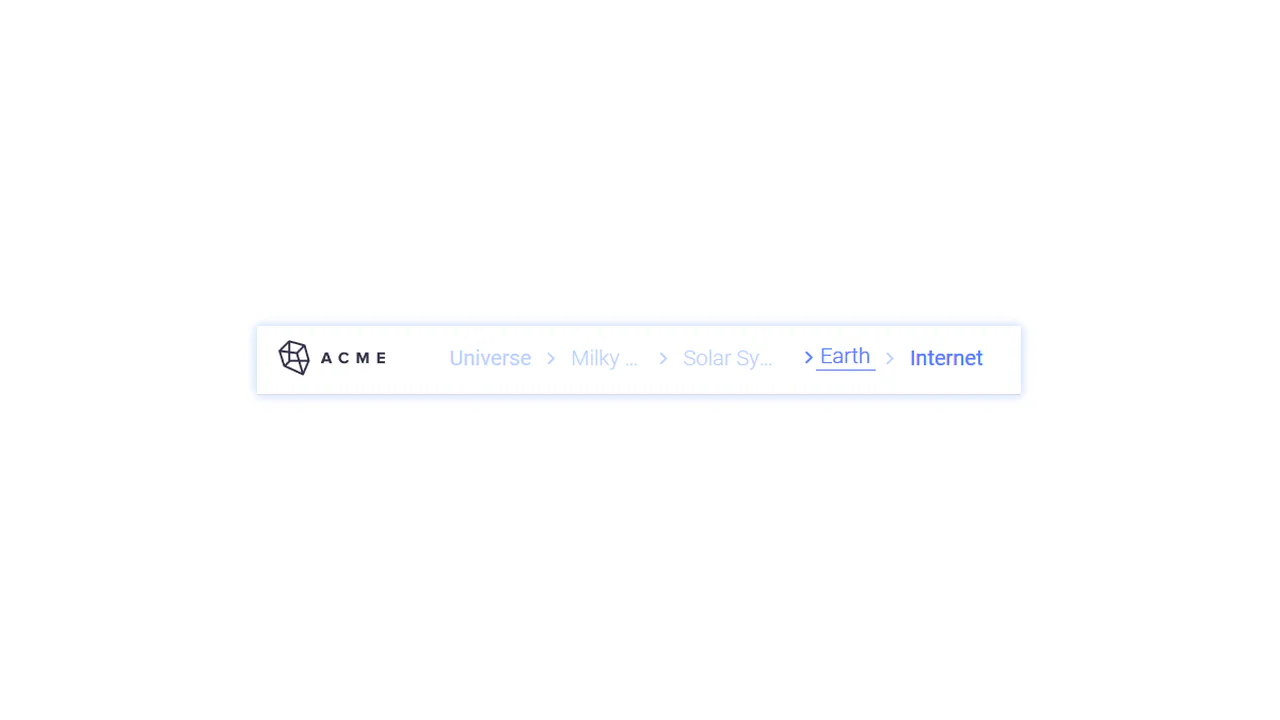
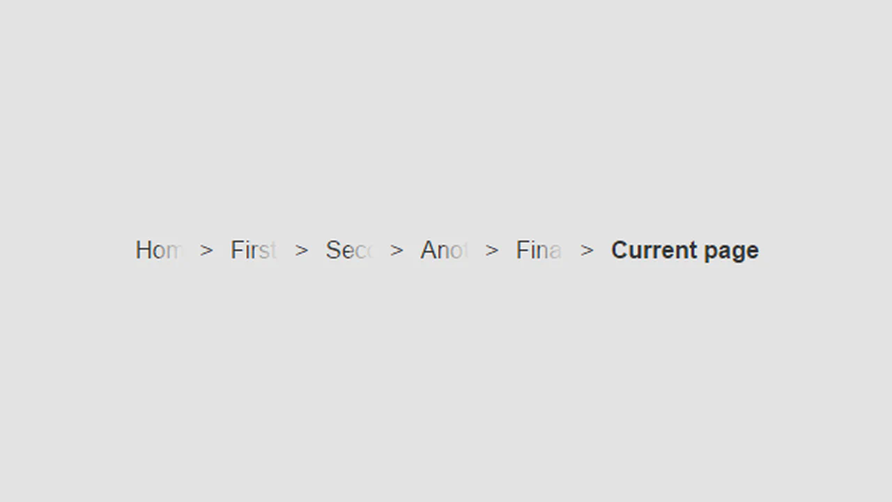
Responsive breadcrumb navigation uses flexbox and CSS custom properties: items shrink with ellipsis on narrow screens and expand to full text on hover. The underline effect is a pseudo‑element with transforms. No JavaScript — just styles and minimal markup.

Breadcrumbs rely on CSS skew transforms: each link is skewed, inner content straightened with reverse skew. The active item stands out with colour. No responsiveness — it’s a purely decorative technique.
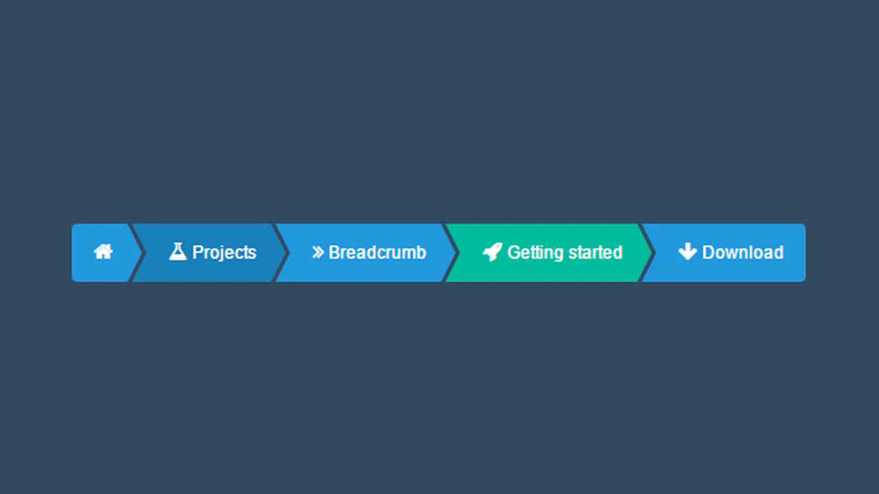
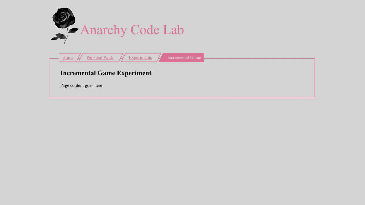
Breadcrumbs are built with absolutely positioned pseudo‑elements :before and :after creating angled edges. Background and colour shift on :hover. Items are laid out in a row using float. No JavaScript — just pure CSS.
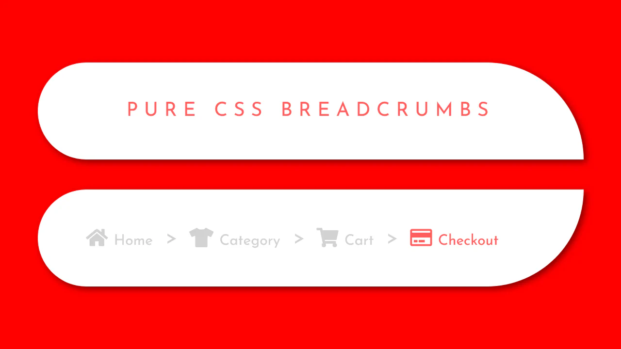
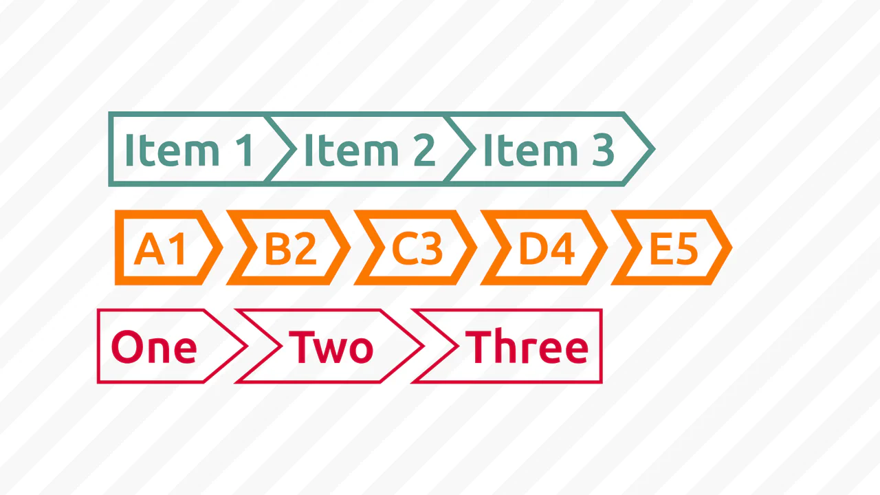
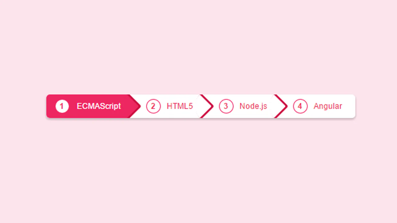
Breadcrumbs use pseudo‑elements :before and :after: the main element sets the background, :after creates the arrow via a rotated square. CSS counters add numbers before each item. Gradients and shadows add depth; hover toggles background and arrow colour — all without JavaScript.
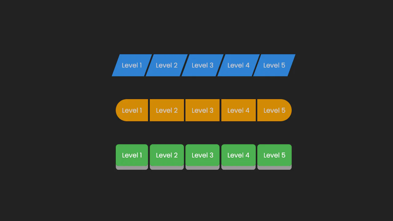
Breadcrumb navigation built with pseudo‑elements :before and :after. Arrows are rotated squares, numbering uses CSS counters. Gradients and shadows add depth, hover toggles the colour scheme. No JavaScript — just styles and markup.
Two breadcrumb variants: standard and collapsed. In collapsed mode, links shrink to 2em and expand on hover using max-width transitions. Separators and a gradient mask hide the text, leaving only the first letters or icons visible. All logic is pure CSS, no JavaScript.

The code generates expandable breadcrumbs that reveal full section names on hover. jQuery handles the width animation, while CSS pseudo-elements create the arrow separators. The first and last items are rounded, and the active item is highlighted with a distinct colour.
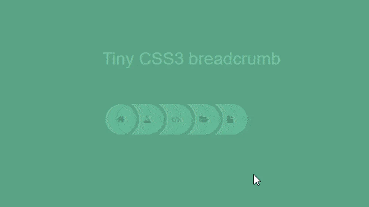
Breadcrumbs are built as overlapping circles: each item shifts left with a negative margin. On hover, the link expands, revealing a text label. The last item scales up further. All animations are CSS‑only, no JavaScript.
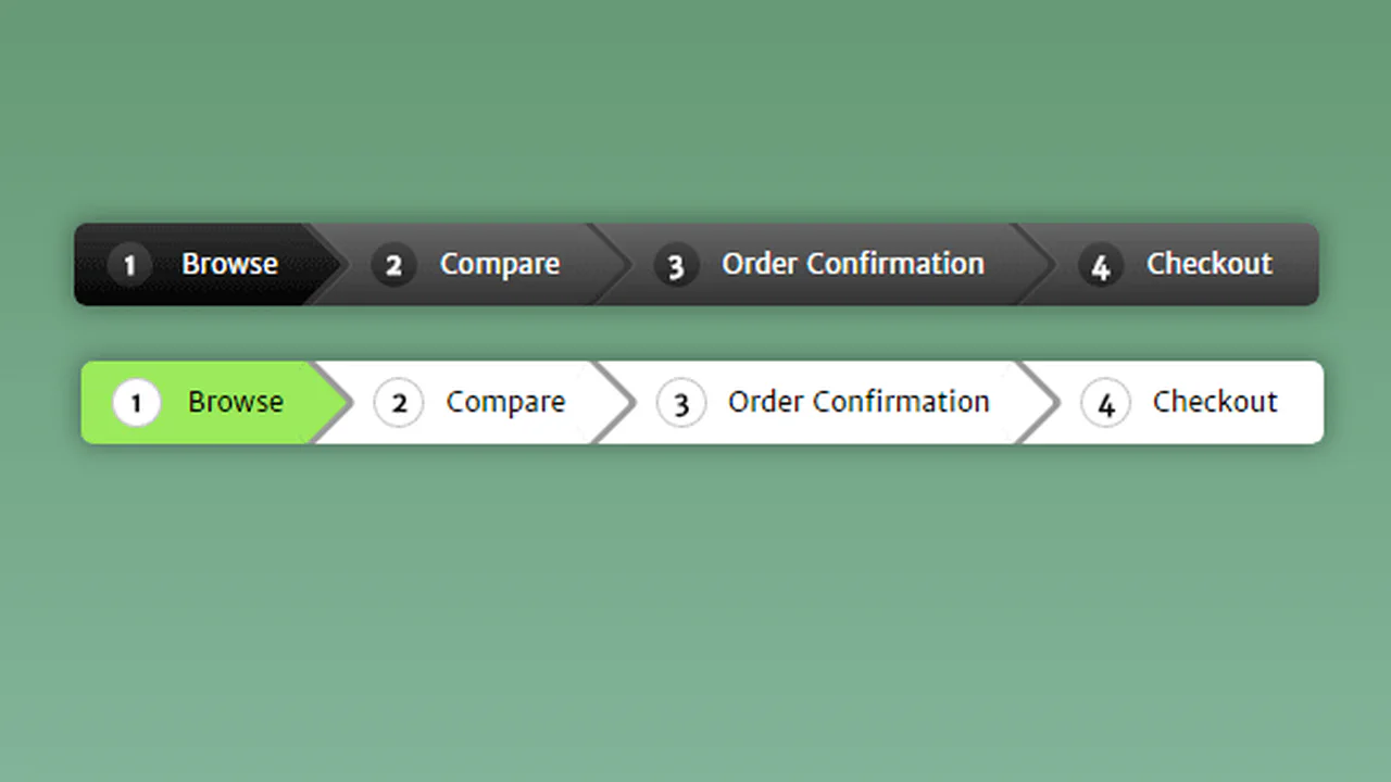
Breadcrumb navigation with numbered circles and arrows built via pseudo‑elements. Clicking a step toggles the active class — plain TypeScript handles the logic. The colour scheme is controlled with CSS custom properties.
A straightforward breadcrumb navigation built with pure CSS: triangular separators are made with border on pseudo‑elements. SCSS variables for colours and nesting keep the code compact and easy to maintain. On hover, the background and arrow colour shift — no extra JavaScript.


Breadcrumb navigation with numbered circles and arrows built via pseudo‑elements. Clicking a step toggles the active class — plain TypeScript handles the logic. The colour scheme is controlled with CSS custom properties.