10+ CSS Bubbles
Geometry does not have to be rigid. The CSS Bubble Examples collection provides fluid, floating shapes for modern UI design. Curated snippets replace heavy image assets with native rendering. Raw code dictates the form.
Technically, these examples rely on border-radius: 50% and layered box-shadow to simulate volume and refraction. Motion states leverage hardware acceleration, animating properties like transform: translateY to ensure 60fps floating sequences. The HTML structure remains strictly semantic, maintaining high layout stability and preventing costly repaints.
Every free demo is fully responsive and cross-browser compatible. Users can instantly download the code or fork an updated interaction on CodePen.
Examples
Whimsical CSS Bubble Preloader
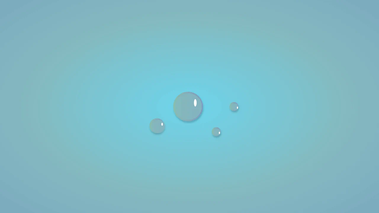
Whimsical CSS Bubble Preloader is a pure CSS animation that simulates rising bubbles that pop and scatter tiny droplets. Using HTML layout without JavaScript, it relies entirely on staggered @keyframes delays, absolute positioning, and math-based rotations via :nth-child. Radial gradients generate realistic reflections, while drop-shadow adds depth. A smart choice for lightweight, playful interfaces, though the dense DOM structure for droplets might feel redundant for some.
 Chrome 52+
 Edge 15+
 Firefox 49+
 Safari 9.1+
See the Pen Whimsical CSS Bubble Preloader.
Pure CSS composition: animation via @keyframes, state visible in markup. Pulsing effect driven by inset shadow and transform — zero JavaScript, no main thread blocking. Decorative layer isolated to avoid interfering with primary content.

Animation separated into appearance and movement: distinct @keyframes control opacity and transform. Gradient and inset shadows create depth without extra DOM elements. Pure CSS, no main thread load.
Abstract animation: two white circles move horizontally inside a blurred container. Brightness and contrast filters are applied to the whole page. Minimal, pure CSS, no scripts.
An SCSS loop generates 30 bubbles with random opacity, position, scale, and animation. Each bubble follows a random path at its own pace. A gradient background and semi‑transparent circles produce a soft, ambient effect — no JavaScript.
A Stylus loop generates 50 bubbles with random size, position, gradient, and animation duration. Each bubble floats upward along an unpredictable path — pure generative graphics, no JavaScript.
The code creates an animated underwater scene with an SVG submarine and numerous bubbles. The submarine gently rocks using the MoveUpDown CSS animation. Bubbles move horizontally and vertically at varying speeds, scales, and opacities — each animation is defined by a dedicated class. No JavaScript, just pure CSS.
SCSS generates an animated bubble‑sort visualization. Each list item is dynamically positioned via CSS custom properties and keyframes, creating the illusion of moving numbers. Gradient circles and pseudo‑elements build the UI entirely with styles.
The code illustrates a chemistry lab with flasks, stands, and bubbles. SCSS variables control colours, loops generate numerous animated bubbles. Absolute positioning and nesting build a complex yet well‑structured scene.
The code builds an animated illustration of a bunny with a stick and bubbles. CSS custom properties control colours and sizes; absolute positioning assembles a complex scene from many elements. Breathing, ear wiggles, tail movement, and bubble flight are handled via keyframes, with bubbles following paths defined by offset‑path.
Bubble wrap is built with checkboxes styled as bubbles. Clicking a checkbox triggers a popping sound via the Howler library. All visual effects (highlights, shadows) are pure CSS.
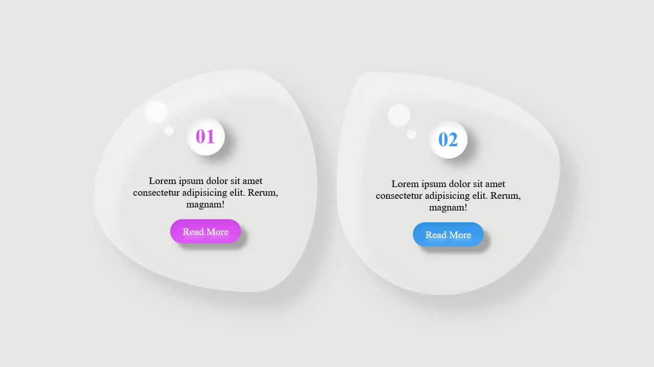
Two droplets are built with CSS pseudo‑elements and irregular border‑radius to mimic organic shapes. Layered shadows and highlights add depth; text sits on top. All magic is in border‑radius and box‑shadow — no images, just pure CSS.
The code animates a sphere using a radial gradient and layered shadows to simulate glass. Soft glows and highlights add depth; the shadow below pulses in sync with the ball’s motion. A media query handles mobile screens — all done with pure CSS.