20+ CSS Button Click Effects: Free Examples & Code Snippets
Button click effects provide immediate tactile feedback — press-down compression, ripple bursts, and pulse reveals that confirm user interaction. These micro-interactions make every click feel physically responsive.
- A scale(0.97) press-down effect combined with translateY(1px) on the :active state creates a physical compression feel using only compositor properties.
- Ripple effects use a ::after pseudo-element with scale(0) to scale(4) and opacity transition on :active, creating a radial burst without JavaScript.
- Asymmetric timing with 0.1s press and 0.15s release mimics physical button behavior — fast engagement, slightly slower disengagement.
Browse this collection of CSS button click effects to master compositor-friendly micro-interactions that confirm every user action with responsive tactile feedback.
Table of Contents:
Examples
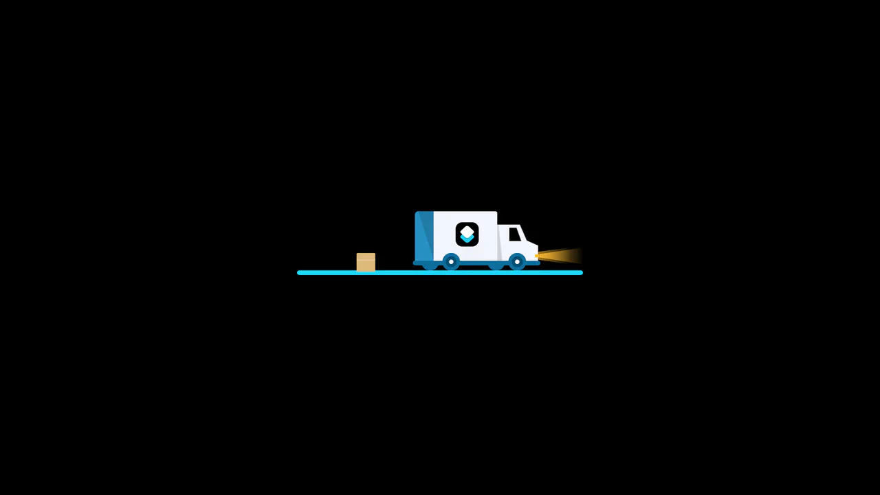
3D Truck Delivery Download Button
An advanced interactive download button featuring a complex 3D truck delivery animation. Powered by GSAP and SCSS, clicking the button triggers a 90-degree backward flip using CSS preserve-3d to convert the top edge into a flat road. A styled vector truck drives in from the left, catches a falling cargo box, departs off-screen, and flips back to reveal a success checkmark. (Requires: gsap.js)
 Chrome 55+
 Edge 79+
 Firefox 54+
 Safari 9.1+
See the Pen 3D Truck Delivery Download Button.
3D Isometric Neon Glow Buttons
An interactive set of 3D-perspective dashboard buttons styled with vibrant neon glowing highlights. Hovering over a card rotates its panel dynamically along the X and Y axes using native CSS preserve-3d and perspective properties, while styling the SVG icon with custom scaling and color-matched drop-shadow filters. Clicking triggers a quick, synchronized scale-pulse animation.
Chrome 57+
Edge 16+
Firefox 52+
Safari 10.1+
See the Pen 3D Isometric Neon Glow Buttons.

Animated Border Drawing Button
This is an Animated Border Drawing Button. It transforms a standard call-to-action into a multi-stage micro-interaction. Upon hovering over the button, the component triggers a sequential animation where four corner dots appear, followed by four dashed border lines that “draw” themselves around the button’s perimeter, creating a high-end, futuristic feel.
Chrome 105+
Edge 105+
Firefox 121+
Safari 15.4+
See the Pen Animated Border Drawing Button.

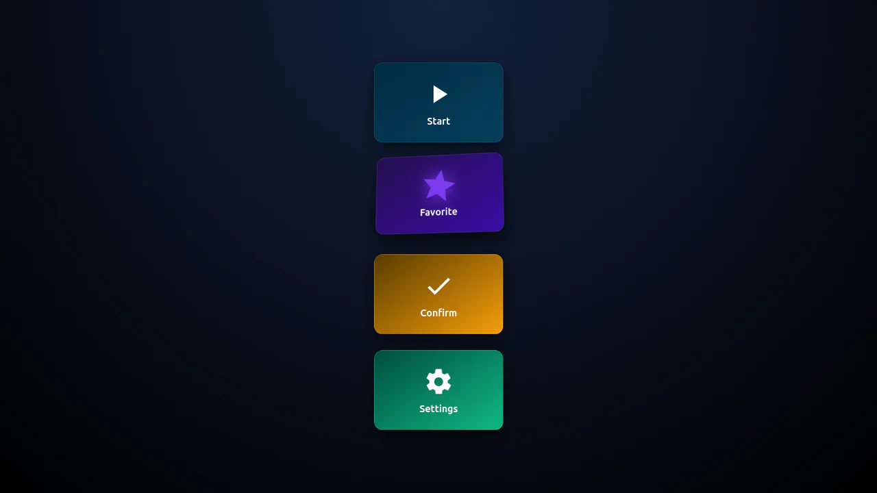
Morphing Hamburger Floating Action Button
This is a Morphing Hamburger Floating Action Button (FAB). It uses a combination of CSS transitions and keyframe animations to reveal a hidden context menu. Its function is to consolidate multiple secondary actions (Settings, Copy, Share, Delete) into a single, space-saving focal point. The interaction is initiated by a vanilla JavaScript class toggle.
Chrome 60+
Edge 79+
Firefox 55+
Safari 11.1+
See the Pen Morphing Hamburger Floating Action Button.

Animated Futuristic State Button
This Animated Futuristic State Button is more than just a clickable element; it’s a self-contained micro-interaction. Designed for actions like “Generate” or “Processing,” it features a idle flicker animation that transitions into an intense, glowing state upon focus. The text cleverly swaps from a call-to-action to a continuous verb (“Generate” → “Generating”) using purely CSS animations, providing immediate visual feedback without JavaScript.
Chrome 80+
Edge 80+
Firefox 75+
Safari 13+
See the Pen Animated Futuristic State Button.

Skeuomorphic Retro Power Buttons
Skeuomorphic design meets modern web animation in these Windows XP-inspired power buttons. This component utilizes detailed CSS shadows to create a tactile 3D effect, paired with SVG path manipulation for playful micro-interactions upon interaction.
Chrome 80+
Edge 80+
Firefox 75+
Safari 13.1+
See the Pen Skeuomorphic Retro Power Buttons.

Micro-Interaction Loading Button
This Micro-Interaction Loading Button demonstrates how to pack multiple feedback states into a single UI element without cluttering the interface. It starts as a clean “Submit” button. Hovering reveals a directional arrow, hinting at action. Clicking triggers a seamless loading sequence where the arrow transforms into a spinner, finally resolving into a checkmark to confirm success.
Chrome 49+
Edge 15+
Firefox 43+
Safari 10+
See the Pen Micro-Interaction Loading Button.

CSS Rage Button
A playful button that shakes, reddens, and “curses” with increasing intensity upon each click (or hover for the secondary button), visualizing a gradual loss of composure.
See the Pen CSS Rage Button.

Neomorphic Button
A striking button with a neomorphic design and a pulsating element, built using pure CSS variables and pseudo-elements. The hover and active state animations provide a smooth UX, making it perfect for drawing attention to key CTAs.
See the Pen Neomorphic Button.
Gummy Buttons
A “gummy” button animation in pure CSS, where the effect is achieved by simultaneously animating transform: scale() and border-radius. Separate @keyframes are used for the :hover and :active states, creating a unique tactile response.
See the Pen Gummy Buttons.
Button Click Effect
A stylish pure CSS button featuring a sophisticated ripple effect on click, built using the ::after pseudo-element. This performance-optimized snippet leverages smooth transitions and dynamic box-shadows, providing a professional UI interaction and immediate visual feedback with zero JavaScript dependencies.
See the Pen Button Click Effect.
Button Click Page Animation
A striking interactive button featuring a full-screen ripple animation with staggered color layers triggered on click. This snippet leverages SCSS loops for sequential transition delays and custom cubic-bezier curves, offering a high-performance, lightweight solution for immersive UI/UX transitions.
See the Pen Button Click Page Animation.
Radial Gradient Animation CSS3
A high-performance pure CSS button featuring a dynamic radial gradient animation on the active state. This snippet leverages @keyframes to simulate a rapid ripple-fill effect, providing an engaging UI micro-interaction with zero JavaScript overhead.
See the Pen Radial Gradient Animation CSS3.

Button Animation With CSS Offset Paths
A high-performance interactive button featuring a radial particle burst powered by the CSS Motion Path (offset-path) API. This lightweight SCSS snippet creates dynamic, wavy trajectories with minimal JavaScript, providing a polished and modern solution for UI micro-interactions.
See the Pen Button Animation With CSS Offset Paths.
CSS Button Click
A minimalist interactive button built with Stylus, featuring a tactile press effect achieved through scale transforms and dynamic box-shadows. This snippet utilizes the nib library and hardware acceleration for fluid response, providing a high-performance and modern UI component with zero JavaScript overhead.
See the Pen CSS Button Click.
Ripple Effect Animation
An interactive Material Design ripple button that implements a dynamic click effect by generating ripple elements with vanilla JavaScript. This snippet leverages Sass animations and coordinate-based positioning to deliver a smooth UI/UX interaction while maintaining optimal frontend performance.
See the Pen Ripple Effect Animation.
Black Biometirics Login Button
Choreographed keyframes and SVG stroke transitions drive this multi-stage biometric scan animation on click. The black pill button collapses into a circle, fading out the text to reveal two fingerprint SVGs. Staggered stroke-dashoffset delays draw a sweeping white “light scan” before fading into an elastic checkmark.
See the Pen Black Biometirics Login Button.
Copy Button Click Effect
An interactive file-copying micro-gesture animates a duplicated document icon on click. The parent .icon-container holds two overlapping SVGs. Pressing down scales the white card via press, while the top SVG triggers a fast bounce animation — rotating and flying up-rightwards out of bounds before fading away.
See the Pen Copy Button Click Effect.
Graph Button
Vector line charts seamlessly transition into bar graphs inside this interactive, pure CSS toggle button. By mapping checkbox states to SVG paths, the styles animate stroke-dasharray and stroke-dashoffset values. On hover or click, the diagonal trend lines morph into vertical bars, while the background expands via a circular clip-path mask.
See the Pen Graph Button.
No Sprite, No JS Heart Animation
Expanding circular shockwaves and radial confetti sparks burst on click from this interactive, zero-JS like button. Checking the input triggers an elastic heart scale. Concurrently, the :before ring expands and collapses its borders into a hollow bubble burst, while :after uses a massive box-shadow chain to shoot out colored sparks.
See the Pen No Sprite, No JS Heart Animation.
Power Button With Animated Icon
A 3D glass-neon power toggle animates its icon states using custom HSL hue variables and SVG stroke morphing. At rest, the checkbox is a deep red button with a broken circular power symbol. Toggling it checks the input, transitioning the casing to green, closing the circle ring, and sliding the inner line indicator using stroke-dashoffset.
See the Pen Power Button With Animated Icon.
Toggle Button with Ripple Effect
CSS Blend-Mode Ripple Switch implements a pure CSS color-inversion animation using the checkbox hack. On click, a hidden checkbox triggers a transition that scales up a circular pseudo-element over the label. Utilizing mix-blend-mode: difference against a black-and-white radial-gradient, it dynamically flips the text and background colors under the expanding ring.
See the Pen Toggle Button with Ripple Effect.