10+ CSS Button Libraries: Free Examples & Code Snippets
A CSS button library provides a consistent, reusable system for all button styles across a project — flat, ghost, gradient, 3D, and animated. A well-structured library reduces duplication and enforces design consistency.
- A .btn base class defines shared structural styles — padding, font-size, border-radius, and transition — while modifier classes independently handle color, size, and state variants.
- Size tokens use CSS Custom Properties on modifier classes, enabling system-wide size adjustments through single variable overrides without touching individual component files.
- Disabled states unify through a shared modifier that toggles base-level properties, ensuring all button variants — flat, ghost, gradient — inherit consistent disabled behavior automatically.
Browse this collection of CSS button libraries to master reusable button systems that bring consistency and scalability to your interface components.
Table of Contents:
Examples
Shine Gradient Buttons
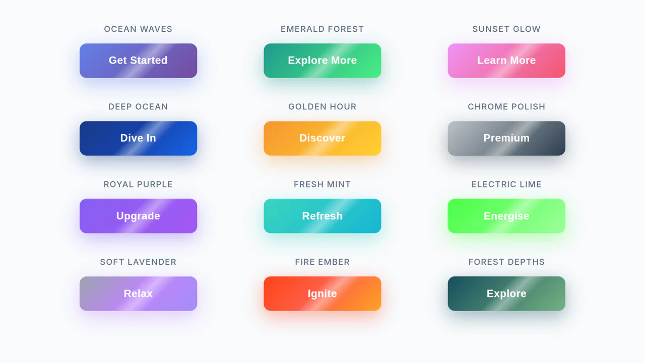
An example of modern UI/UX design implemented with pure CSS. The demo shows how to use linear-gradient, box-shadow, and transform to create buttons with gradient fills and a 3D-like effect, while the @keyframes animation adds a dynamic shine, making the interactive element more engaging.
See the Pen Shine Gradient Buttons.

Some creative and modern button styles and effects for your inspiration.
A collection of fresh button styles and effects for your inspiration.
A set of flat and 3D progress button styles where the button itself serves as a progress indicator. 3D styles are used for showing the progress indication on one side of the button while rotating the button in perspective.
Awesome buttons for awesome projects!
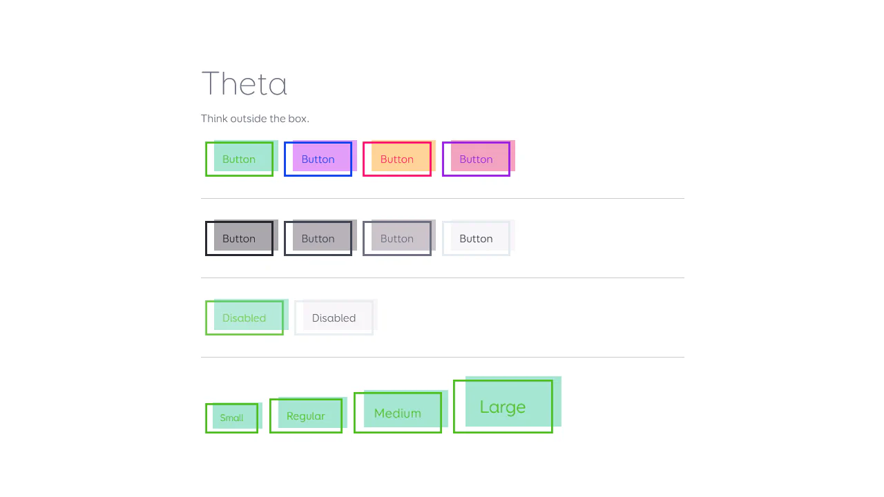
A collection of CSS buttons.
A set of inspirational, highly experimental distortion effects for buttons using SVG filters.
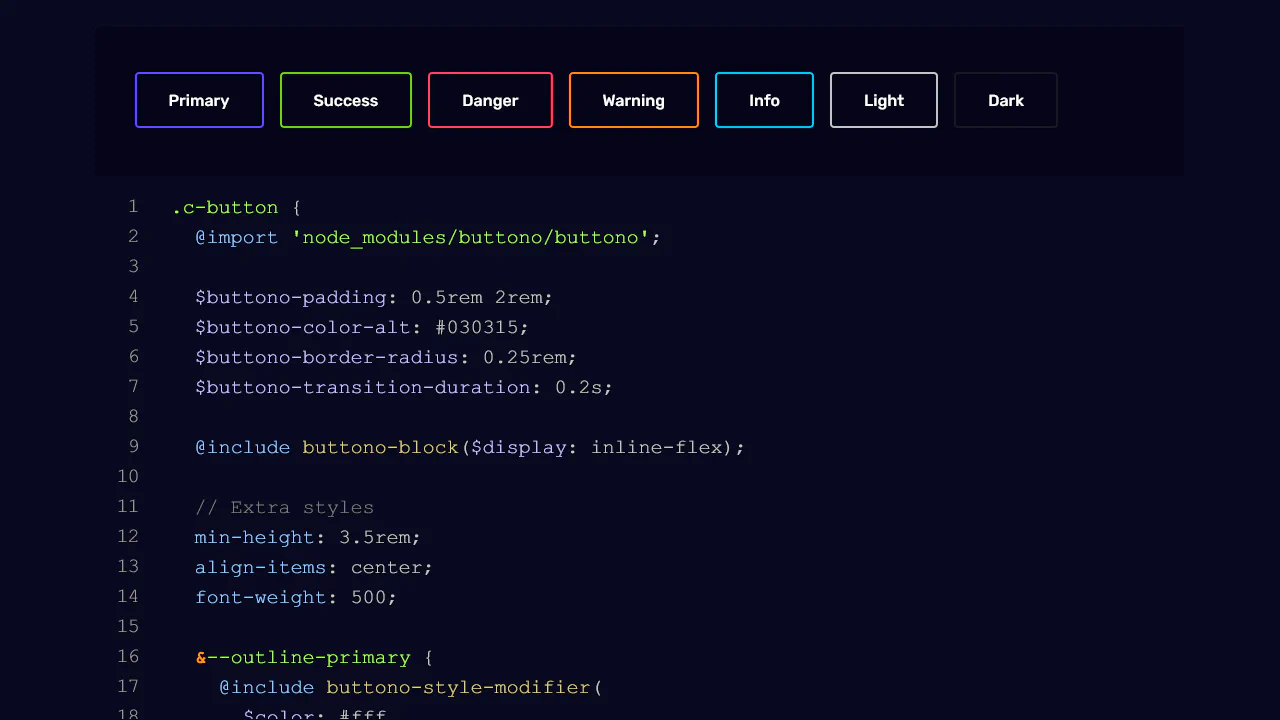
A flexible Sass mixin for creating BEM-style buttons.
A collection of high-performance CSS hover effects built entirely with the box-shadow property, requiring no extra HTML markup. These snippets utilize Sass and CSS variables to create modular transitions (fill, pulse, slide), ensuring fast rendering and easy customization of UI components.
A comprehensive library of 21 pure CSS hover animations featuring fill patterns, directional slides, and intricate border-tracing effects. Built without JavaScript, these high-performance snippets ensure a smooth UI/UX experience and 60fps rendering, making them perfect for any modern frontend project.
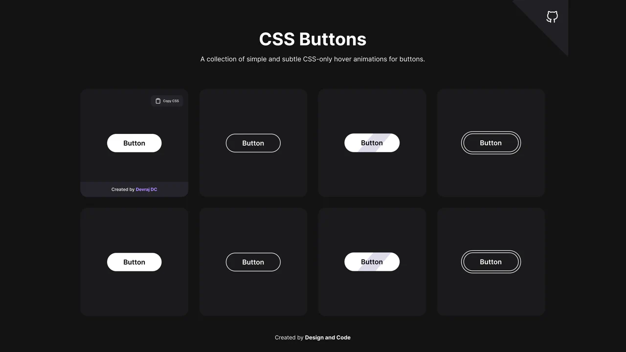
Some inspiration for button hover animations using CSS only.
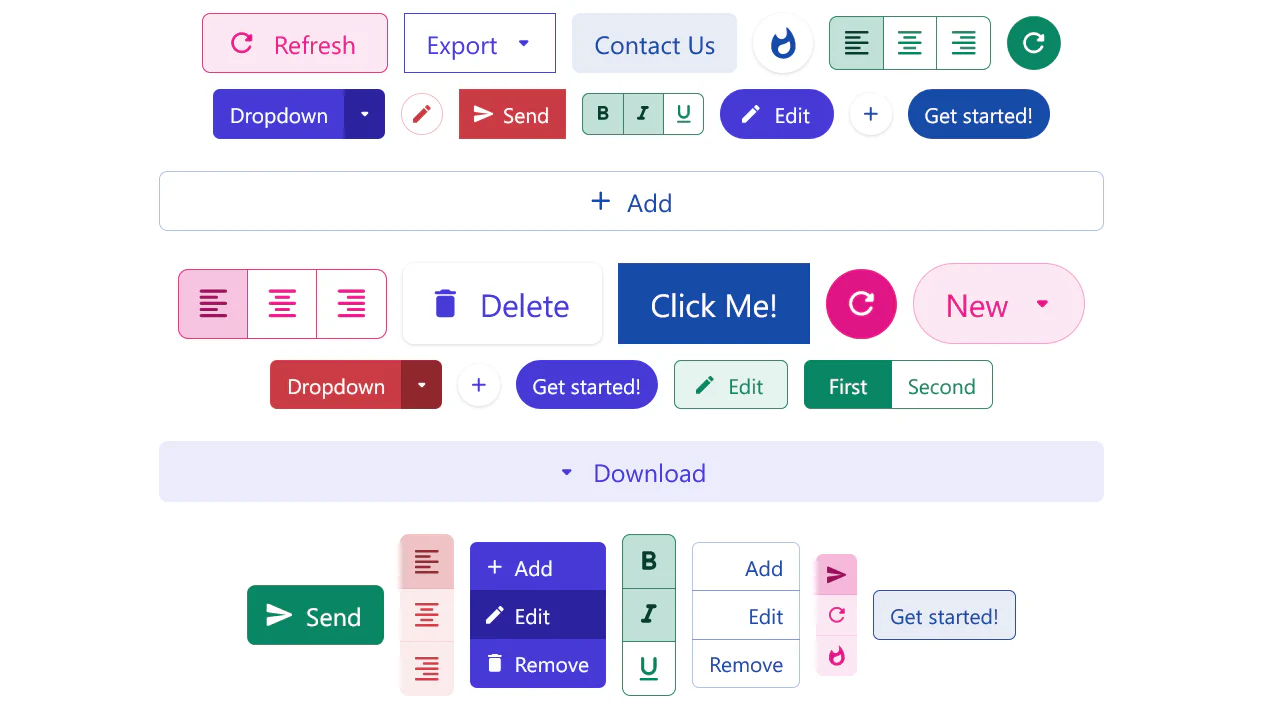
Modern, modular, extensible button system designed for both rapid prototyping and production-ready applications.