10+ CSS Card Layouts
Cards serve as the primary containers for modular data in digital interfaces. This updated collection of CSS Card Layouts removes visual complexity to prioritize content clarity. Utilizing pre-built structures allows for immediate deployment of consistent UI patterns without the need to calculate spacing or alignment from scratch. Logic-driven design ensures that information remains the focus.
Technically, these examples utilize CSS Grid and Flexbox for precise structural control. Properties like aspect-ratio and gap ensure high layout stability across various viewports. The HTML remains strictly semantic, while CSS variables manage the theme logic. Transitions for interactive states leverage hardware acceleration to maintain 60fps performance on the rendering thread, avoiding unnecessary re-renders.
Every free demo in this library is fully responsive and cross-browser compatible. Users can instantly download the raw code or fork a specific project on CodePen.
Examples

E-commerce Product Filter
This is a Pure CSS E-commerce Product Filter. It replaces JavaScript-based array filtering with native CSS relationship selectors. Its function is to toggle product visibility based on multiple checkbox states within a sidebar, offering an instant, script-free sorting mechanism for catalog grids.
 Chrome 105+
 Edge 105+
 Firefox 121+
 Safari 15.4+
See the Pen E-commerce Product Filter.

Smooth View Transition Grid Cards
This is a Smooth View Transition Grid Cards component. It transforms a standard CSS Grid of cards into an interactive, animated gallery. Its function is to elegantly expand a selected item to full width, smoothly reflowing the remaining siblings using native browser rendering instead of complex JavaScript math.
Chrome 111+
Edge 111+
Firefox 128+
Safari 18+
See the Pen Smooth View Transition Grid Cards.

CSS Scroll-Driven Masonry Reveal
This Scroll-Driven Masonry Reveal creates a playful, tactile experience where content cards appear to be “dealt” onto the screen as the user scrolls. By leveraging the native CSS Scroll-driven Animations API, it achieves smooth, main-thread-free entrance effects without a single line of JavaScript. The layout adapts intelligently from 2 to 8 columns, making it a robust solution for image galleries or blog archives. (Requires: Open Props (CSS Library))
Chrome 115+
Edge 115+
Safari 26+
Firefox (flag/polyfill)
See the Pen CSS Scroll-Driven Masonry Reveal.
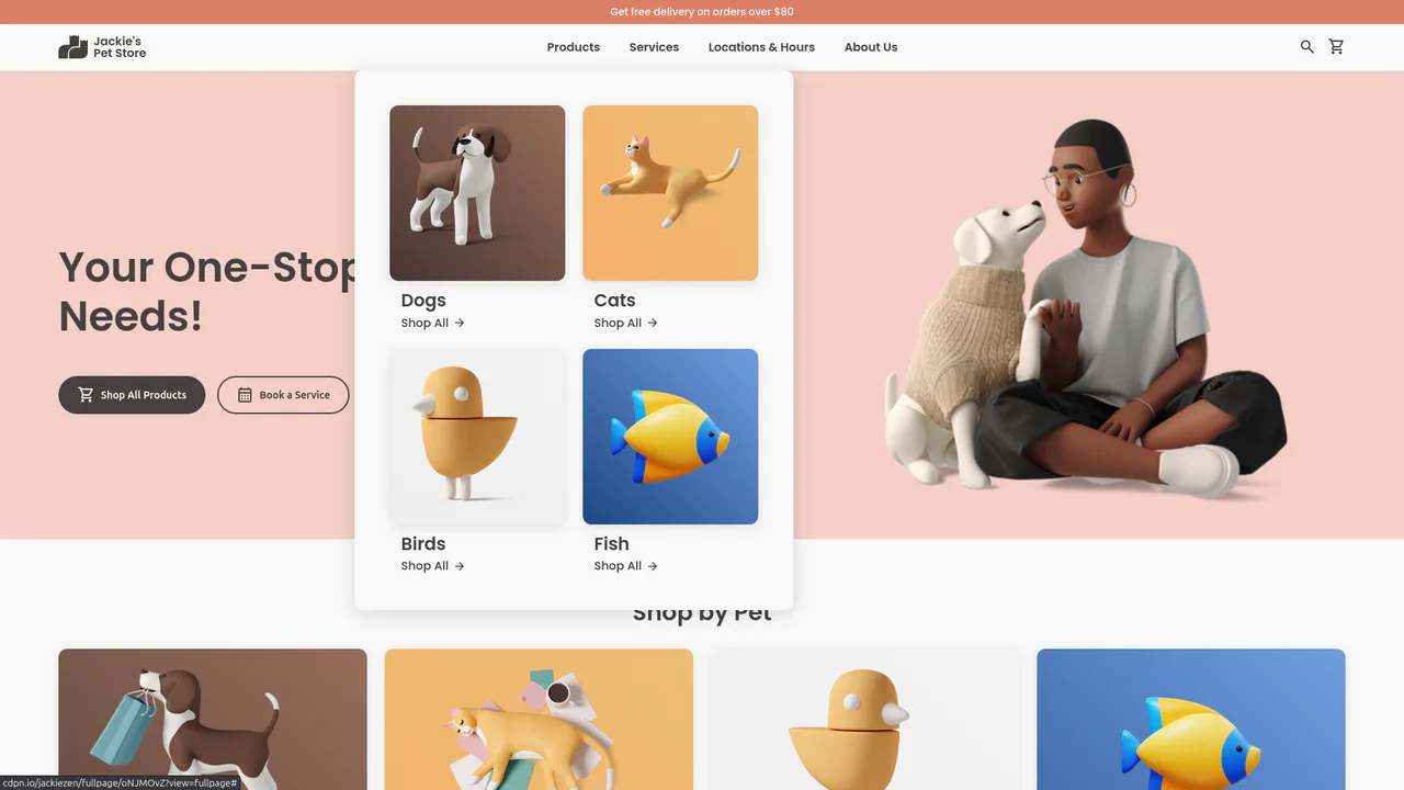
Jackie's Pet Store
A responsive pet store landing page built with CSS Grid and Flexbox. It features a dynamic navigation system with hover-triggered mega-menus, gradient-styled product cards with scale transitions, and a comprehensive use of CSS variables for consistent theming across breakpoints.
See the Pen Jackie's Pet Store.

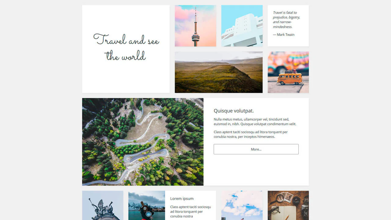
Open Props Bento Grid
A modern, visually appealing content grid that smoothly assembles on scroll, adapting seamlessly to any screen size.
See the Pen Open Props Bento Grid.
Card Grid
A responsive article layout built with CSS Grid that adapts from a single column stack to a complex four-column grid.
See the Pen Card Grid.
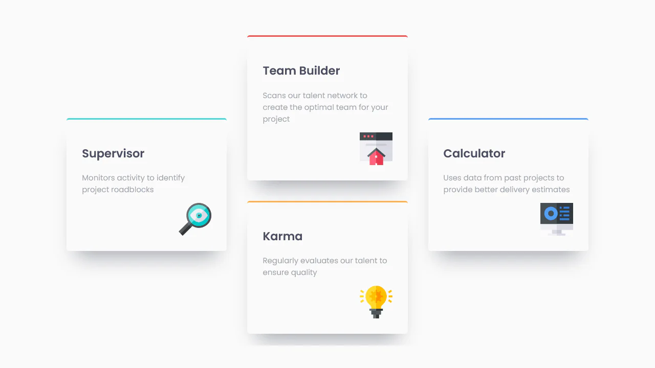
A 3D isometric business card grid powered by a virtual scroll mechanism. JavaScript maps the window’s scroll position to a CSS custom property, driving the vertical translation of a fixed, tilted container.

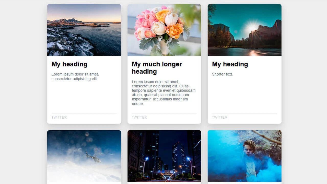
Responsive card grid. Images 16:9 on mobile, 3:2 on desktop. On hover, image contrast increases. Cards with title, description, and button. Shadows and rounding.
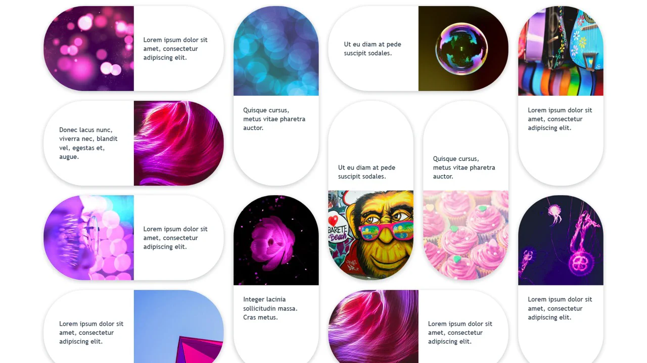
Responsive card grid with variable cell sizes. Cards can span 1, 2, or 3 cells horizontally/vertically via modifiers (--featured, --2x, --horizontal, --vertical). Images fill cells via object-fit: cover. Quotes and text.
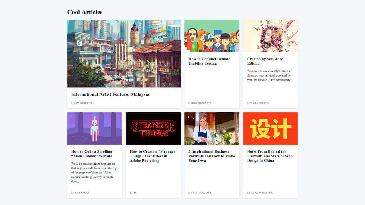
Blog Posts Card Layout
Article cards with background animation. On hover, colored circle expands from corner, changing text and tag colors. Background image darkened via linear-gradient. Responsive grid with numbering. CSS variables for color and time.
See the Pen Blog Posts Card Layout.
Card grid with variable image-text orientation. Four types (card-top, right, bottom, left) define image position relative to text. Images take half the card and round on corresponding side. Mobile adaptation.
News cards with expanding description on hover. On desktop, hover scales image, reveals text, changes background and title color. Static on mobile. Button with arrow animation. Bottom gradient overlay.
Cards with gradient posters and background images. Each card contains date, title, and round poster with letter. On hover, card lifts and shadow sharpens. 16 different gradients.
Responsive card grid (1, 2, 3 columns). Images via background-image, content stretches full height via flex-1, ensuring equal footer height. Link button with top border.