20+ CSS Checkout Forms
Checkout forms are the final bridge between user intent and successful transaction. This updated collection of CSS checkout form examples provides structural clarity, eliminating visual noise between the user and the screen. High-performance UI design ensures that the payment process remains transparent and frictionless, focusing strictly on data accuracy.
Technically, these snippets rely on CSS Grid and Flexbox to maintain strict layout stability. Input validation utilizes native HTML pseudo-classes like :invalid and :focus-within for real-time feedback without the need for heavy scripts. By utilizing hardware acceleration for transitions, the code ensures 60fps interaction on the rendering thread, minimizing latency during the most critical part of the user journey.
Every free demo is fully responsive and cross-browser compatible. Users can instantly download the raw code or fork a specific layout on CodePen.
Examples

Expandable Wallet Payment Card
This is an Expandable Wallet Payment Card. It uses pure CSS to manage complex UI states without JavaScript. Its function is to conceal secondary actions — like selecting a payment method or adding funds — behind a compact primary view showing the balance. The interaction is self-contained, optimizing screen real estate while keeping critical functions one click away.
 Chrome 105+
 Edge 105+
 Firefox 121+
 Safari 15.4+
See the Pen Expandable Wallet Payment Card.

Checkout Radios
A modern checkout form component utilizing the powerful CSS :has() selector to style parent containers based on the state of nested radio inputs.
See the Pen Checkout Radios.
UI Credit Card Checkout
This payment UI is a showcase of clean SCSS architecture, utilizing variables and a custom @mixin for maintainability. A key feature is its clever, JS-free state management for card selection, where input[type="button"] elements are toggled using the :focus pseudo-class to remove a grayscale() filter. The component’s cohesive design is further enhanced by custom-styled native <select> elements, achieved by stripping default browser styles with appearance: none;.
See the Pen UI Credit Card Checkout.

Credit Card Checkout
This JS-free form component achieves a distinct “neo-brutalist” aesthetic by pairing a solid border with a hard, offset box-shadow, creating a tactile, pseudo-3D effect. This visual system is applied to a modern Flexbox layout and is enhanced by polished micro-interactions, including a unique box-shadow outline on :hover and a clear background change on :focus for a cohesive user experience.
See the Pen Credit Card Checkout.
Payment form with skewed sidebar. Left panel (skew) tilted via transform: skew, inner content corrected with reverse skew. Right part — card input fields. Gradient background and button.
Payment form with floating labels. On focus or when filled, label moves up and shrinks. JavaScript adds payment__field--filled class to detect filled state. Two fields inline (date and CVV). Button with icon.
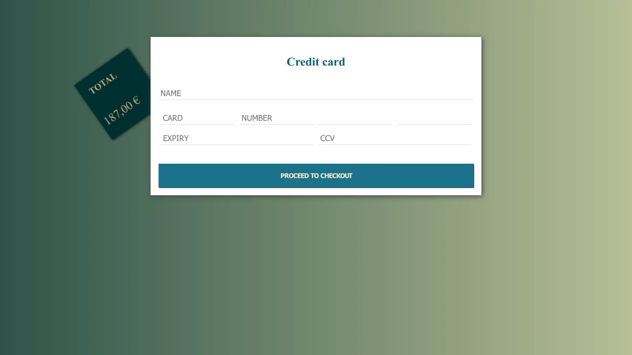
Payment form with detached total block. Rotated .total absolutely positioned, protruding from card. Inputs have bottom border only. Button with shadow that disappears on hover.
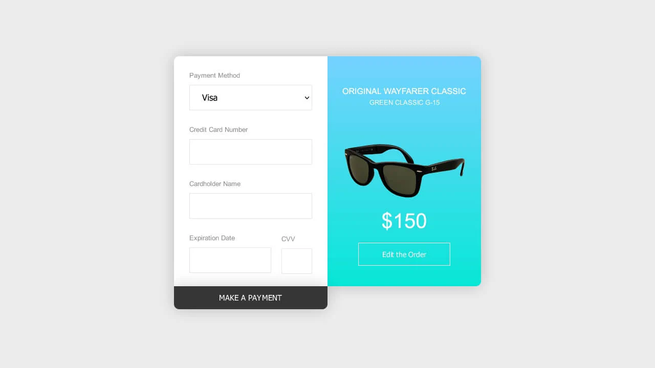
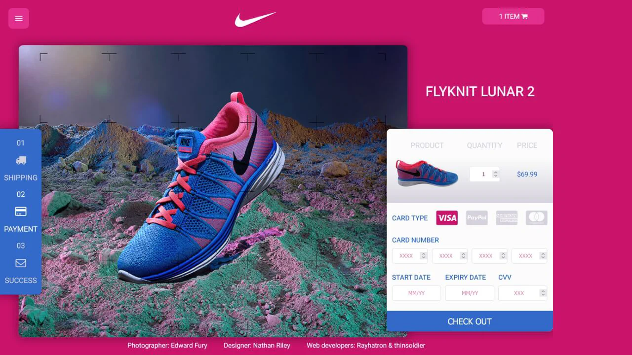
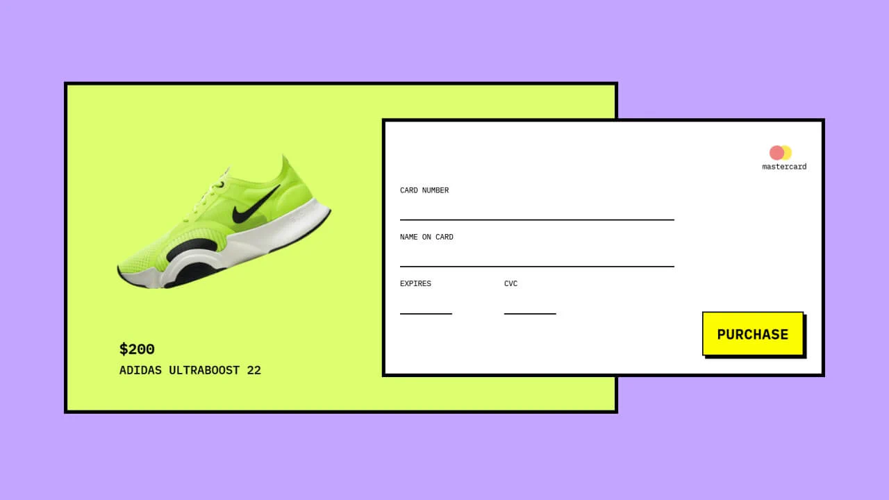
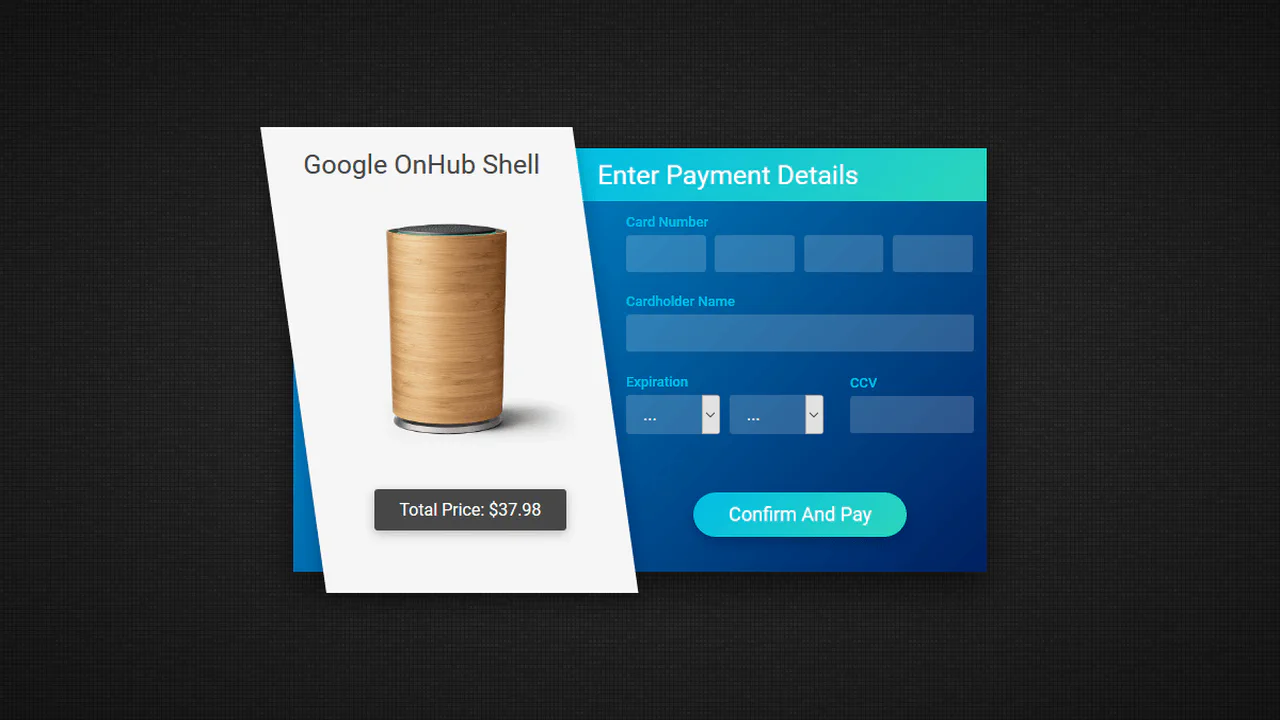
Two-panel payment form with product info. Left panel — card input fields, right — description with image. Payment button slides from bottom with animation. Image scales on hover.

Payment form with method selection (PayPal/card). Custom radio buttons with fill animation. Inputs with placeholders and custom date selects. CVV tooltip icon. Button with lock icon.
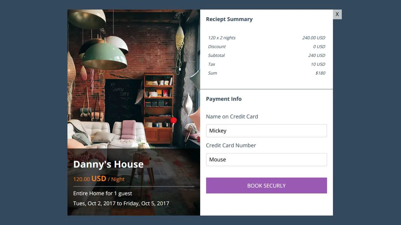
Booking modal with two columns. Left — property info with photo and dark text overlay. Right — order summary and payment form. Appearance animation via fadein. Purple button with text.
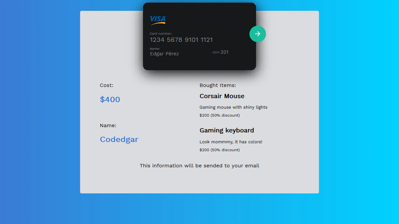
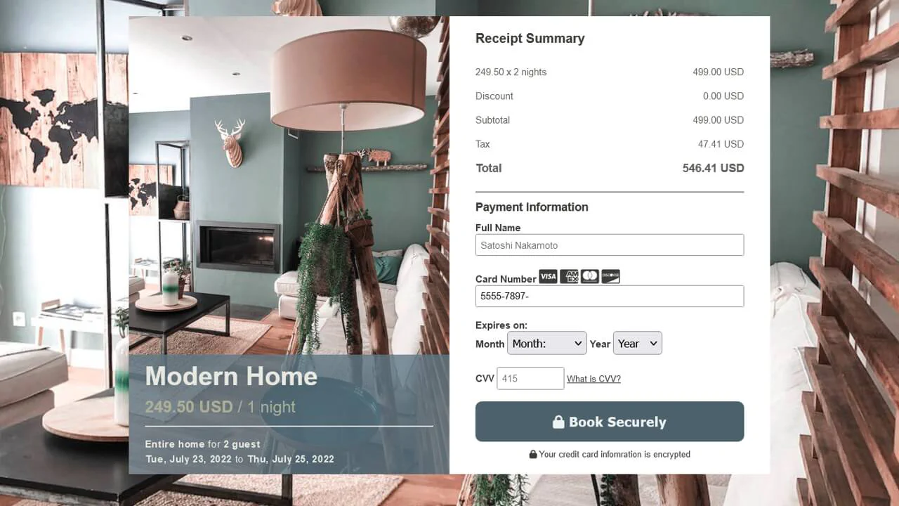
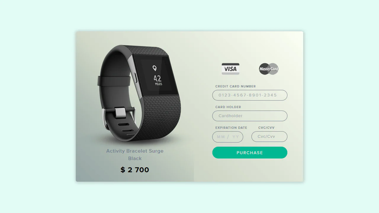
Payment form with receipt below card. Card with input fields (number, name, CCV) overlays purchase details block. Circular submit button absolutely positioned. Styled inputs without borders, bottom border on focus.

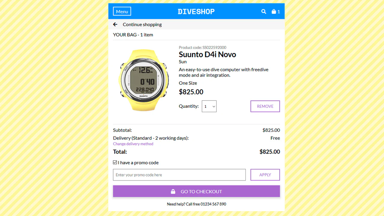
Checkout modal with two columns. Left side — product image slider and details (name, price). Right — payment form with field icons. Large circular background element creates depth. Custom slider dots.