10+ CSS clamp() Example
Fluid typography is a core tenet of modern responsive design. This updated collection of CSS clamp() examples removes the friction of rigid font sizes and manual media queries. Utilizing these curated snippets guarantees that headings and paragraphs scale perfectly within a defined range, allowing raw logic to dictate the visual form based on the viewport. No script bloat. No layout jumps.
The architecture relies strictly on the clamp() function, which defines a minimum, preferred, and maximum value. By setting a fluid preferred value (e.g., calc(1rem + 2vw)), the code ensures text remains legible on all screens. This approach maintains absolute layout stability. The HTML structure remains strictly semantic, while hardware acceleration ensures smooth rendering during resize events without triggering costly browser repaints.
Every free demo is fully responsive and cross-browser compatible. Users can instantly download the raw code or fork an updated typography scale on CodePen. These assets are strictly optimized for accessibility, delivering a fast, frictionless reading experience across all modern UI design systems.
Examples
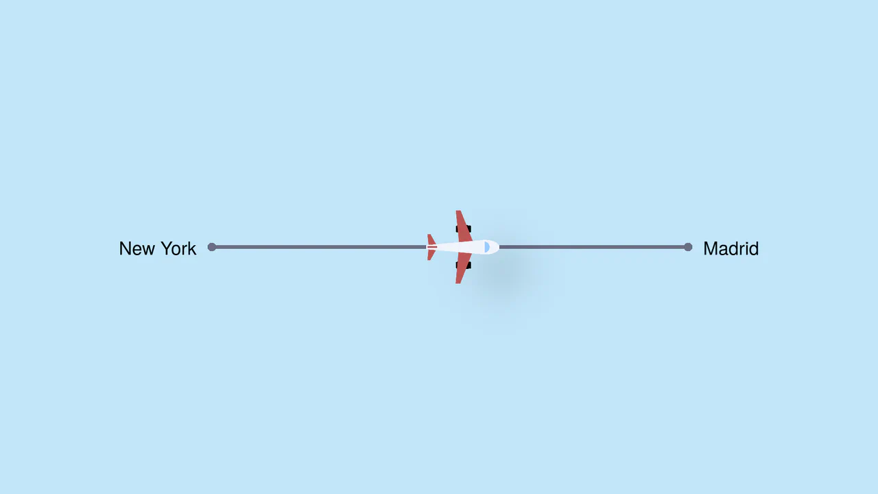
Pure CSS Trigonometric Flight Range Slider
Pure CSS Trigonometric Flight Range Slider uses CSS math functions like sin() and clamp() to dynamically scale a custom airplane thumb and cast realistic altitude shadows based on the input’s current percentage. It features a responsive container query that swaps the plane for a helicopter on narrow screens, and includes dedicated high-contrast mode styles for robust accessibility.
 Chrome 111+
 Edge 111+
 Firefox 110+
 Safari 16+
See the Pen Pure CSS Trigonometric Flight Range Slider.

Curtain Transition Navigation Menu
Curtain Transition Navigation Menu implements a lightweight state toggle via a data-nav attribute, shifting the entire <main> view up by 50% to reveal an absolutely-positioned bottom navigation drawer. Dynamic sizing features like clamp() and max() ensure responsive link layouts, while a sharp cubic-bezier(.13, .53, .38, .97) curve coordinates the simultaneous scaling and entry of image-rich navigation elements. While visually fluid, animating massive full-screen wrappers containing large Unsplash media can trigger costly rasterization overhead unless GPU compositing is actively hinted.
Chrome 88+
Edge 88+
Firefox 89+
Safari 15+
See the Pen Curtain Transition Navigation Menu.

CSS Scroll-Driven Radial Gallery
This is a Scroll-Driven Radial Gallery. It binds a circular, rotating layout directly to the viewport’s scroll position. Its function is to transform linear page scrolling into a dynamic, spatial carousel, keeping only the active item in sharp focus while pushing others into a blurred, grayscale periphery.
Chrome 132+
Edge 132+
Safari 26.2+
See the Pen CSS Scroll-Driven Radial Gallery.

Dynamic Variable Multi-Theme Dashboard
This is a Dynamic Variable Multi-Theme Dashboard. It orchestrates entire UI shifts by remapping root-level CSS custom properties to predefined theme palettes. Its function is to provide a seamless visual state manager for applications requiring multiple aesthetic environments without reloading the DOM.
Chrome 88+
Edge 88+
Firefox 84+
Safari 14.1+
See the Pen Dynamic Variable Multi-Theme Dashboard.

Interactive Vertical Parallax Cursor Navigation
This is an Interactive Vertical Parallax Cursor Navigation. It combines large-scale typography with a dynamic image-reveal system. Its function is to provide an immersive, tactile menu experience for high-end creative portfolios, where the user’s cursor physically “steers” the list and uncovers visual content linked to each item.
Chrome 80+
Edge 80+
Firefox 75+
Safari 13.1+See the Pen Interactive Vertical Parallax Cursor Navigation.

Minimalist Grid Editorial Layout
This is a Minimalist Grid Editorial Layout built for digital publishing. It translates traditional Swiss print design into a responsive web format using CSS Grid. The layout utilizes asymmetric columns and deliberate negative space to establish a clear hierarchy for long-form reading.
Chrome 88+
Edge 88+
Firefox 85+
Safari 14.1+
See the Pen Minimalist Grid Editorial Layout.

DotLottie Interactive Sparkle Header
This is a DotLottie Interactive Sparkle Header. It blends high-performance character-level typography effects with the modern DotLottie animation format. Its function is to create a delightful, “juicy” hero interaction: when a user hovers over the title, the letters individually react with a staggered lift-and-tilt motion, while a complex Lottie sparkle animation plays in the background. (Requires: @lottiefiles/dotlottie-web)
Chrome 80+
Edge 80+
Firefox 75+
Safari 13+
See the Pen DotLottie Interactive Sparkle Header.

Cinematic Parallax Reactive Navigation Menu
This is a Cinematic Parallax Reactive Navigation Menu. It synchronizes large-scale typographical navigation with multi-layered background shifts. Its function is to transform a standard menu into a high-end atmospheric gateway for editorial or premium portfolio websites, using user interaction to drive the visual narrative.
Chrome 80+
Edge 80+
Firefox 75+
Safari 13.1+See the Pen Cinematic Parallax Reactive Navigation Menu.

Skeuomorphic Reversi Radio Buttons
This is a Skeuomorphic Reversi Radio Button component. It overrides standard browser inputs to create a tactile, three-dimensional interaction mechanism. Its function is to replace flat state changes with physical motion, animating the selection exactly like a two-sided piece flipping over on a board.
Chrome 43+
Edge 12+
Firefox 16+
Safari 9+
See the Pen Skeuomorphic Reversi Radio Buttons.

CSS Scroll-Driven Circular Typographic Scramble
This is a Scroll-Driven Circular Typographic Scramble. It utilizes experimental CSS animation-timeline to bind complex trigonometric and geometric transitions directly to the user’s scrollbar. Its function is to create a highly engaging, interactive hero section where chaotic, scattered letters perfectly align into a readable circular sentence as the user scrolls down.
Chrome 115+
Edge 115+See the Pen CSS Scroll-Driven Circular Typographic Scramble.

Cyberpunk Glitch Upgrade Modal
This is a Cyberpunk Glitch Upgrade Modal. It transforms a standard confirmation dialog into a highly stylized, cinematic interface. Its function is to provide explicit interaction boundaries using the native HTML Popover API, augmented with aggressive visual distortion (glitches) and integrated audio feedback for a deeply immersive user experience. (Requires: Tweakpane)
Chrome 114+
Edge 114+
Firefox 125+
Safari 17+
See the Pen Cyberpunk Glitch Upgrade Modal.

Scroll-Driven Sticky Text Reveal
Scroll-Driven Sticky Text Reveal is a high-end typographic interface. It utilizes modern CSS scroll timelines to synchronize the visual state of a list with the user’s scroll position. As items move through a designated “focal point,” they transition from a dimmed state to a vibrant highlight, creating a seamless reading experience. (Requires: tweakpane)
Chrome 115+
Edge 115+
Safari 26+See the Pen Scroll-Driven Sticky Text Reveal.

Modern Our Team Section
A stylish, modern employee profile grid on a dark background featuring subtle, elegant gradient borders and atmospheric glowing effects.
See the Pen Modern Our Team Section.

Original vs. Negative Card (Hover and Drag)
A tactile 3D comparison card where the slider reveals image states via blend modes, with smart label occlusion logic.
See the Pen Original vs. Negative Card (Hover and Drag).

Huge Headers and Mega Menus
An immersive, cinematic landing page that captures user attention with smooth, complex animation and offers convenient navigation via a stylish fullscreen menu.
See the Pen Huge Headers and Mega Menus.
1980's Pop Magazine Pullquote
This demo showcases advanced CSS features like clip-path and shape-outside for creating non-rectangular layouts, while leveraging modern CSS units like clamp() and dvh for a fully responsive design across devices.
See the Pen 1980's Pop Magazine Pullquote.
Skateboard Product Grid
This demo showcases a responsive grid built on modern CSS technologies: CSS Grid for layout, Custom Properties for centralized theme management, and Fluid Typography using clamp() for ’elastic’ font sizes. The key feature is a complex animation system, including a staggered appearance of cards and advanced :hover effects using animated SVG.
See the Pen Skateboard Product Grid.