130+ CSS clip-path Examples (Page 3)
Examples

Rating Stars
A sophisticated star rating component featuring fractional fills implemented via CSS clip-path. The JavaScript class generates SVG stars and orchestrates a staggered entrance animation, while SCSS keyframes drive complex scale, rotate, and shockwave effects for a tactile, gamified feel.
See the Pen Rating Stars.

IKEA Room Gallery Redesign
A sophisticated React/Redux e-commerce SPA featuring seamless page transitions powered by GSAP. It utilizes clip-path animations for cinematic reveals and the Draggable plugin for interactive product grids, creating a fluid, app-like shopping experience.
See the Pen IKEA Room Gallery Redesign.

Kill the Ketchup
A powerful visual effect of a red liquid “flood” filling the screen, suitable for loading screens, game level transitions, or creative overlays.
See the Pen Kill the Ketchup.

Slider #2
An immersive, cinematic slider that feels like a high-budget interactive installation, thanks to its complex animations, custom cursor, and comprehensive input support.
See the Pen Slider #2.

Star Rating with CSS :has()
A fully functional rating widget that responds to hover and click events, illuminating the appropriate number of stars and updating the digit on the right, creating a dynamic interface feel without a single line of JS.
See the Pen Star Rating with CSS :has().

Product Plan Cards with CSS Ribbons
A pure CSS pricing component that creates a dimensional ‘ribbon’ aesthetic solely through ::after pseudo-elements and clip-path geometry. The layout leverages CSS Custom Properties for distinct color themes and calc with negative margins to extend elements beyond the parent container, creating a folded paper effect without any JavaScript dependencies.
See the Pen Product Plan Cards with CSS Ribbons.

Animated Portfolio with SVG ClipPath Hover Effect
This interactive portfolio showcases a masonry-style layout built with two overlapping CSS Grids, where grid-row: span and grid-column: span create the complex pattern. The key interaction is a unique “spotlight” reveal effect on hover, powered by a JavaScript-controlled SVG <clipPath> that dynamically updates the position of a <circle> mask to follow the mouse.
See the Pen Animated Portfolio with SVG ClipPath Hover Effect.
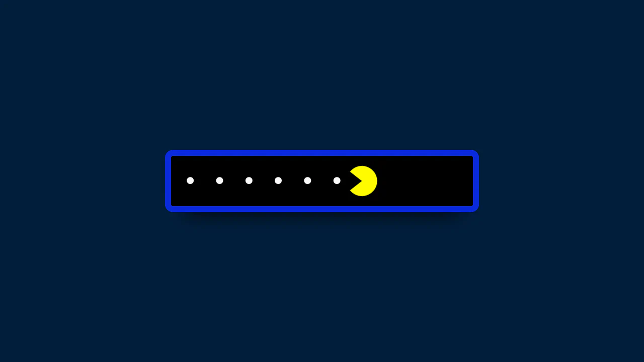
Pac-Man Password Reveal with GSAP
This component provides a delightful user experience by replacing the standard “show/hide” password icon with animated Pac-Man characters. The entire interaction is driven by two GSAP timelines, which not only move the characters but also change the input’s background and letter spacing, creating a fully immersive and playful UI.
See the Pen Pac-Man Password Reveal with GSAP.

Animated Slider with Morphing Effects
This cinematic slider interface leverages GSAP timelines and sophisticated clip-path polygon transformations to orchestrate fluid transitions between full-screen slides and an overlay navigation system.
See the Pen Animated Slider with Morphing Effects.

100-Year Clock Wheel
This demo showcases a multi-ring clock with rotating elements where each date/time value is generated and positioned using trigonometry. A key feature is the dynamic localization of month and day names using the Intl.DateTimeFormat API and language selection via the native <dialog> element.
See the Pen 100-Year Clock Wheel.

Interactive Spotlight Effect
An interactive “spotlight” effect created with clip-path: circle(), whose position is controlled via CSS variables. JavaScript tracks the cursor and updates the variables inside a requestAnimationFrame loop for a smooth and performant animation.
See the Pen Interactive Spotlight Effect.
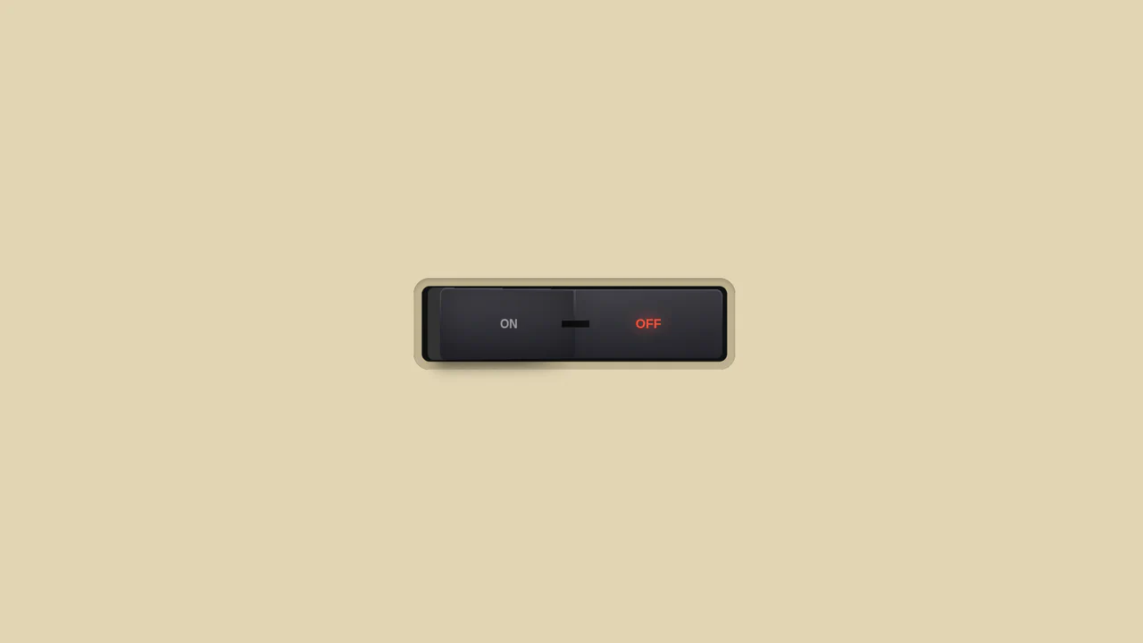
3D Toggle On/Off Switch v2
The use of gradients to create a realistic metallic effect and highlights on the button. Various types of linear-gradient and radial-gradient are applied to create a multi-layered background, and clip-path precisely clips the shapes of the pseudo-elements.
See the Pen 3D Toggle On/Off Switch v2.
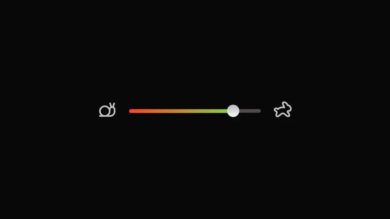
Slider with Animated Icons
Smooth visual representation of the slider track fill using the CSS clip-path property and the --slider-percentage variable. The tooltip showing the current value is animated with GSAP, including a slight rotation to simulate “wobbling” during drag.
See the Pen Slider with Animated Icons.

Range Slider with Value and Ruler
An unconventional use of datalist to create a custom ruler scale under the slider, where tick marks are styled using box-shadow and linear-gradient, and their visibility is controlled by CSS variables within media queries.
See the Pen Range Slider with Value and Ruler.

Pagination with Morphing Numbers
This interactive pagination features a fluid numerical transition achieved solely through CSS clip-path animations, where JavaScript toggles the body class to trigger the complex morphing sequence on the SVG elements.
See the Pen Pagination with Morphing Numbers.

Lighthouse Single-Div CSS Illustration
The entire scene is constructed from a combination of gradients (linear-gradient/radial-gradient) and precise element positioning using background-position.
See the Pen Lighthouse Single-Div CSS Illustration.

Pure CSS 3D Animated Cat Model
Complex yet high-performance 3D rendering in the browser: the model is built on CSS Box Model Hacking principles, where each polygon is positioned in space using translate and rotate for continuous 360-degree animation.
See the Pen Pure CSS 3D Animated Cat Model.

CSS Triangles with pow() and sqrt()
A demonstration of creating perfectly equilateral CSS triangles using the native pow() and sqrt() mathematical functions inside calc(). This showcases how to achieve geometric precision without preprocessors, relying solely on modern CSS.
See the Pen CSS Triangles with pow() and sqrt().

CSS Accordion with Custom Animated Arrows
A pure CSS accordion based on native <details>/<summary> elements, where the standard marker is hidden, and a custom animated chevron arrow is created and controlled exclusively via clip-path: polygon() and the rotate property upon expansion.
See the Pen CSS Accordion with Custom Animated Arrows.
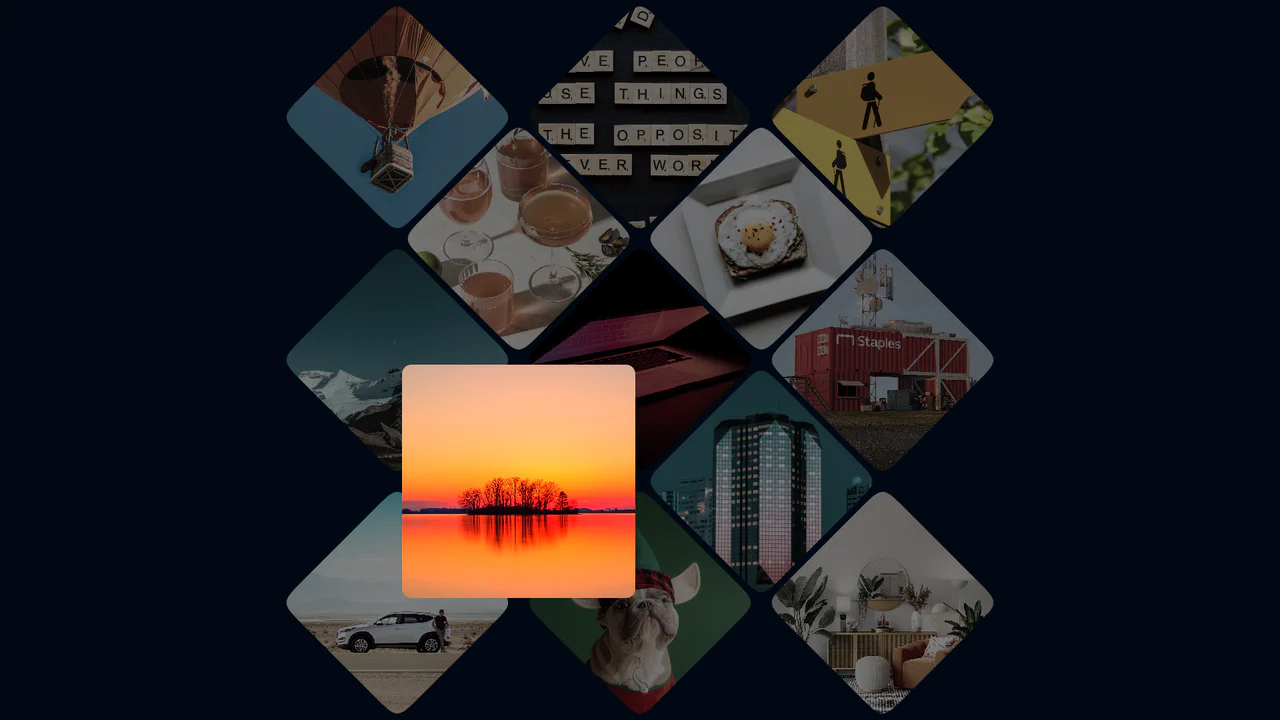
Photo Gallery Grid Animation with CSS Clip-Path
A showcase of the creative application of clip-path to create an “unfolding” image effect on hover, where the interaction not only changes the shape but also uses z-index to elevate the element and overlap neighboring tiles.
See the Pen Photo Gallery Grid Animation with CSS Clip-Path.
Responsive Speech Bubbles using CSS Container Queries
A stylish, pure CSS solution for creating speech bubbles with custom tails using the :after pseudo-element and the advanced clip-path: polygon() property to give the content frame a unique, angled edge shape.

Dynamic Carousel Slider with Infinite Scroll
A full-screen, scroll-hijacked slider orchestrated by a single GSAP timeline, achieving a sophisticated transition effect by simultaneously animating clip-path on image layers and translating text elements.
See the Pen Dynamic Carousel Slider with Infinite Scroll.

Animated Apple Tear Strip with React and GSAP
This interactive animation, built with React and GSAP, lets the user “tear” a stylized seal. The complex effect is achieved by tracking cursor movement with Draggable.create() and then smoothly changing properties like clip-path and box-shadow to simulate the tear.
See the Pen Animated Apple Tear Strip with React and GSAP.
1980's Pop Magazine Pullquote
This demo showcases advanced CSS features like clip-path and shape-outside for creating non-rectangular layouts, while leveraging modern CSS units like clamp() and dvh for a fully responsive design across devices.
See the Pen 1980's Pop Magazine Pullquote.
CSS Glitch Image Effect
The key feature is the control of animation parameters via CSS variables, which allows for easy changes to the speed and intensity of the glitch. The animation itself is built on three layered elements, each with unique offsets, shadows, and clipping animations (@keyframes glitch-top/bottom).
See the Pen CSS Glitch Image Effect.
Cyberpunk Glitch Input
Here is an advanced example of an interactive UI element built entirely with CSS. The demo is technically notable for its approach to visualizing activity: it uses pseudo-elements and CSS variables to create glow effects, scanning lines, and a “data stream” that activates on input focus.
See the Pen Cyberpunk Glitch Input.

CSS Art: The Hipotenuse Illustration
A stunning example of pure CSS art that brings a whimsical illustration to life using advanced techniques like clip-path, pseudo-elements, and multiple divs. It creatively applies modern CSS trigonometric functions (hypot(), atan()) to precisely render a right triangle.
See the Pen CSS Art: The Hipotenuse Illustration.
CyberPopover 2025
A complex cyberpunk UI using the latest web APIs - native [popover] and View Transitions. Its intricate glitch animation and transition are controlled via JavaScript, while the clean, state-driven logic is built upon @layer and @starting-style.
See the Pen CyberPopover 2025.
clip-path controls the shape of the viewport (from a point to a full frame), while transform applies a subtle scaling effect to the image, creating a cinematic reveal.
Smooth Corners with CSS
A progressive technique for creating complex UI shapes using the CSS Houdini Paint API - a squircle is generated by the smooth-corners worklet, surpassing the capabilities of border-radius. The shape’s curvature is dynamically controlled via the --smooth-corners CSS Custom Property, while the effect itself is built with a combination of pseudo-elements, mask, and clip-path.
See the Pen Smooth Corners with CSS.