130+ CSS clip-path Examples (Page 5)
Examples


Pure CSS Expanding Search
This search bar features a sophisticated, multi-stage animation where the icon morphs from a magnifying glass to a cross. The effect is achieved by transitioning the border-radius, transform, and box-shadow of the ::after pseudo-element with custom cubic-bezier timing functions that are dynamically updated via CSS variables, creating a seamless and fluid transformation.
See the Pen Pure CSS Expanding Search.
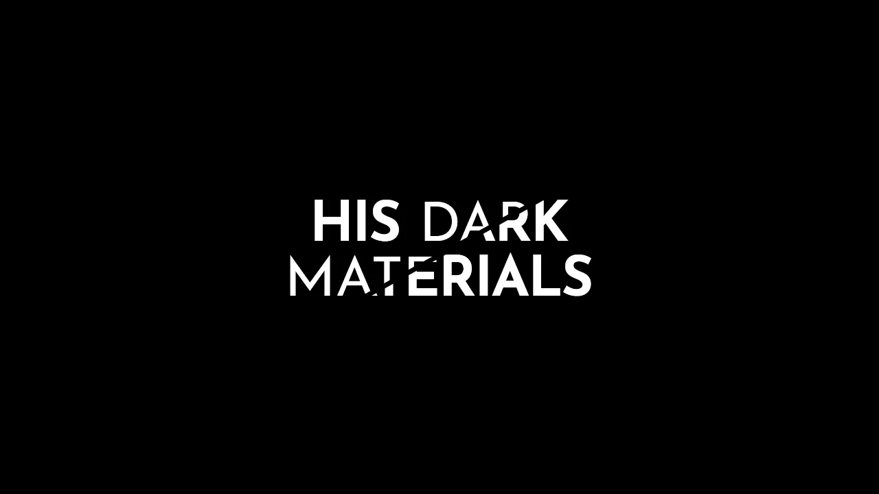
His Dark Materials: TV Series Logo
A stylish, graphic headline with a diagonal split, creating a sense of layering or a “cut-out” effect, ideal for posters or logos.
See the Pen His Dark Materials: TV Series Logo.

Flyer Design #01
A modern, corporate cover design with an emphasis on geometry and typography, fully implemented with CSS without relying on graphic editors for composition.
See the Pen Flyer Design #01.
Link Split Hover Effect
A “tearing” text effect created by layering two <span>s with an asymmetrical clip-path. On hover, transform shifts the top part, ::after pseudo-elements draw the tear line, and an underline animates via background-position - the entire choreography is managed by transition-delay and a custom cubic-bezier function.
See the Pen Link Split Hover Effect.
Logo with Ripple Effect
An advanced ripple effect adapted to irregular geometric shapes using the CSS clip-path property. The technical implementation relies on minimal JavaScript to accurately determine click coordinates and dynamically position the wave using inline styles.
See the Pen Logo with Ripple Effect.
Direction Aware Tiles
This demo illustrates how to achieve complex hover direction detection logic (top, right, bottom, left) solely via CSS by utilizing overlapping transparent links with unique clip-path masks as an implicit controller.
See the Pen Direction Aware Tiles.