30+ CSS Clocks
The Pure CSS Clock Examples collection showcases how time displays function without JavaScript. CSS handles rotation, animation, and layout — eliminating unnecessary complexity between concept and execution.
Analog clocks use CSS transforms with rotate() to move hour, minute, and second hands. CSS animations tied to real time leverage animation-delay and steps() for smooth or ticking motion. Digital displays employ CSS Grid for digit alignment and pseudo-elements for segment rendering (seven-segment displays). CSS Custom Properties enable instant theme switching and timezone adjustments without recompilation.
Responsive design adapts clock sizes from mobile to desktop via media queries and aspect-ratio properties, preserving proportions. Accessibility is native: semantic HTML (<time>, <div role="img">) ensures screen readers announce time correctly. Focus states remain visible on interactive controls. The collection includes free CodePen demos, downloadable code, and updated examples. Each snippet prioritizes Core Web Vitals — zero layout shift, hardware-accelerated transforms via will-change, minimal repaints.
Every example works in modern browsers (Chrome, Firefox, Safari, Edge). Download, customize, deploy.
Examples

Neumorphic Analog Clock with Springy Hands
An interactive analog clock featuring a rich crimson neumorphic face and springy tick transitions. Built with SCSS and vanilla JavaScript, the script queries local system time and translates hours, minutes, and seconds into corresponding geometric degrees. A custom cubic-bezier timing function adds an organic, elastic bounce to each ticking hand.
 Chrome 36+
 Edge 12+
 Firefox 16+
 Safari 9+
See the Pen Neumorphic Analog Clock with Springy Hands.

Haunted Grandfather Clock
This is a Haunted CSS Grandfather Clock. It renders a highly detailed, thematic timepiece using only CSS shapes, set against an animated spooky background. Its function is to provide an immersive, real-time clock interface, replacing flat digital readouts with rich, analog spatial design.
Chrome 55+
Edge 79+
Firefox 54+
Safari 10+
See the Pen Haunted Grandfather Clock.

Neon 3D Seven-Segment Digital Clock
This is a Neon 3D Seven-Segment Digital Clock. It procedurally generates a classic LCD/LED interface using pure CSS geometry. Its function is to provide a highly atmospheric, real-time clock that utilizes 3D space and realistic glowing floor reflections to enhance cyberpunk or dashboard aesthetics.
Chrome 60+
Edge 79+
Firefox 55+
Safari 11+
See the Pen Neon 3D Seven-Segment Digital Clock.

Tick-Tock Typographic Clock
This Tick-Tock Typographic Clock reimagines the traditional clock face by replacing ticks and numbers with words. Using a clever SCSS loop, it arranges 60 text elements (“TICK” for even seconds, “TOCK” for odd) in a perfect circle. A JavaScript interval updates the active class every second, creating a rhythmic, reading-based timekeeping experience. (Requires: FontAwesome)
Chrome 49+
Edge 15+
Firefox 43+
Safari 10+
See the Pen Tick-Tock Typographic Clock.

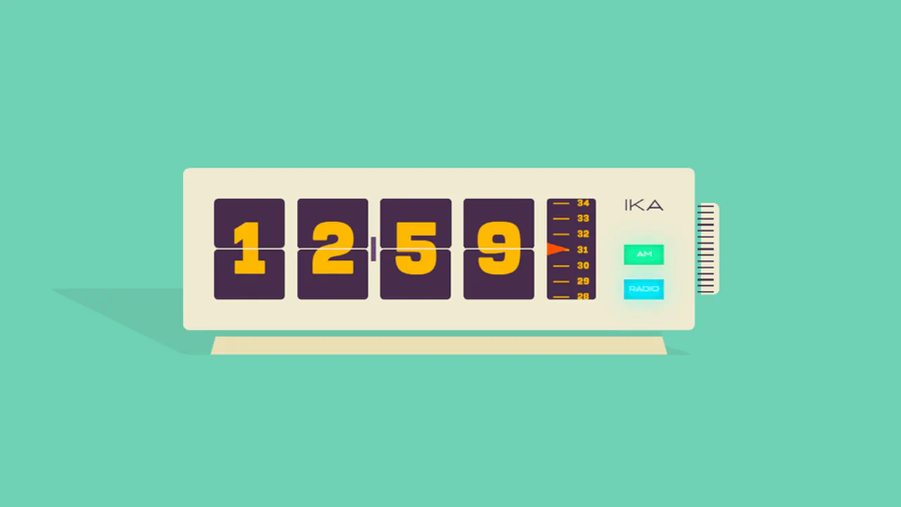
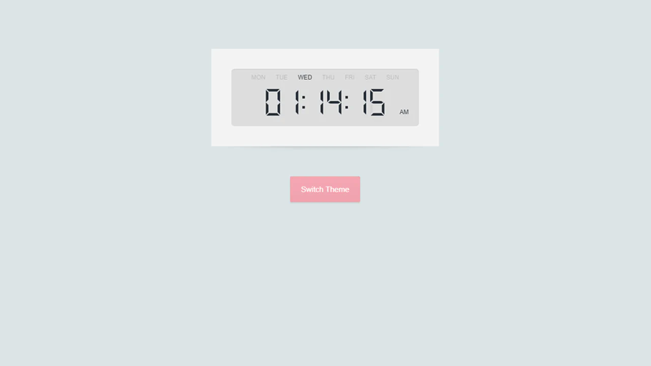
Blocky Digital Clock
A voxel-style 3D clock where digits morph physically via CSS transforms driven by sibling selectors, creating a floating, mechanical restructuring effect.
See the Pen Blocky Digital Clock.

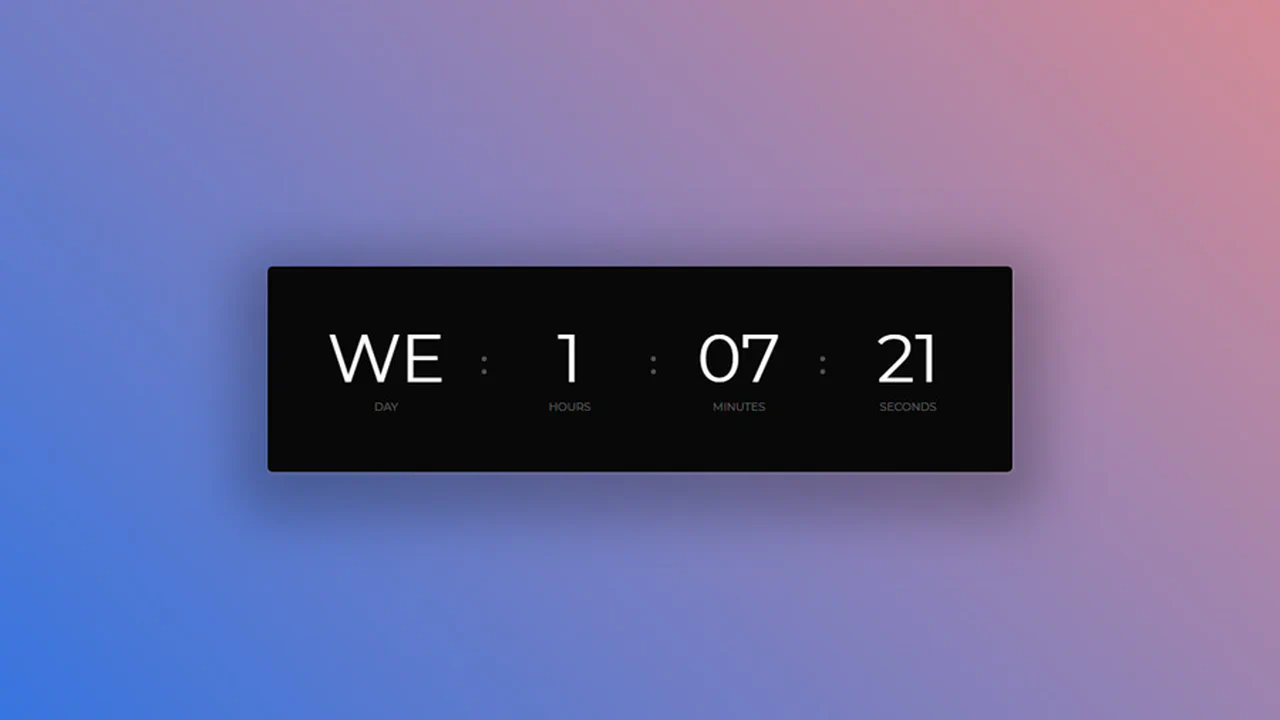
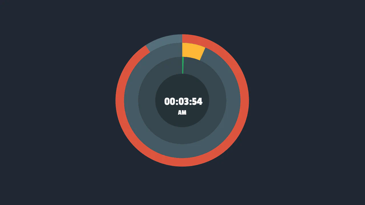
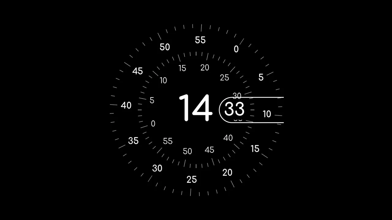
CSS Grid Clock (Animated)
A highly detailed Dual Analog Clock component that compares abstract and real-time animation.
See the Pen CSS Grid Clock (Animated).
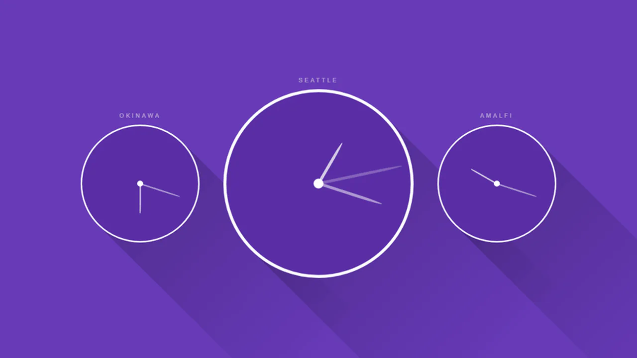
Digital-Analog Dial Clock
A digital-analog clock hybrid where JavaScript’s setInterval only updates a single CSS variable - --dRotate, while all the complex rotation and counter-rotation of the dials and numbers is handled by pure CSS transform.
See the Pen Digital-Analog Dial Clock.
Blocks Clock with Pixel Art Digits
This retro-style clock leverages CSS Grid for its 3x5 matrix display, dynamically updating the digit structure by manipulating the parent element’s class, while setInterval(setTime, 500) ensures a responsive time refresh.
See the Pen Blocks Clock with Pixel Art Digits.

Neon Clock
A technical showcase demonstrating how to control the neon glow intensity and color scheme using CSS variables and the hsl() function, while delivering a realistic neon tube effect on each digital segment via subtle text-shadow and box-shadow styling.
See the Pen Neon Clock.

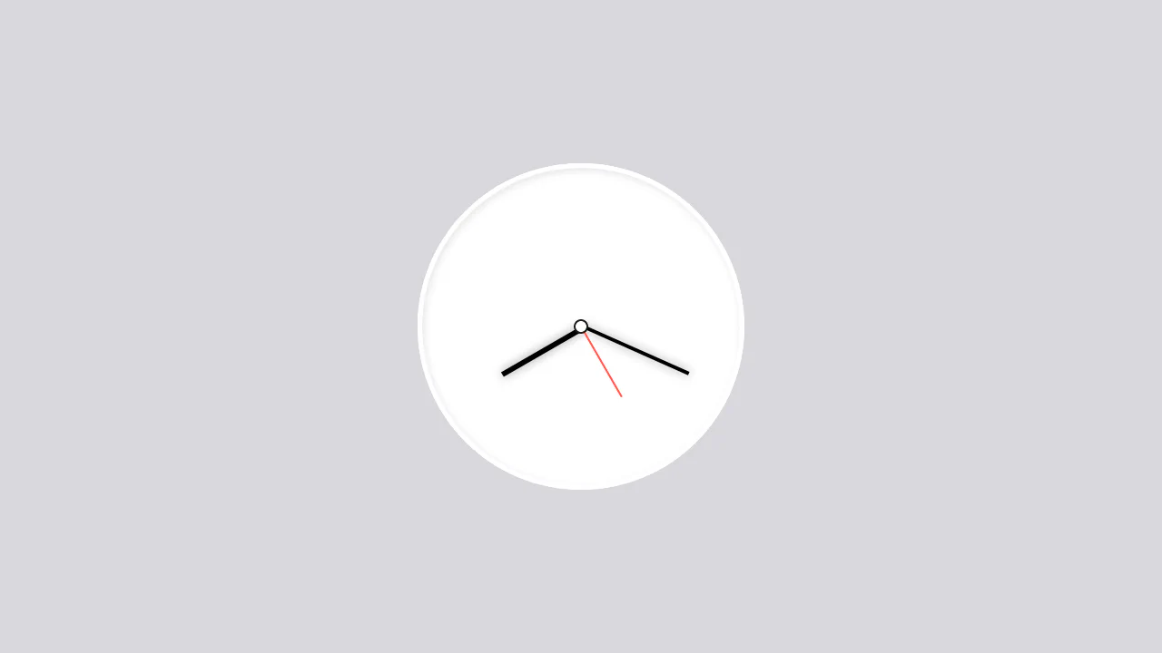
JavaScript rotates the clock hands every second, updates the digital display, and plays a sidestick sound on each tick. The hands are positioned absolutely with transforms; the numbers are manually placed using nth‑child selectors.
JavaScript updates the digital time every half‑second, while CSS keyframes continuously warp the clock’s rings — height, position, and scale shift in a pulsating loop. The result is an abstract, organic timepiece where form breathes rather than ticks.
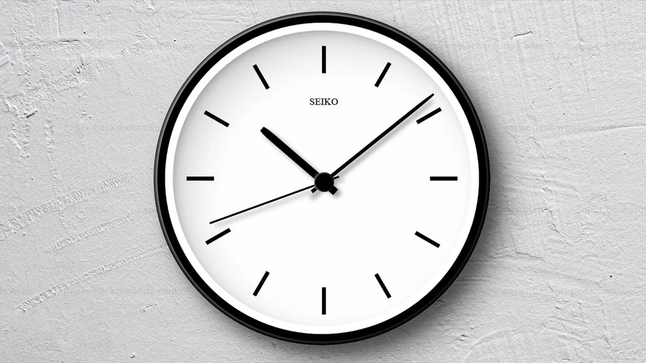
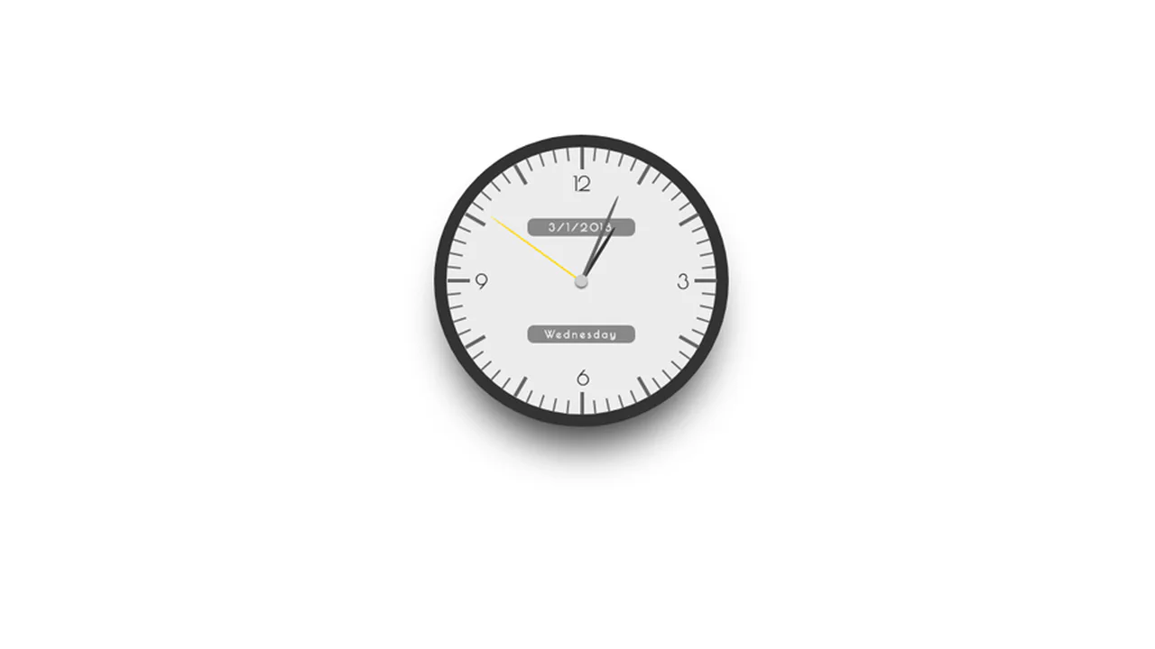
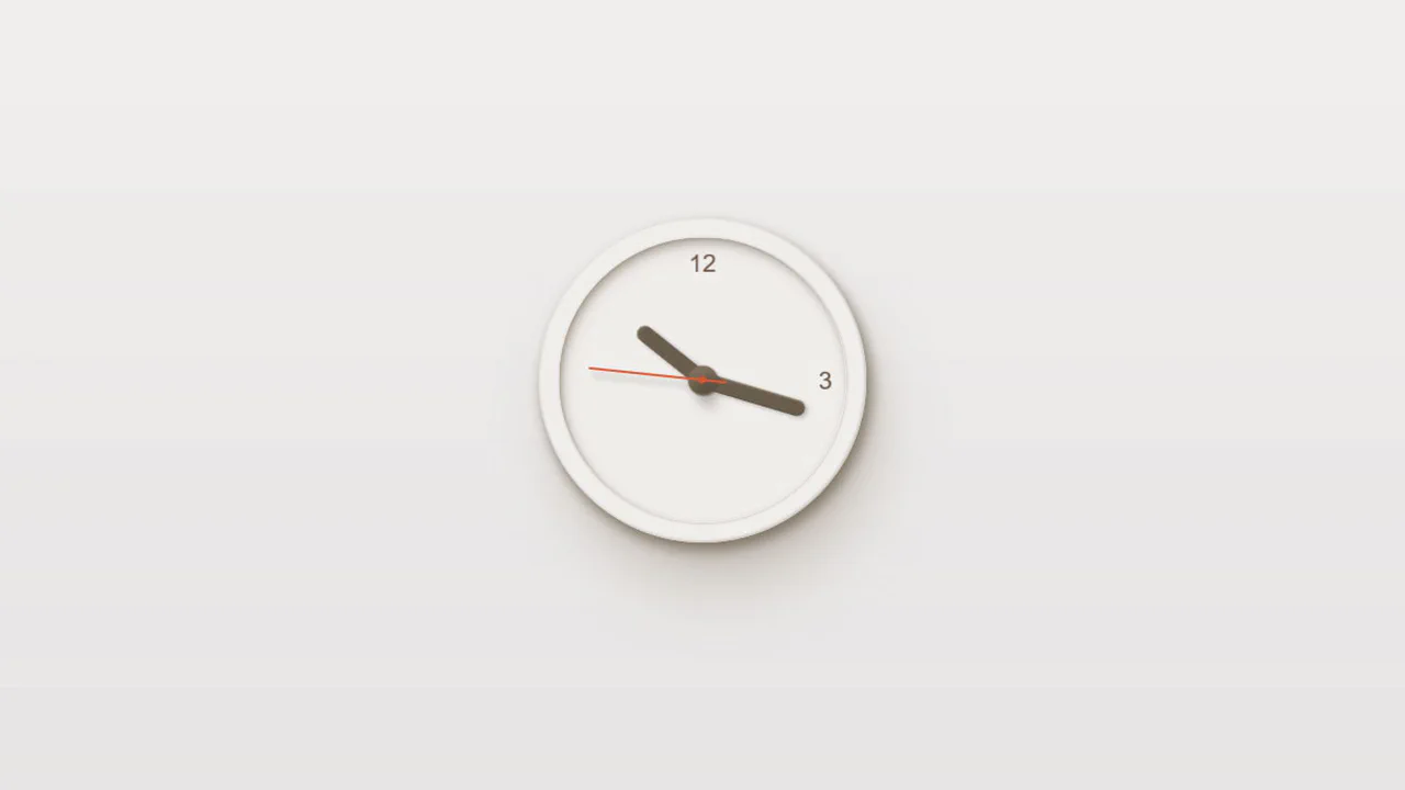
This is a static illustration of a Seiko watch — the hands are fixed at arbitrary angles, not showing the current time. The design uses absolute positioning for hour markers and hands, with pseudo‑elements adding dimensional shadows and highlights. No JavaScript runs the clock; it’s a purely visual piece.
JavaScript calculates the current time and sets animation delays on the clock hands to position them correctly. CSS animations then rotate the hands continuously, creating a seamless analog clock. The indicator marks are generated with an SCSS loop, keeping the markup clean.

JavaScript updates the hour, minute, and second hands every second by setting rotation angles via transform. Decorative dots around the clock are drawn with box‑shadow on pseudo‑elements — a lightweight, pure‑CSS pattern. The design is compact and functional.
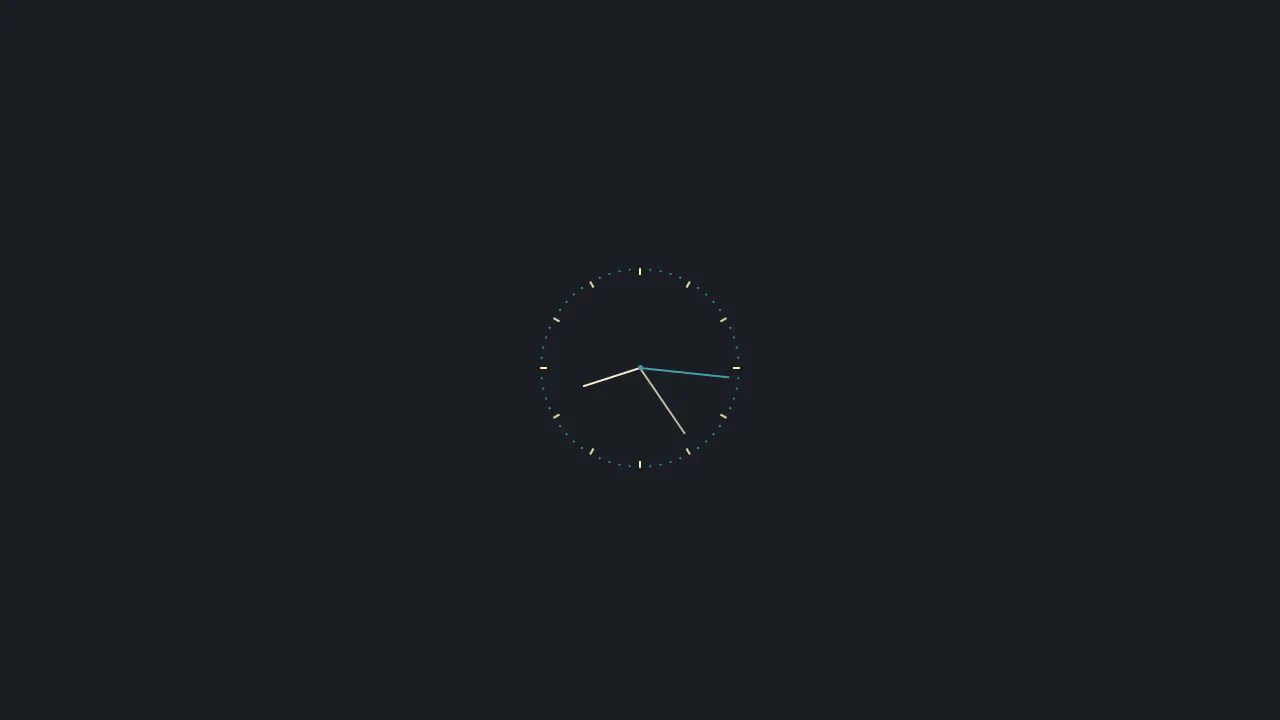
Pseudo‑elements draw both clock hands and hour markers using transforms and box‑shadow. Two hands rotate at different speeds, creating an abstract mechanical loop. The layout is fixed — markers are positioned via hardcoded offsets.