10+ CSS Close Buttons: Free Examples & Code Snippets
Close buttons provide essential dismissal paths for modals, notifications, and popups. A well-crafted close button is instantly recognizable, accessible, and performs reliably across all interaction modes.
- The classic X shape is built from ::before and ::after pseudo-elements rotated 45 and -45 degrees, creating crossing lines without Unicode characters or SVG assets.
- A native
<button>element with aria-label ensures keyboard focusability and screen reader announcements, providing the close action semantics without additional ARIA overrides. - Hover rotation animates transform: rotate() on the button — a compositor-only property that stays entirely on the GPU thread without triggering repaints or layout recalculations.
Browse this collection of CSS close buttons to master lightweight, accessible dismissal controls that integrate into modals, notifications, and overlay components.
Table of Contents:
Examples
Close Button
A “close” icon created in pure CSS from two pseudo-elements. On hover, both lines forming the cross smoothly rotate 180 degrees using transform: rotate(180deg) and transition.
See the Pen Close Button.
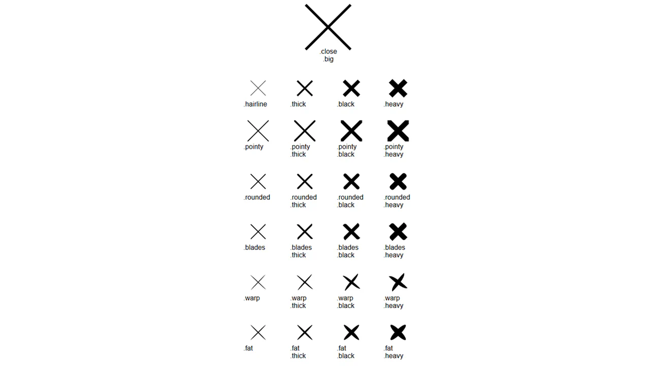
Pure CSS Close Buttons
A collection of “close” icon variations created with a single base class, .close, and multiple modifier classes. Each modifier changes one property to create a new style.
See the Pen Pure CSS Close Buttons.
Back To Close
Creation of a complex icon from three <span> elements that form a “back” arrow in one state and reconfigure into a cross in another state with the .open class. JavaScript is used solely for toggling the state.
See the Pen Back To Close.
Close Button
A minimalist pure CSS button featuring a creative line-to-border transformation animation on hover. This lightweight snippet leverages pseudo-elements and hardware-accelerated transform properties, providing a smooth text reveal and high-performance UI micro-interaction.
See the Pen Close Button.

Open / Close
A seamless icon morphing animation that transforms a directional arrow into a close button upon click. This lightweight snippet utilizes CSS pseudo-elements and hardware-accelerated transitions to create a responsive toggle control for dropdowns and menus.
See the Pen Open / Close.
Animated Close Icon
A minimalist pure CSS close button featuring a smooth rotation and color shift animation on hover. This snippet utilizes CSS transitions to trigger a label reveal and transform the cross icon, offering a lightweight and intuitive UI micro-interaction for modals or popups.
See the Pen Animated Close Icon.

Interactive Close Button
A stylish interactive close button built with SCSS, featuring a unique internal sliding animation triggered on hover. This snippet utilizes custom cubic-bezier transitions and color shifting to create a fluid and engaging UI micro-interaction for modals or menus.
See the Pen Interactive Close Button.
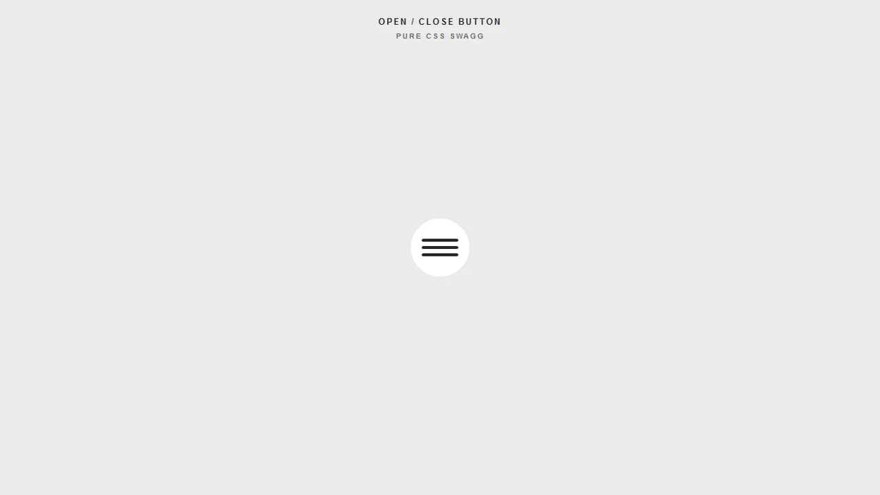
Open / Close Button Animation
A sleek hamburger menu toggle that morphs into a close icon using synchronized CSS @keyframes animations. This snippet features a satisfying color-fill hover effect and precise transformations, making it a perfect UI component for responsive navigation systems.
See the Pen Open / Close Button Animation.

Close Animation
Animated Close button implemented with SCSS using pseudo-elements and CSS transforms. This lightweight UI component features a smooth cross-line transition effect on hover, making it perfect for modals and pop-ups in modern web apps.
See the Pen Close Animation.
Chat Bubble Button
An interactive, zero-JS chat icon morphs into a close button on click. By nesting two svg paths and shifting their stroke-dashoffset parameters dynamically, the outline of the rounded speech bubble “unravels” to form a sharp, rotated “X” symbol. Simultaneously, the three internal dot circles scale down to zero.
See the Pen Chat Bubble Button.
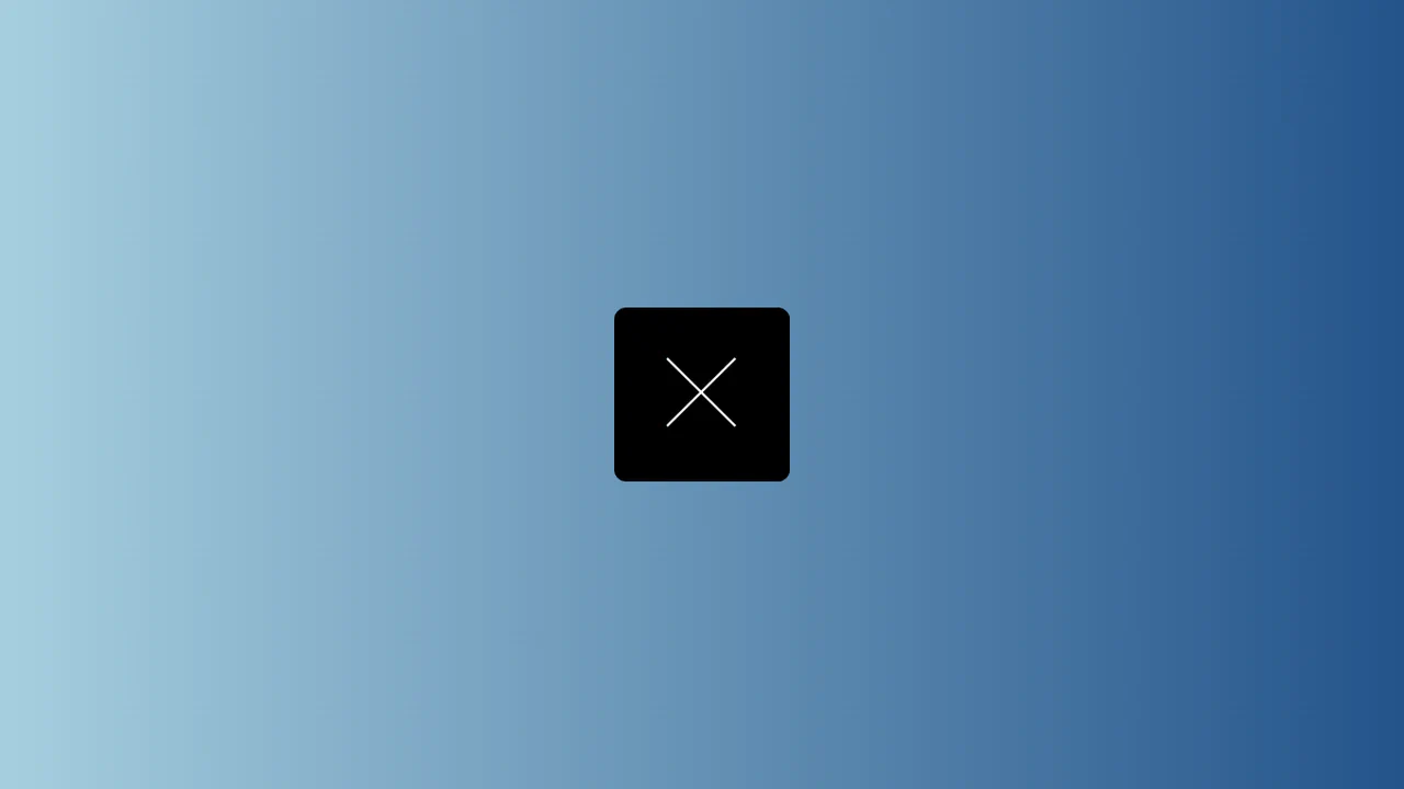
Pure CSS Close Button
An elegant, splitting close crossmark is created inside this square button on hover. The :before and :after pseudo-elements are angled at 45deg. At rest, their zero-width borders touch. Hovering transitions width to 15px, sliding the solid segments outward to create a gap and split the “X” into four separate corner marks.
See the Pen Pure CSS Close Button.