10+ CSS Color Palettes: Free Code Snippets & Examples
Color systems are the structural backbone of visual design — a well-defined palette eliminates guesswork and ensures every interface element carries intentional contrast and harmony. CSS color palettes deliver this through native color functions and custom properties, keeping the theme layer flexible and the rendering pipeline deterministic.
- Each palette uses CSS custom properties with a consistent naming convention (
--color-primary,--color-surface, etc.), enabling theme-wide color updates by changing a single variable value without touching component styles. - Modern color functions like
oklch()andhsl()provide perceptually uniform gradients and algorithmic color generation, so tinting, shading, and complement selection produce visually consistent results across the entire palette. - The
light-dark()function handles dark mode switching at the property level rather than the cascade level, eliminating the need for duplicatedprefers-color-schemeblocks and keeping the palette compact.
Browse the collection to find a color system that fits your design workflow — from minimal two-color palettes for focused UI kits to comprehensive 12-color systems with semantic tokens and dark mode variants.
Table of Contents:
Examples
Copy Color
This CSS component is a great example of creating an interactive color palette without JavaScript. Its key technical highlights are the use of transform-style: preserve-3d and perspective for a 3D effect, and most importantly, the + and :has() selectors to scale adjacent elements on hover, creating a unique “ripple” effect.
See the Pen Copy Color.
Color Swatch
This is a dynamic radial menu built purely with HTML/CSS, where elements deploy on hover using the CSS transform: rotate() technique and smooth transitions, controlled by SASS variables. It showcases current techniques for complex hover animations, cross-browser compatibility via vendor prefixes, and precise interactivity control using pointer-events: initial.
See the Pen Color Swatch.
Color Palette
A responsive Flexbox grid featuring interactive cards that combine smooth transition and a @keyframes animation on hover. The implementation focuses on performance - using will-change - and styling flexibility through SASS variables and currentColor.
See the Pen Color Palette.
Color Palette
Systematic display of color variations. SCSS variables provide a single source of truth, nested rules make structure predictable. Shadows and hover effects add tactility without compromising the informational content.
See the Pen Color Palette.
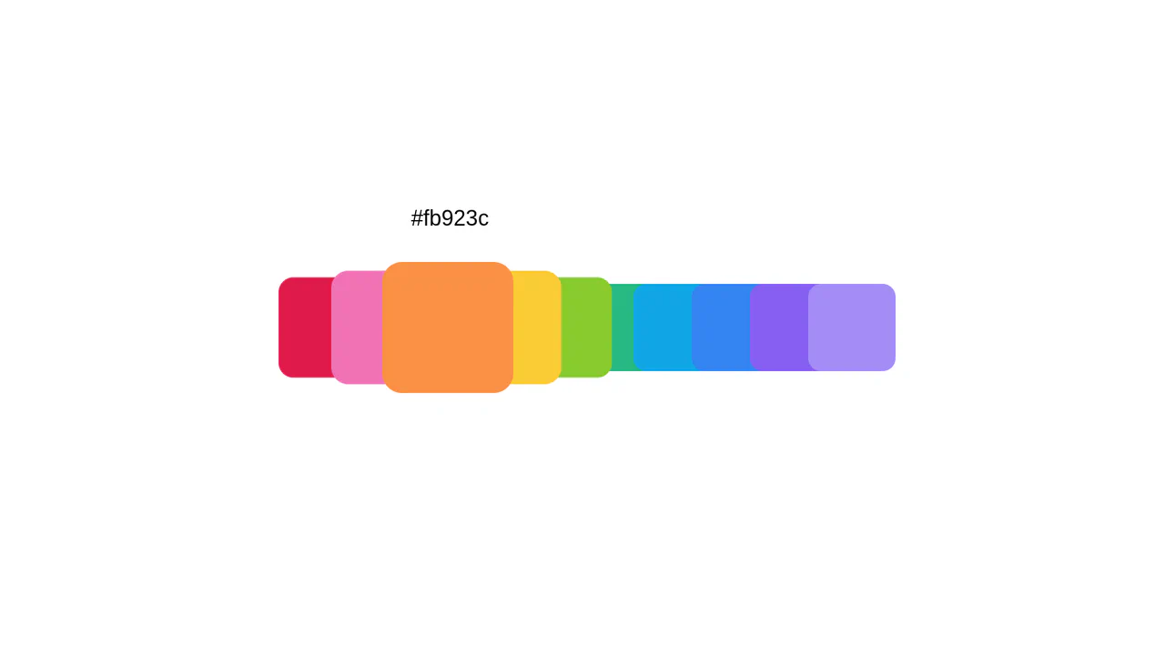
Color Palette
Interactive color scale with predictable animation. On hover, element expands revealing technical color details — others contract, creating clear focus. Minimum decoration: only shadow and typeface for work.
See the Pen Color Palette.

Auto Color Palette Formatting
Dynamic palette generation based on input data. Algorithm automatically determines text readability: white for dark colors, black for light ones. Page background color calculated from the brightest shade — logic without extra decorations.
See the Pen Auto Color Palette Formatting.
Bootstrap 4 Color Palette Generator. Including Color Variants
Systematic approach to color palette generation based on Bootstrap logic. SCSS color map automatically creates lightness variants, utility classes ensure consistent application. Mixins for text, background and borders make the system extensible without code duplication.
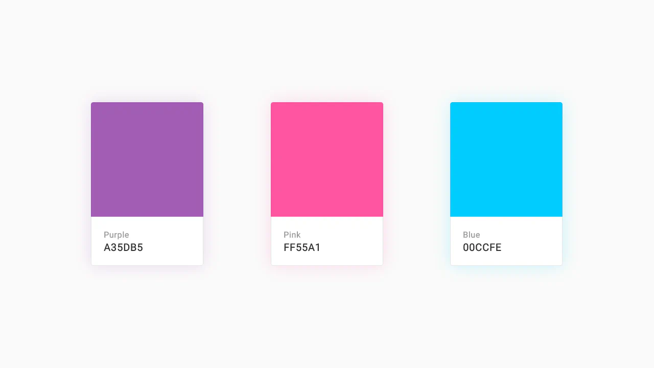
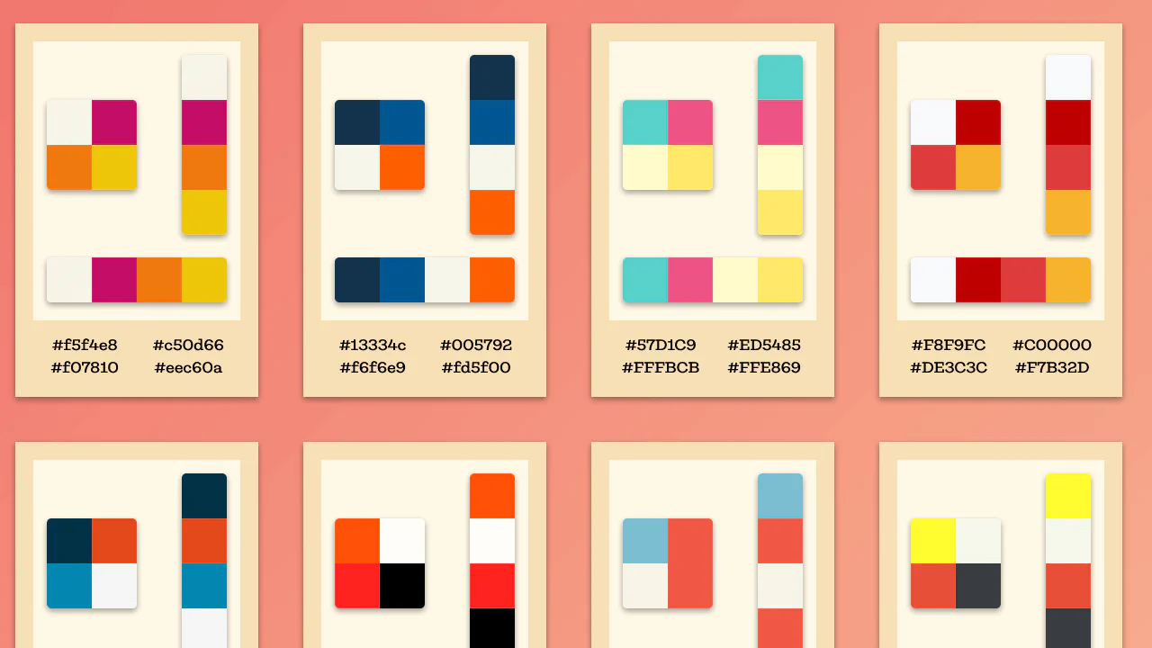
Color Palette
Modular card system on CSS Grid with predictable behavior. Base color and its light variation displayed in 2×2 grid, hover reveals shade type. Info panel with copy button — functionality without extra layers.
See the Pen Color Palette.
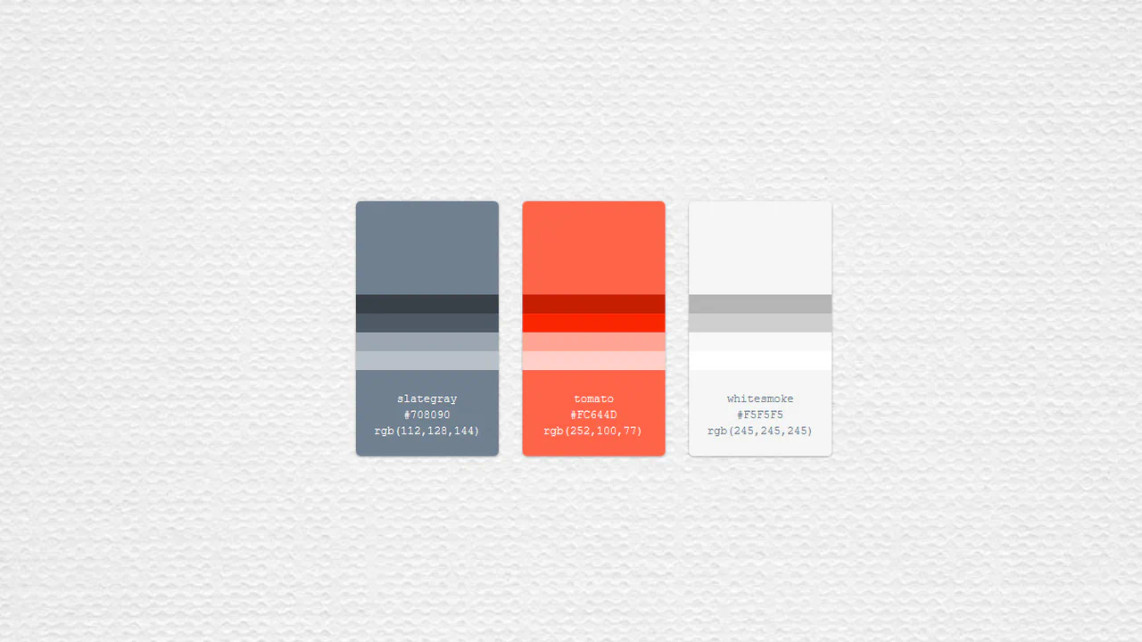
CSS Grid: Color Palette
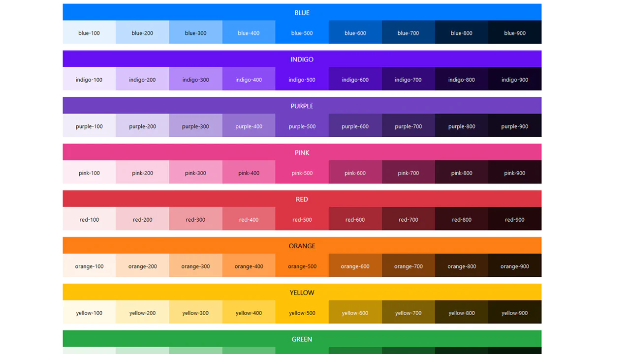
Grid system with interactive expansion of additional shades on hover. Each card shows the main color, hover smoothly reveals variations with animation delay. Clear hierarchy: primary, secondary colors and gray scale grouped visually.
See the Pen CSS Grid: Color Palette.
Duotone Filtering with CSS Variables
Interactive duotone filter controlled by radial switches. Color selection for lighten and darken modifies CSS variables, circular layout provides visual feedback. Minimal JS only for property updates — logic in styles.
See the Pen Duotone Filtering with CSS Variables.
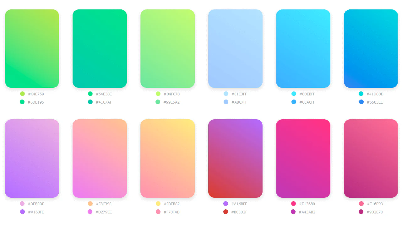
Gradient Collection
Responsive gradient grid with CSS variables for each color. Column count changes based on screen width via media queries, card height adjusts accordingly. Pseudo-elements display hex codes — data stored in custom properties.
See the Pen Gradient Collection.
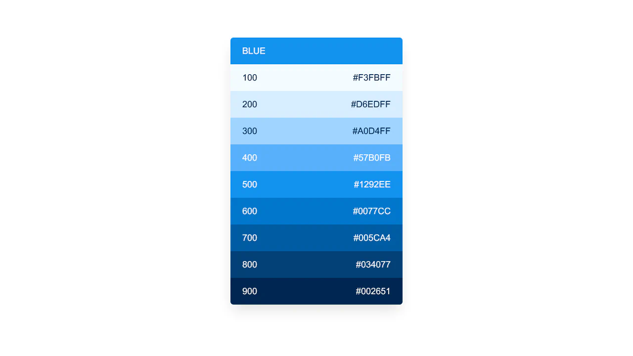
Color Palette
Linear blue color scale with interactive background change. Each item sets page background color on click, hover adds scale and shadow for tactile feedback. Structure follows Help Scout design system.
See the Pen Color Palette.
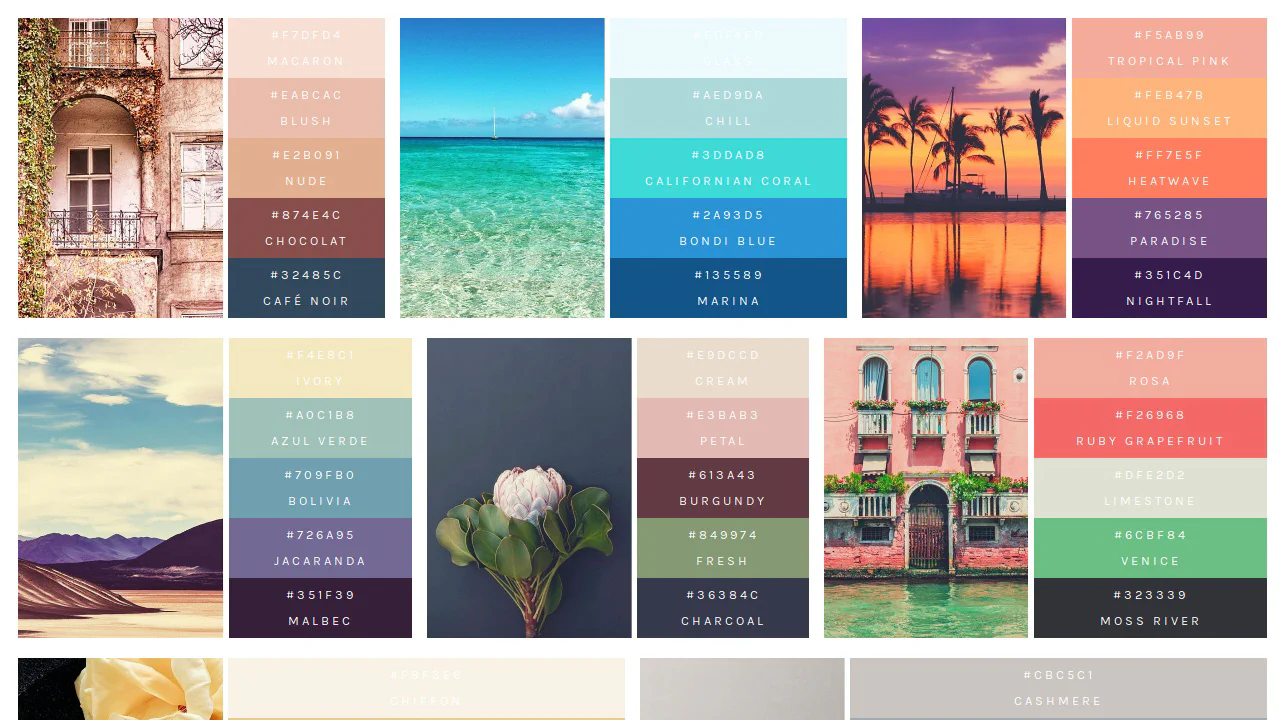
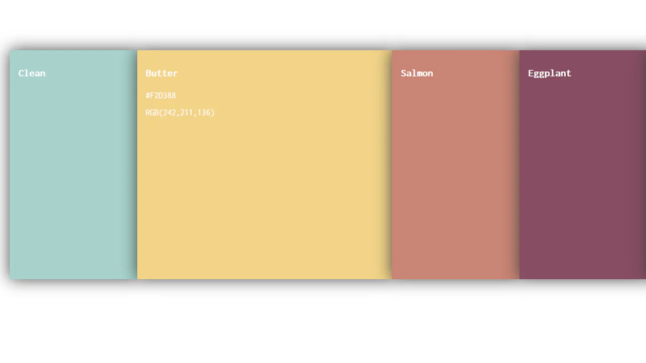
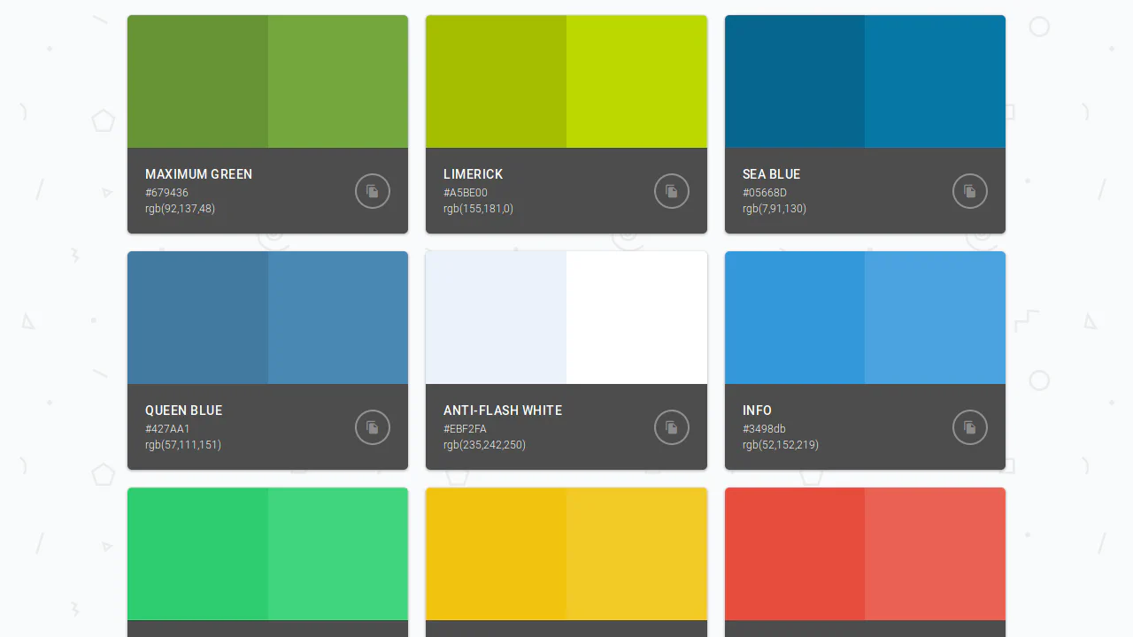
Color Palettes
Visual palette system where each color set is tied to a source image. Image takes fixed height, colors stack vertically with hex and name labels. Minimum styling — only color, typeface and basic alignment.
See the Pen Color Palettes.
Gradients Collection Preview
15 gradients on flexbox. Each card uses --start and --end inline custom properties to paint a 45° linear-gradient swatch. Zero JS — layout, hover effects, custom scrollbar styling — all pure CSS. Border transitions to cyan on hover. Data lives in inline styles, presentation in CSS. Clean separation, minimal markup.
See the Pen Gradients Collection Preview.
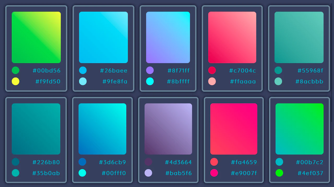
Color Palettes
16 color palettes, 4 swatches each. Rendered three ways — 2×2 grid, vertical stack, horizontal bar. Colors via CSS classes (paletteItem__colorItem_1), no inline values. BEM, float layout, responsive at 1280, 960, 642px. No JS. The code is repetitive by design — data in CSS, not preprocessor variables.
See the Pen Color Palettes.
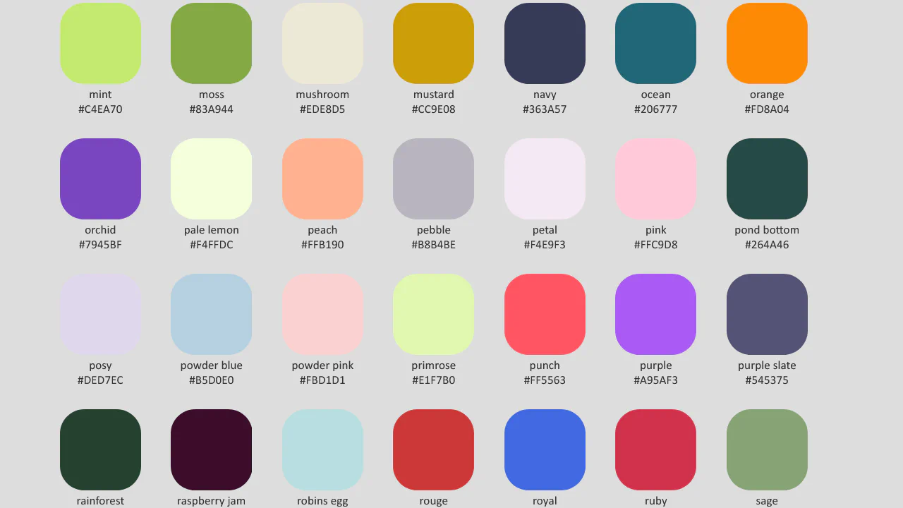
Colour Palette Condensed
100+ named colours as CSS custom properties in :root, grouped by lightness — light (dark text), medium, dark (light text). Each swatch is a 6rem circle via <li style="background: var(--name)">. Name and hex sit below. No preprocessor, no JS, no build step. Just a big block of --name: #hex and a list. Pure CSS colour reference, and it works exactly as intended.
See the Pen Colour Palette Condensed.