20+ CSS conic-gradient Examples
Angular color transitions require exact structural logic. The CSS conic-gradient examples in this collection provide a direct method for creating radial distributions without external assets. In modern UI design, these gradients are essential for building precise pie charts, color wheels, and loading indicators that remain lightweight and transparent. Using curated snippets allows for immediate deployment of functional geometry, letting raw code dictate the visual form.
Technically, the logic relies on the conic-gradient function to map color stops to degrees around a central point. These snippets leverage hardware acceleration by offloading pixel calculations to the GPU, ensuring a locked 60fps performance during interactive transitions. The HTML remains strictly semantic, ensuring absolute layout stability while keeping the DOM footprint minimal and optimized for rendering engines. This approach eliminates the need for heavy SVG paths or raster images.
Every free demo in this updated library is fully responsive and cross-browser compatible. Users can instantly download the raw code or fork a specific pattern on CodePen. These assets prioritize performance, providing a fast, logic-driven experience across all modern desktop and mobile devices where the interface serves the user directly.
Examples

Neon Glow Toggle Switch
This is a Neon Glow Toggle Switch. It replaces a standard HTML checkbox with a highly tactile, skeuomorphic control. Its function is to provide satisfying visual feedback for state changes, utilizing a “filling” neon border and a sliding, textured handle to make binary selections feel like engaging physical hardware.
 Chrome 85+
 Edge 85+
 Firefox 128+
 Safari 16.4+
See the Pen Neon Glow Toggle Switch.

Generative Glitch Cube Art
This is Generative Glitch Cube Art. It is a piece of procedural digital art created entirely with CSS. Its function is to demonstrate how complex, three-dimensional geometry and dynamic lighting effects can be simulated without JavaScript or SVG, relying solely on multi-layered conic-gradient backgrounds and CSS custom property animation.
Chrome 85+
Edge 85+
Safari 16.4+
Firefox 128+
See the Pen Generative Glitch Cube Art.

Mouse-Reactive Iridescent Button
This is a Mouse-Reactive Iridescent Button. It uses a sophisticated layering of CSS conic gradients and JavaScript pointer tracking to create a button with a vibrant, shimmering border that physically follows the user’s cursor. Its function is to provide a high-end, tactile micro-interaction that makes a standard call-to-action feel like a premium, light-sensitive object.
Chrome 122+
Edge 122+
Firefox 128+
Safari 16.4+
See the Pen Mouse-Reactive Iridescent Button.
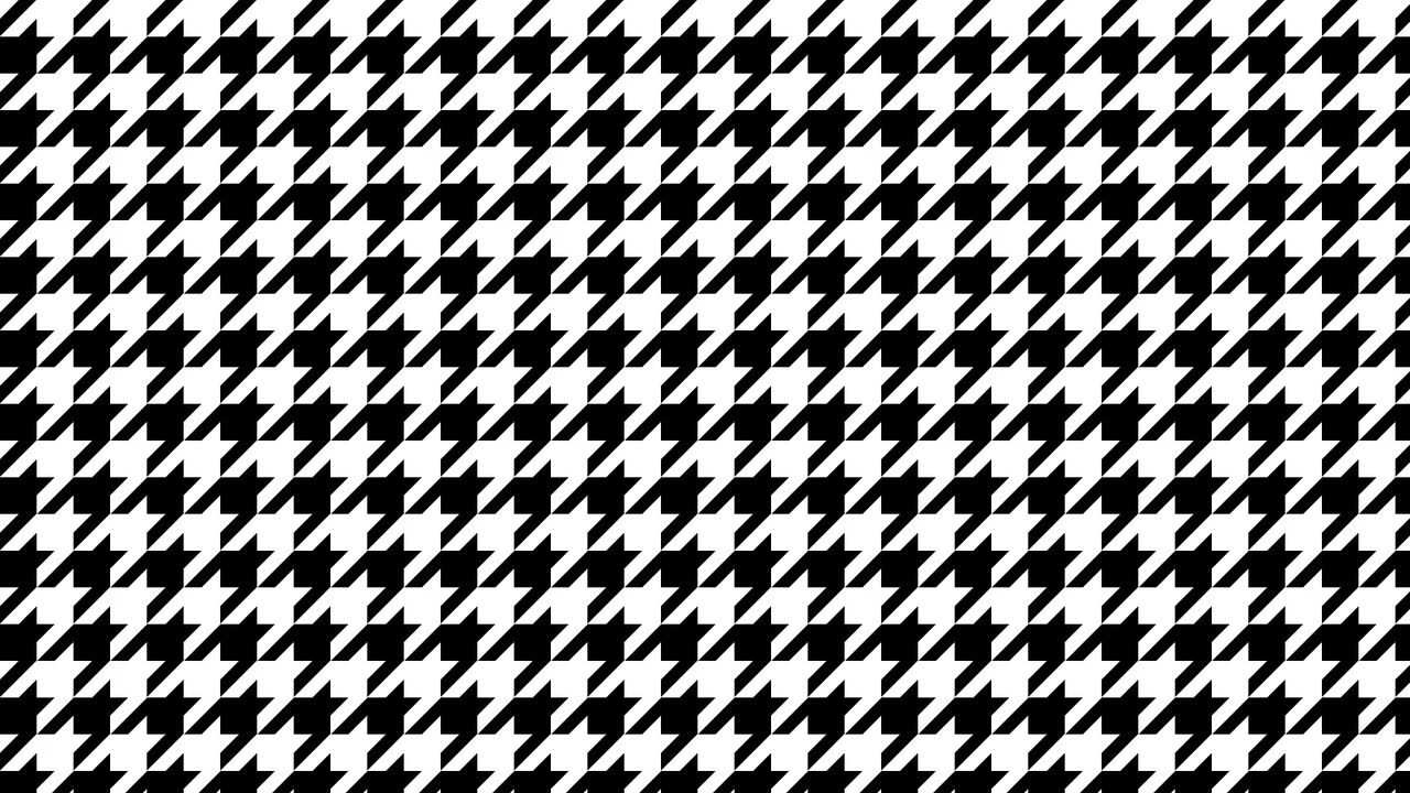
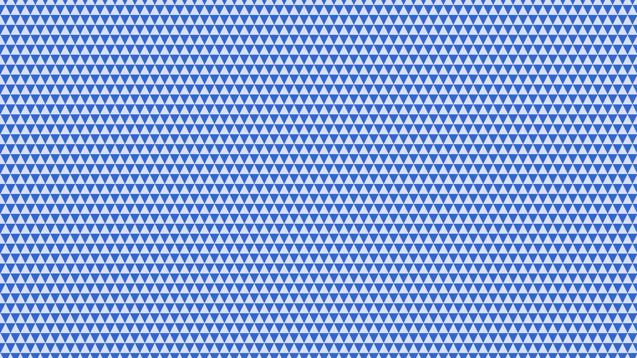
Optical Illusion CSS Background Pattern
This is an Optical Illusion CSS Background Pattern. It generates a complex, interlocking geometric tessellation using only mathematical gradient overlays. Its function is to provide a visually striking, lightweight background texture without requiring external image assets.
Chrome 69+
Edge 79+
Firefox 83+
Safari 12.1+See the Pen Optical Illusion CSS Background Pattern.

Pure CSS Retro Arcade Machine
This is a Pure CSS Retro Arcade Machine. It constructs a highly detailed, nostalgic gaming cabinet entirely out of HTML nodes and CSS styling. Its function is to showcase the power of CSS as an illustrative medium, replacing static raster images or SVGs with resolution-independent, scalable code.
Chrome 69+
Edge 79+
Firefox 83+
Safari 12.1+
See the Pen Pure CSS Retro Arcade Machine.

Vibrant OKLCH Conic Hero
For too long, the web has been trapped in the dull, muddy spectrum of sRGB. We accept “gray dead zones” in our gradients as a fact of life. No more. This hero section embraces the OKLCH color space to deliver vibrance that matches the human eye’s perception. It is not just a background; it is a radiant, high-definition light source that bathes your typography in pure energy. (Requires: open-props)
Chrome 111+
Edge 111+
Firefox 113+
Safari 15.4+
See the Pen Vibrant OKLCH Conic Hero.

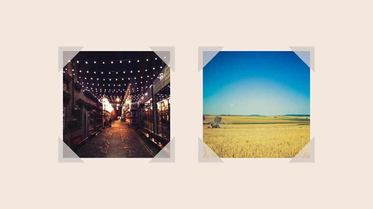
Rounded Triangle CSS Image Mask
This Rounded Triangle CSS Image Mask offers a mathematically perfect way to shape visuals into equilateral triangles with soft, professional edges. It is an ideal choice for high-end portfolio galleries, creative team sections, or landing pages where standard rectangular or circular crops feel too conventional. By leveraging modern CSS math, the shape remains perfectly symmetrical regardless of the image dimensions.
Chrome 105+
Edge 105+
Firefox 121+
Safari 15.4+
See the Pen Rounded Triangle CSS Image Mask.
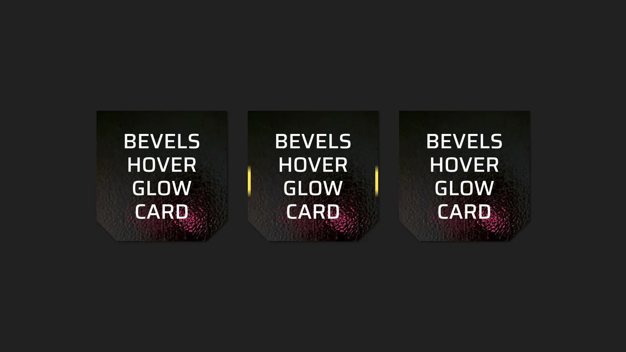
Beveled Corner Glow Cards
This Beveled Corner Glow Card component demonstrates the bleeding edge of CSS UI styling. It primarily utilizes the new corner-shape property to create chamfered (angled) edges without complex clip-paths, while implementing a sophisticated CSS Mask fallback for older engines. The interaction features a “scanning” light beam effect on the border, powered by CSS Houdini for buttery smooth interpolation.
Chrome 120+
Edge 120+
Firefox 120+
Safari 17+
See the Pen Beveled Corner Glow Cards.
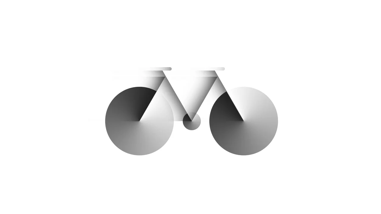
Bicycle
A pure CSS bicycle illustration constructed from geometric primitives using absolute positioning and vmin units for responsiveness. conic-gradient simulates wheel spokes, transform: skewX shapes the frame, and inset box-shadow adds depth, while pseudo-elements efficiently duplicate components like wheels.
See the Pen Bicycle.
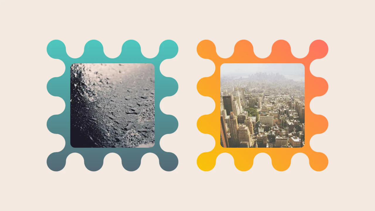
Images Inside Wiggly Boxes
A decorative image frame created entirely with CSS mask compositing. It combines radial-gradient layers with conic-gradient and the intersect composite operator to sculpt a scalloped, wavy border, while the CSS round() function ensures perfect pattern alignment along the edges.
See the Pen Images Inside Wiggly Boxes.

Profile CSS Drawing
A stylish, detailed vector-style portrait with depth and shadows, fully implemented using pure CSS gradients and clipping paths.
See the Pen Profile CSS Drawing.

Shapes Alphabet with CSS
A pure CSS typography experiment rendering the full alphabet using layered gradients.
See the Pen Shapes Alphabet with CSS.

Neumorphic Loader
A tactile Neumorphic progress indicator where JavaScript drives the animation state by updating a custom property --progress. The visual logic relies on CSS conic-gradient utilizing calculated color stops to dynamically render the filling arc, while complex layered box-shadow creates a soft, extruded 3D aesthetic.
See the Pen Neumorphic Loader.

CSS-Only Pattern: Squares in Squares
A tartan plaid pattern generated entirely with CSS.
See the Pen CSS-Only Pattern: Squares in Squares.

Single Element Progress
Elegant, segmented radial charts that smoothly fill upon page load, showcasing the capabilities of modern CSS without JavaScript.
See the Pen Single Element Progress.
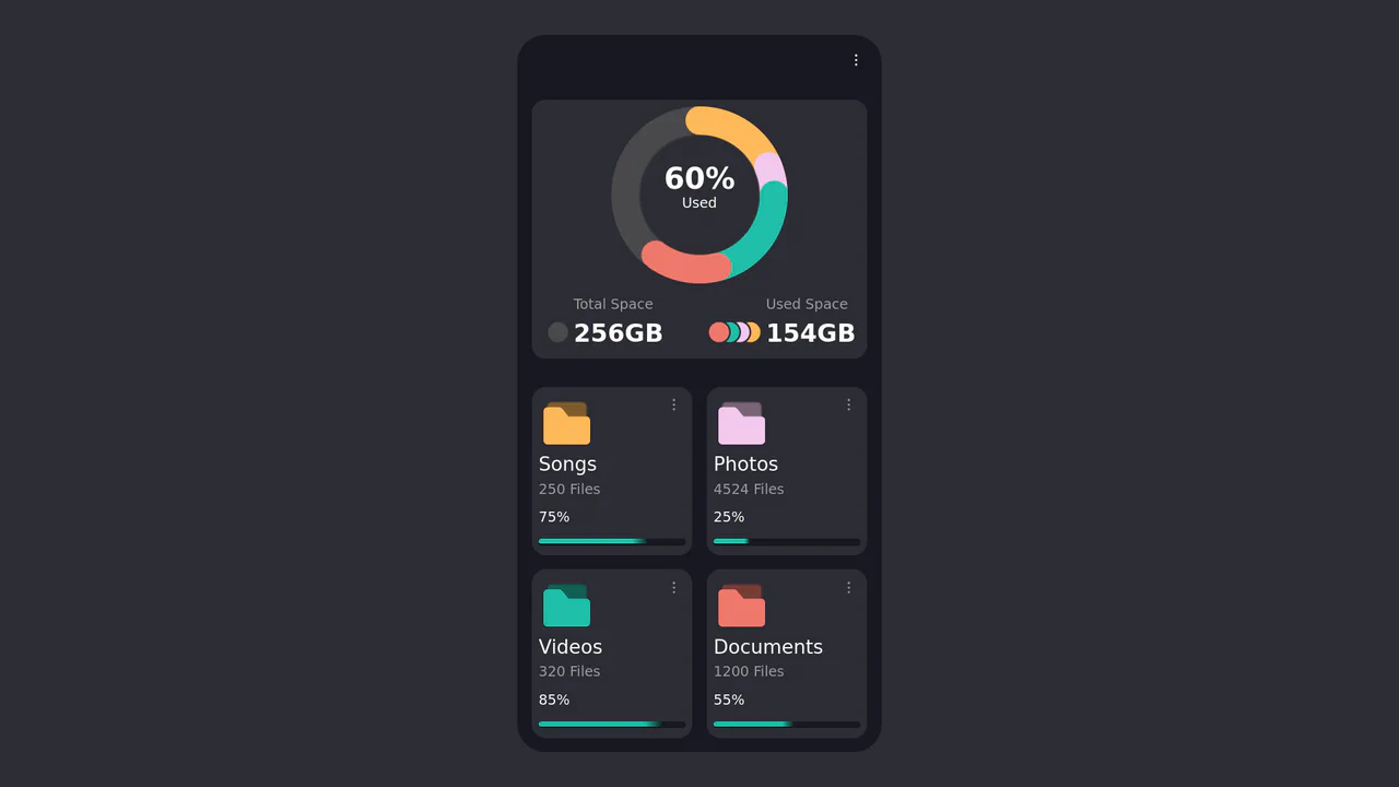
CSS Donut Chart for a File Manager UI
This component features a sophisticated donut chart created entirely with CSS, using a conic-gradient masked with a radial-gradient to create the arcs. The chart’s data is dynamically rendered from Pug variables into CSS Custom Properties, which then control the size and color of each segment.
See the Pen CSS Donut Chart for a File Manager UI.

CSS Blockquote with Gradient Drop Cap
A unique drop cap is created with modern CSS techniques - its complex background is generated by layering linear-gradient and repeating-conic-gradient, while its responsive size is managed by calc().
See the Pen CSS Blockquote with Gradient Drop Cap.
Fancy Corner Decoration for Images
A border effect for an <img> tag - the size of the decorative edge, created with repeating-conic-gradient and -webkit-mask, is dynamically calculated via a complex calc() function controlled by CSS variables.
See the Pen Fancy Corner Decoration for Images.

Change Bass Color with Hue
A simple example of media control - a click event in vanilla JS is used both to control the HTML5 Audio API and to dynamically change the hue-rotate CSS filter.
See the Pen Change Bass Color with Hue.

CSS Knob Widget with Range Slider
A demonstration of the power of CSS and Sass - the knob is a standard range slider where the thumb is styled as a knob, and its transform: rotate is calculated based on the input’s value via CSS variables updated by JS.
See the Pen CSS Knob Widget with Range Slider.
The main button has a semi-transparent background, the ::before pseudo-element contains the animated gradient, and ::after has a solid dark background that “cuts out” the inner part, leaving only the border visible.
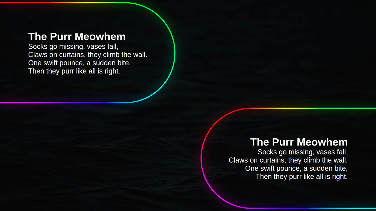
Animated Border Gradient Glow
An animated rainbow border effect with a neon glow, implemented using @property, conic-gradient, and SVG filters. The @keyframes animation smoothly changes the --a CSS variable, which controls the hue in the conic-gradient, creating a continuous color transition.
See the Pen Animated Border Gradient Glow.

ctrl+c ctrl+v Keys RGB
A decorative keyboard with a realistic press effect and dynamic, iridescent RGB backlighting, reminiscent of gaming keyboards.
See the Pen ctrl+c ctrl+v Keys RGB.
Animate Single img Gradient Glow Border With CSS + SVG Filter Enhancement
An animated rainbow border with a neon glow, created using @property, repeating-conic-gradient, and SVG filters. The @keyframes CSS animation continuously changes the --a CSS variable, which controls the angle of the conic-gradient, creating a rotating rainbow effect.
The use of the atan() function in SCSS to calculate the angles for a conic-gradient, which allows for the creation of a complex geometric pattern. The entire page background is set with a single background property, demonstrating the power and conciseness of modern CSS.