4 CSS corner-shape Examples
This updated collection explores the cutting edge of container styling, moving beyond the ubiquitous “rounded rectangle” to offer diverse geometric aesthetics. The CSS corner-shape property allows developers to define complex vertex styles - such as notches (angles), scoops (inverse curves), and bevels - directly in the stylesheet. Using these curated snippets enables distinct UI design languages, perfect for Cyberpunk interfaces, futuristic dashboards, or playful branding, without relying on unsemantic empty <div> hacks or heavy SVG masking.
Technically, these examples demonstrate the future of the CSS Backgrounds and Borders Level 4 specification. We showcase how to use properties like corner-shape: angle alongside standard border-radius to define the size of the cut. Unlike clip-path solutions, which slice off outer shadows and borders, true corner-shape implementations (and their Houdini Paint API polyfills) preserve the box model, allowing for continuous borders and proper box-shadow rendering. The HTML remains clean, applying these shapes purely through visual presentation logic.
Each free demo provides a robust implementation strategy, offering fallbacks for browsers where native support is still behind a flag. Whether you need to download a sci-fi button pack or fork a scooped card design on CodePen, these examples represent the next evolution of box geometry.
Examples
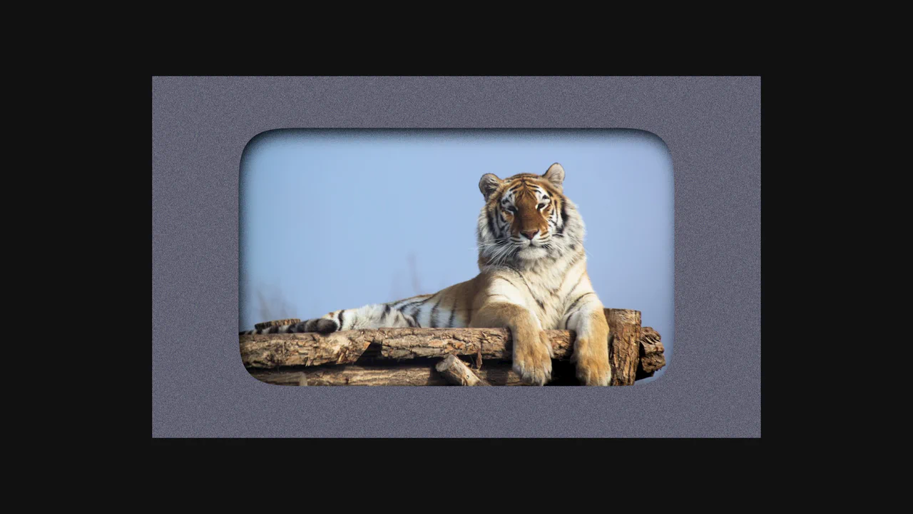
SVG Filter Noise Mask & Squircle Layout
This is an SVG Filter Noise Mask & Squircle Layout. It demonstrates the profound visual impact of chaining SVG <filter> primitives onto standard HTML elements. Its function is to transform a pristine photograph and a flat background into a gritty, atmospheric, cyberpunk-style composition using native browser rendering math instead of pre-processed images in Photoshop.
 Chrome 60+
 Edge 79+
 Firefox 55+
 Safari 11+
See the Pen SVG Filter Noise Mask & Squircle Layout.

Auto-Generated Anchor Positioned TOC
This is an Auto-Generated Anchor Positioned TOC. It parses an article’s heading structure on the fly and constructs a sticky navigation menu. Its primary function is to replace heavy JavaScript scroll-spies (Intersection Observers) with native CSS Anchor Positioning and Scroll Targeting, moving an animated highlight alongside the active content section. (Requires: Tweakpane, GSAP)
Chrome 125+
Edge 125+
See the Pen Auto-Generated Anchor Positioned TOC.

Pure CSS Responsive Hexagon Grid
This is a Pure CSS Responsive Hexagon Grid. It replaces complex SVG or Javascript-driven honeycomb layouts with a purely mathematical CSS approach. Its function is to automatically tile and nest geometric shapes in a tight honeycomb pattern that recalculates rows and offsets on the fly as the parent container resizes.
Chrome 119+
Edge 119+
See the Pen Pure CSS Responsive Hexagon Grid.
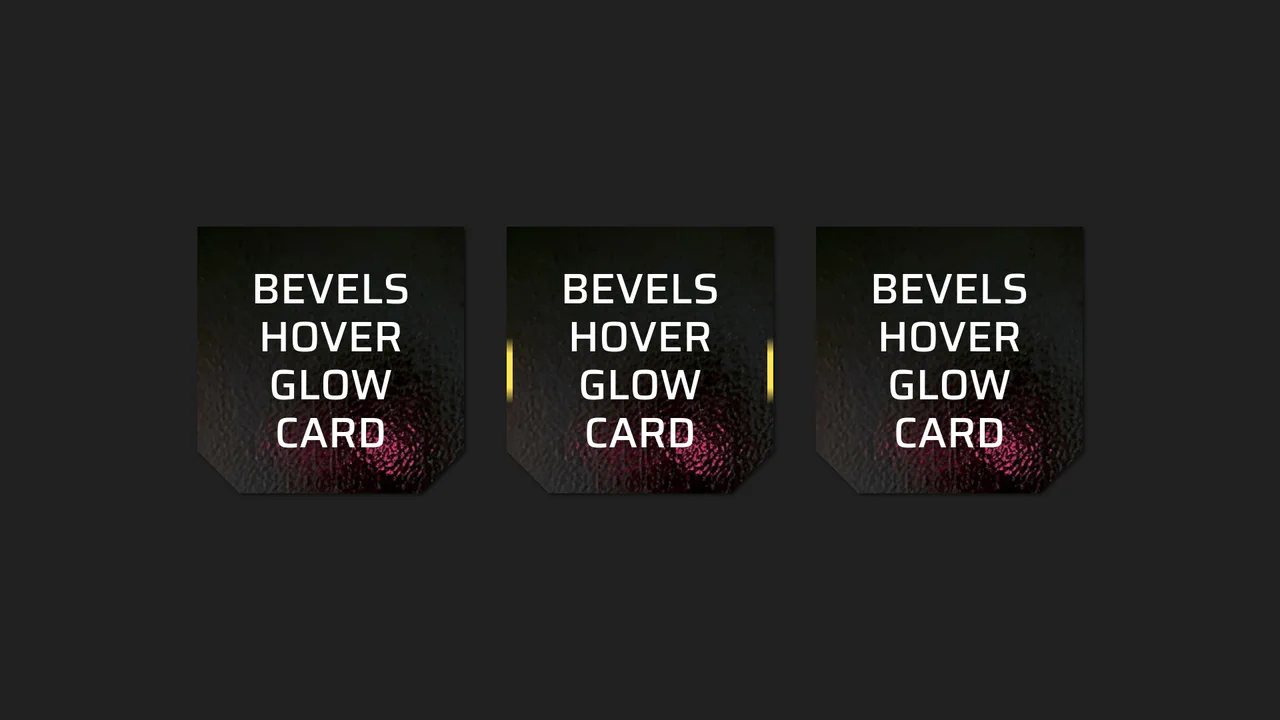
Beveled Corner Glow Cards
This Beveled Corner Glow Card component demonstrates the bleeding edge of CSS UI styling. It primarily utilizes the new corner-shape property to create chamfered (angled) edges without complex clip-paths, while implementing a sophisticated CSS Mask fallback for older engines. The interaction features a “scanning” light beam effect on the border, powered by CSS Houdini for buttery smooth interpolation.
Chrome 120+
Edge 120+
Firefox 120+
Safari 17+See the Pen Beveled Corner Glow Cards.