20+ CSS Corners
Geometry dictates digital structure. Manipulating CSS corners removes rigid barriers between data and the screen, creating organic flow. This updated collection provides modular shapes for modern UI design. Utilizing these curated snippets replaces manual SVG drawing with fast, native browser rendering.
These examples rely on advanced geometric manipulation. The code utilizes clip-path: polygon() for sharp, responsive cutouts and the CSS Paint API for mathematically precise squircles. Hover states leverage hardware acceleration, animating properties like transform and opacity to maintain a 60fps frame rate without reflows. The HTML structure remains strictly semantic, ensuring high layout stability and rapid rendering.
Every free demo is fully responsive and cross-browser compatible. Users can instantly download the raw code or fork a shape on CodePen.
Examples

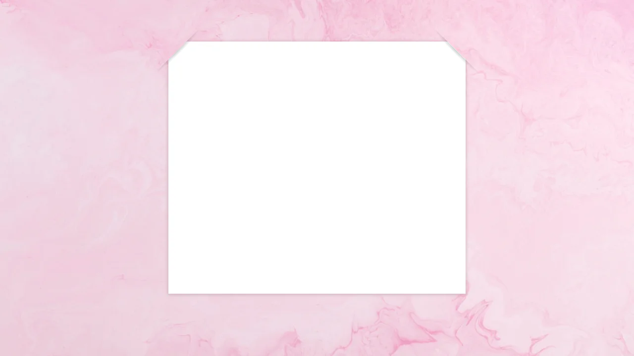
Rounded Triangle CSS Image Mask
This Rounded Triangle CSS Image Mask offers a mathematically perfect way to shape visuals into equilateral triangles with soft, professional edges. It is an ideal choice for high-end portfolio galleries, creative team sections, or landing pages where standard rectangular or circular crops feel too conventional. By leveraging modern CSS math, the shape remains perfectly symmetrical regardless of the image dimensions.
 Chrome 105+
 Edge 105+
 Firefox 121+
 Safari 15.4+
See the Pen Rounded Triangle CSS Image Mask.
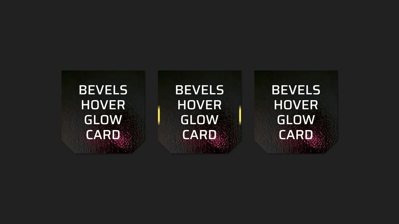
Beveled Corner Glow Cards
This Beveled Corner Glow Card component demonstrates the bleeding edge of CSS UI styling. It primarily utilizes the new corner-shape property to create chamfered (angled) edges without complex clip-paths, while implementing a sophisticated CSS Mask fallback for older engines. The interaction features a “scanning” light beam effect on the border, powered by CSS Houdini for buttery smooth interpolation.
Chrome 120+
Edge 120+
Firefox 120+
Safari 17+
See the Pen Beveled Corner Glow Cards.
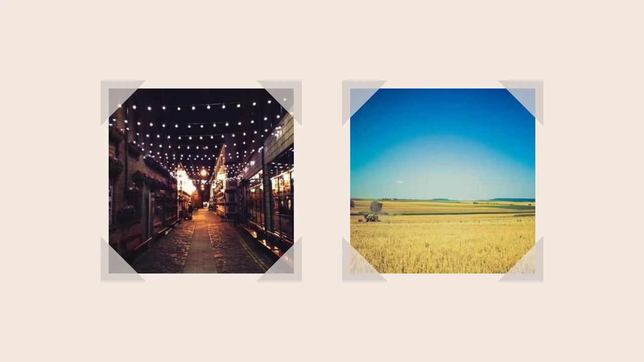
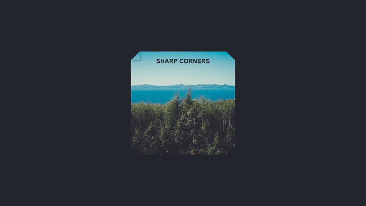
Fancy Corner Decoration for Images
A border effect for an <img> tag - the size of the decorative edge, created with repeating-conic-gradient and -webkit-mask, is dynamically calculated via a complex calc() function controlled by CSS variables.
See the Pen Fancy Corner Decoration for Images.
Smooth Corners with CSS
A progressive technique for creating complex UI shapes using the CSS Houdini Paint API - a squircle is generated by the smooth-corners worklet, surpassing the capabilities of border-radius. The shape’s curvature is dynamically controlled via the --smooth-corners CSS Custom Property, while the effect itself is built with a combination of pseudo-elements, mask, and clip-path.
See the Pen Smooth Corners with CSS.
Inverted Border Boxes
A demonstration of a non-trivial technique for creating inverted rounded corners using ::before pseudo-elements and box-shadow. This trick allows you to “carve out” complex shapes from parent blocks, bypassing the limitations of standard border-radius.
See the Pen Inverted Border Boxes.
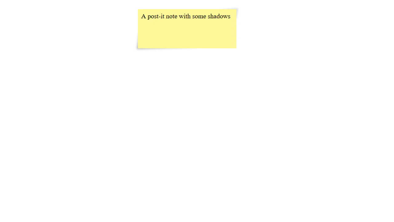
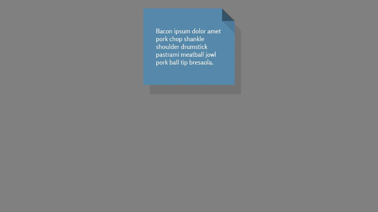
Post-it simulation using pseudo-elements and shadows. :before and :after create 3D paper effect with folded corners, transforms add slight skew for natural look. Inner block with background completes the illusion.
“Bubble” corner effect triggered by hovering an invisible area. Icon transforms into full-screen message through pseudo-element resizing and positioning. Two animation timings separate content and background movement.
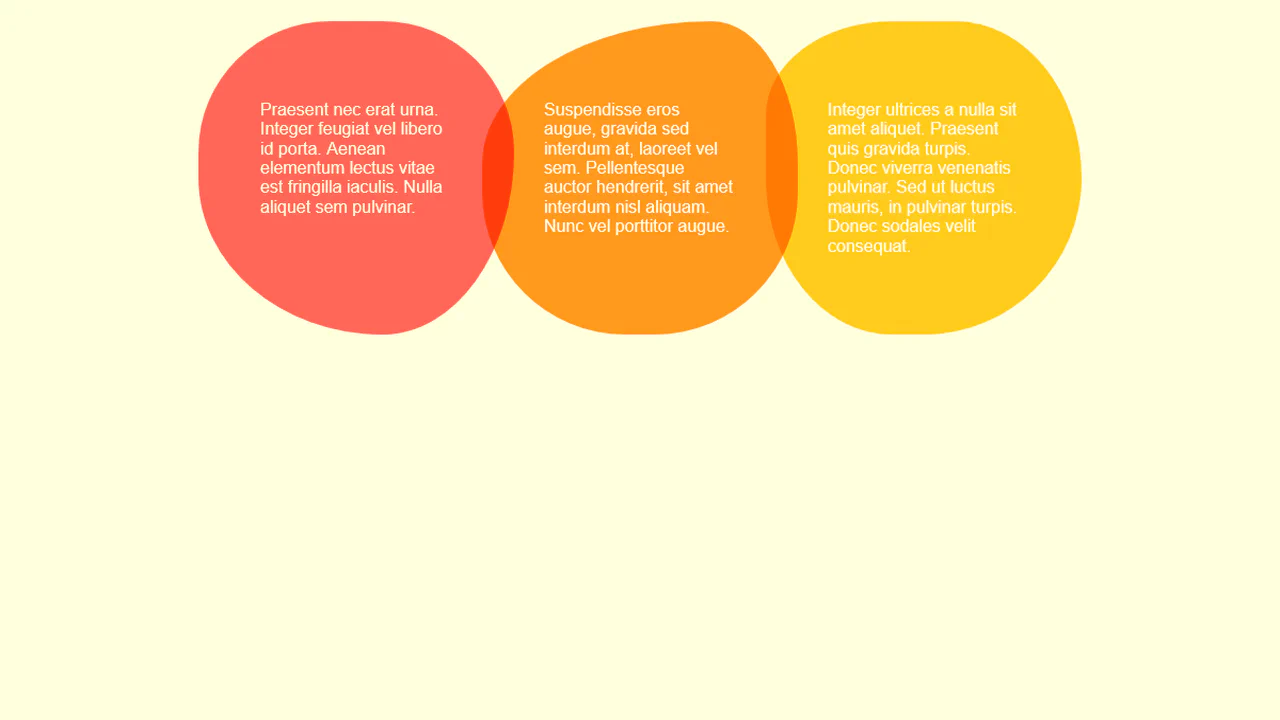
Responsive cards with variable background geometry. CSS variables control pseudo-element position and radius, creating color bleed effect between header and section. Media query changes structure — colored circle shifts based on card parity.
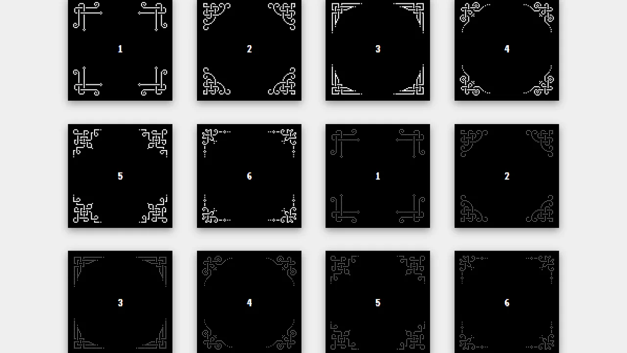
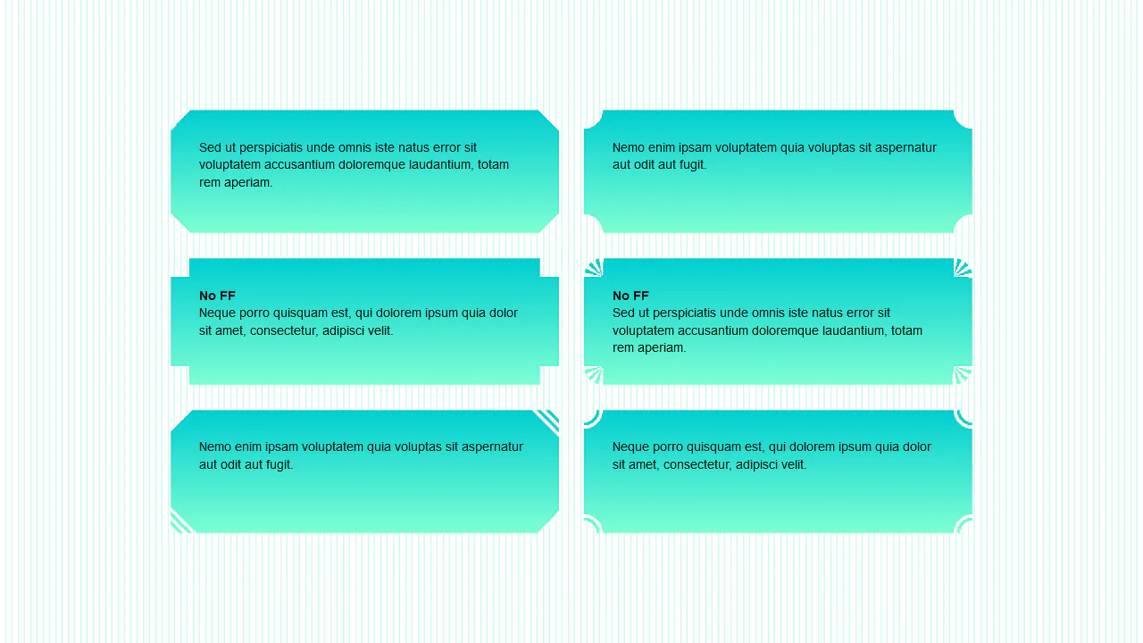
Six corner variants assembled from box-shadow. Each corner draws unique pixel pattern through shadow coordinates. Transform rotation creates symmetry in all four corners. Variant class uses thinner dots.
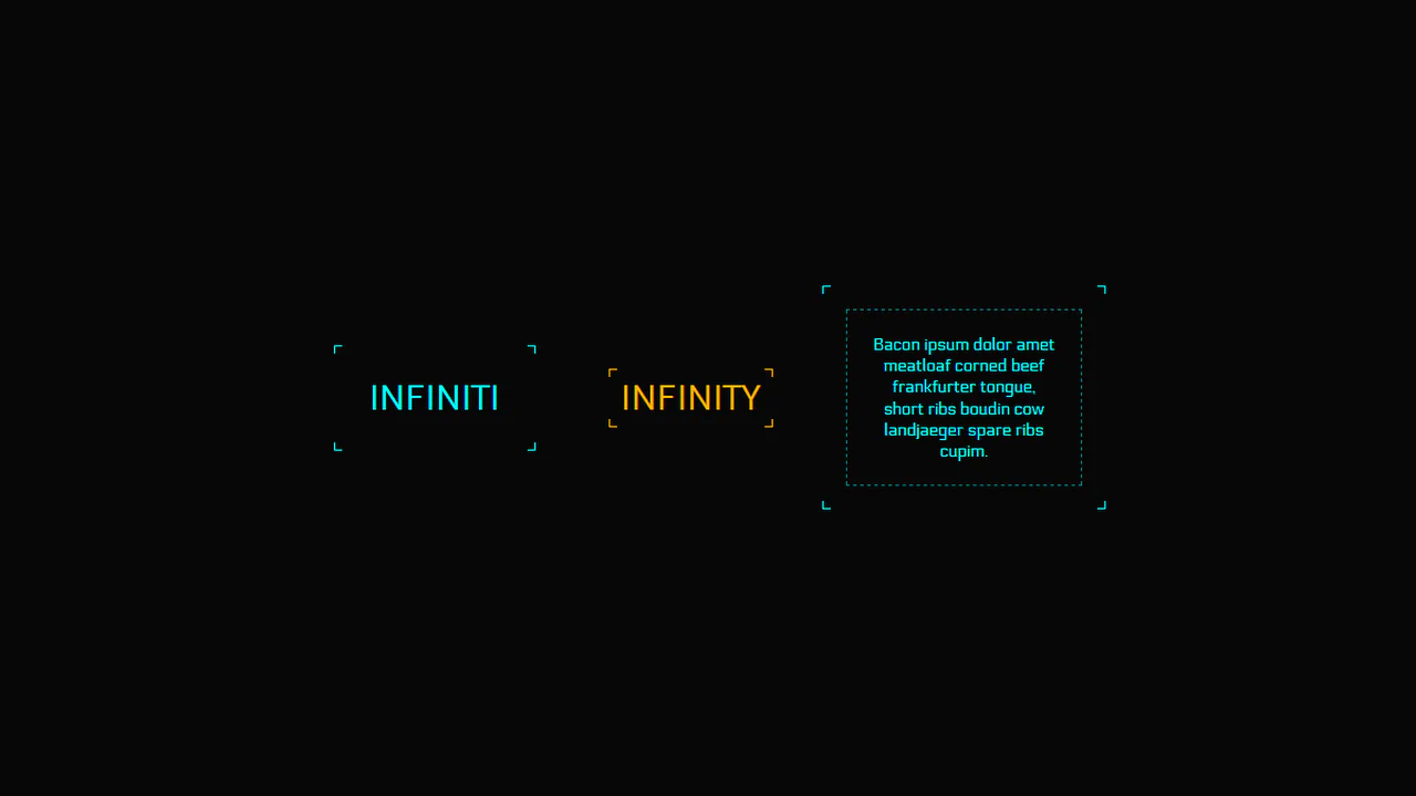
Universal mixin for creating corner frames with animation. Parameters control color, line thickness and position (inside/outside). On hover, corners move creating border pulse effect — logic extracted into reusable code.
Folded corner effect achieved through two gradients and drop-shadow filter. First creates fold triangle, second forms main background with cutout. Pseudo-element adds shadow on fold — no extra wrappers.
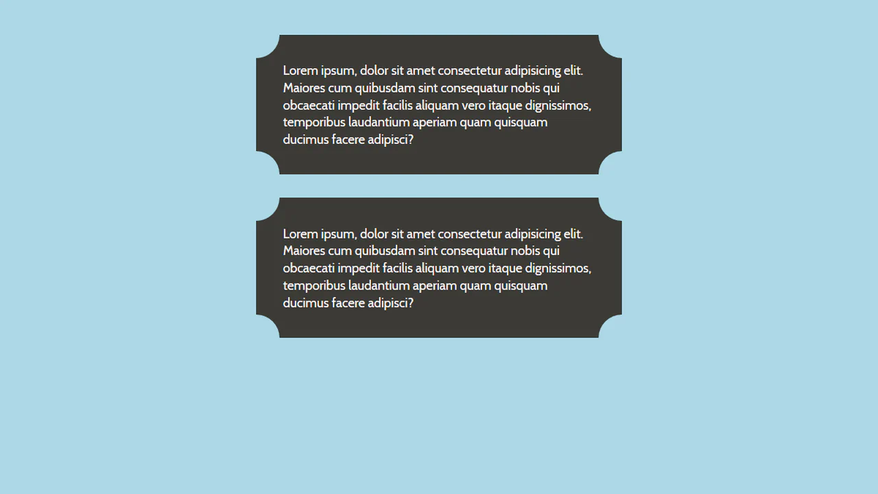
Corner elements created through border property combination. Each corner is a triangle formed by colored border and transparent opposite border. Size controlled by variable, card background can be image.
Corner cutouts created through pseudo-elements with border-radius. Four elements form “recessed” corners on card and text block. Shadows compensate background color — cutout illusion without changing DOM.

Corner Border Button
See the Pen Corner Border Button.

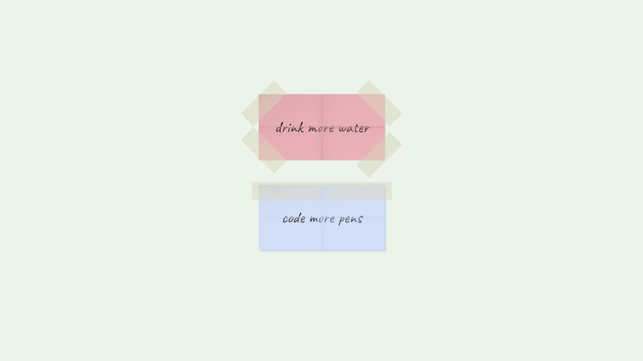
Paper with Sellotaped Corners
Taped Sticky Notes Illustration replicates taped memo pads using CSS gradients. Creases are drawn across the .paper containers using thin crossed lines on a ::after pseudo-element. Translucent adhesive tape strips are rendered at the corners and top using opacity: 0.5 and dotted side borders to mimic torn dispenser edges. It is a highly creative vector layout done entirely without images.
See the Pen Paper with Sellotaped Corners.