10+ CSS Counters
The Pure CSS Counter Examples collection demonstrates how numeric displays function without JavaScript overhead. CSS handles animation, timing, and visual progression — removing barriers between data and visualization.
Counters use CSS animations with steps() to create flip and odometer effects, simulating mechanical digit rotation. CSS Custom Properties store current values, enabling real-time updates through attribute selectors and content pseudo-elements. Progress counters leverage conic-gradient and mask-image for circular fills, while linear variants use linear-gradient with dynamic background-position. Transform-origin and rotate() create spinning number wheels; clip-path isolates visible digits in scrolling displays.
Responsive design scales counter sizes across devices via media queries and calc() functions, maintaining legibility. Accessibility is embedded: semantic HTML ensures screen readers announce numeric changes. ARIA labels clarify counter purpose. The collection includes free CodePen demos, downloadable code, and updated examples. Each snippet prioritizes Core Web Vitals — hardware-accelerated animations via will-change: transform, zero layout shift through fixed container dimensions, minimal repaints using contain: layout.
Every example works in modern browsers (Chrome, Firefox, Safari, Edge). Download, customize, deploy.
Examples
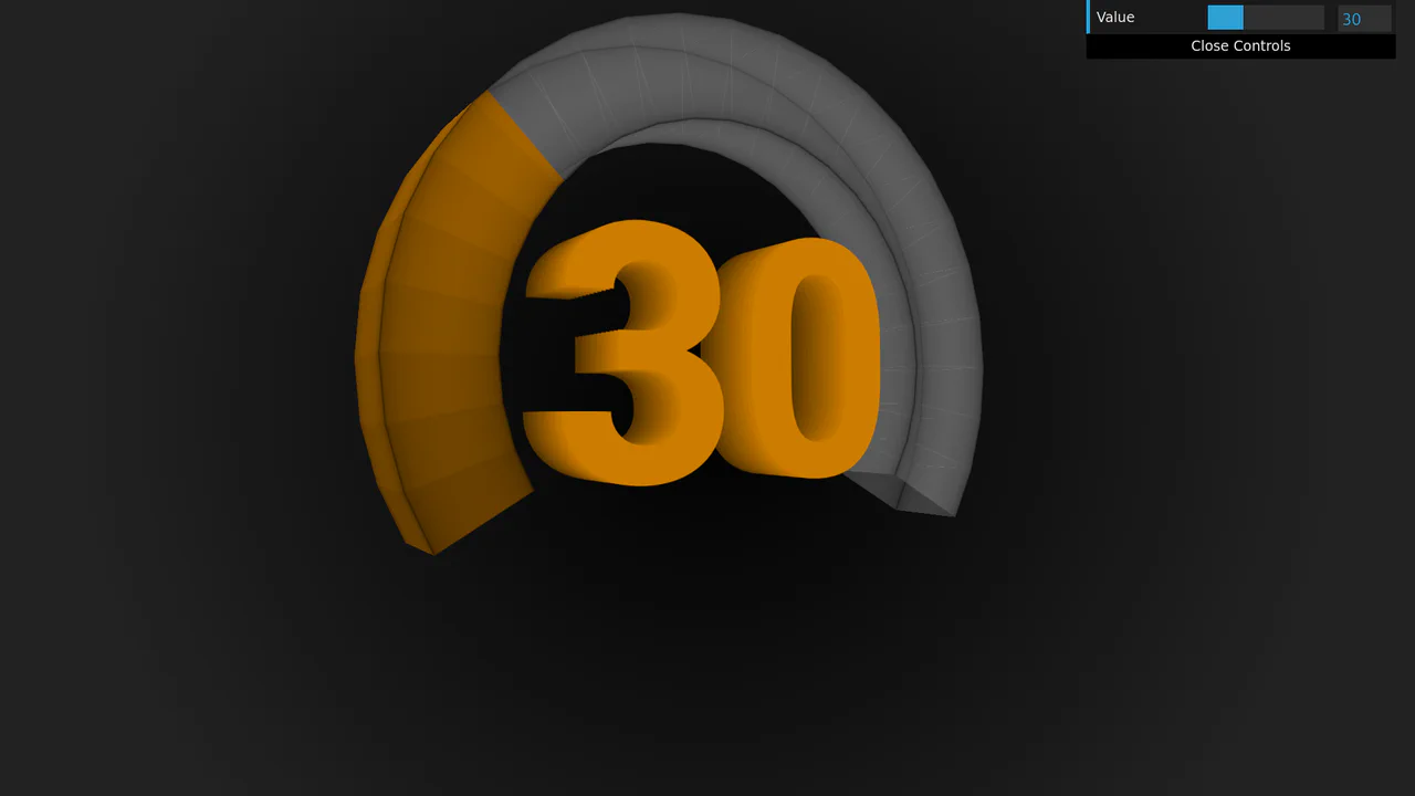
3D Rotating Value Dial
This is a 3D Rotating Value Dial. It visualizes continuous data through a spatial, cylindrical interface. Its function is to replace flat range indicators with a tactile, volumetric readout that dynamically shifts color hue based on value. (Requires: dat.gui)
 Chrome 111+
 Edge 111+
 Firefox 108+
 Safari 15.4+
See the Pen 3D Rotating Value Dial.

Literally Linked Lists
An engaging data comparison tool that transforms static lists into a dynamic relationship map, clearly visualizing taste overlaps via connecting lines.
See the Pen Literally Linked Lists.

Pure HTML/CSS Image Slideshow
A lightweight, fast gallery that operates without JS libraries, supporting keyboard navigation, mobile swipes, and deep linking to specific slides.
See the Pen Pure HTML/CSS Image Slideshow.
A pure CSS number counter leveraging CSS Houdini’s @property to animate an integer custom property.
Metal Gear Solid Soliton Radar States
Atmospheric, lively interface elements mimicking high-tech equipment screens with interference, scrolling data, and a countdown.
See the Pen Metal Gear Solid Soliton Radar States.
The Magic of Cascading CSS Counters
Interactive CSS counter demo with draggable sections. Sortable enables nested block reorganization, tweakpane controls counter start and increment values. shiki generates live syntax highlighting. Visualizes CSS variables --section-start and --section-increment.
See the Pen The Magic of Cascading CSS Counters.
CSS Gradient Counter List
CSS counters generate hierarchical numbers for each list item — the counter increments on every <li>. Gradient text is applied via background-clip: text with a fixed background attachment, creating a color shift. The layout uses flexbox for alignment and a top border separates items. The Pug loop at the bottom would generate 30 static items if compiled.
See the Pen CSS Gradient Counter List.
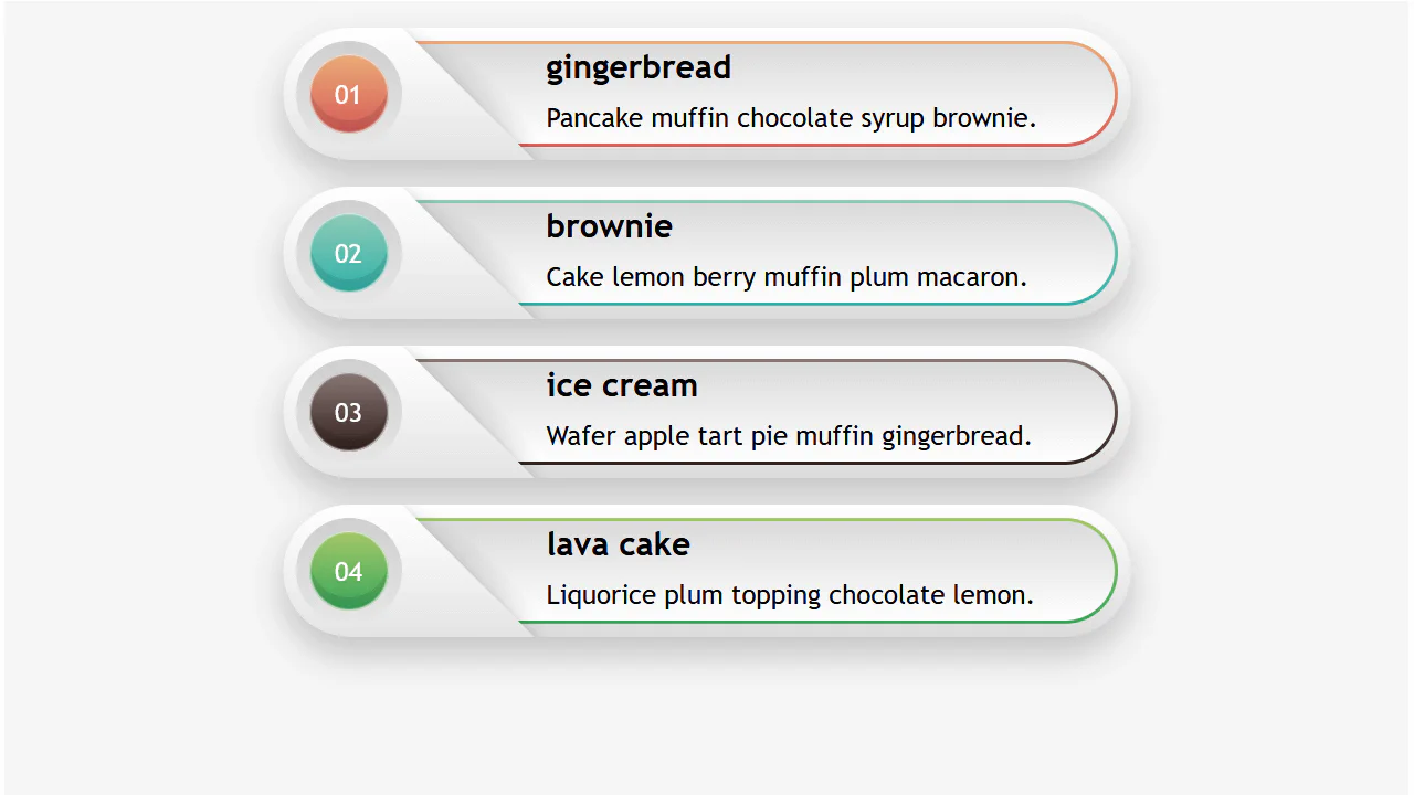
Responsive Infographic
A highly responsive list component utilizing a CSS variable switch technique to toggle layout states.
See the Pen Responsive Infographic.
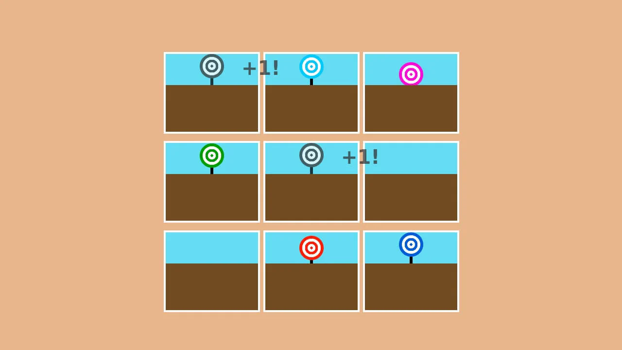
Pure CSS Carnival Game
A fun and dynamic reaction game where the user must click moving targets within a time limit, with the score automatically tracked using CSS.
See the Pen Pure CSS Carnival Game.
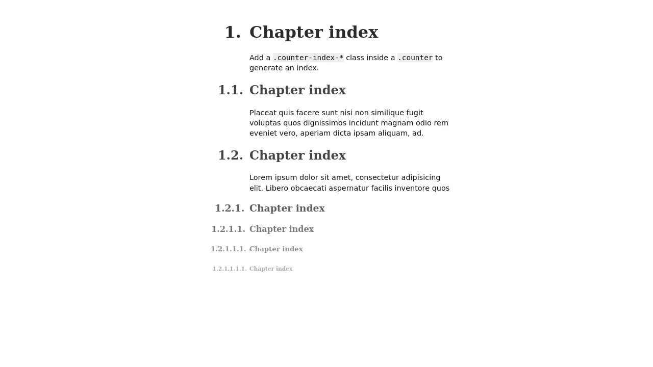
SCSS loop generates a hierarchical index — each heading increments its own counter and resets deeper ones. The ::before pseudo‑element builds a dotted‑number string (e.g., “1.2.1”) using nested counters. The layout uses absolute positioning to place the index numbers in the margin, keeping the text aligned.

A step‑by‑step guide layout using CSS counters — each <h3> automatically increments and displays “STEP 1”, “STEP 2”, etc. On narrow screens, the step number floats left inline; on wider screens, it shifts into the left border using absolute positioning. The design relies on box‑shadow and border for a layered frame effect.

CSS counters generate large step numbers outside each card — the numbers are absolutely positioned and rely on counter-increment. Hover lifts the card with a translate3d effect. The layout uses inline-flex for horizontal alignment on wider screens and switches to stacked blocks on mobile.

CSS counters automatically number list items across multiple <ol> blocks — the counter continues where the previous left off. Background uses two gradients to simulate lined paper; the handwriting font adds a personal touch.
CSS counters track checked and total checkboxes — the “unchecked” counter actually increments for all inputs, so it displays the total count, not the unchecked ones.

3D Flipping Cards
A classic 3D card flip on :hover within a perspective container, plus an elegant solution for auto-numbering items using CSS counters.
See the Pen 3D Flipping Cards.