40+ CSS Cubes (Page 2)
Examples

Quantum Project x Eedi
A 3D dot cube where each face is a separate div and the dots are nested divs. The 3D effect is achieved using transform-style: preserve-3d and perspective, with each face offset along the Z-axis by a different distance.
See the Pen Quantum Project x Eedi.
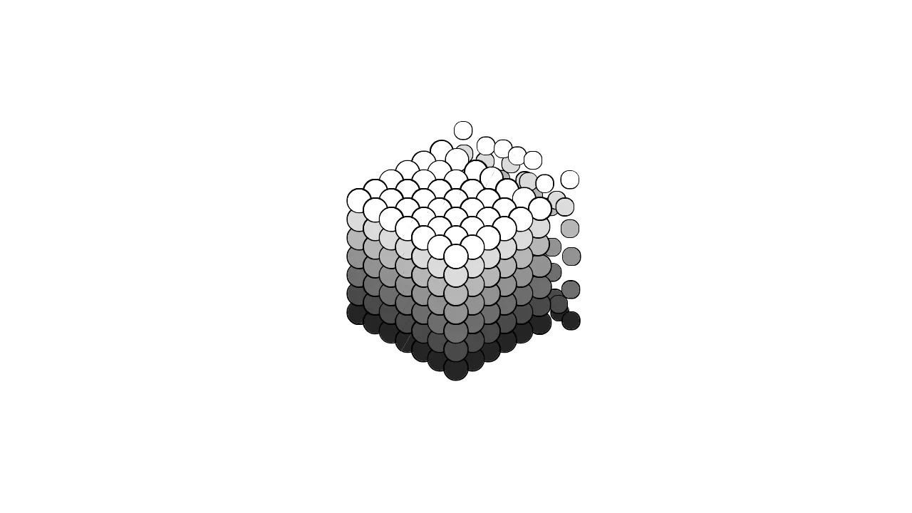
Bubbly
An isometric CSS grid of spherical nodes dispersing from a shared origin. Each ball receives its own --i, --j, --k index via nth-child math, mapped to 3D coordinates through custom properties and translate3d. A cubic-bezier animation alternately collapses all balls to a single point and expands them into a floating cloud, while box-shadow outlines each sphere against a gray-to-white luminance gradient. Zero JavaScript — pure CSS preserve-3d and transform-style.
See the Pen Bubbly.