30+ CSS cubic-bezier Examples
Linear motion feels artificial. This updated collection of CSS cubic-bezier examples removes the robotic barrier of default timing functions, allowing developers to craft custom easing curves that mimic real-world physics. Utilizing these curated snippets ensures animations feel organic, tactile, and intentional, bridging the gap between static states and fluid interaction.
Technically, the cubic-bezier() function defines a timing curve using four control points (P0 to P3). This mathematical precision allows for effects like anticipation, overshoot, and bounce — all calculated natively by the browser. By defining these curves, animations leverage strict hardware acceleration, targeting transform and opacity to maintain a locked 60fps performance on the compositor thread. The HTML remains strictly semantic, as the motion physics are handled entirely by the UI design layer.
Every free demo in this library is fully responsive and cross-browser compatible. Users can instantly download the raw code or fork an updated animation curve on CodePen. These assets are optimized for performance, ensuring a fast, frictionless experience across all modern design systems.
Examples
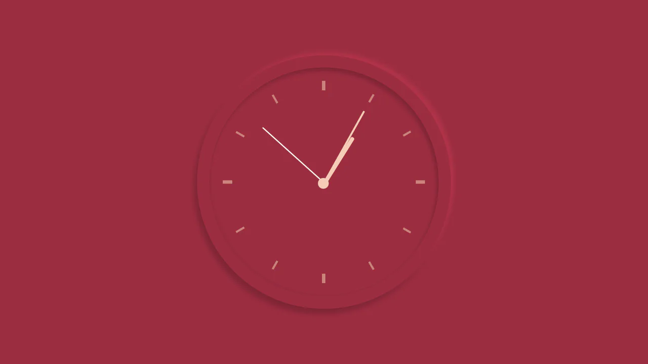
Neumorphic Analog Clock with Springy Hands
An interactive analog clock featuring a rich crimson neumorphic face and springy tick transitions. Built with SCSS and vanilla JavaScript, the script queries local system time and translates hours, minutes, and seconds into corresponding geometric degrees. A custom cubic-bezier timing function adds an organic, elastic bounce to each ticking hand.
 Chrome 36+
 Edge 12+
 Firefox 16+
 Safari 9+
See the Pen Neumorphic Analog Clock with Springy Hands.
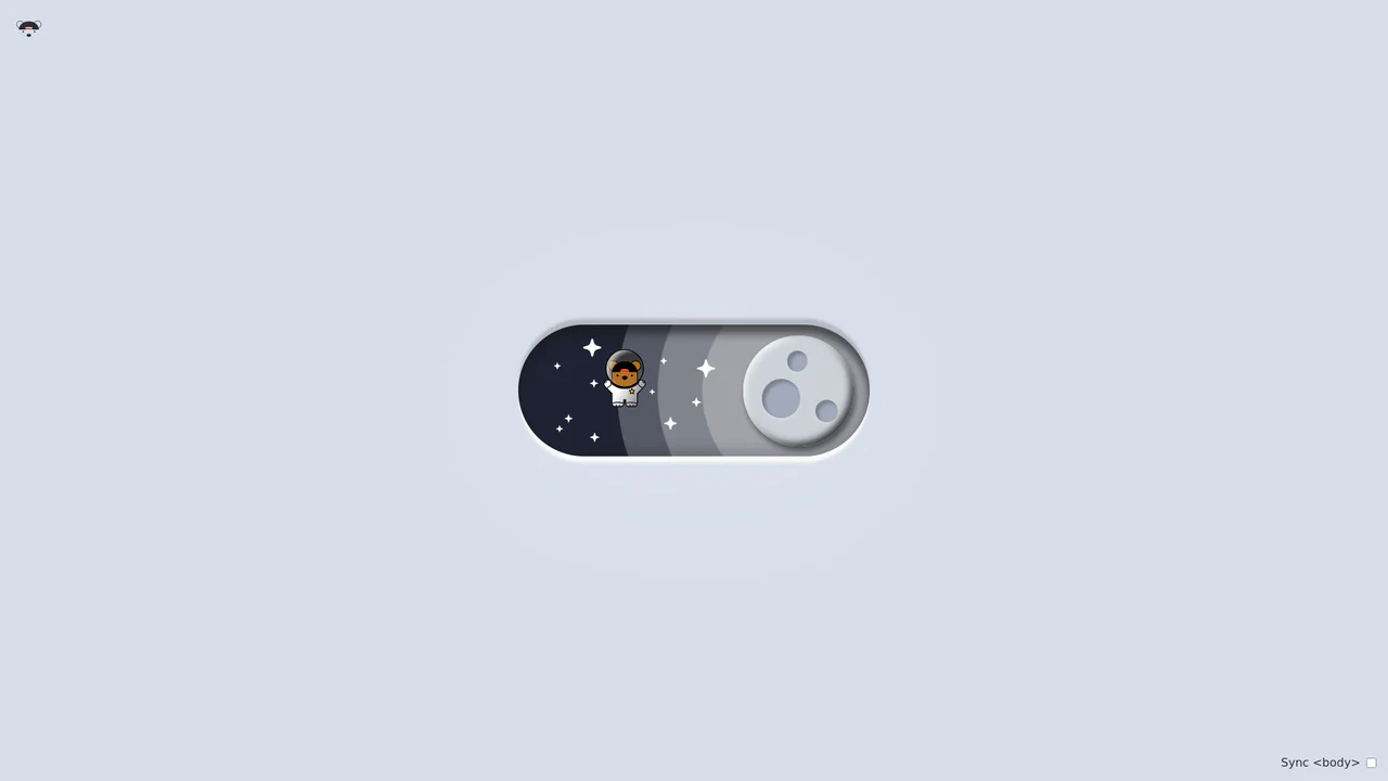
Bouncy Bear Theme Toggle Switch
Bouncy Bear Theme Toggle Switch relies on a clean, accessible HTML <button> to toggle an aria-pressed state, initiating a complex visual narrative that shifts between an aviator bear in light mode and an astronaut bear in dark mode. The animation utilizes modern CSS layout techniques including container-type queries, separate translate declarations, and a heavy-backwards cubic-bezier(.4,-0.3,.6,1.3) curve to achieve physical bounce. While structurally robust, the sheer volume of concurrently transitioning inline SVG paths and scaling stars can generate intensive layout recalculation spikes unless elements are actively isolated via hardware-promoted layers.
Chrome 105+
Edge 105+
Firefox 110+
Safari 16+
See the Pen Bouncy Bear Theme Toggle Switch.

3D Neumorphic Pill Toggle Switch
This is a 3D Neumorphic Pill Toggle Switch. It replaces the default browser checkbox with a tactile, extruded slider mechanism. Its function is to govern binary states (on/off) while providing physical, hardware-like visual feedback to ground the digital interaction in reality.
Chrome 87+
Edge 87+
Firefox 66+
Safari 14.1+
See the Pen 3D Neumorphic Pill Toggle Switch.

Bursting Animated SVG Star Rating
The Bursting Animated SVG Star Rating is an explosive feedback component for user reviews. It replaces standard instantaneous state changes with a multi-layered animation sequence consisting of a ring expansion, radial line “sparks,” and an elastic fill. Its function is to provide high-fidelity tactile validation for user input within forms.
Chrome 80+
Edge 80+
Firefox 63+
Safari 13.1+
See the Pen Bursting Animated SVG Star Rating.

Staggered Animated Hamburger Toggle Button
The Staggered Animated Hamburger Toggle Button is a highly refined navigation trigger. It utilizes aria-pressed states to drive complex, multi-stage CSS transitions. Its function is to provide an accessible, tactile entry point for menus, using staggered motion to visually explain the transformation from a “hamburger” to a “close” icon.
Chrome 99+
Edge 99+
Firefox 97+
Safari 15.4+See the Pen Staggered Animated Hamburger Toggle Button.

Skeuomorphic 3D Elastic Toggle Switch
This is a Skeuomorphic 3D Elastic Toggle Switch. It utilizes multi-layered shadowing and complex keyframe sequences to mimic a physical sliding component embedded in a technical grid. Its function is to transform a standard checkbox into a high-fidelity micro-interaction that emphasizes physical mass and momentum.
Chrome 43+
Edge 12+
Firefox 16+
Safari 9+See the Pen Skeuomorphic 3D Elastic Toggle Switch.
Sliding Line Hamburger Menu Animation
This is a Sliding Line Hamburger Menu Animation. It reinvents the standard three-bar toggle by using internal pseudo-element sliding instead of simple opacity changes. Its function is to provide a high-end, staggered interaction that signals navigation states with mechanical precision.
Chrome 26+
Edge 12+
Firefox 16+
Safari 7+
See the Pen Sliding Line Hamburger Menu Animation.

Interactive Radial Image Carousel
This is an Interactive Radial CSS Image Carousel. It arranges a deck of image cards into a curved, fan-like layout. Its function is to provide an engaging, space-saving gallery interface where hovering over a card gracefully shifts its neighbors away along a circular path, bringing the focused item into clear view without relying on JavaScript math.
Chrome 119+
Edge 119+
Firefox (partial)
Safari 26.2+
See the Pen Interactive Radial Image Carousel.

Anchored Glassmorphic Tab Indicator
This is an Anchored Glassmorphic Tab Indicator. It utilizes the cutting-edge CSS Anchor Positioning API to physically tether a floating visual highlight to the currently active or hovered navigation button. Its function is to provide highly fluid, magnetic feedback without relying on complex JavaScript bounding-box calculations.
Chrome 125+
Edge 125+
Firefox (partial)
Safari (partial)
See the Pen Anchored Glassmorphic Tab Indicator.

Industrial Ember Glow Toggle Switch
This is an Industrial Ember Glow CSS Toggle Switch. It uses layered box-shadow properties and complex radial gradients to simulate a physical, heat-emitting mechanism. Its function is to handle binary states (On/Off) while providing intense visual feedback. The effect relies completely on CSS, bypassing JavaScript to manage its interactive state and idle animations.
Chrome 88+
Edge 88+
Firefox 84+
Safari 14+
See the Pen Industrial Ember Glow Toggle Switch.
Micro-Animated SVG Icon Bar
Static icons are dead pixels; they occupy space but offer no soul. We believe that every interaction — no matter how small — is an opportunity to delight. This navigation bar transforms the mundane act of switching tabs into a tactile event. By embedding the animation logic directly into the SVG structure, we create a system that feels organic, responsive, and deeply crafted. It is not just about showing the user where they are; it is about rewarding them for arriving there.
Chrome 60+
Edge 79+
Firefox 60+
Safari 11+
See the Pen Micro-Animated SVG Icon Bar.

Tectonic Stacked Tooltip Button
This Tectonic Stacked Tooltip creates a sophisticated, industrial-grade micro-interaction. Instead of a simple fade-in, the tooltip constructs itself from multiple sliding “plates” (slabs) that expand outward upon hovering. With its dark aesthetic, noise textures, and precise easing, it fits perfectly into sci-fi games, technical dashboards, or brutalist web designs. (Requires: Google Fonts (JetBrains Mono))
Chrome 60+
Edge 79+
Firefox 55+
Safari 12+
See the Pen Tectonic Stacked Tooltip Button.

CSS Flip-Disc Mechanical Checkbox
This Flip-Disc Mechanical Checkbox brings the satisfying, tactile physics of old-school airport information boards to the web. Instead of a simple tick, selecting an item triggers a 3D rotation of a mechanical disc, flipping it from a dark, inactive side to a glowing orange active side. This creates a high-contrast, industrial aesthetic perfect for system dashboards or retro-themed interfaces.
Chrome 36+
Edge 12+
Firefox 16+
Safari 9+
See the Pen CSS Flip-Disc Mechanical Checkbox .

Extreme Hover with HTML and CSS
A visually dynamic and impressive effect where hovering over a static image transforms it into a complex, 3D-like collage, showcasing the capabilities of CSS transitions and imperative loading control.
See the Pen Extreme Hover with HTML and CSS.

Real-time Clock
An analog clock with a mechanical ticking effect driven by cubic-bezier transitions and precise rotation logic.
See the Pen Real-time Clock.

Simple and Responsive Image Slider
A smooth, responsive image slider where slides glide horizontally via container translation, featuring dynamic navigation dots and adaptive resizing.
See the Pen Simple and Responsive Image Slider.

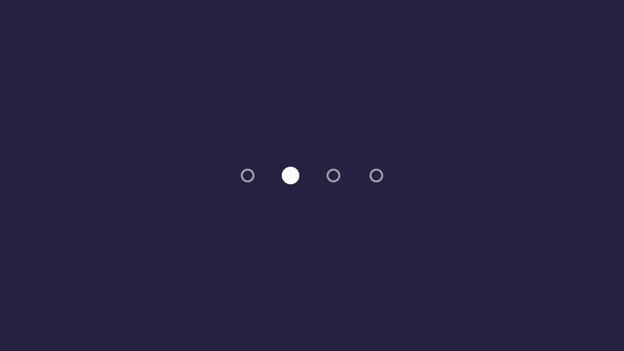
Segmented/Pill Radio Input
A sliding segmented control that uses CSS Custom Properties calculated via JS to animate a pseudo-element background. The layout relies on flexbox for equal distribution, while calc() dynamically positions the “pill” based on the active index, enhanced by a springy cubic-bezier transition.
See the Pen Segmented/Pill Radio Input.

Form Wave Animation
Clicking the input field doesn’t just slide the label up; instead, it playfully ‘hops’ letter by letter, adding a micro-interaction that brings the form to life.
See the Pen Form Wave Animation.

Rotating Navigation
An interactive card stack that fans out into a deck-like display upon toggling. JavaScript handles the state transition by toggling classes, triggering CSS cubic-bezier transitions that rotate and translate the cards from a bottom-center origin, creating a smooth, elastic opening animation accompanied by a rotating navigation button.
See the Pen Rotating Navigation.
Sliding Dot Pagination
This pagination component’s core logic is managed in SCSS, where the .active class (toggled by a minimal JavaScript snippet) triggers a transform: translateX() on a .pagination-current element, creating a fluid “sliding dot” effect. The user experience is further enhanced by a series of polished micro-interactions on the :hover and :active states, which use transform transitions with custom cubic-bezier timing functions to create subtle scaling and “squash and stretch” animations.
See the Pen Sliding Dot Pagination.
Colorful Popup Hamburger Menu
A “fan-out” circular menu in pure CSS, where the hamburger icon animation and cascading item reveal are triggered by the “checkbox hack.” The reveal effect uses transform: translate3d() with transition-delay, and the animation’s liveliness is achieved through complex cubic-bezier curves, giving it a natural “elastic” bounce.
See the Pen Colorful Popup Hamburger Menu.
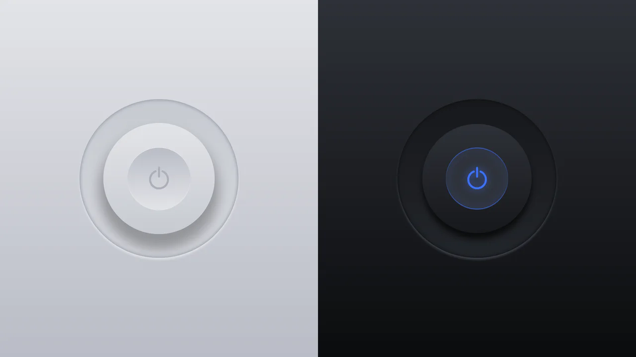
Glowing On/Off Buttons
A skeuomorphic toggle button where the entire press effect is implemented in pure CSS using box-shadow and transform: scale(). JavaScript is only used to toggle the WAI-ARIA attribute aria-pressed on click.
See the Pen Glowing On/Off Buttons.

3D Capsule Slider Button
A combination of the ‘checkbox hack’ and 3D transforms to create an interactive neumorphism-style switcher. JavaScript only adds classes, while the entire transform: rotateX() animation and complex box-shadow are controlled by CSS.
See the Pen 3D Capsule Slider Button.

Animated Day/Night Toggle Switch
An implementation of a complex animated switcher in pure CSS, where a single line of JS is only used to toggle the .is-active class - the rest is the magic of transform and custom properties.
See the Pen Animated Day/Night Toggle Switch.
CSS Image Stack Cycle
An exceptionally complex image slider/stack UI component, fully implemented via CSS custom properties and CSS Houdini to allow the animation of abstract numerical values; the system uses complex mathematics to control the 3D stacking order, the “fly-out” effect, and random rotation, creating a looping, cascading stack with smooth transitions.
See the Pen CSS Image Stack Cycle.
A high-precision visual timer that starts counting upon page load, operating smoothly (for hundredths) and rhythmically (for seconds), demonstrating the power of pure CSS for time management.

Comic Director Splash Animation
A dynamic splash screen where the layer reveal choreography is built on transform and transition-delay, applied to each element via :nth-child. The final layer “explodes” spectacularly using @keyframes and a custom cubic-bezier function, with the entire animation optimized for hardware acceleration.
See the Pen Comic Director Splash Animation.
A stylish “hipster” image card featuring a lifted paper effect created with rotated pseudo-elements and shadows.
Link Split Hover Effect
A “tearing” text effect created by layering two <span>s with an asymmetrical clip-path. On hover, transform shifts the top part, ::after pseudo-elements draw the tear line, and an underline animates via background-position - the entire choreography is managed by transition-delay and a custom cubic-bezier function.
See the Pen Link Split Hover Effect.
Hover Effect #2
A performant text-swapping effect on hover, built on a synchronized animation - the original <span> is displaced by a ::after pseudo-element. The replacement content is sourced from a data-replace attribute via attr(), while smoothness and performance are ensured by transform: translate3d and a custom cubic-bezier function.
See the Pen Hover Effect #2.