30+ CSS cubic-bezier Examples (Page 2)
Examples
Material Design: Profile Card
This is a technically complex Material Design demo, relying on intricate CSS animation precisely controlled by @keyframes and Bézier curves, which creates a sequential element reveal effect; the key feature is the four-stage transformation of the card from a circle to a rectangle and the dynamic background fill, while the entire layout is responsive via media queries.
See the Pen Material Design: Profile Card.
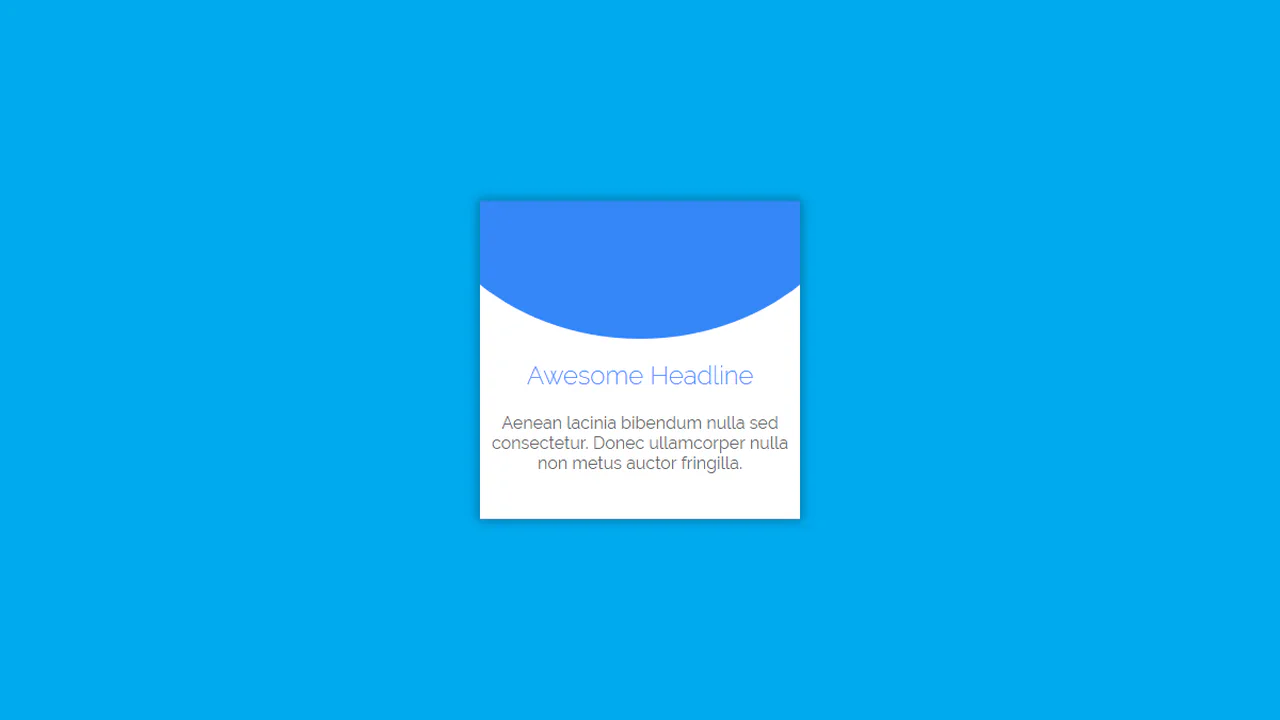
Material Card with Animated Featured Image
A pure CSS card transformation effect on :hover, where a circular background element morphs into a rectangle via a transition of the border-radius property, while a custom cubic-bezier(.3, 0, 0, 1.3) function gives the motion a unique “elasticity”.
See the Pen Material Card with Animated Featured Image.
Button Hover Animation
A complex “add” button hover animation where the text is replaced by a cross and the border “draws” itself. On hover, the .fl and .sfl layers fill the button with color, hiding the text, while pseudo-elements animate their width and height to create the border. The cross animation uses cubic-bezier and transition-delay for an “assembly” effect, and the <i> icon morphs from a plus to an arrow.
See the Pen Button Hover Animation.
Animated Ghost Button 2
The button features a complex, non-linear hover effect powered by a cubic-bezier transition curve and CSS transform: translate3d applied to the inner .mask element, creating a sweeping diagonal light wipe effect.
See the Pen Animated Ghost Button 2.
Drip Drop Animation
A dynamic, JavaScript-free animation of a water drop falling and rippling, using a specific cubic-bezier easing function to precisely simulate the realistic acceleration and motion of the falling object.
See the Pen Drip Drop Animation.