360+ CSS Custom Property Examples
Hard-coded values create design debt. This updated collection of CSS Custom Property examples removes the friction of maintaining static stylesheets. By defining relationships rather than fixed values, these snippets create a logic-driven system where a single change can cascade through the entire UI. The code becomes the single source of truth for the design.
Technically, Custom Properties (variables) are scoped to the elements they are declared on, inheriting down the DOM tree. The code showcases their use for everything from color theming and dark mode toggles to fluid spacing and modular font scales. Interactive states leverage hardware acceleration, animating properties linked to variables to ensure 60fps performance. This maintains absolute layout stability while keeping the HTML structure strictly semantic and lightweight.
Every free demo in this library is fully responsive and cross-browser compatible. You can instantly download the raw code or fork an updated theming engine on CodePen. These assets are strictly optimized for performance and accessibility, delivering a fast, maintainable foundation for any modern design system.
Examples
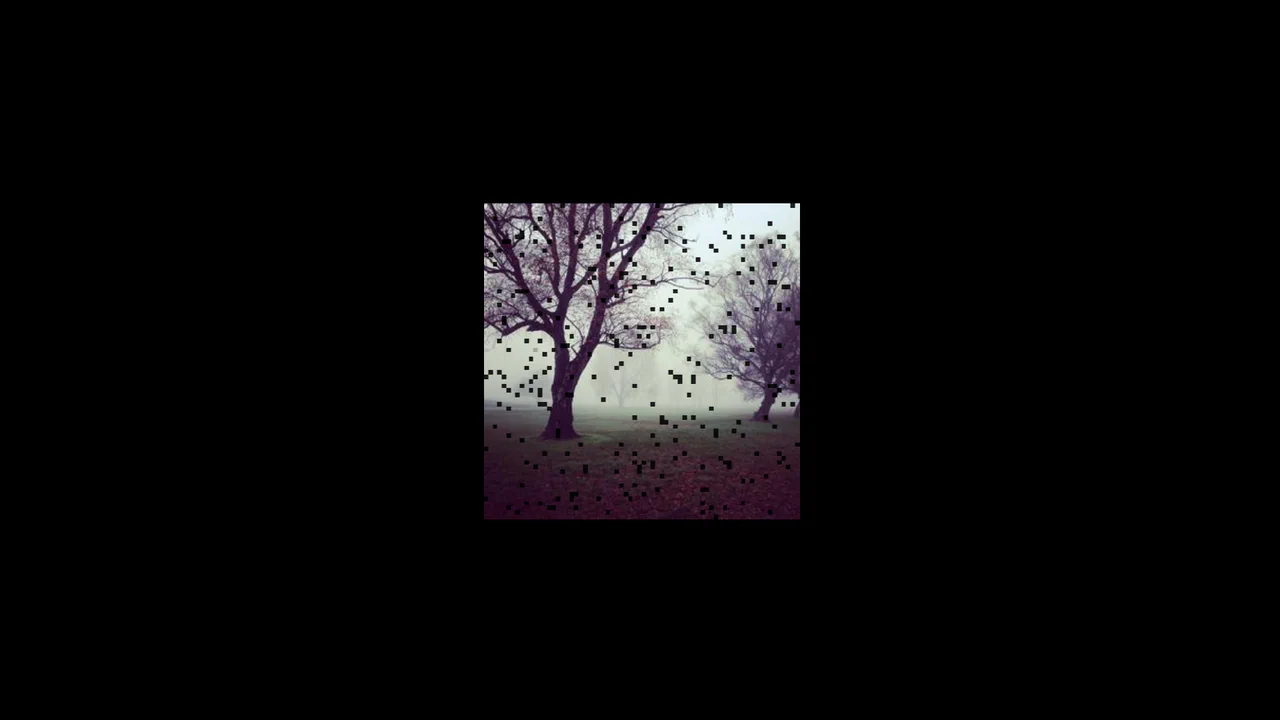
CSS Mask Glitch Image Effect
The CSS Mask Glitch Image Effect creates a high-performance glitch animation on an <img> element using pure CSS. By combining custom properties, an optimized set of -webkit-mask-position coordinates, and mask-composite: exclude (or xor), it slices the image into a dynamically shifting grid. The keyframe animation handles the rapid displacement of the mask slices without relying on external libraries or heavy JavaScript.
 Chrome 120+
 Edge 120+
 Firefox 53+
 Safari 15.4+
See the Pen CSS Mask Glitch Image Effect.
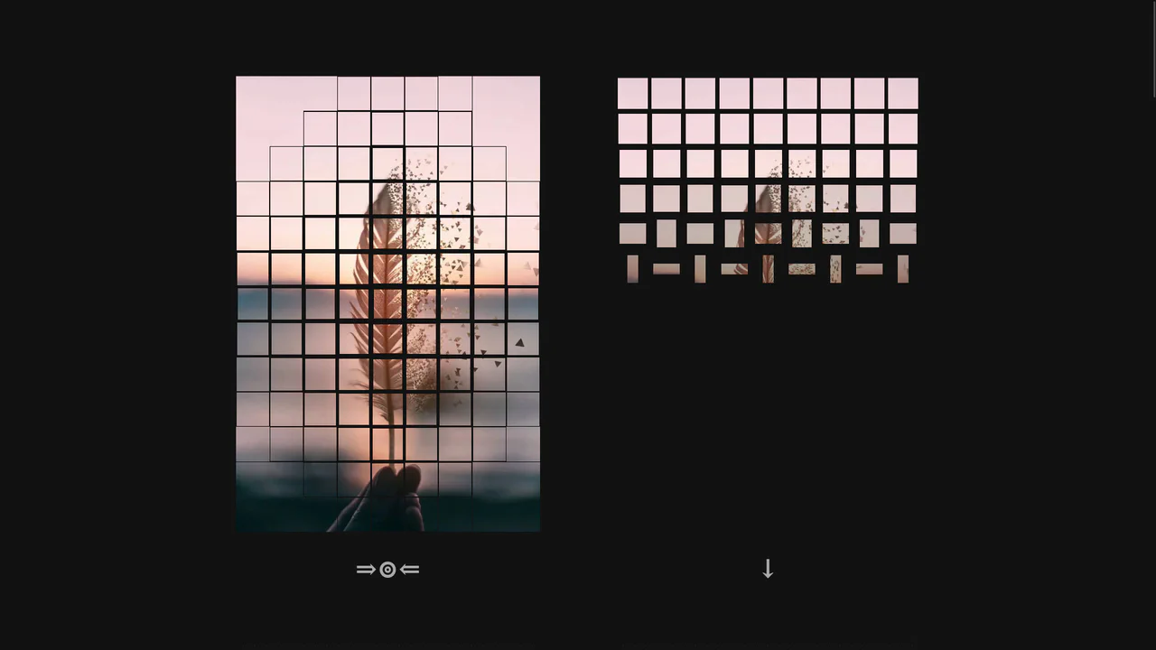
Directional 3D Flip Grid Animation
This component dynamically fragments an image container into a grid of 3D-flipping tiles upon click. The JavaScript controller parses directional formulas to assign coordinated stagger delays via CSS custom properties. Each tile performs an alternate rotation using CSS 3D transforms and keyframe animations, offering fourteen distinct wave-like patterns without requiring canvas drawing or external WebGL libraries.
Chrome 49+
Edge 12+
Firefox 49+
Safari 10+
See the Pen Directional 3D Flip Grid Animation.
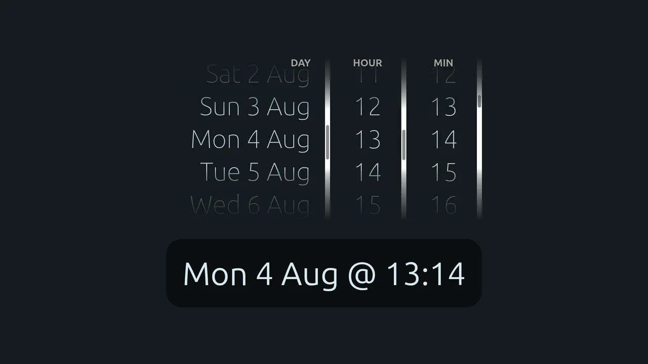
Native CSS Scroll Snap Time Picker
This date and time wheel selector leverages the cutting-edge CSS Scroll Snap Events API to build an efficient mobile-style picker. By registering event listeners for scrollsnapchanging and scrollsnapchange, the layout dynamically updates the select state in real time as the wheels rotate. It uses native CSS scroll-start-target-block to set initial positions, offering a smooth, lightweight solution.
Chrome 129+
Edge 129+
Safari 18+
See the Pen Native CSS Scroll Snap Time Picker.
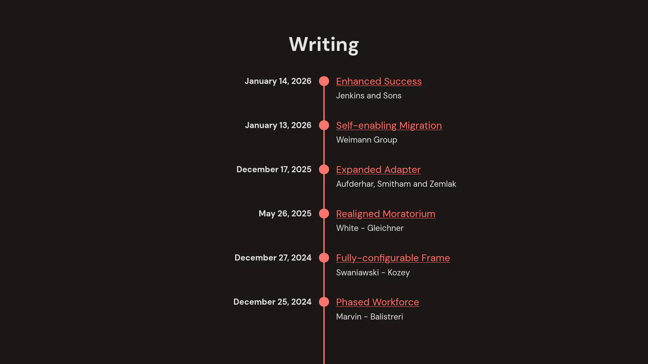
Observer-Animated Responsive Vertical Timeline
This chronological content layout uses an Intersection Observer to fade and slide events smoothly into view as the user scrolls. Utilizing Faker to populate mock data, the ES6 script generates semantic <time> and <small> nodes on load. On larger viewports, the grid transitions to a split layout with left-aligned dates, while a native @media query auto-toggles dark mode. (Requires: faker.js)
Chrome 51+
Edge 15+
Firefox 55+
Safari 12.1+
See the Pen Observer-Animated Responsive Vertical Timeline.
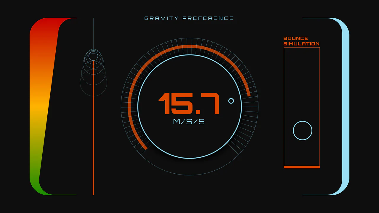
Sci-Fi Gravity Simulation Dashboard
An interactive sci-fi dashboard demonstrating variable physics and dynamic UI synchronization. Powered by GSAP and Draggable plugins, users can manipulate gravity parameters through either a rotary SVG dial or a vertical linear range slider. Adjusting the inputs scales the bouncing ball simulation’s trajectory height and speed in real-time, while simultaneously morphing variable font weights and HUD color gradients. (Requires: gsap.js, scroll-trigger.js, draggable.js)
Chrome 62+
Edge 79+
Firefox 63+
Safari 11.1+
See the Pen Sci-Fi Gravity Simulation Dashboard.
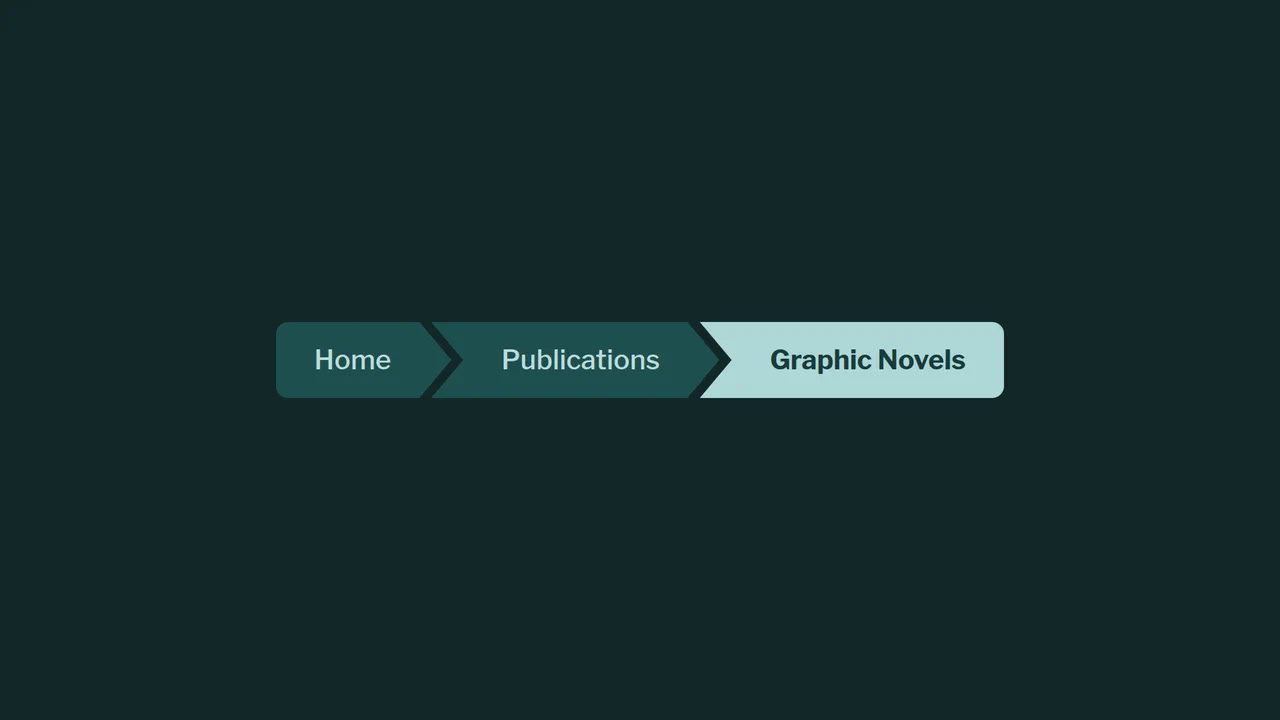
Beveled Chevron CSS-only Breadcrumbs
A highly experimental, CSS-only breadcrumb navigation component styled with geometric chevron shapes. By overlapping adjacent elements and applying a polygonal clip-path mask, it creates continuous, interconnected markers. The visual styling leverages CSS relative color syntax, relative color-mix() mixing, and experimental corner beveling properties.
Chrome 119+
Edge 119+
See the Pen Beveled Chevron CSS-only Breadcrumbs.
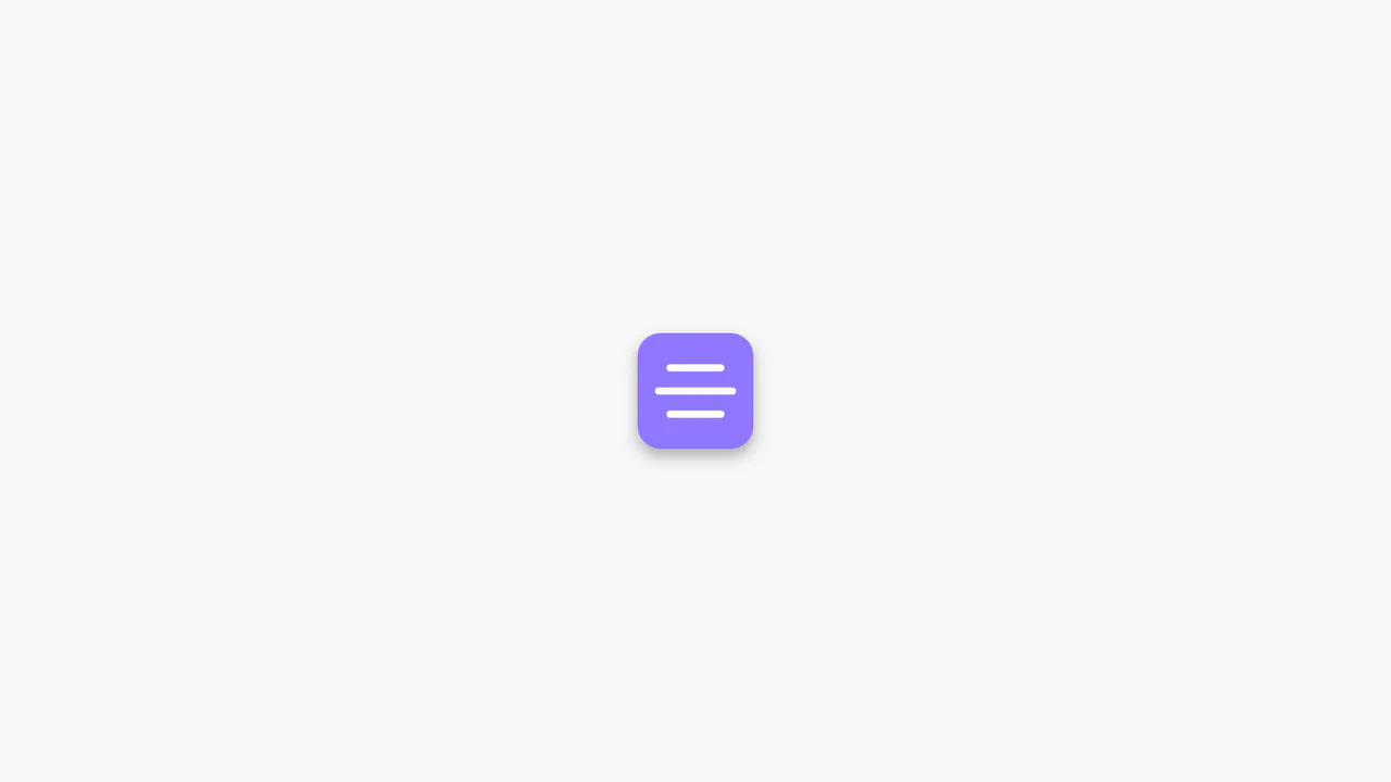
Animated CSS Hamburger Menu Icon
Animated CSS Hamburger Menu Icon transforms a standard three-line menu into a close button. JavaScript toggles an active class, while CSS handles the heavy lifting. The middle line slides out using translateX, and the outer lines rotate 45 degrees via transform. Simultaneously, the background and icon colors invert. A clean, lightweight micro-interaction for mobile navigation headers.
Chrome 49+
Edge 15+
Firefox 31+
Safari 10+
See the Pen Animated CSS Hamburger Menu Icon.
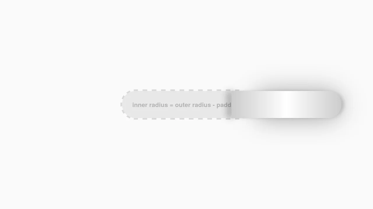
Interactive CSS Tear Strip Animation
Interactive CSS Tear Strip Animation simulates the satisfying physical action of tearing open a cardboard package. It cleverly uses an invisible <input type="range"> linked to the CSS Scroll-Driven Animations API (animation-timeline: --thumb). As the user drags the slider, CSS variables dynamically update clip-path, box-shadow, and transform properties to reveal the content beneath while curling the torn strip. A JavaScript fallback ensures compatibility for browsers without native scroll-timeline support.
Chrome 115+
Edge 115+
Firefox 110+
Safari 16.4+
See the Pen Interactive CSS Tear Strip Animation.
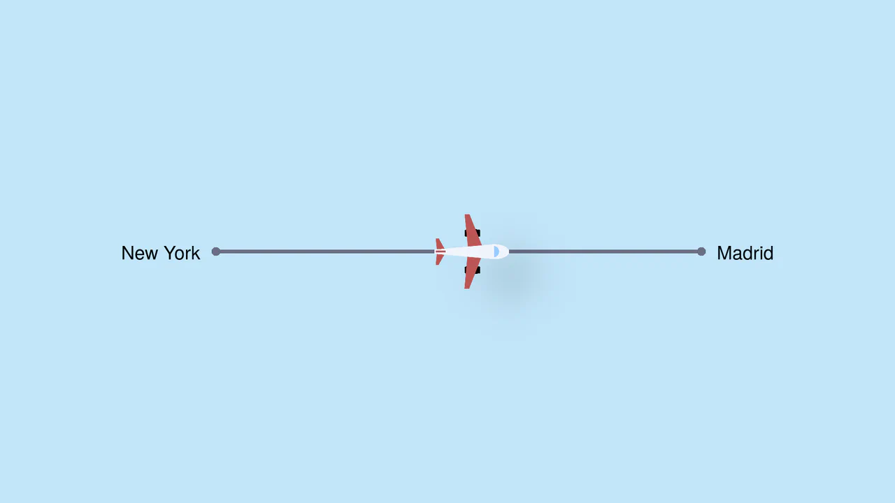
Pure CSS Trigonometric Flight Range Slider
Pure CSS Trigonometric Flight Range Slider uses CSS math functions like sin() and clamp() to dynamically scale a custom airplane thumb and cast realistic altitude shadows based on the input’s current percentage. It features a responsive container query that swaps the plane for a helicopter on narrow screens, and includes dedicated high-contrast mode styles for robust accessibility.
Chrome 111+
Edge 111+
Firefox 110+
Safari 16+
See the Pen Pure CSS Trigonometric Flight Range Slider.

Single Div Vintage TV CSS Illustration
Single Div Vintage TV CSS Illustration is a masterclass in CSS gradient art. Using only one div and its ::before/::after pseudo-elements, it renders a retro television set. The body, screen, antenna, and speaker grill are meticulously drawn using layered linear-gradient, radial-gradient, and repeating-linear-gradient. The mask-image property is cleverly used to carve out the control knobs. A brilliant example of pushing CSS drawing to its limits.
Chrome 53+
Edge 79+
Firefox 53+
Safari 15.4+
See the Pen Single Div Vintage TV CSS Illustration.
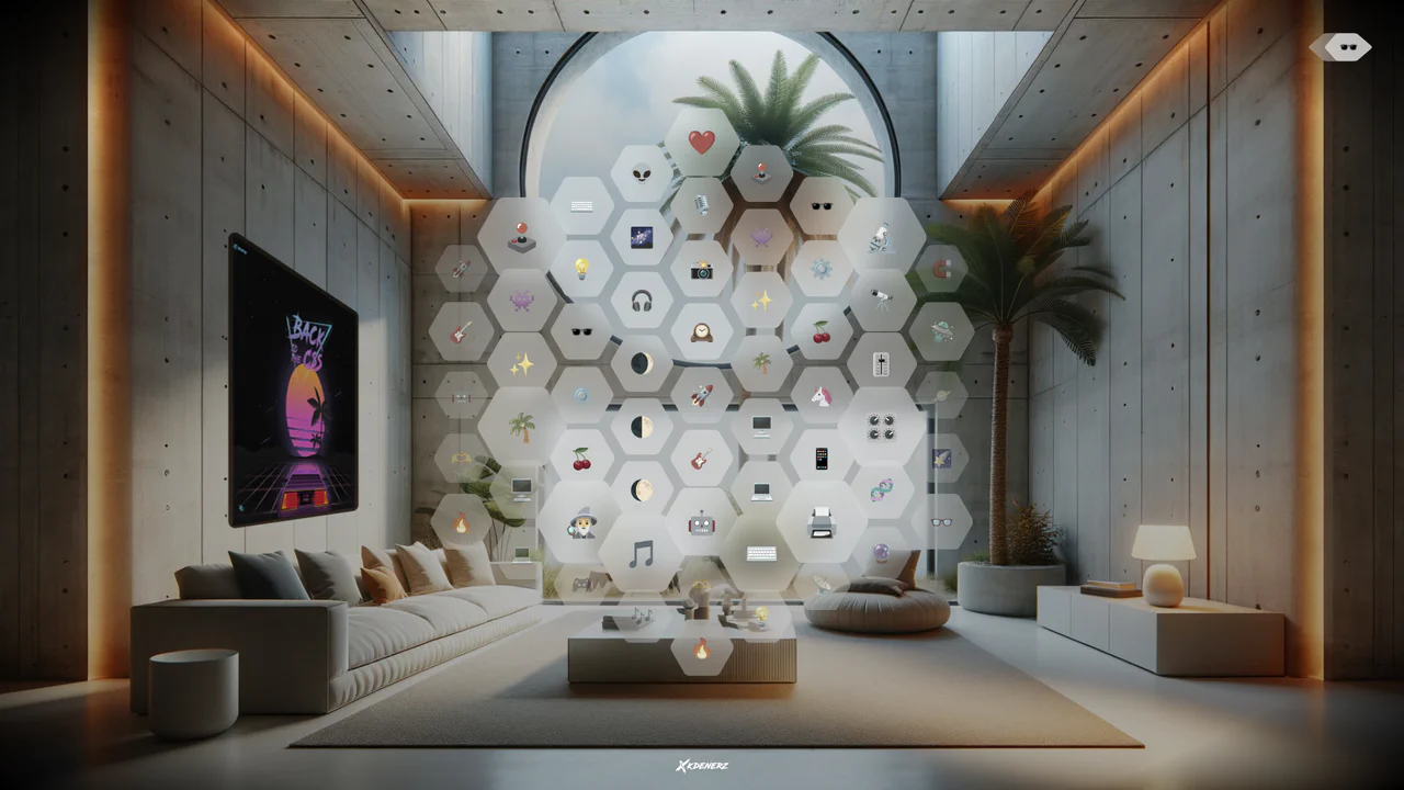
VisionOS Hexagonal App Grid Ripple
VisionOS Hexagonal App Grid Ripple recreates the spatial UI aesthetic of Apple VisionOS. It uses complex clip-path polygons to form the hexagons and backdrop-filter for the glassmorphism effect. The standout feature is the JavaScript-calculated ripple animation: on click, JS measures the distance from the target to every other hexagon, updating a CSS custom property (--ripple-factor) to stagger the CSS @keyframes delay radially.
Chrome 111+
Edge 111+
Firefox 113+
Safari 16.2+
See the Pen VisionOS Hexagonal App Grid Ripple.
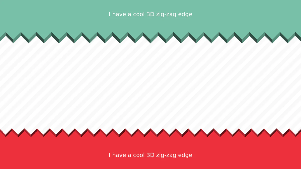
3D Zig-Zag Edge CSS Dividers
3D Zig-Zag Edge CSS Dividers creates a paper-cut illusion using only CSS. It relies on conic-gradient applied to both the background (for shading) and -webkit-mask (for the jagged shape). CSS variables control the size and depth of the teeth. This approach requires zero extra DOM elements or SVG files, making it a highly optimized solution for section transitions.
Chrome 69+
Edge 79+
Firefox 83+
Safari 12.1+See the Pen 3D Zig-Zag Edge CSS Dividers.
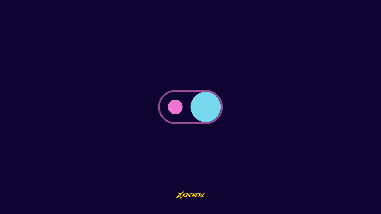
Gooey Liquid SVG Filter Toggle Switch
Gooey Liquid SVG Filter Toggle Switch uses a classic SVG filter trick — combining a blur (feGaussianBlur) with a high-contrast color matrix (feColorMatrix) — to achieve a fluid, organic morphing effect. The sliding thumb dynamically deforms and stretches before snapping into place. Built with modern CSS custom properties and individual transform properties, it includes a simple JavaScript loop for continuous demonstration.
Chrome 111+
Edge 111+
Firefox 113+
Safari 16.2+See the Pen Gooey Liquid SVG Filter Toggle Switch.
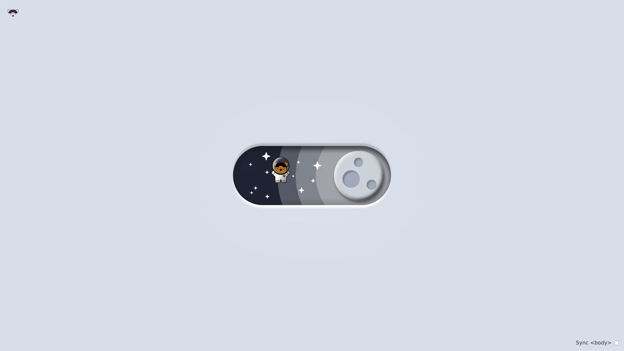
Bouncy Bear Theme Toggle Switch
Bouncy Bear Theme Toggle Switch relies on a clean, accessible HTML <button> to toggle an aria-pressed state, initiating a complex visual narrative that shifts between an aviator bear in light mode and an astronaut bear in dark mode. The animation utilizes modern CSS layout techniques including container-type queries, separate translate declarations, and a heavy-backwards cubic-bezier(.4,-0.3,.6,1.3) curve to achieve physical bounce. While structurally robust, the sheer volume of concurrently transitioning inline SVG paths and scaling stars can generate intensive layout recalculation spikes unless elements are actively isolated via hardware-promoted layers.
Chrome 105+
Edge 105+
Firefox 110+
Safari 16+See the Pen Bouncy Bear Theme Toggle Switch.
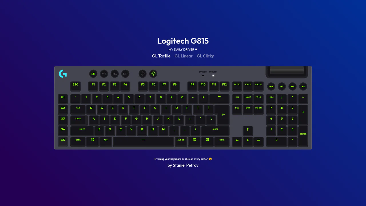
Interactive Mechanical Keyboard Audio Simulation
Interactive Mechanical Keyboard Audio Simulation utilizes a highly detailed CSS grid structure to align complex multi-row vector keys and simulate a physical G815 layout. A central event listener handles key interaction by mapping event.code to correspond with data-key attributes on target DOM nodes, simultaneously triggering dedicated audio samples of tactile, linear, or clicky switch sounds. While the visual depth is elegantly achieved with layered CSS shadow offsets and custom hex shading, firing unthrottled HTML5 audio playback on rapid typings can lead to output buffer congestion or slight audio delays on standard browsers.
Chrome 57+
Edge 16+
Firefox 52+
Safari 10.1+
See the Pen Interactive Mechanical Keyboard Audio Simulation.

Direction Aware 3D Cube Gallery
This is a Direction Aware 3D Cube Gallery. It tracks the exact angle at which a cursor enters or leaves an image tile, applying a responsive 3D cube rotation that follows the mouse’s trajectory. Its function is to provide highly contextual, physical feedback during interaction, making a flat image grid feel like an array of tangible, rotatable blocks.
Chrome 60+
Edge 79+
Firefox 55+
Safari 11+
See the Pen Direction Aware 3D Cube Gallery.

CSS 3D Morphing Geometric Polyhedron
This is a 3D Morphing Geometric Polyhedron. It seamlessly transitions a six-sided cube into a twelve-sided rhombic dodecahedron through continuous spatial interpolation. Its function is to serve as a highly complex visual anchor or loading state, demonstrating advanced volumetric transformations without relying on WebGL or external physics engines.
Chrome 85+
Edge 85+
Safari 16.4+
See the Pen CSS 3D Morphing Geometric Polyhedron.
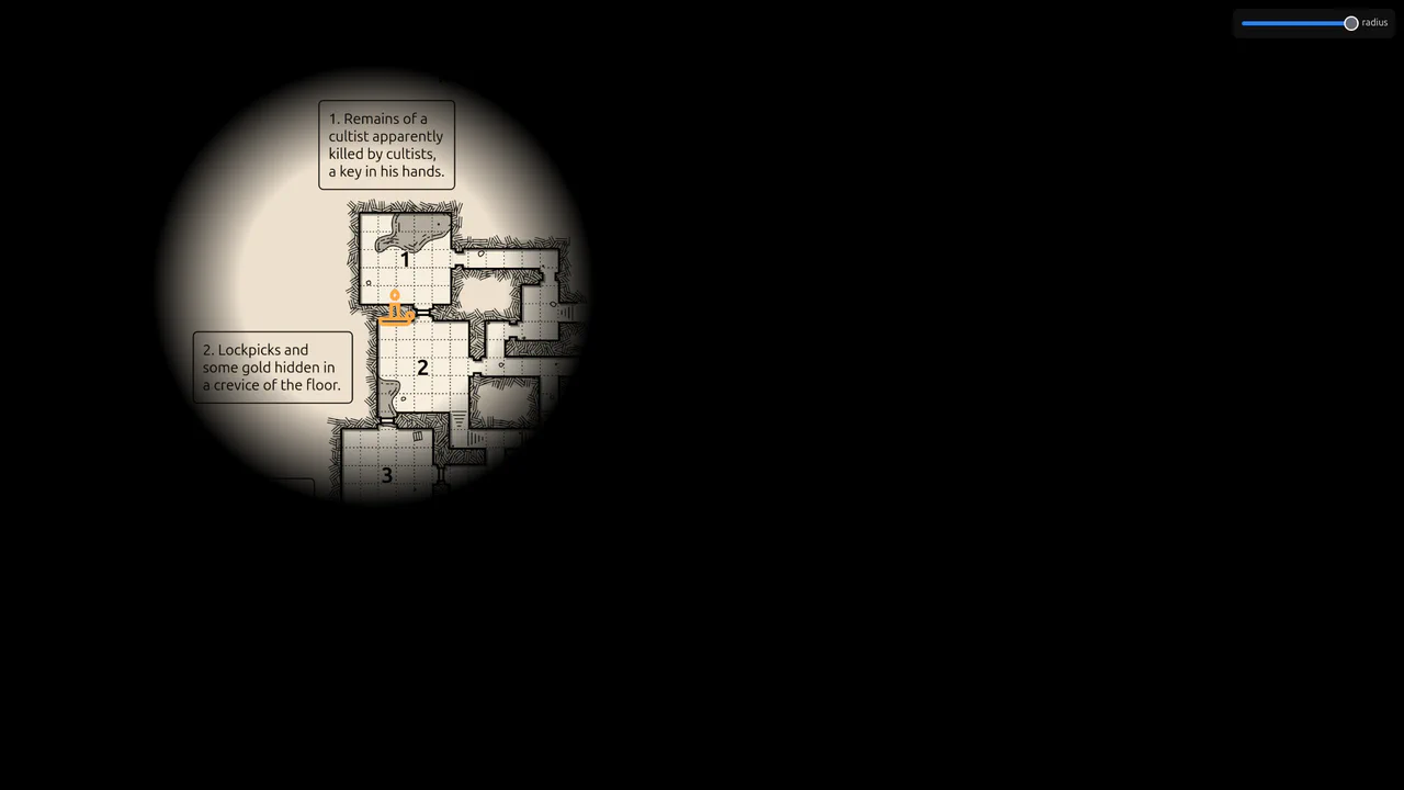
Flickering Torchlight Reveal Overlay
This is a Flickering Torchlight Reveal Overlay. It pairs a custom cursor with a dynamic radial mask to selectively expose underlying content. Its function is to restrict visibility to the immediate cursor vicinity, replacing open layouts with an exploratory, constrained interaction model.
Chrome 80+
Edge 80+
Firefox 75+
Safari 14+
See the Pen Flickering Torchlight Reveal Overlay.
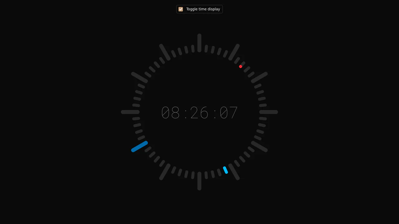
Minimalist Radial Dot Clock
This is a Minimalist Radial Dot Clock. It visualizes time through three concentric rings of geometric dots (hours, minutes, seconds) rather than traditional sweeping hands. Its function is to provide an ambient, modern alternative to standard analog or digital readouts, integrating seamlessly into high-end, futuristic interfaces.
Chrome 123+
Edge 123+
Safari 17.5+
Firefox 120+
See the Pen Minimalist Radial Dot Clock.
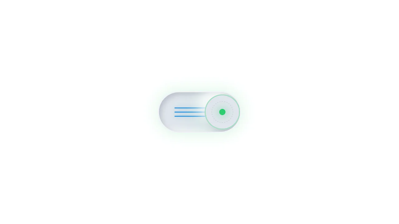
Neumorphic Mechanical Toggle Switch
This is a Neumorphic Mechanical Toggle Switch. It replaces the default browser checkbox with a tactile, extruded hardware-style button. Its function is to govern binary states (on/off) while providing strong physical visual feedback through inverted shadows, glowing indicators, and spring-loaded motion.
Chrome 80+
Edge 80+
Firefox 70+
Safari 14+
See the Pen Neumorphic Mechanical Toggle Switch.
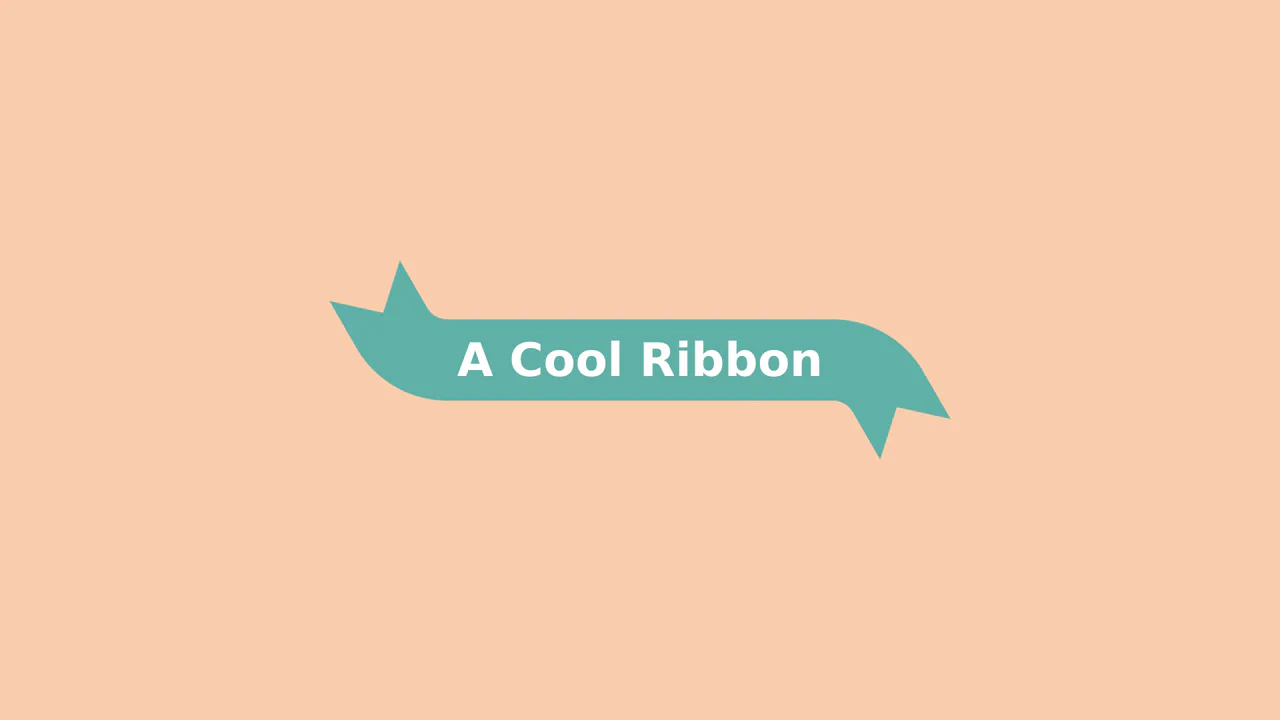
Animated 3D Folding Ribbon
This is an Animated 3D Folding Ribbon. It decorates standard heading text with pseudo-element tails that dynamically fold backward in 3D space upon interaction. Its function is to elevate standard static title banners or badge elements into interactive, spatially-aware UI focal points.
Chrome 111+
Edge 111+
Firefox 117+
Safari 16.4+See the Pen Animated 3D Folding Ribbon.

Pure CSS Faded Infinite Text Marquee
This is a Faded Infinite CSS Text Marquee. It creates a continuous, horizontal scrolling display for text elements using advanced CSS animation math. Its function is to showcase lists of keywords, tags, or announcements in a constrained space, using gradient masks to seamlessly blend the moving text into the background.
Chrome 104+
Edge 104+
Firefox 104+
Safari 14.1+See the Pen Pure CSS Faded Infinite Text Marquee.
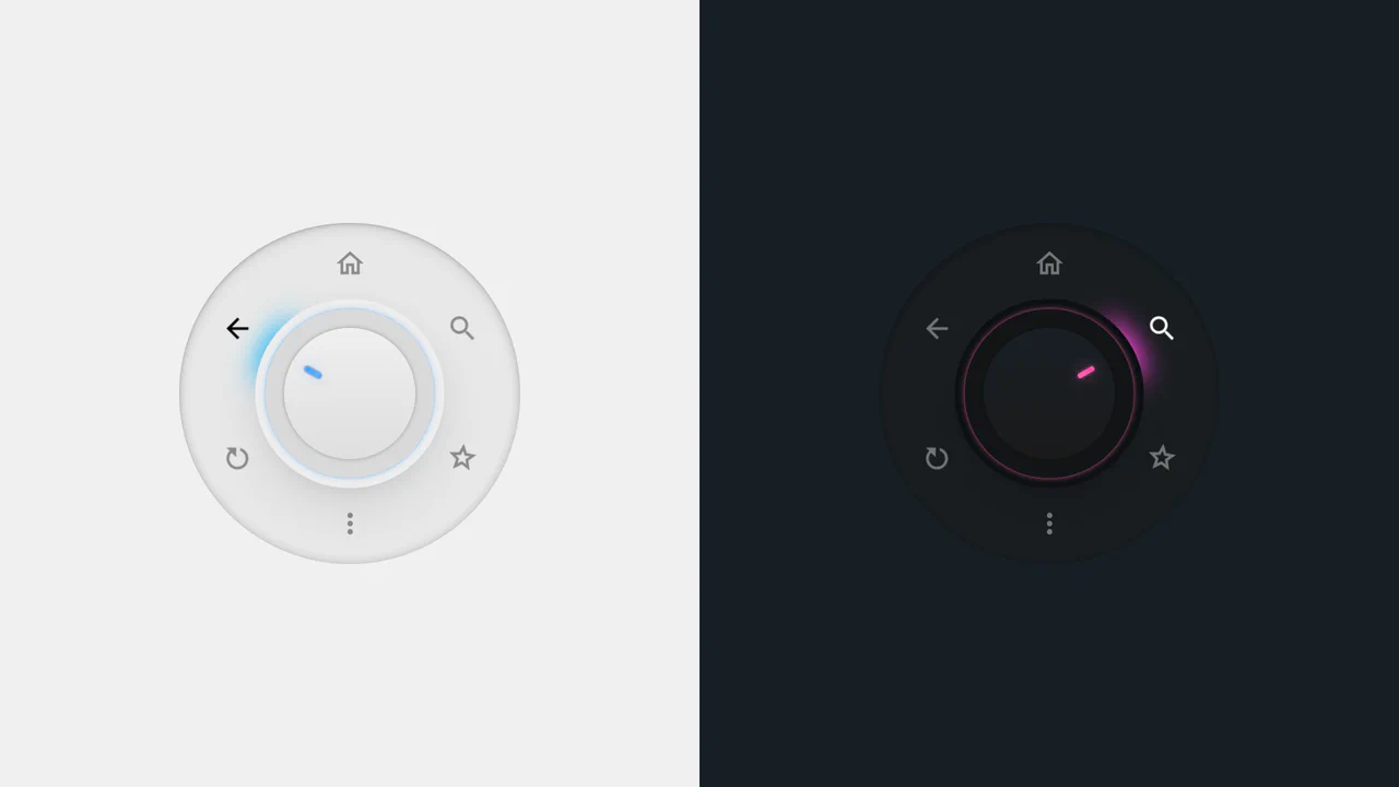
Radial Dial Control Menu
This is a Radial Dial Control Menu. It replaces traditional linear dropdowns with a rotary, hardware-inspired interface. Its function is to provide rapid, omnidirectional access to secondary actions, utilizing the user’s spatial memory and reducing cursor travel distance.
Chrome 115+
Edge 115+
Safari 16.4+
Firefox 128+
See the Pen Radial Dial Control Menu.

Sci-Fi Glowing Triangle Loader
This is a Sci-Fi Glowing Triangle Loader. It animates three spheres along the edges of a neon-lit geometric path while rotating in 3D space. Its function is to serve as a high-fidelity visual placeholder during asynchronous data fetching, establishing a strong thematic aesthetic immediately upon application launch.
Chrome 104+
Edge 104+
Firefox 104+
Safari 14.1+
See the Pen Sci-Fi Glowing Triangle Loader.
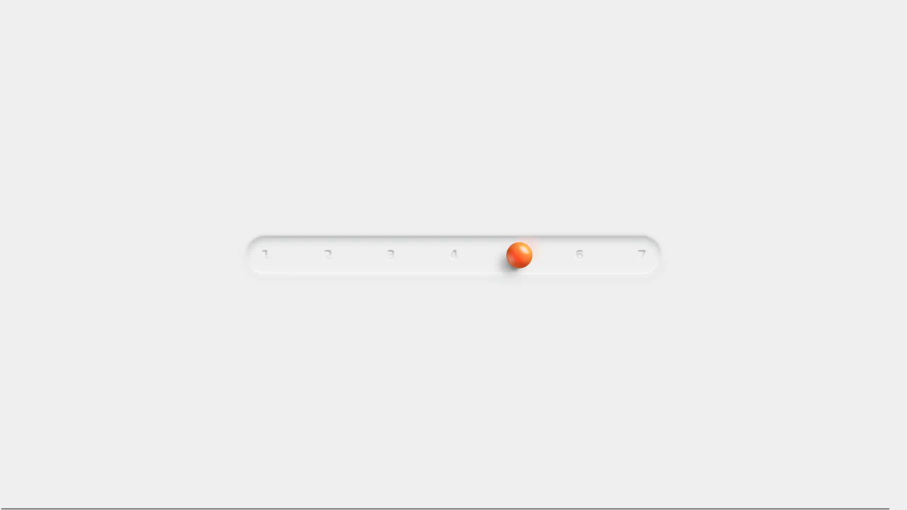
Neumorphic 3D Range Slider
This is a Neumorphic 3D Range Slider. It replaces the default browser input track with a recessed tactile trench and a volumetric, glassmorphic sphere. Its function is to provide highly physical, stepped input selection, making data entry feel like interacting with premium hardware.
Chrome 88+
Edge 88+
Firefox 80+
Safari 14+
See the Pen Neumorphic 3D Range Slider.
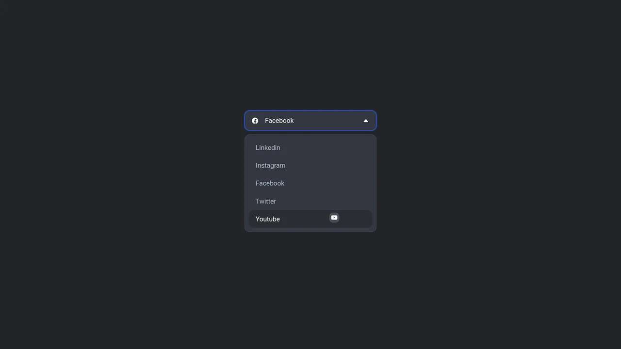
Floating Icon Select Dropdown
This is a Floating Icon Select Dropdown. It replaces the native OS <select> element with a spatial, hardware-accelerated interface. Its primary function is to provide immediate, physical feedback: as the user interacts with the list, a custom icon detaches from the layout and physically tracks the cursor’s coordinates.
Chrome 80+
Edge 80+
Firefox 75+
Safari 13+
See the Pen Floating Icon Select Dropdown.

Retro Airmail Envelope Border
This is a Retro Airmail Envelope Border. It wraps a container with continuous diagonal red and blue stripes. Its function is to provide a nostalgic, thematic framing for content without relying on external raster image assets.
Chrome 108+
Edge 108+
Firefox 101+
Safari 15.4+
See the Pen Retro Airmail Envelope Border.
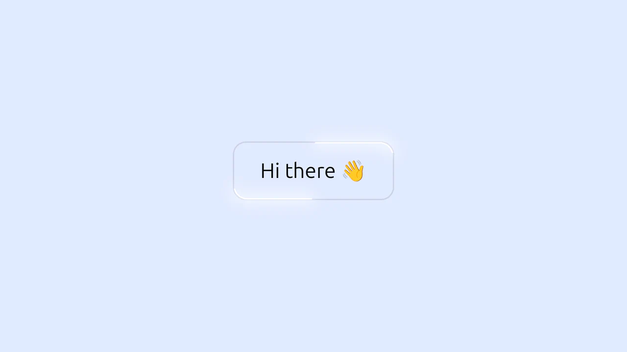
Glowing Border Trace Button
This is a Glowing Border Trace Button. It utilizes embedded SVG rectangles to create a moving neon stroke along the perimeter upon interaction. Its function is to provide highly visible, tactile feedback for primary actions without disrupting the core layout geometry or triggering expensive repaints.
Chrome 88+
Edge 88+
Firefox 78+
Safari 14+
See the Pen Glowing Border Trace Button.
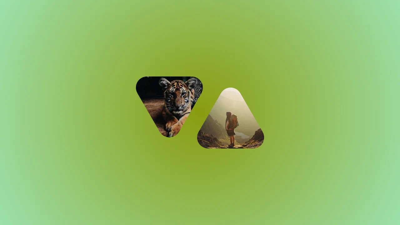
Morphing Rounded Triangle Image Mask
This is a Morphing Rounded Triangle Image Mask. It relies on advanced CSS mathematics and masking to clip raster graphics into smooth, interlocking geometric shapes. Its function is to replace standard grid layouts with organic, tessellating image tiles that physically react to user interaction.
Chrome 111+
Edge 111+
Firefox 117+
Safari 16.4+See the Pen Morphing Rounded Triangle Image Mask.
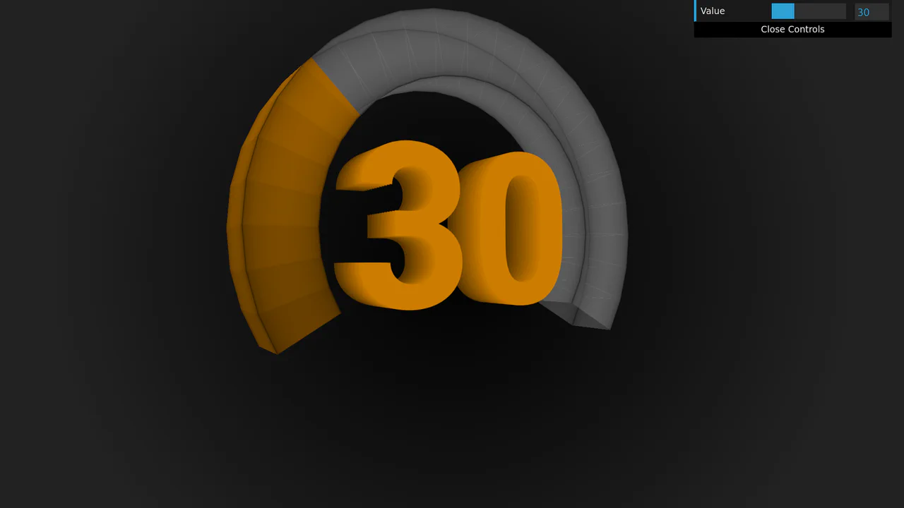
3D Rotating Value Dial
This is a 3D Rotating Value Dial. It visualizes continuous data through a spatial, cylindrical interface. Its function is to replace flat range indicators with a tactile, volumetric readout that dynamically shifts color hue based on value. (Requires: dat.gui)
Chrome 111+
Edge 111+
Firefox 108+
Safari 15.4+
See the Pen 3D Rotating Value Dial.