360+ CSS Custom Property Examples (Page 12)
Examples



Pure CSS Expanding Search
This search bar features a sophisticated, multi-stage animation where the icon morphs from a magnifying glass to a cross. The effect is achieved by transitioning the border-radius, transform, and box-shadow of the ::after pseudo-element with custom cubic-bezier timing functions that are dynamically updated via CSS variables, creating a seamless and fluid transformation.
See the Pen Pure CSS Expanding Search.

Olly Moss Star Wars Parallax
A multi-layered 3D parallax poster of C-3PO from Star Wars, driven by JavaScript mouse tracking.
See the Pen Olly Moss Star Wars Parallax.
A complex visual placeholder structure implemented without cluttering the DOM, automatically disabling itself when content appears.
His Dark Materials: TV Series Logo
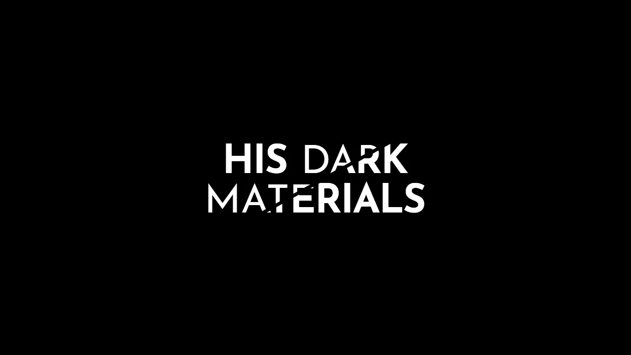
A stylish, graphic headline with a diagonal split, creating a sense of layering or a “cut-out” effect, ideal for posters or logos.
See the Pen His Dark Materials: TV Series Logo.
Pure CSS Circles Infographic
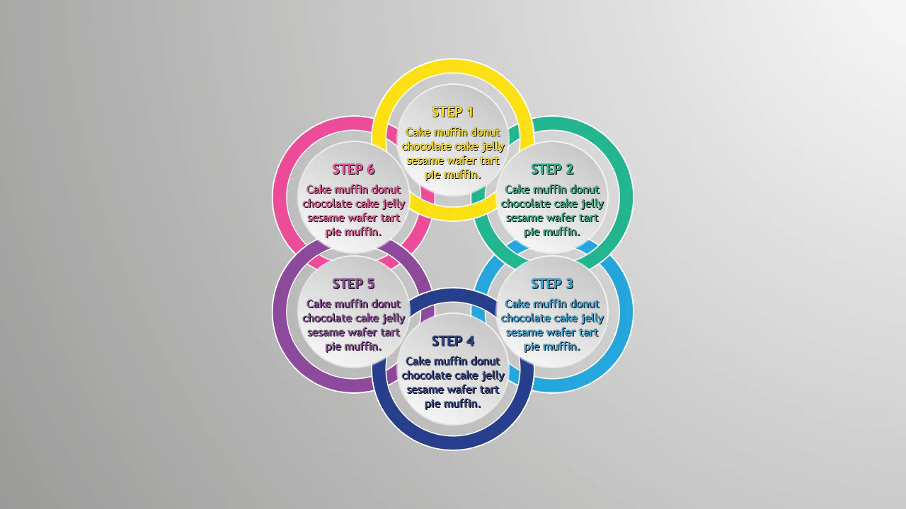
A circular step diagram constructed entirely with CSS transforms, where items are positioned radially using a custom property to calculate rotation angles.
See the Pen Pure CSS Circles Infographic.
Responsive Infographic
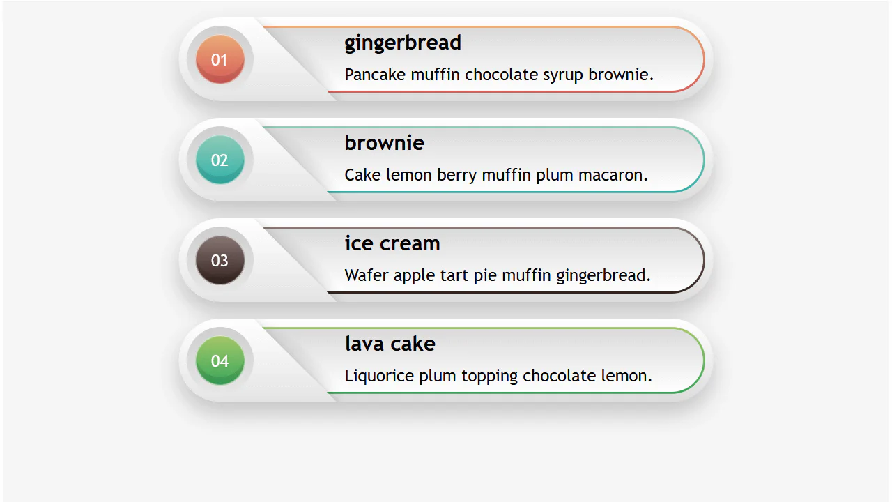
A highly responsive list component utilizing a CSS variable switch technique to toggle layout states.
See the Pen Responsive Infographic.
CSS Isometric Card Grid
A 3D isometric business card grid powered by a virtual scroll mechanism. JavaScript maps the window’s scroll position to a CSS custom property, driving the vertical translation of a fixed, tilted container.
See the Pen CSS Isometric Card Grid.
Color Swatch
This is a dynamic radial menu built purely with HTML/CSS, where elements deploy on hover using the CSS transform: rotate() technique and smooth transitions, controlled by SASS variables. It showcases current techniques for complex hover animations, cross-browser compatibility via vendor prefixes, and precise interactivity control using pointer-events: initial.
See the Pen Color Swatch.
Hover/Focus Effect For Flat Burron
A “slicing” fill effect created with two pseudo-elements - rotated rectangles that slide in from opposite sides on hover. The animation state is controlled by the --p CSS variable, which changes from 0 to 1, triggering the transform of the pseudo-elements via calc() to create a complex geometric transition.
See the Pen Hover/Focus Effect For Flat Burron.