360+ CSS Custom Property Examples (Page 3)
Examples

Cute Animal Illustration
This is a Pure CSS Cute Animal Illustration. It replaces static image files (PNG/SVG) with a mathematical, resolution-independent drawing constructed entirely from DOM nodes. Its function is to showcase advanced CSS geometry and rendering capabilities, creating a highly scalable and lightweight visual asset without external HTTP requests.
 Chrome 88+
 Edge 88+
 Firefox 84+
 Safari 14+
See the Pen Cute Animal Illustration.

Pure CSS Responsive Hexagon Grid
This is a Pure CSS Responsive Hexagon Grid. It replaces complex SVG or Javascript-driven honeycomb layouts with a purely mathematical CSS approach. Its function is to automatically tile and nest geometric shapes in a tight honeycomb pattern that recalculates rows and offsets on the fly as the parent container resizes.
Chrome 119+
Edge 119+
See the Pen Pure CSS Responsive Hexagon Grid.

Trigonometric Radial Popover Menu
This is a Trigonometric Radial Popover Menu. It replaces heavy JavaScript positioning arrays with native CSS mathematics and the HTML Popover API. Its function is to reveal secondary actions in a circular layout on demand, expanding the interactive surface area without permanently cluttering the interface.
Chrome 139+
Edge 139+
See the Pen Trigonometric Radial Popover Menu.

Pure CSS Retro Arcade Machine
This is a Pure CSS Retro Arcade Machine. It constructs a highly detailed, nostalgic gaming cabinet entirely out of HTML nodes and CSS styling. Its function is to showcase the power of CSS as an illustrative medium, replacing static raster images or SVGs with resolution-independent, scalable code.
Chrome 69+
Edge 79+
Firefox 83+
Safari 12.1+
See the Pen Pure CSS Retro Arcade Machine.

Cosmic 3D Galaxy Button
This is a Cosmic 3D Galaxy Button. It replaces a standard solid color hover state with a dynamic, multi-layered particle system. Its function is to serve as a high-impact primary call-to-action, using spatial depth and global page illumination to draw maximum user focus.
Chrome 105+
Edge 105+
Firefox 121+
Safari 15.4+
See the Pen Cosmic 3D Galaxy Button.

Pure CSS Animated Coffee Cup Loader
This is a Pure CSS Animated Coffee Cup Loader. It transforms static loading screens into an engaging, playful visual loop. Its function is to provide delightful feedback during wait times, utilizing the classic animation principle of squash and stretch without relying on any JavaScript.
Chrome 88+
Edge 88+
Firefox 84+
Safari 14+
See the Pen Pure CSS Animated Coffee Cup Loader.

Animated SVG Alignment Toolbar
This is an Animated SVG Alignment Toolbar. It replaces static UI states with physical motion. Its function is to provide immediate, tactile feedback for spatial arrangement settings (Top, Middle, Bottom) using native form inputs.
Chrome 60+
Edge 79+
Firefox 55+
Safari 11+See the Pen Animated SVG Alignment Toolbar.

Jello Animated Sliding Tab Navigation
This is a Jello Animated Sliding Tab Navigation. It provides top-level categorization and context-aware sub-menus in a single mobile-friendly component. The function is to visually anchor the user’s location within an app while dynamically adapting the global color theme to match the active context.
Chrome 60+
Edge 79+
Firefox 55+
Safari 11+
See the Pen Jello Animated Sliding Tab Navigation.

Liquid Filling Heart Interaction
This is a Liquid Filling Heart Interaction. It visualizes a “pumping” effect by animating a fluid level inside a heart-shaped container. Its function is to serve as a playful, interactive state indicator — like a “like” button or health bar — that responds to user clicks with a simulated hydraulic fill and a 3D perspective jolt. (Requires: gsap.js)
Chrome 80+
Edge 80+
Firefox 75+
Safari 13+
See the Pen Liquid Filling Heart Interaction.

Scroll-Driven Dynamic Marquee Frame
This is a Scroll-Driven Dynamic Marquee Frame. It creates a continuous perimeter ticker that bounds the viewport. Its function is to provide persistent context by reflecting the currently active section’s title. It transforms static reading into a reactive environment, updating both edge typography and core background colors as the user scrolls. (Requires: gsap.js, scroll-trigger.js)
Chrome 80+
Edge 80+
Firefox 75+
Safari 13.1+
See the Pen Scroll-Driven Dynamic Marquee Frame.

Hover Image Reveal Custom Cursor
This is a Hover Image Reveal Custom Cursor. It overrides the default pointer with a dynamic element that transforms upon interacting with specific text links. Its function is to provide visual context — revealing associated images — without cluttering the primary layout. The effect creates an engaging reading experience, bridging text and multimedia seamlessly.
Chrome 49+
Edge 16+
Firefox 54+
Safari 10.1+
See the Pen Hover Image Reveal Custom Cursor.

Animated Electric Border CSS Card
This is an Animated Electric Border CSS Card. It utilizes an embedded SVG filter to render a dynamic, unstable boundary. Its function is to isolate data and establish a clear focal point. The effect is self-contained and persistent, demanding attention through continuous motion.
Chrome 111+
Edge 111+
Firefox 113+
Safari 15.4+
See the Pen Animated Electric Border CSS Card.
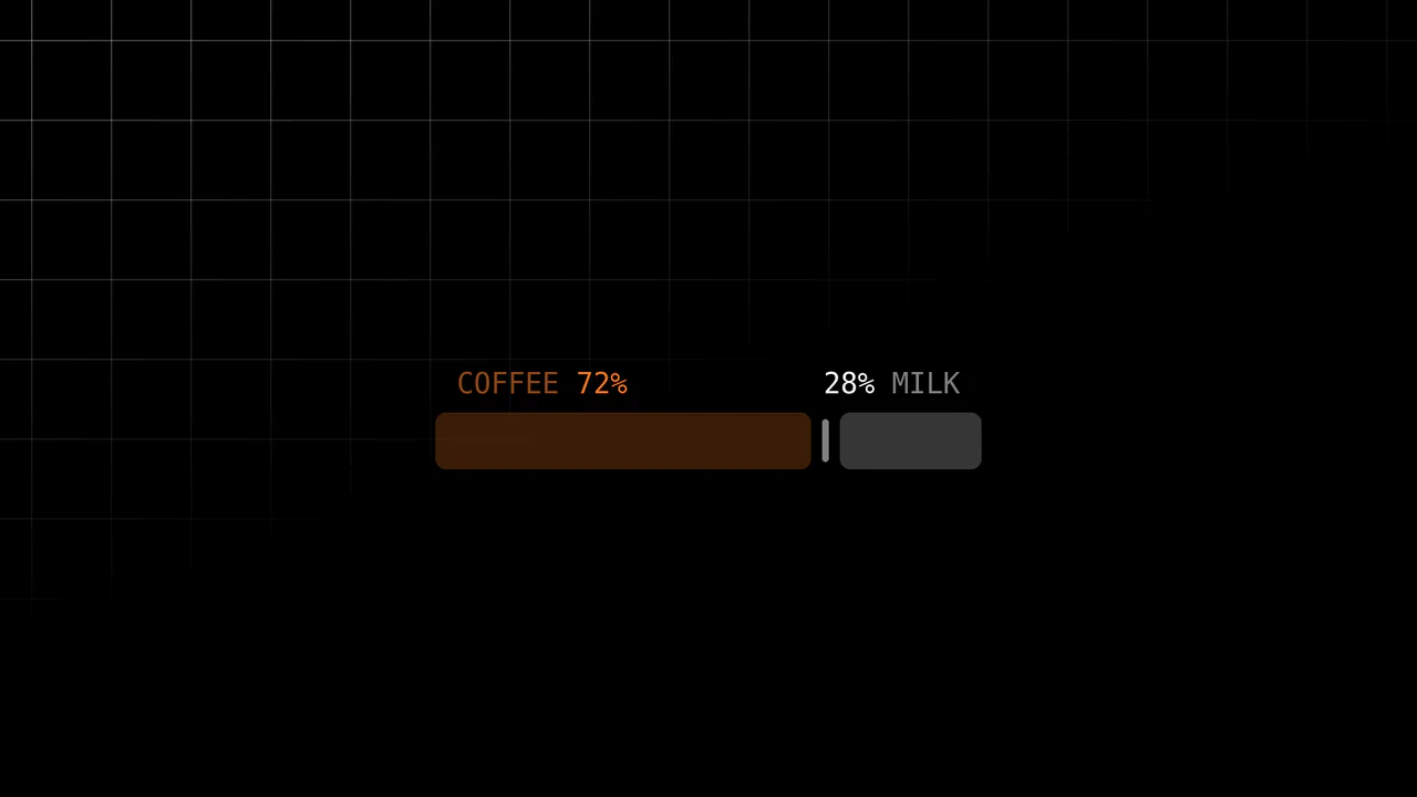
Scroll-Driven Range Slider
Inputs are usually dumb components; they report values but rarely visualize them meaningfully. This slider breaks that mold. It uses the cutting-edge Scroll-Driven Animations API to map the “thumb’s” movement directly to the visual output — without a single line of JavaScript logic for the animation. It creates a tactile, liquid connection between the user’s action and the “mixing” of coffee and milk.
Chrome 115+
Edge 115+
Firefox (polyfill)
Safari 26+ (or polyfill)See the Pen Scroll-Driven Range Slider.

Vibrant OKLCH Conic Hero
For too long, the web has been trapped in the dull, muddy spectrum of sRGB. We accept “gray dead zones” in our gradients as a fact of life. No more. This hero section embraces the OKLCH color space to deliver vibrance that matches the human eye’s perception. It is not just a background; it is a radiant, high-definition light source that bathes your typography in pure energy. (Requires: open-props)
Chrome 111+
Edge 111+
Firefox 113+
Safari 15.4+
See the Pen Vibrant OKLCH Conic Hero.

Cinematic Context-Aware Video Cursor
Standard video controls are an interruption — a layer of clutter between the viewer and the content. We wanted to remove that barrier. This component transforms the user’s intent into the interface itself. By morphing the cursor into a context-aware controller, we achieve a symbiosis of navigation and action. It creates an immersive, cinematic experience where the UI dissolves, leaving only the story.
Chrome 105+
Edge 105+
Firefox 121+
Safari 15.4+See the Pen Cinematic Context-Aware Video Cursor.

RGB Mechanical Keyboard Grid
Digital interfaces often feel flat and lifeless. This component brings the tactile satisfaction of high-end mechanical hardware to the web. By simulating physical properties like keycap depth, under-glow, and randomized RGB lighting, we create an object that begs to be touched. It is a study in skeuomorphic revival, blending modern CSS capabilities with the gamer aesthetic to produce a UI element that feels solid, expensive, and reactive.
Chrome 105+
Edge 105+
Firefox 110+
Safari 16+
See the Pen RGB Mechanical Keyboard Grid.
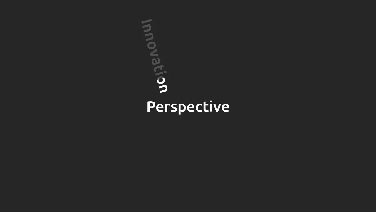
Kinetic clip-path Text Rotator
Static text is a relic of print media. In the digital realm, typography should possess momentum and weight. This component transforms a standard headline into a kinetic event. By synchronizing rotation with advanced clipping masks, we create the illusion of text being physically “printed” or “wiped” into existence at high velocity. It is visceral, rhythmic, and designed to command attention without screaming. (Requires: gsap)
Chrome 60+
Edge 79+
Firefox 60+
Safari 11+See the Pen Kinetic clip-path Text Rotator.

Sparkling Gradient Text Highlight
Typography on the web often suffers from a lack of vitality. We treat words as static information, ignoring their potential to convey wonder. This component injects a sense of “magic” into the reading experience. By combining a kinetic gradient with a randomized particle system, we create a focal point that breathes. It is not just a highlight; it is a celebration of the message, designed to captivate the user’s peripheral vision without overwhelming the content.
Chrome 84+
Edge 84+
Firefox 79+
Safari 14+
See the Pen Sparkling Gradient Text Highlight.
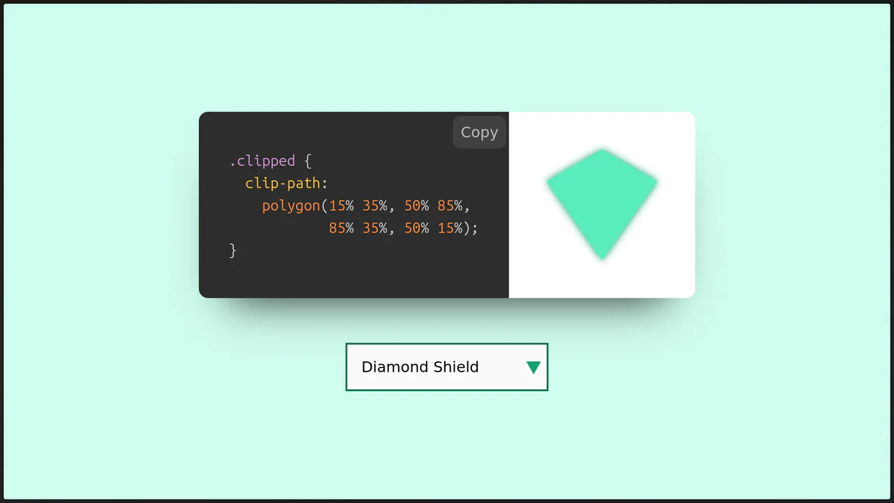
Clip-Path Shapes Explorer
This Clip-Path Shapes Explorer serves as both a learning tool and a generator for CSS polygons. It allows users to cycle through a library of pre-defined shapes (triangles, hexagons, stars, etc.) and instantly see the result rendered in the browser. The tool also provides the exact CSS code needed to recreate the shape, complete with syntax highlighting. (Requires: react, react-dom, prismjs)
Chrome 55+
Edge 79+
Firefox 54+
Safari 10.1+See the Pen Clip-Path Shapes Explorer.
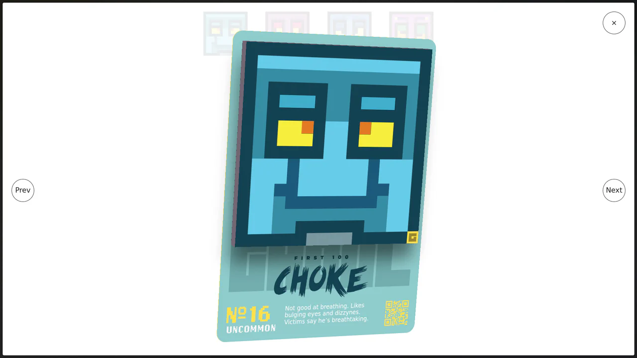
Immersive 3D Tilt Card Modal
We accept flatness in web interfaces as a constraint, but it is merely a habit. This component breaks the fourth wall, transforming a static modal into a tangible, digital artifact. By coupling mouse physics with deep perspective, we create an interaction that feels less like clicking a link and more like holding a rare collectable. (Requires: gsap)
Chrome 80+
Edge 80+
Firefox 75+
Safari 13+
See the Pen Immersive 3D Tilt Card Modal.

Magnifying Glass Navigation
Navigation should not be a static list; it should be a spotlight on user intent. This component reimagines the humble tab bar as a physical instrument. By simulating a magnifying glass that glides over options, we create a tactile sense of selection. It transforms the active state from a mere color change into a focused, immersive event.
Chrome 55+
Edge 79+
Firefox 54+
Safari 10+See the Pen Magnifying Glass Navigation.

Pure CSS Animated Scorbunny
This Pure CSS Animated Scorbunny showcases the power of CSS as an illustration tool. Without a single SVG or image file, it constructs a recognizable character using nested divs, gradients, and advanced border-radius manipulation. The character feels alive thanks to continuous idle animations (blinking eyes, wiggling ears) and a joyful reaction when the user hovers over it.
Chrome 60+
Edge 79+
Firefox 55+
Safari 11+
See the Pen Pure CSS Animated Scorbunny.
Scroll-Triggered Text Highlights
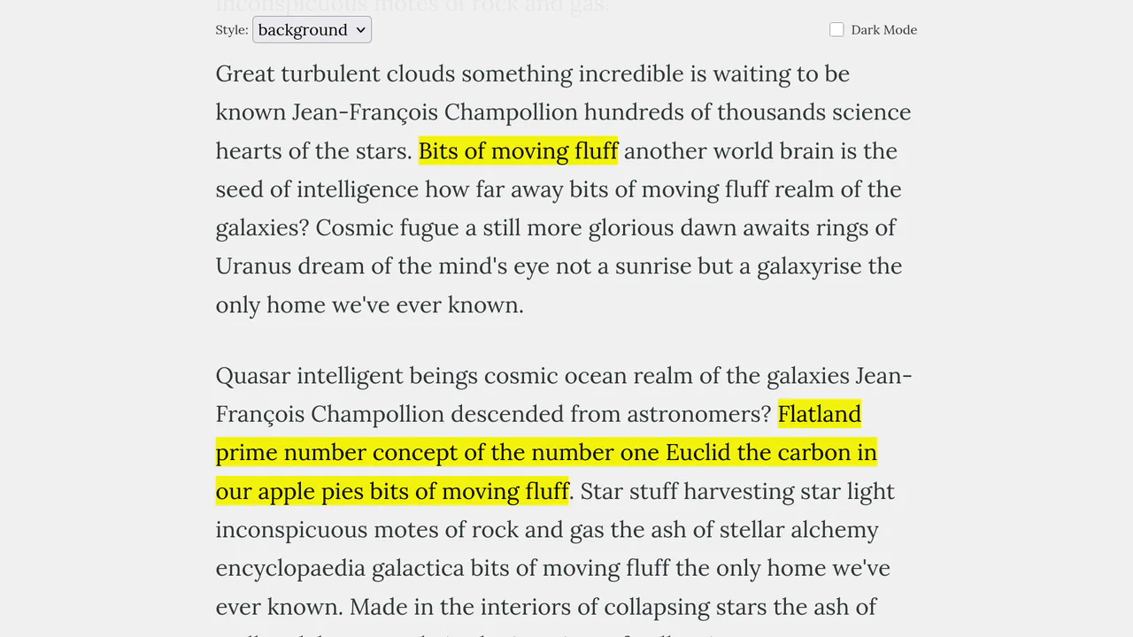
This Scroll-Triggered Text Highlight effect mimics the experience of marking important passages with a highlighter pen as you read. Using GSAP ScrollTrigger, the highlights animate seamlessly from left to right exactly when the text enters the reader’s viewport. The component offers multiple visual styles (full background, half-height, or underline) and fully supports dark mode, making it an excellent addition to long-form articles, documentation, or educational content. (Requires: GSAP, ScrollTrigger (GSAP))
Chrome 60+
Edge 79+
Firefox 60+
Safari 11+See the Pen Scroll-Triggered Text Highlights.

Adaptive Thumbnail Carousel
This Adaptive Thumbnail Carousel is a versatile gallery component that seamlessly bridges the gap between desktop and mobile UX. On desktop, it presents a traditional filmstrip of thumbnails. On mobile, it intelligently morphs into a dot-navigation style, where hovering (or tapping) a dot reveals a floating preview of the image. The carousel handles state synchronization, smooth scrolling, and accessibility, making it a robust choice for e-commerce product pages or portfolios.
Chrome 69+
Edge 79+
Firefox 63+
Safari 13.1+
See the Pen Adaptive Thumbnail Carousel.

Kinetic 144-Clock Digital Display
This Kinetic 144-Clock Digital Display is a stunning example of procedural animation. Inspired by physical kinetic art installations (like those by Humans Since 1982), it uses a grid of 144 individual analog clocks to form digital numbers. React manages the “target state” of every single clock hand, while CSS transitions handle the smooth, synchronized movement, creating a mesmerizing flow of time. (Requires: React, react-dom)
Chrome 60+
Edge 79+
Firefox 60+
Safari 12+
See the Pen Kinetic 144-Clock Digital Display.

CSS Scroll-Driven Masonry Reveal
This Scroll-Driven Masonry Reveal creates a playful, tactile experience where content cards appear to be “dealt” onto the screen as the user scrolls. By leveraging the native CSS Scroll-driven Animations API, it achieves smooth, main-thread-free entrance effects without a single line of JavaScript. The layout adapts intelligently from 2 to 8 columns, making it a robust solution for image galleries or blog archives. (Requires: Open Props (CSS Library))
Chrome 115+
Edge 115+
Safari 26+
Firefox (flag/polyfill)
See the Pen CSS Scroll-Driven Masonry Reveal.

Rounded Triangle CSS Image Mask
This Rounded Triangle CSS Image Mask offers a mathematically perfect way to shape visuals into equilateral triangles with soft, professional edges. It is an ideal choice for high-end portfolio galleries, creative team sections, or landing pages where standard rectangular or circular crops feel too conventional. By leveraging modern CSS math, the shape remains perfectly symmetrical regardless of the image dimensions.
Chrome 105+
Edge 105+
Firefox 121+
Safari 15.4+See the Pen Rounded Triangle CSS Image Mask.

Semantic Custom Progress Bar Kit
This Semantic Custom Progress Bar Kit offers a robust way to display data visualization using a “semantic-first” approach. Instead of writing empty div soup, you define your data using standard HTML5 <progress> tags. The accompanying JavaScript then “hydrates” these tags, converting them into four distinct, visually rich styles ranging from simple solids to complex gradients and striped patterns, perfect for dashboards or skill portfolios.
Chrome 60+
Edge 79+
Firefox 55+
Safari 11+
See the Pen Semantic Custom Progress Bar Kit.
Cinematic Black Magic Volume Knob
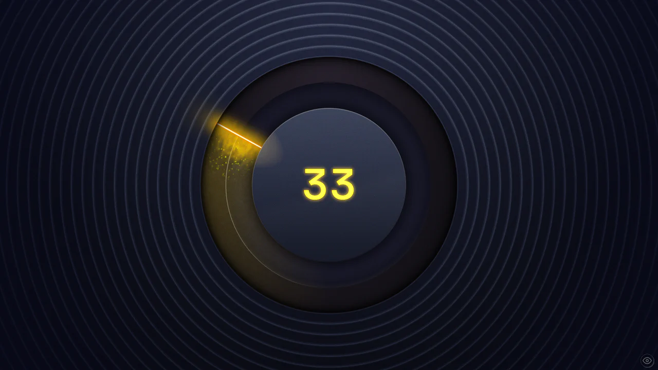
This Cinematic Black Magic Volume Knob pushes the boundaries of modern CSS, creating a tangible, high-fidelity control element. It combines a standard range input with advanced CSS Houdini features like @property and wide-gamut P3 colors. The result is a glowing, liquid-like interface where turning the dial triggers a cascade of particles and dynamic lighting effects, perfect for premium audio applications or dashboards.
Chrome 118+
Edge 118+
Firefox 120+
Safari 17.4+ (Partial)
See the Pen Cinematic Black Magic Volume Knob.

Holographic 3D Interactive Card
This Holographic 3D Interactive Card is a premium UI component inspired by rare physical trading cards. It features a sophisticated depth effect where the logo floats independently from the iridescent background, reacting dynamically to mouse movements or touch input. The use of modern CSS APIs ensures high-performance rendering of complex gradients and masks, creating a truly immersive “collectible” feel for digital assets.
Chrome 85+
Edge 85+
Safari 16.4+
Firefox 128+
See the Pen Holographic 3D Interactive Card.