6 CSS Cutout Effects: Free Code Snippets & UI Examples
CSS cutout effects create striking visual hierarchies by leveraging negative space, allowing background imagery or gradients to dynamically bleed through foreground elements. By punching transparent shapes through solid layers, developers can craft highly immersive, magazine-like typography and fluid spatial designs.
- Modern implementations heavily utilize the mix-blend-mode property (specifically
screenormultiply) to calculate pixel intersections between DOM layers directly on the compositor thread. - Advanced architectural patterns rely on mask-image and SVG clipping paths, which maintain crisp vector edges regardless of viewport scaling while avoiding the reflow costs of heavy transparent PNGs.
- For hardware-accelerated text cutouts, the background-clip property combined with a transparent text fill offloads rendering logic to the GPU, preserving native accessibility and semantic flow.
Master these masking techniques to engineer depth-driven, layered interfaces that seamlessly merge typography with underlying visual contexts.
Table of Contents:
Examples
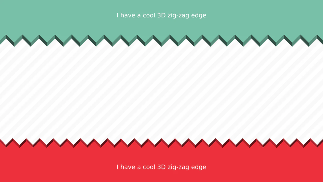
3D Zig-Zag Edge CSS Dividers
3D Zig-Zag Edge CSS Dividers creates a paper-cut illusion using only CSS. It relies on conic-gradient applied to both the background (for shading) and -webkit-mask (for the jagged shape). CSS variables control the size and depth of the teeth. This approach requires zero extra DOM elements or SVG files, making it a highly optimized solution for section transitions.
 Chrome 69+
 Edge 79+
 Firefox 83+
 Safari 12.1+
See the Pen 3D Zig-Zag Edge CSS Dividers.
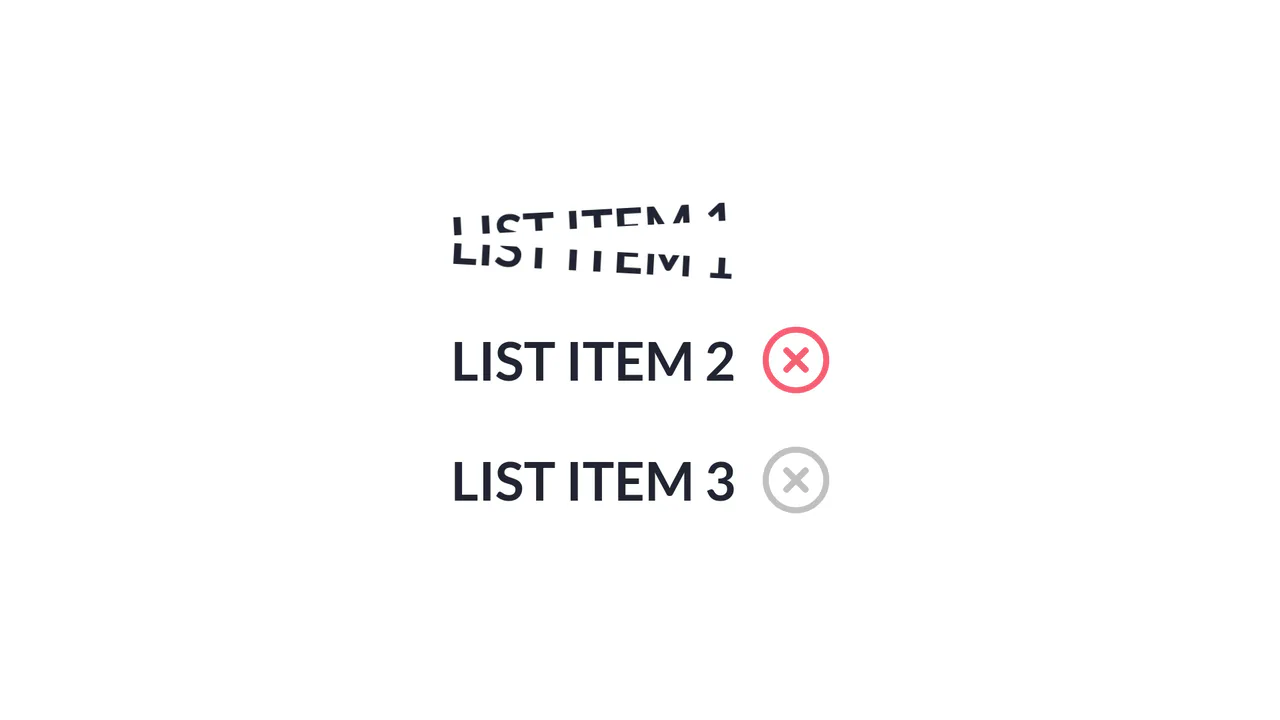
Slice Action List Item
Slice Action List Item achieves a physical text-splitting illusion by duplicating each text node into two overlapping, masked <span> blocks aligned via absolute positioning and CSS pseudo-elements. A jQuery handler triggers a sequential timeline: an SVG checkmark collapses, a dynamically generated absolute .line animates across the list item simulating a laser slice, and then both text halves rotate outward in opposite directions. The implementation provides a distinct, highly engaging micro-interaction, although triggering jQuery .animate() alongside CSS transforms can lead to inconsistent frame timing if layout changes overlap with GPU-accelerated compositing layers. (Requires: jquery.js)
Chrome 56+
Edge 79+
Firefox 51+
Safari 10.1+
See the Pen Slice Action List Item.
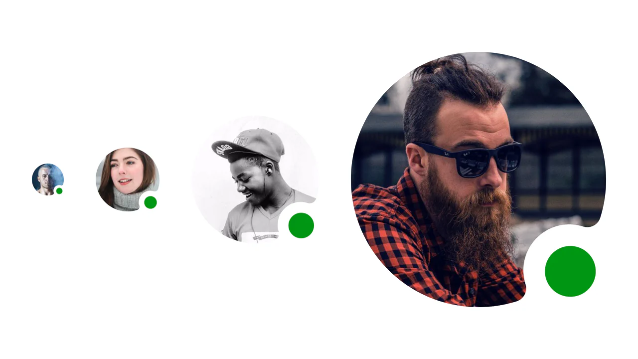
Resizable Masked CSS Avatar with Status Indicator
A clean, professional profile UI element where the status indicator looks integrated into the avatar’s shape rather than just tacked on top, adding polish to the interface.
See the Pen Resizable Masked CSS Avatar with Status Indicator.
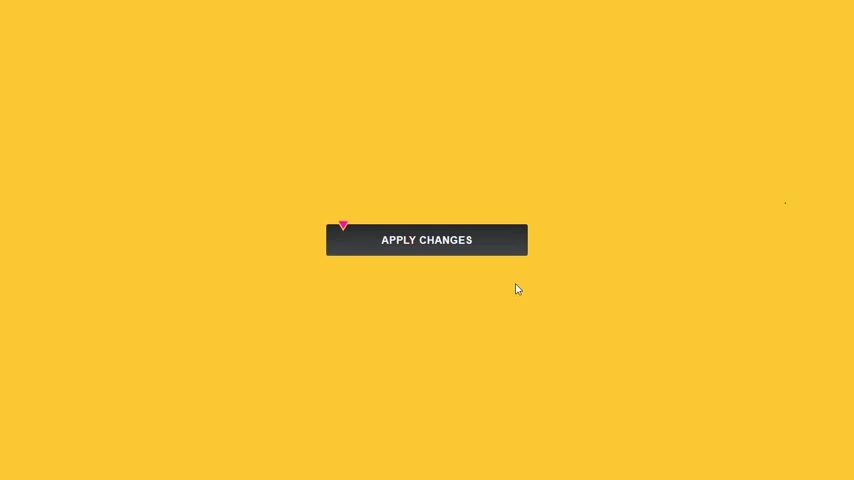
CSS Cutout Button with Mask Composite
A creative button demonstrating the power of CSS masking and mask-composite to create a custom geometric “notch” effect. This snippet utilizes SVG masks within pseudo-elements to achieve a futuristic UI interaction with zero extra HTML markup, perfect for modern web design.
See the Pen CSS Cutout Button with Mask Composite.
CSS 3D Cutout Card
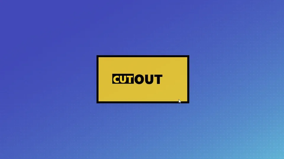
A creative 3D hover effect that utilizes CSS perspective to visually deconstruct the card’s layout. The content and its border float separately in space but merge into a unified 2D plane upon interaction, showcasing the power of advanced CSS transformations.
See the Pen CSS 3D Cutout Card.

Newspaper Cutout Text
An eclectic CSS typography experiment where every character features a distinct font family and a custom geometric background shaped via clip-path. This snippet showcases how to mix patterns, shadows, and shapes to achieve a complex collage-style or “ransom note” effect using only CSS3.
See the Pen Newspaper Cutout Text.