3 CSS Drop Caps: Free Code Snippets & Design Examples
CSS drop caps introduce elegant editorial visual hierarchy into digital publications, mimicking classic illuminated manuscript lettering to signal the start of major chapters. By magnifying and aligning the opening letter of a paragraph natively, this typography system establishes a structured, book-like reading flow.
- Dynamic initial sizing is calculated natively by applying the initial-letter property directly onto paragraph selectors, defining both line height and line sink.
- Styling is isolated without document mutations by leveraging the browser’s native ::first-letter pseudo-element, avoiding hacky inline span elements.
- To safeguard INP (Interaction to Next Paint) performance, modern initial letter calculations execute as a single-pass rendering step directly on the layout engine.
Master these sophisticated editorial layout patterns to bring timeless publishing typography and clear visual structure to your content blocks.
Table of Contents:
Examples

CSS Blockquote with Gradient Drop Cap
A unique drop cap is created with modern CSS techniques - its complex background is generated by layering linear-gradient and repeating-conic-gradient, while its responsive size is managed by calc().
See the Pen CSS Blockquote with Gradient Drop Cap.
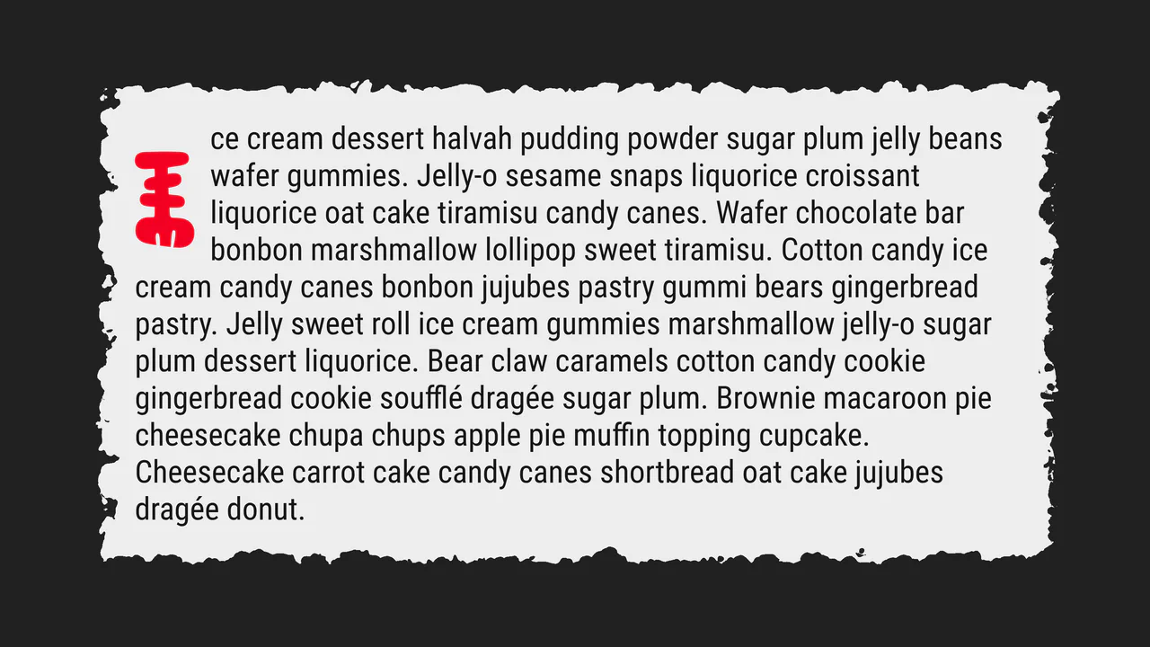
Drop Cap, Please!
A creative “torn paper” text effect powered by SVG filters such as feTurbulence and feDisplacementMap for realistic edge distortion. This snippet showcases advanced CSS pseudo-element styling and fluid typography, providing a lightweight and high-performance solution for organic UI design.
See the Pen Drop Cap, Please!.
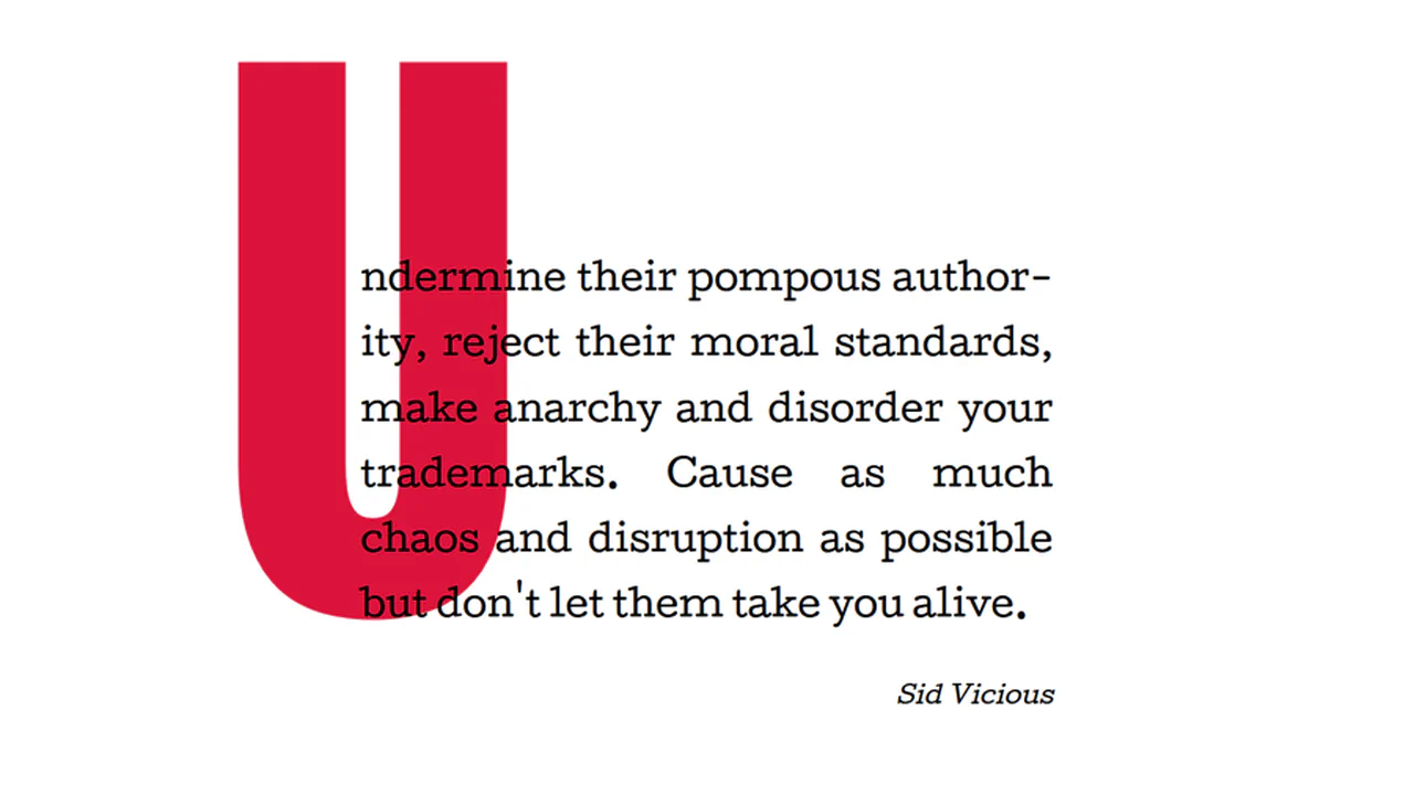
Big Drop Cap
The demo showcases a classic yet relevant technique for creating an extra-large drop cap via :first-letter using negative horizontal margins (margin-right: -1000px) and line-height: 1, allowing the element not to affect the main text flow, thus ensuring clean typography.
See the Pen Big Drop Cap.