6 CSS drop-shadow() Examples
Standard box-shadow is confined to the rectangular box model. The CSS drop-shadow() examples in this updated collection remove this barrier, creating realistic depth for non-rectangular shapes like transparent PNGs or complex SVGs. Utilizing these curated snippets ensures shadows are generated efficiently, respecting alpha channels without manual SVG filter chains or heavy raster images, which is essential for modern UI design.
Technically, the filter: drop-shadow() function operates on the GPU, leveraging hardware acceleration to process pixel data. Unlike box-shadow, it calculates the shadow based on the element’s alpha mask, not its bounding box. This approach maintains a clean HTML structure, preventing the need for complex wrapper elements while ensuring high layout stability and preventing costly repaints during user interaction.
Every free demo in this library is fully responsive and cross-browser compatible. The code is optimized to balance visual fidelity with rendering performance, ensuring that even complex shadows do not introduce lag or frame drops. You can instantly download the raw code or fork a specific interaction on CodePen. These assets are built for modern design systems, delivering an accessible, performant experience.
Examples

Dynamic Circular Avatar Gallery
This is a Dynamic Circular Avatar Gallery. It arranges a series of profile images into a perfect circle that smoothly expands when interacted with. Its function is to showcase user groups or team members in a compact, engaging format, using cutting-edge CSS math instead of JavaScript to handle complex radial positioning and dynamic item counting.
 Chrome 119+
 Edge 119+
See the Pen Dynamic Circular Avatar Gallery.

Interactive Download Folder Animation
This is an Interactive Download Folder Animation. It replaces a static download button with a lively, physics-based micro-interaction. Its function is to provide immediate, satisfying visual confirmation of a user action. The effect drops a new document into a stacked folder, triggering a synchronized elastic bounce across multiple UI layers. (Requires: gsap.js)
Chrome 60+
Edge 79+
 Firefox 55+
 Safari 11.1+
See the Pen Interactive Download Folder Animation.

Pure CSS Synthwave 80s Animation
This Pure CSS Synthwave 80s Animation captures the nostalgic aesthetic of the 1980s retrowave genre. It features a complete animated scene: an infinite neon grid, a setting sun with scanlines, shaking palm trees, and a DeLorean driving into the distance. The scene is brought to life with a driving synthwave audio track and intricate CSS-only motion.
Chrome 60+
Edge 79+
Firefox 55+
Safari 11+
See the Pen Pure CSS Synthwave 80s Animation.
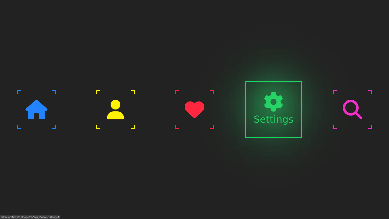
Neon Icon Hover Effect
A navigation menu with a neon glow and a complex hover effect. Icons and text use the CSS drop-shadow filter to create a glow effect, while the element’s color is controlled via an inline CSS variable --clr.
See the Pen Neon Icon Hover Effect.

Background Triangle Pattern
A clever technique for creating triangles using CSS border (width: 0; height: 0; border: ... solid transparent). The transparent side and top borders allow border-bottom to form a triangle, and its color is cyclically changed via the SCSS selector :nth-child(5n+...).
See the Pen Background Triangle Pattern.
Animated Squiggly Border Glow Cards
A card with a neon border effect where two CSS animations are synchronized - stroke-dashoffset for the SVG frame and hue-rotate for the drop-shadow glow. Each card gets a unique theme via :nth-child and the --cardAccent CSS variable, while multi-layering with z-index positions the glow underneath the main content.
See the Pen Animated Squiggly Border Glow Cards.