2 CSS Dynamic Shadows
Depth defines the relationship between the user and the screen. Standard static shadows create a fixed layer, but dynamic shadows react to content and light, removing the flat barrier of the interface. This updated collection provides logic-driven depth for modern UI design. Utilizing these snippets replaces heavy image assets with real-time, calculated visual feedback.
Technically, these examples leverage CSS filters—specifically blur(), saturate(), and opacity(). Some utilize pseudo-elements that inherit the parent’s background to create a “glow” effect that matches the image content. We prioritize hardware acceleration through transform: translateZ(0) to ensure smooth 60fps performance on the compositor thread. This ensures high layout stability while keeping the HTML markup minimal and semantic.
Every free demo is fully responsive and cross-browser compatible. You can instantly download the raw code or fork a specific interaction on CodePen.
Examples
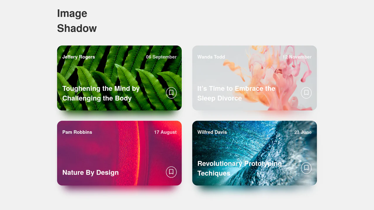
Dynamic Image Drop Shadow Cards
A responsive grid of article cards showcasing a dynamic, color-matched drop shadow effect. Built entirely with HTML and SCSS, the trick involves duplicating the card’s background image into a lower z-index container, shifting it downwards, and applying a heavy CSS filter: blur(). This creates a soft, glowing shadow that perfectly matches the hues of the original photograph.
 Chrome 57+
 Edge 16+
 Firefox 52+
 Safari 10.1+
See the Pen Dynamic Image Drop Shadow Cards.

Tumbling 3D Cubes Animation
This is a Tumbling 3D Cubes Animation. It visualizes three interconnected, translucent cubes endlessly rolling across a grid floor in a synchronized sequence. Its function is to demonstrate complex spatial geometry and continuous kinetic motion using exclusively DOM nodes and stylesheets, replacing heavy WebGL libraries with pure CSS mathematics.
Chrome 36+
Edge 12+
Firefox 16+
Safari 9+
See the Pen Tumbling 3D Cubes Animation.