7 CSS Fading Effects: Free Examples & Code Snippets
CSS fading effects offer a lightweight, performant mechanism to introduce and dismiss interface elements, creating natural visual cues that smoothly orient users through state changes. Utilizing these native transitions allows developers to convey temporal depth and focus without overloading page payloads.
- Modern layouts combine
opacitywith @starting-style to transition elements directly from adisplay: nonestate, avoiding old JS timing hacks. - Scroll-tied fading uses native view-timeline bounds, linking frame progress dynamically to the document rendering pipeline without IntersectionObserver event pollution.
- Offloading layout interpolations to the browser’s GPU-backed compositor thread ensures steady frame pacing and keeps main-thread execution free from layout shifts.
Experiment with these progressive transparency techniques to build cohesive, flow-oriented interfaces that react instantly to user behavior.
Table of Contents:
Examples
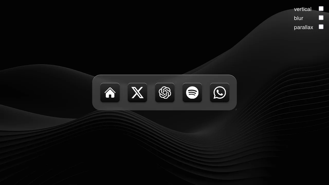
Scroll-Driven macOS iOS Dock Concept
Pure CSS Scroll-Driven macOS iOS Dock recreates Apple’s legendary dock using the native CSS Scroll-Driven Animations API. Icons dynamically scale, blur, and shift depth completely without JavaScript. Utilizing @supports (animation-timeline: scroll()), the layout safely handles horizontal and vertical snaps. A zero-dependency, ultra-lightweight demonstrator of modern CSS capabilities. (Requires: gsap.js, scroll-trigger.js)
 Chrome 115+
 Edge 115+
 Safari 26+
See the Pen Scroll-Driven macOS iOS Dock Concept.

Pure CSS Faded Infinite Text Marquee
This is a Faded Infinite CSS Text Marquee. It creates a continuous, horizontal scrolling display for text elements using advanced CSS animation math. Its function is to showcase lists of keywords, tags, or announcements in a constrained space, using gradient masks to seamlessly blend the moving text into the background.
Chrome 104+
Edge 104+
 Firefox 104+
Safari 14.1+
Firefox 104+
Safari 14.1+
See the Pen Pure CSS Faded Infinite Text Marquee.
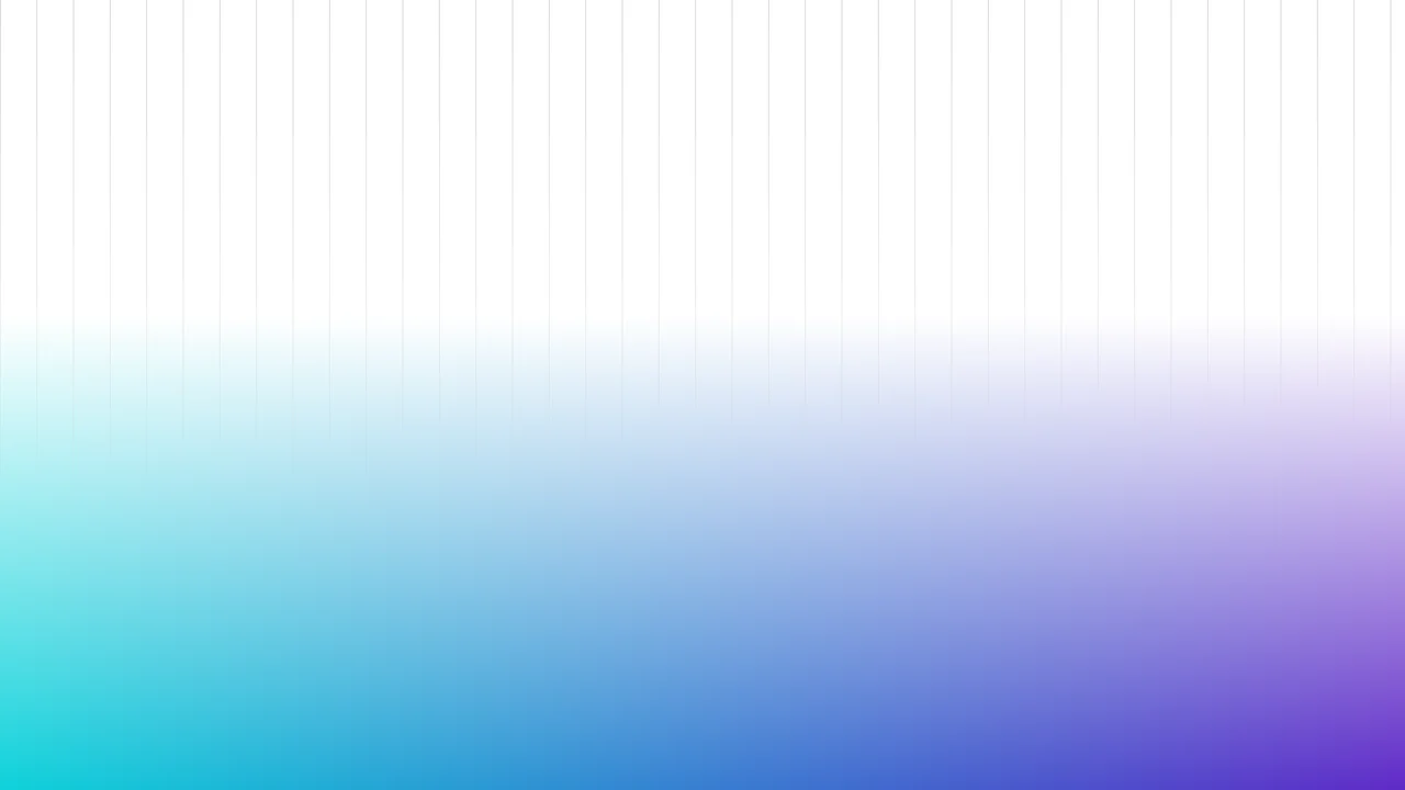
Fading Grid Gradient Background
This Fading Grid Gradient Background creates a clean, architectural aesthetic suitable for SaaS landing pages or documentation sites. It features a technical vertical grid pattern that gently dissolves into a vibrant teal-and-purple gradient at the bottom. The effect mimics a “horizon” line, adding depth and structure to an otherwise flat page without using any images.
Chrome 80+
Edge 80+
Firefox 53+
Safari 15.4+
See the Pen Fading Grid Gradient Background.

Fading Away Text Effect
This demo shows how to create a dynamic text fade effect using CSS variables and JavaScript. Each character is wrapped in a <span> with a unique index, which is then used in calc() to apply a blur and opacity effect.
See the Pen Fading Away Text Effect.
Scroll Mask Indicators
A modern and clean way to indicate scrollability: the “fade-to-mist” effect is implemented using mask-image and linear-gradient, while key parameters of the fade phase are precisely tuned using @property.
See the Pen Scroll Mask Indicators.
Fancy Fading Footer
A sleek Glassmorphism footer effect that gracefully blurs underlying fixed content upon scrolling. By combining backdrop-filter with a CSS gradient mask (mask-image), this snippet creates a premium, depth-rich UI overlay ideal for modern landing pages.
See the Pen Fancy Fading Footer.
Horizontal Scroller Edge Fade Mask
A polished horizontal scrolling container featuring soft fade-out edges achieved via CSS mask-image and linear gradients. This technique eliminates harsh content cut-offs, creating a seamless and premium UI experience for image galleries or sliding card lists.
See the Pen Horizontal Scroller Edge Fade Mask.