20+ CSS Flat Buttons: Free Examples & Code Snippets
Flat buttons rely on minimal styling — solid colors, clean typography, and subtle spatial cues — to communicate interactivity without decorative gradients or 3D effects. Their simplicity makes them foundational components in any design system.
- Flat button interaction feedback uses transform: translateY() combined with opacity transitions on pseudo-elements, providing spatial hover and active cues that work independently of color perception.
- CSS Custom Properties for background, text, padding, and radius enable system-wide flat button theming through variable overrides, maintaining visual consistency without duplicating component styles.
- Ripple-like effects use a ::after pseudo-element with scale(0) to scale(1) transition on hover, creating a color wash on the compositor thread without layout recalculations.
Browse this collection of CSS flat buttons to master minimalist interaction components that prioritize clarity, accessibility, and consistent theming across your interface.
Table of Contents:
Examples

Merging Pill Filter Buttons
This Merging Pill Filter Button set introduces a fluid, organic feel to standard multi-select inputs. Instead of keeping active items isolated, this component visually fuses adjacent selected buttons into a single continuous shape. It’s an excellent choice for music apps, filtering systems, or any UI where categories are related and grouping them visually adds context.
 Chrome 60+
 Edge 79+
 Firefox 50+
 Safari 10+
See the Pen Merging Pill Filter Buttons.

Micro-Interaction Loading Button
This Micro-Interaction Loading Button demonstrates how to pack multiple feedback states into a single UI element without cluttering the interface. It starts as a clean “Submit” button. Hovering reveals a directional arrow, hinting at action. Clicking triggers a seamless loading sequence where the arrow transforms into a spinner, finally resolving into a checkmark to confirm success.
Chrome 49+
Edge 15+
Firefox 43+
Safari 10+
See the Pen Micro-Interaction Loading Button.

Expanding Buttons
A horizontal contact bar (Email, Telegram, Twitter) smoothly collapses into a small arrow button and expands back upon clicking.
See the Pen Expanding Buttons.
Moving Corners with offset-path
A sophisticated pure CSS button component leveraging offset-path and offset-distance to animate decorative corner icons during hover states. This snippet showcases fluid typography, modern color-mix() functions, and container queries.
See the Pen Moving Corners with offset-path.
Button Hover Animation
A complex “add” button hover animation where the text is replaced by a cross and the border “draws” itself. On hover, the .fl and .sfl layers fill the button with color, hiding the text, while pseudo-elements animate their width and height to create the border. The cross animation uses cubic-bezier and transition-delay for an “assembly” effect, and the <i> icon morphs from a plus to an arrow.
See the Pen Button Hover Animation.
Hover Over Me Button
A button with a multi-stage animation in pure CSS: on load, it smoothly appears “from the ground up” using @keyframes that animate opacity and transform: translateY(). On hover, a ::after pseudo-element, positioned underneath the button with z-index: -1, scales up and fades out, creating a “pulsating” wave effect.
See the Pen Hover Over Me Button.
Hover/Focus Effect For Flat Burron
A “slicing” fill effect created with two pseudo-elements - rotated rectangles that slide in from opposite sides on hover. The animation state is controlled by the --p CSS variable, which changes from 0 to 1, triggering the transform of the pseudo-elements via calc() to create a complex geometric transition.
See the Pen Hover/Focus Effect For Flat Burron.
Flat Buttons Hover Effects
A collection of interactive CSS buttons featuring diverse hover animations such as wobbling, shine effects, and sliding underlines. These lightweight UI components leverage SCSS, keyframes, and pseudo-elements to deliver smooth, performant transitions that enhance user engagement in modern web interfaces.
See the Pen Flat Buttons Hover Effects.
Stretchy Button
Elegant “Learn More” button built with SCSS, featuring a sophisticated letter-spacing animation on hover and focus.
See the Pen Stretchy Button.
Only CSS Animated Border Button
An interactive button featuring a sequential border-tracing effect built with pure SCSS and no JavaScript. The component utilizes staggered transition-delay properties to create a dynamic outline on hover, providing developers with a lightweight and visually striking solution for modern UI designs.
See the Pen Only CSS Animated Border Button.
Outline Button or Ghost Button: Icon on Hover
A collection of scalable outline buttons featuring a sliding icon animation built with SCSS and @each loops. This UI component offers multiple size variations and color themes, allowing for easy customization and seamless integration into modern web projects.
See the Pen Outline Button or Ghost Button: Icon on Hover.
Button Hover Distrotion Effect
An interactive CSS button featuring a unique distortion hover effect achieved through extreme scaling and pseudo-elements. This lightweight UI component smoothly transitions between text states using HTML5 data attributes, providing a modern and high-performance visual experience for web projects.
See the Pen Button Hover Distrotion Effect.
Button Hover Light Reflection
A pure CSS button featuring an interactive light reflection effect created with smooth pseudo-element animations.
See the Pen Button Hover Light Reflection.
Only CSS: Usually Button
Two pure CSS buttons demonstrating directional hover animations. Hovering expands a solid white background overlay using scale3d transitions with shifting transform-origin coordinates. Simultaneously, the text color swaps dynamically by shifting a clipped linear gradient background using background-clip: text.
See the Pen Only CSS: Usually Button.
Animal Crossing Inspired Hover
A retro-styled set of pure CSS buttons featuring animated striped hover effects. On hover, an angled linear-gradient with sharp color stops generates diagonal stripes, while an inset box-shadow serves as a thick border. An @keyframes rule continuously shifts the background-position to produce a smooth, infinite rolling animation.
See the Pen Animal Crossing Inspired Hover.
Fancy CSS Button
A stencil-style CSS button featuring a fragmented border. White spans like .top-key act as layout masks, covering parts of the black border to make it look broken. On hover, these masks shrink to zero width and slide away, restoring the solid border outline as the background transitions to solid black and the text shifts slightly left.
See the Pen Fancy CSS Button.

Flat Layered Button
A retro-themed pop-art button using an ::before pseudo-element layered with multiple offset, hard-edged box-shadow values. This setup generates a stacked 3D color shadow effect behind the text. On hover, the colored shadows transition to none while the pseudo-element shifts to flatly fill the button background.
See the Pen Flat Layered Button.

CSS Buttons
A creative collection of six pure CSS button micro-interactions. The hover animations demonstrate diverse layout techniques: filling backgrounds via expanding inset box-shadow values, sliding striped and diagonal linear-gradient positions using background-position, and scaling a central ::after pseudo-element.
See the Pen CSS Buttons.
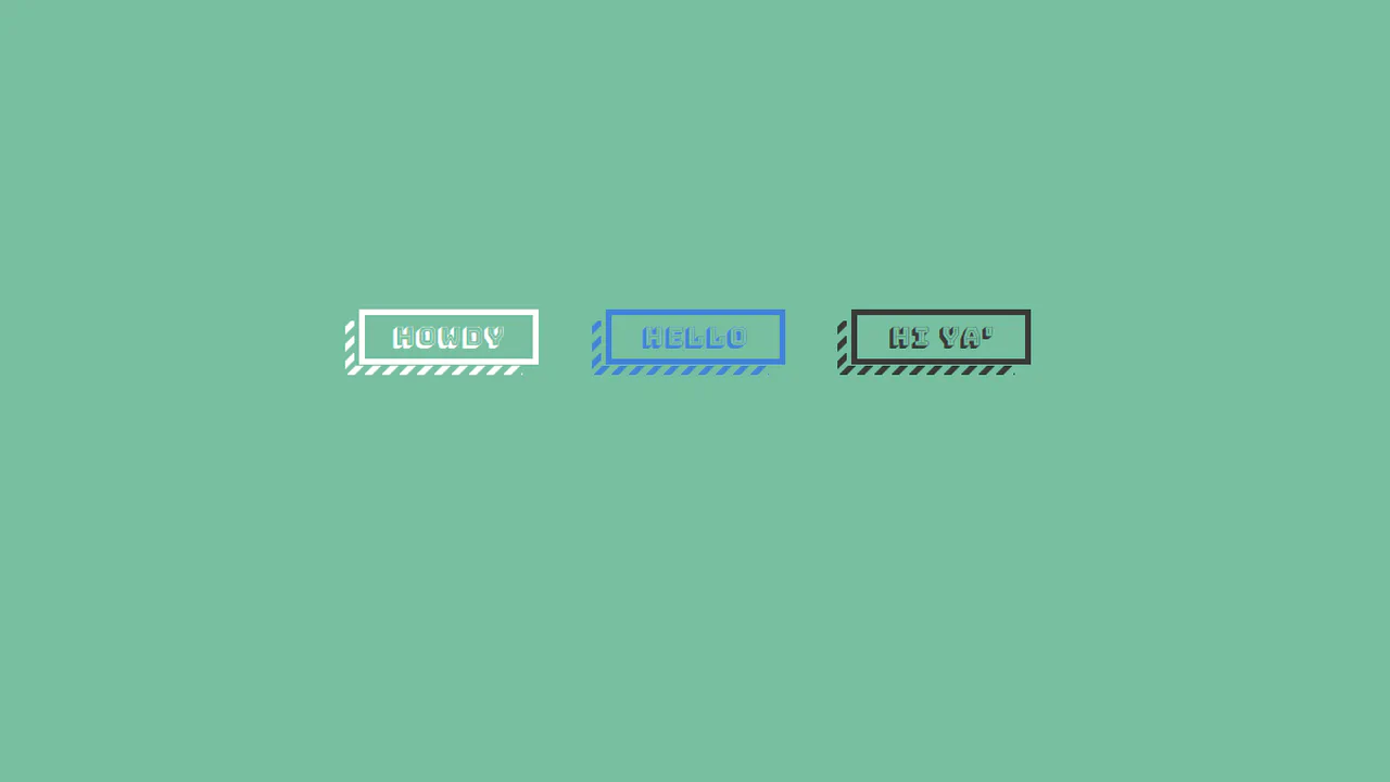
Flat Buttons Psuedo Striped Shadows
A retro-style button featuring a striped drop shadow built with pure CSS. The striped pattern is rendered using repeating diagonal linear-gradient values on :before and :after pseudo-elements. On hover, the button translates down-left while the pseudo-elements shift in the opposite direction, pinning the shadow in 3D space.
See the Pen Flat Buttons Psuedo Striped Shadows.
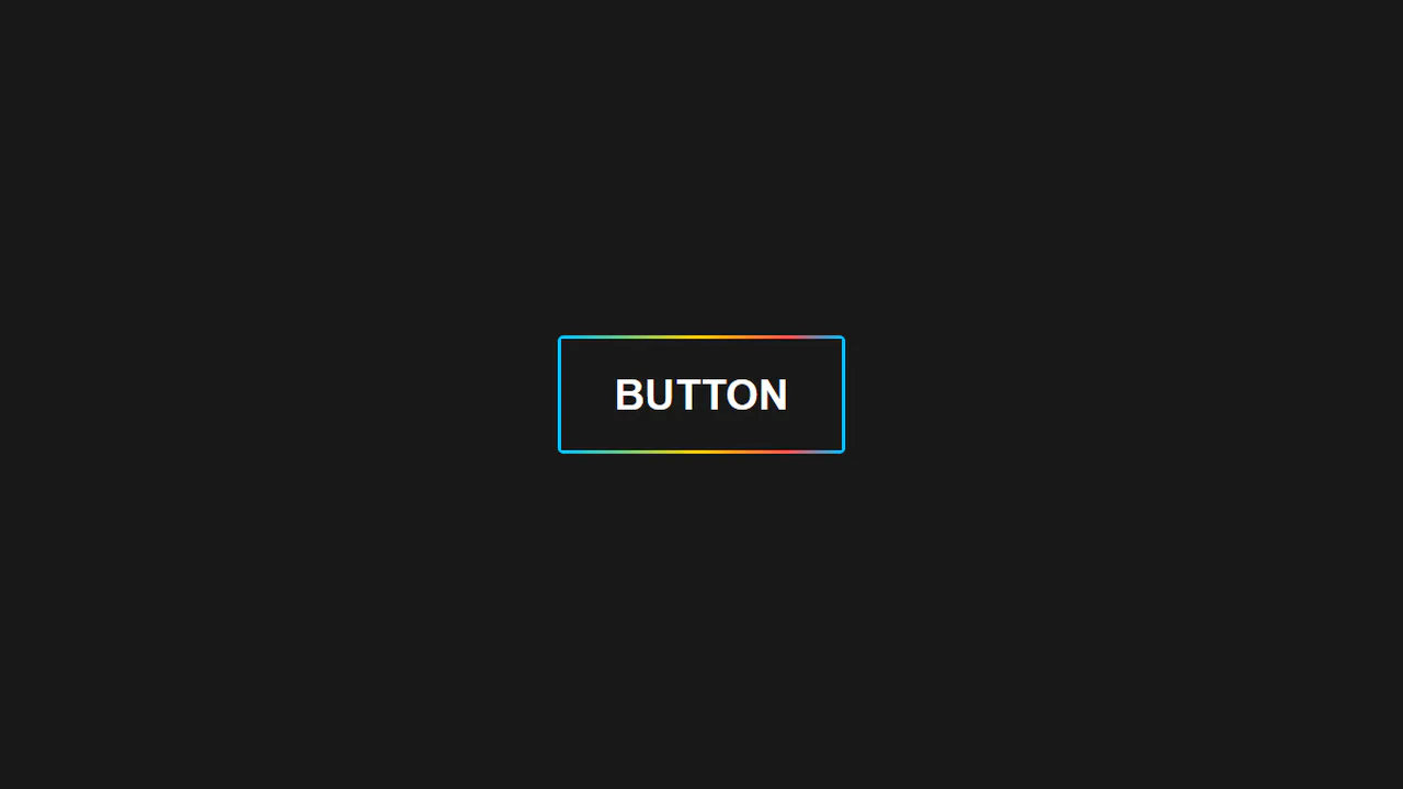
Animated Rainbow Button
A pure CSS button featuring a scrolling rainbow border. The effect uses a mask setup: the button container has a multicolor linear-gradient background, while its :after pseudo-element pulls text via content: attr(alt) to mask the center. On hover, an animation slides background-position to cycle the exposed border colors.
See the Pen Animated Rainbow Button.
Hover Effects For Buttons
A CSS-grid layout showcasing five minimalist button hovers. Each card uses basic CSS transitions to trigger a clean micro-interaction upon hover: changing a solid border to a dashed style, rounding the corners via border-radius, swapping background fills, or elevating the button using translateY and a soft box-shadow.
See the Pen Hover Effects For Buttons.