70+ CSS Flexbox Examples
Adaptive alignment is the foundation of digital interfaces. This updated CSS flexbox collection removes the complexity of manual positioning, allowing elements to flow logically within their containers. Instead of building layout systems from scratch, using these curated snippets ensures precise distribution of space and alignment, bridging the gap between raw data and the screen.
The logic relies on Flexbox properties like flex-direction, justify-content, and align-items. By utilizing semantic HTML, the code ensures high layout stability and prevents unexpected shifts. Interactive transitions within flex containers leverage hardware acceleration to maintain smooth performance without triggering expensive reflows on the Main Thread.
Every free demo is designed for full responsiveness and cross-browser compatibility. You can instantly download the raw code or fork a specific design on CodePen. These resources prioritize performance and clarity, providing an essential toolkit for any modern UI project where functionality dictates the form.
Examples
Seamless Infinite Logo Carousel in Pure CSS
This is a Seamless Infinite CSS Logo Carousel. It creates an automatic, never-ending horizontal scrolling effect for a set of images, typically used for partner or client logos. Its function is to provide continuous visual social proof without requiring user interaction or heavy JavaScript logic.
 Chrome 43+
 Edge 12+
 Firefox 16+
 Safari 9+
See the Pen Seamless Infinite Logo Carousel in Pure CSS.

Fluid Flexbox Accordion Carousel
This is a Fluid Flexbox Accordion Carousel. It manages the spatial distribution of images using CSS flex-basis and animates an infinite scrolling loop via DOM node manipulation. Its function is to showcase featured content without hard clipping, allowing users to preview adjacent items while maintaining absolute focus on the active selection.
Chrome 88+
Edge 88+
Firefox 78+
Safari 14+
See the Pen Fluid Flexbox Accordion Carousel.
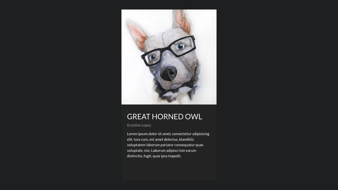
Fluid Shared Element Image Gallery
This is a Fluid Shared Element Image Gallery. It connects a thumbnail grid to a full-screen detail view through continuous spatial morphing. Its function is to eliminate context loss, carrying the user’s visual focus seamlessly from a macro overview to a micro inspection.
Chrome 36+
Edge 79+
Firefox 48+
Safari 13.1+
See the Pen Fluid Shared Element Image Gallery.
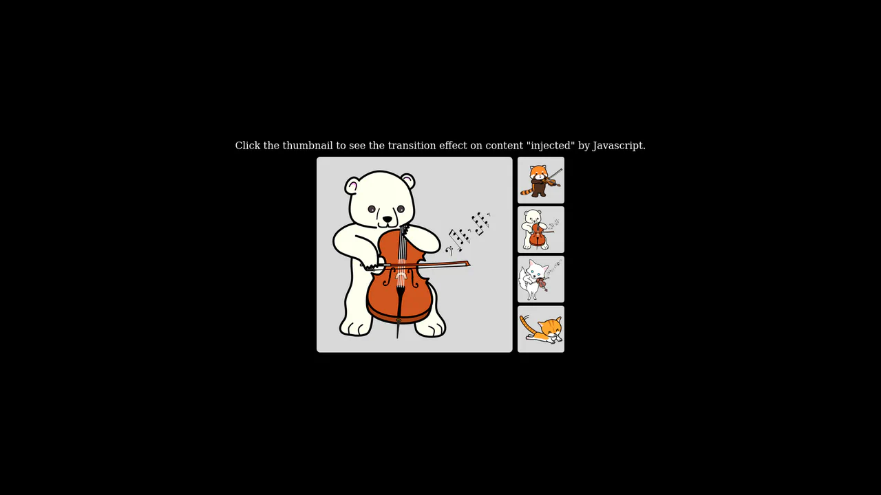
Native Cross-Fade View Transition Gallery
This is a Native Cross-Fade View Transition Gallery. It updates a central image source triggered by thumbnail interactions. Its function is to smooth out abrupt visual DOM updates using the browser’s built-in rendering engine, entirely eliminating the need for external animation payloads or CSS opacity toggles.
Chrome 111+
Edge 111+
Firefox 131+
Safari 18+
See the Pen Native Cross-Fade View Transition Gallery.
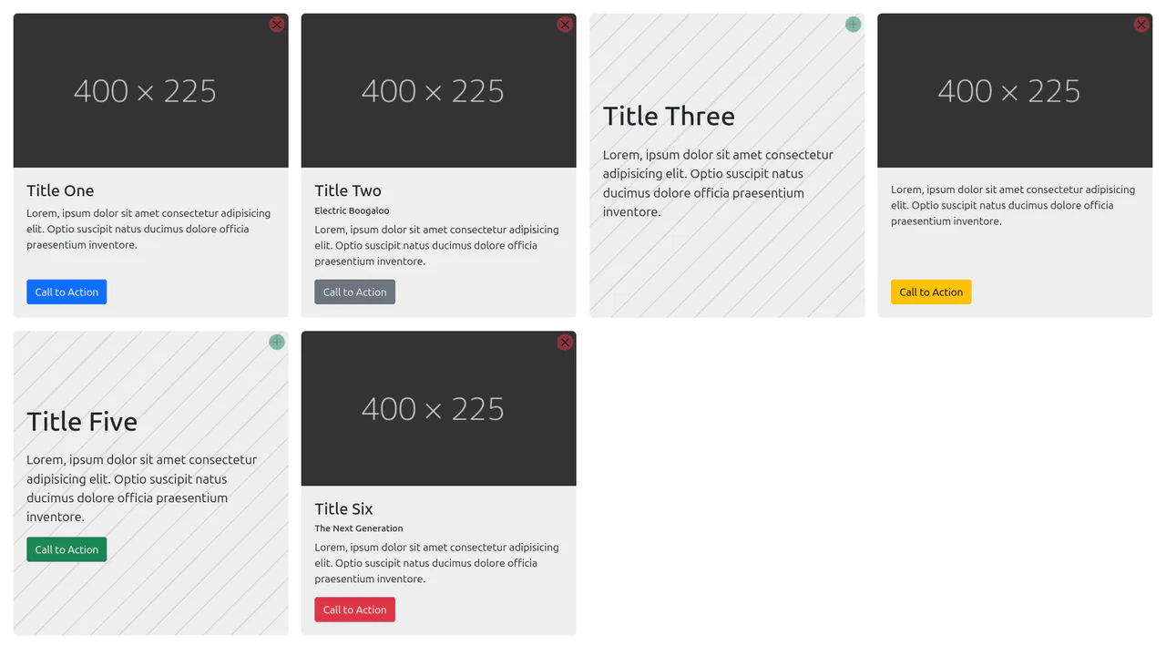
Content-Aware Cards
This is a Content-Aware Bootstrap Card. It uses the structural :has() pseudo-class to dynamically alter its internal layout, background, and typography based solely on the presence of an image node. Its function is to provide an adaptable, self-managing container that eliminates the need for redundant state-tracking classes in your JavaScript logic. (Requires: bootstrap)
Chrome 105+
Edge 105+
Firefox 121+
Safari 15.4+
See the Pen Content-Aware Cards.

Dynamic Data-Driven Tag Cloud Component
This is a Dynamic Data-Driven Tag Cloud Component. It consumes an external JSON payload to generate interactive tags, proportionally scaling their font sizes based on their frequency of use. Its function is to visually prioritize popular categories, allowing users to intuitively navigate heavy content taxonomies without reading numbers.
Chrome 42+
Edge 14+
Firefox 39+
Safari 10.1+
See the Pen Dynamic Data-Driven Tag Cloud Component.

Responsive Fluid Photo Gallery Grid
This is a Responsive Fluid Photo Gallery Grid. It organizes varied aspect-ratio images into justified rows without cropping essential content. Its primary function is to optimize visual space, ensuring edge-to-edge alignment while deferring offscreen asset loading for strict performance control. (Requires: lazysizes, object-fit-images)
Chrome 80+
Edge 80+
Firefox 75+
Safari 13+
See the Pen Responsive Fluid Photo Gallery Grid.

Interactive Glowing Grid Cards
This snippet presents Interactive Glowing Grid Cards. It transforms a static grid of content into an immersive, tactile interface by having a soft, localized glow follow the user’s cursor. This effect illuminates both the background of the hovered card and the borders of adjacent cards, providing continuous, spatial feedback that enhances the premium feel of a dark-mode dashboard or feature list.
Chrome 60+
Safari 11+
Firefox 55+
Edge 79+
See the Pen Interactive Glowing Grid Cards.

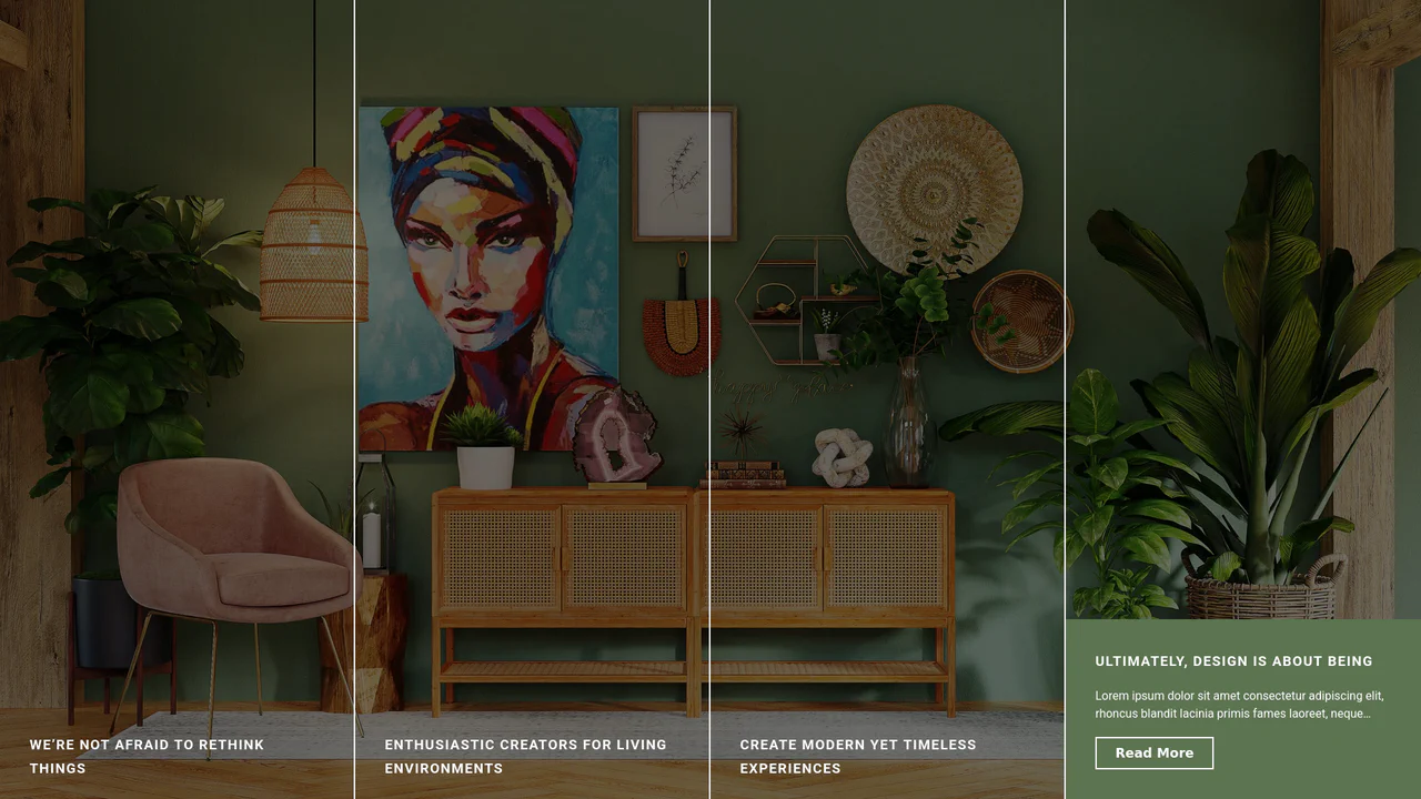
Pinned Split-Screen Mask Reveal
Pinned Split-Screen Mask Reveal is a high-performance scroll-driven layout. It synchronizes fixed image stacks with flowing text content. This element creates a cinematic transition where images are “unmasked” as the user progresses through sections. It is designed to bridge the gap between static information and immersive visual storytelling. (Requires: gsap-js, scroll-trigger-js, lenis-js)
Chrome 88+
Edge 88+
Firefox 85+
Safari 14.1+
See the Pen Pinned Split-Screen Mask Reveal.
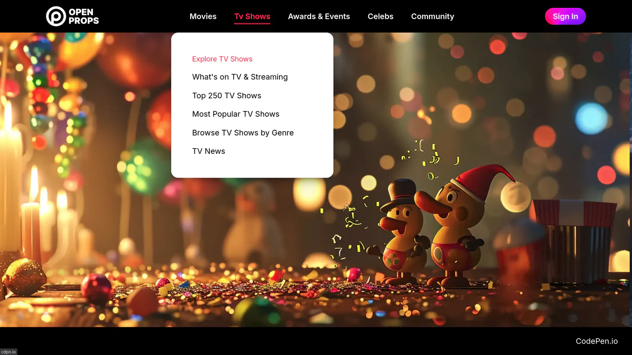
Dropdown Navigation
Navigation is the backbone of usability, but traditional dropdowns can feel cramped and elusive. This component expands the concept of a menu into a panoramic dashboard. It is not just a list of links; it is a structured map of your application’s architecture. (Requires: open-props, remixicon, normalize-css)
Chrome 99+
Edge 99+
Firefox 97+
Safari 15.4+
See the Pen Dropdown Navigation.
Expanding Split-Screen Grid Navigation
This Expanding Split-Screen Grid Navigation transforms standard menu items into an immersive, interactive gallery experience. It organizes content into a responsive grid where hovering over an item reveals a contextual background image, and clicking expands the section into a full-screen detailed view. This component is ideal for portfolios, featured article selections, or high-end agency landing pages where visual storytelling is key.
Chrome 45+
Edge 15+
Firefox 35+
Safari 9+
See the Pen Expanding Split-Screen Grid Navigation.

GSAP Flip Layout Expansion
This GSAP Flip Layout Expansion demonstrates how to animate complex layout changes that are usually impossible with pure CSS. By utilizing the FLIP (First, Last, Invert, Play) technique via GSAP, a list item transforms from a horizontal row into a vertical, detailed card. It smoothly handles the resizing of nested elements (like the avatar) and the repositioning of surrounding items without jumpy reflows. (Requires: GSAP, GSAP Flip Plugin)
Chrome 60+
Edge 79+
Firefox 60+
Safari 11+
See the Pen GSAP Flip Layout Expansion.

React Filterable Image Gallery
This React Filterable Image Gallery is a clean, component-based solution for organizing visual content. Unlike simple “show/hide” scripts, it uses React’s state management to handle complex multi-criteria filtering. Users can toggle multiple categories (e.g., “Food” AND “Plants”) simultaneously, or reset everything with an “All” button. The UI is polished with pastel colors and smooth hover animations. (Requires: React, ReactDOM)
Chrome 80+
Edge 80+
Safari 13+
Firefox 75+
See the Pen React Filterable Image Gallery.

Responsive Portfolio Profile Card
This Responsive Portfolio Profile Card packs a full personal website’s functionality into a single, elegant component. Designed to mimic a native mobile app interface, it features a sticky bottom navigation bar that toggles between “About,” “Experience,” and “Contact” sections. The standout feature is the smooth, animated transition of the card’s dimensions and header layout as users switch contexts.
Chrome 50+
Edge 15+
Firefox 45+
Safari 10+
See the Pen Responsive Portfolio Profile Card.

Modern Our Team Section
A stylish, modern employee profile grid on a dark background featuring subtle, elegant gradient borders and atmospheric glowing effects.
See the Pen Modern Our Team Section.

Animated Navigation
An elegant and responsive menu that saves space when collapsed and provides a smooth, delightful interaction experience upon opening.
See the Pen Animated Navigation.

Incrementing Counter
A dynamic and engaging statistics block that creates a sense of activity and popularity through running numbers and background animation.
See the Pen Incrementing Counter.
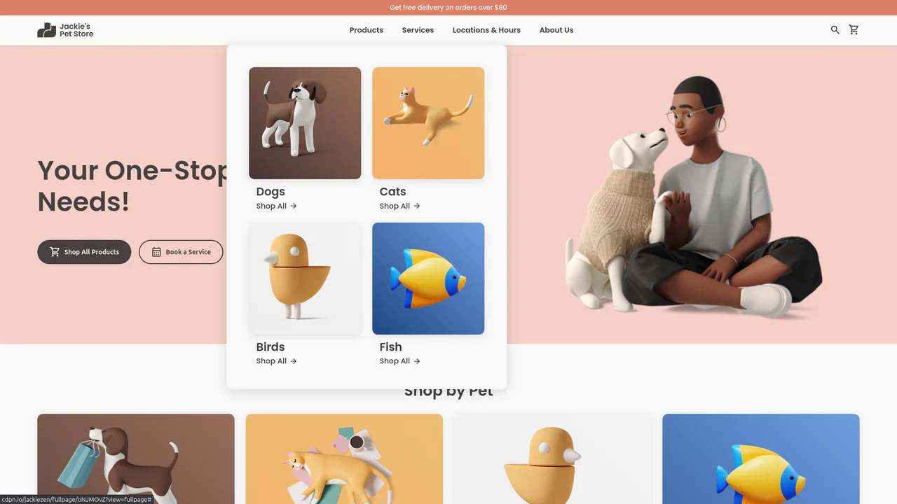
Jackie's Pet Store
A responsive pet store landing page built with CSS Grid and Flexbox. It features a dynamic navigation system with hover-triggered mega-menus, gradient-styled product cards with scale transitions, and a comprehensive use of CSS variables for consistent theming across breakpoints.
See the Pen Jackie's Pet Store.

Product Slider: Marvel Characters
A smooth, touch-enabled infinite loop of cards offering tactile feedback via scale transitions on hover.
See the Pen Product Slider: Marvel Characters.
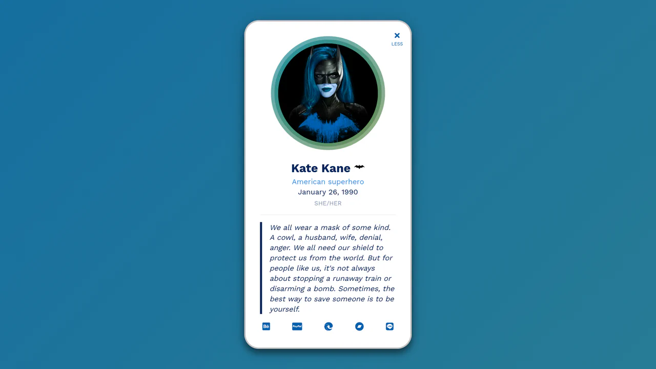
Folding/Collapsing Profile Card Starring Batwoman
An interactive profile card featuring a dynamic theme toggle triggered by clicks on the avatar or menu button.
See the Pen Folding/Collapsing Profile Card Starring Batwoman.

Literally Linked Lists
An engaging data comparison tool that transforms static lists into a dynamic relationship map, clearly visualizing taste overlaps via connecting lines.
See the Pen Literally Linked Lists.

Segmented/Pill Radio Input
A sliding segmented control that uses CSS Custom Properties calculated via JS to animate a pseudo-element background. The layout relies on flexbox for equal distribution, while calc() dynamically positions the “pill” based on the active index, enhanced by a springy cubic-bezier transition.
See the Pen Segmented/Pill Radio Input.

Round Cards
An aesthetic, minimalist gallery of circular elements where each card is uniquely composed (image on top, bottom, left, or right), creating visual variety within a strict grid.
See the Pen Round Cards.

Complex Navigation
A fully responsive, accessible mega-menu designed for e-commerce, featuring multi-column dropdowns and a mobile-friendly hamburger toggle.
See the Pen Complex Navigation.

Expanding Cards
A vertical neumorphic accordion that uses CSS Flexbox transitions to dynamically expand content panels. JavaScript toggles the .active class, triggering a smooth flex-grow animation that enlarges the selected panel while revealing its detailed content via opacity transitions, creating a tactile and responsive settings interface.
See the Pen Expanding Cards.

Sticky Header Calendar
A user-friendly calendar interface that functions seamlessly on both desktop and mobile devices, keeping context (time and day) constantly visible to the user, featuring both horizontal and vertical scrolling.
See the Pen Sticky Header Calendar.

Expanding Flexbox Panels
This expanding panel gallery’s core animation is powered by CSS Flexbox, where the flex property is transitioned to create a fluid expansion effect. The state is managed by a minimal vanilla JavaScript snippet that simply toggles an .active class on click. This .active class also triggers a multi-layered text animation, using a delayed transition on the <h1>’s opacity and filter: blur() properties for a polished, cinematic reveal.
See the Pen Expanding Flexbox Panels.

3D Text Shadow
An example of a complex text-shadow where SCSS is used to create a multi-layered shadow with precise offsets for each layer - this gives the text a dimensional, “cartoonish” effect that is unachievable with standard tools.
See the Pen 3D Text Shadow.
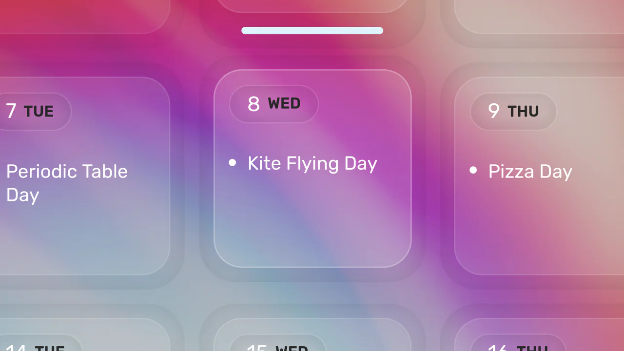
Click-to-Zoom Calendar
Explore responsive calendar design featuring a detailed hover and click zoom effect, implemented through precise coordinate calculations to manipulate CSS transform based on the selected date’s index.
See the Pen Click-to-Zoom Calendar.

Responsive Flexbox Slider
A responsive accordion in Vue.js where the panel expansion effect is implemented via CSS animation of the flex property - the state is changed with a simple click, without complex logic in JS.
See the Pen Responsive Flexbox Slider.