20+ CSS Flip Cards
This updated collection provides professional components that introduce spatial depth to flat UI design. Flip cards maximize screen real estate, allowing dual-sided presentation for product details, pricing tiers, or team profiles. Using these curated snippets offers an optimized alternative to building 3D interactions from scratch, ensuring a professional and engaging user experience.
Technically, these examples rely on hardware acceleration for smooth 60fps animations on the compositor thread. By utilizing perspective, transform-style: preserve-3d, and backface-visibility, the snippets guarantee flawless rotation. The underlying HTML markup integrates with CSS Grid to maintain strict layout stability, preventing cumulative layout shifts during the flip transition and safeguarding Core Web Vitals.
Every free demo in this library is fully responsive and cross-browser compatible. Developers can effortlessly download the source code or fork a project on CodePen to customize rotation axes and timings.
Examples
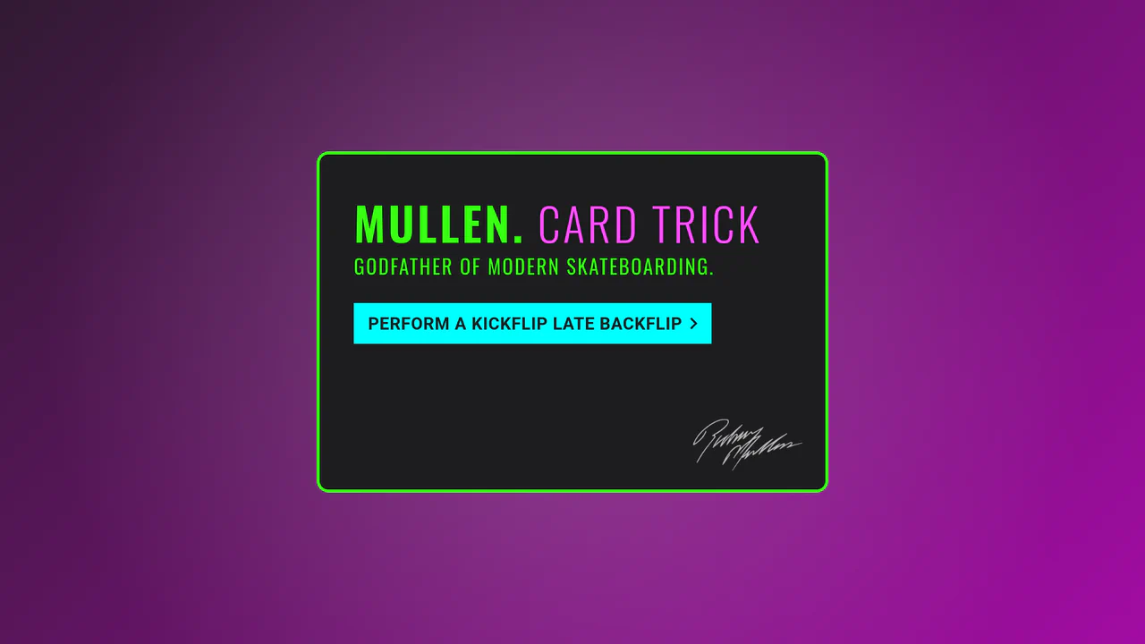
SlowMo Mullen Card Trick
An interactive 3D simulation of skateboarding tricks (Kickflip, Impossible, etc.) performed by a rotating card via CSS transforms and JavaScript.
See the Pen SlowMo Mullen Card Trick.
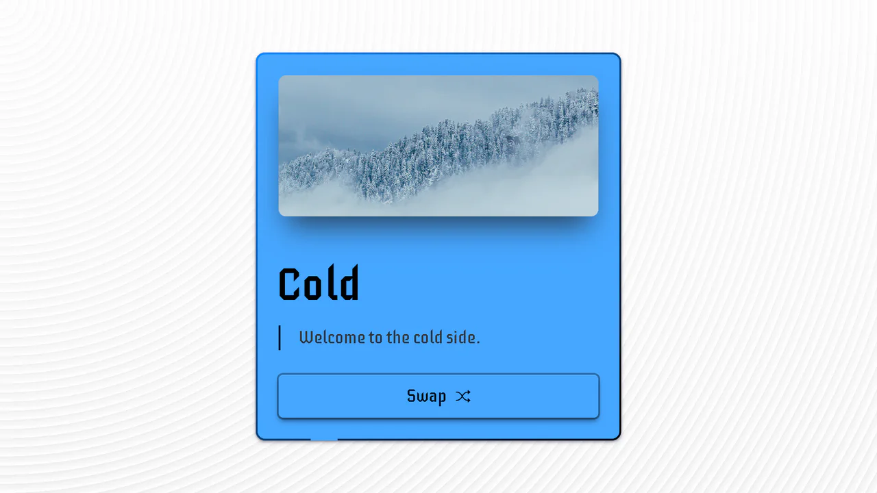
Hot & Cold Swap Card
An advanced UI component demonstrating pure CSS capabilities to create a complex 3D flip effect, with the added use of animated SVG strokes and CSS variables for an instant change of color scheme and media content.
See the Pen Hot & Cold Swap Card.
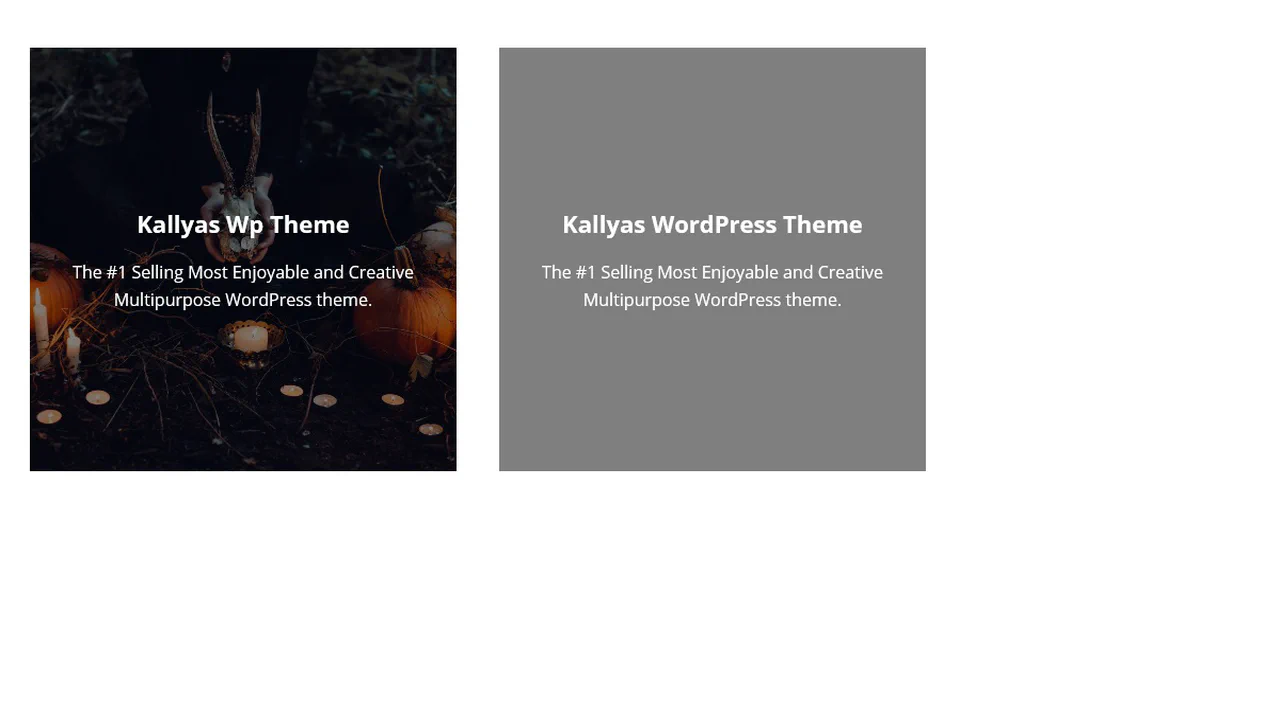
3D Flip Card
A practical approach where a spectacular 3D flip is implemented in pure CSS, complemented by a small jQuery script for dynamically substituting background images from data-image attributes.
See the Pen 3D Flip Card.

3D Flipping Cards
A classic 3D card flip on :hover within a perspective container, plus an elegant solution for auto-numbering items using CSS counters.
See the Pen 3D Flipping Cards.

A flip card built with CSS 3D transforms. The front displays only a symbol, blended with the background using mix-blend-mode. The back holds descriptive text, revealed through a 180‑degree rotation.

A flip card with a separate rotating control. The card rotates 180 degrees on click, revealing detailed information and a call‑to‑action on the reverse.

A set of interactive cards using CSS 3D transforms. On hover, each card tilts slightly. On click, it expands and flips 180 degrees, revealing detailed information on the reverse.

A 3D flip card that transitions between a personal profile and a contact form. On hover, the container rotates 180 degrees, revealing the reverse side. The interaction is a single, direct transformation — no extraneous effects.

A set of flipping cards arranged in a responsive grid. Each card rotates 180 degrees on hover, swapping a front image and label for a detailed description on the reverse.
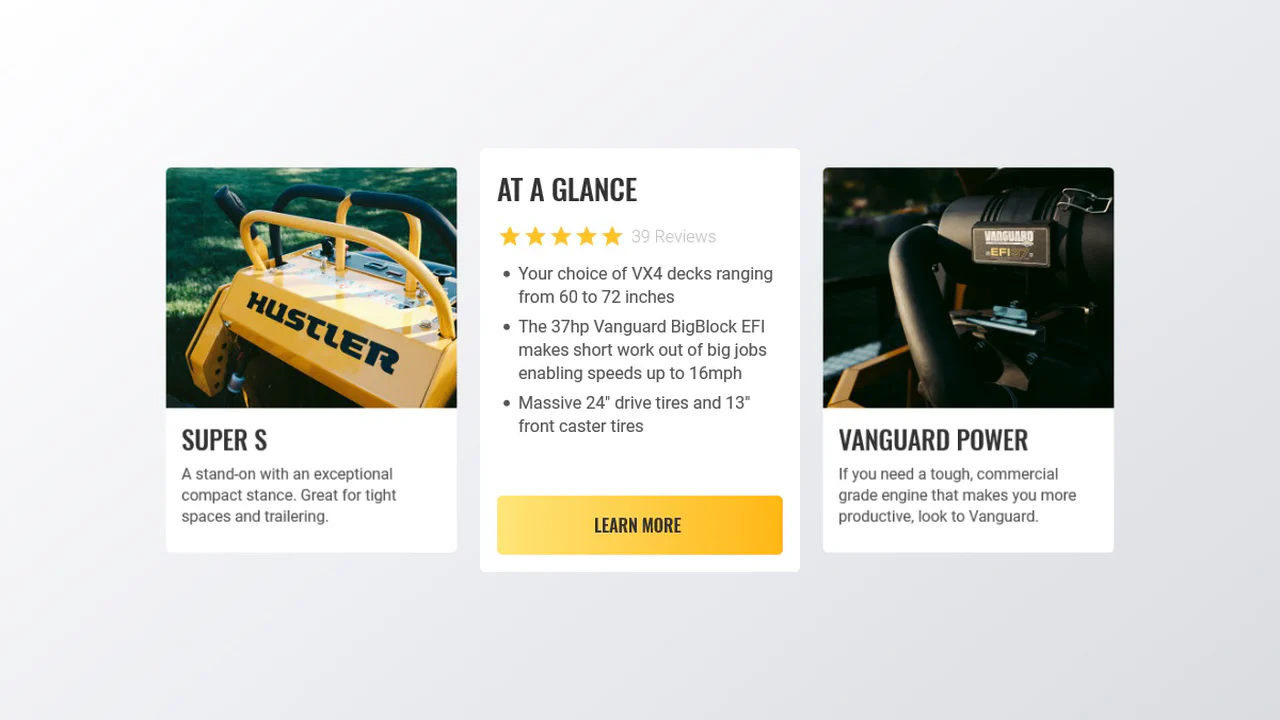
A product card that flips on click to reveal detailed specifications and a call‑to‑action. The front presents an image and a short description; the back lists features, reviews, and a button. A hover‑triggered shadow adds depth.
A grid of flip cards. Each card rotates 180 degrees on hover, revealing a call‑to‑action button with its own 3D press effect. The front uses a gradient overlay for readability; the back centers content with a button that simulates depth via a pseudo‑element.

A flip card built with CSS 3D transforms. On hover, the card rotates horizontally or vertically, swapping the front image for a descriptive back. The interaction uses a cubic‑bezier curve for a snappy, mechanical motion.

A family of flip cards built with CSS 3D transforms. Each card rotates along a different axis on hover — horizontal, vertical, or diagonal — revealing a back panel. The direction is controlled by a single class, and the animation uses a consistent ease-in-out timing.


A spectacular 3D card flip on click, implemented through a combination of jQuery’s toggleClass and CSS transforms - the animation is enhanced with hover effects and a delayed content reveal on the back using transition-delay, while backface-visibility: hidden ensures a clean execution.

CSS3 Business Card
A demonstration of SCSS power, where a 3D card flip on hover is combined with the procedural generation of a “long shadow” via a @function and @for loop, while a custom @keyframes animation adds a wobble effect to the button.
See the Pen CSS3 Business Card.