10+ CSS Floating Action Buttons: Free Examples & Code Snippets
Floating Action Buttons provide persistent access to primary actions while staying out of the content flow. Speed-dial patterns extend a single FAB into contextual action menus without cluttering the interface.
- A fixed-position FAB uses position: fixed with clamp()-based offsets to stay accessible at all viewport sizes without overlapping critical content or navigation elements.
- Speed-dial menus leverage :focus-within and incremental transition-delay via CSS Custom Properties to reveal child action buttons in a staggered sequence without JavaScript.
- Accessibility is maintained through aria-label on the primary button and aria-expanded on the menu container, ensuring screen readers convey the FAB state and available actions.
Browse this collection of CSS floating action buttons to master persistent action triggers that expand into contextual menus while remaining fully keyboard-accessible.
Table of Contents:
Examples

Morphing Hamburger Floating Action Button
This is a Morphing Hamburger Floating Action Button (FAB). It uses a combination of CSS transitions and keyframe animations to reveal a hidden context menu. Its function is to consolidate multiple secondary actions (Settings, Copy, Share, Delete) into a single, space-saving focal point. The interaction is initiated by a vanilla JavaScript class toggle.
 Chrome 60+
 Edge 79+
 Firefox 55+
 Safari 11.1+
See the Pen Morphing Hamburger Floating Action Button.
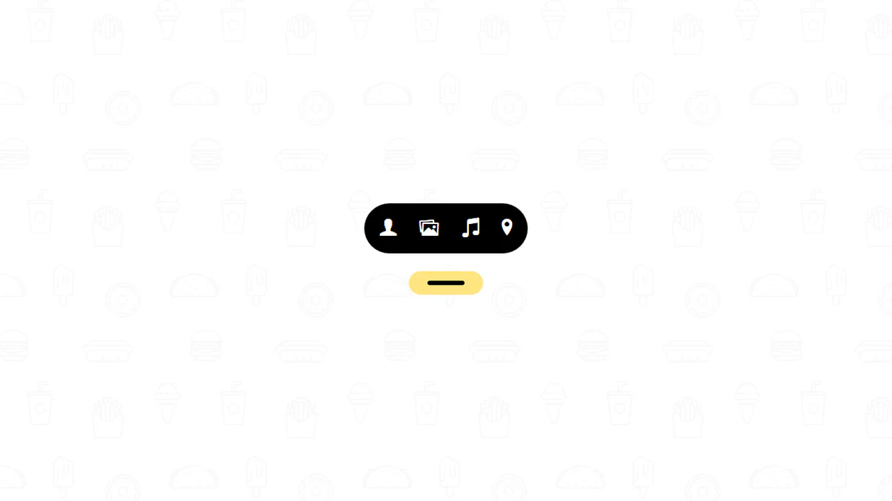
Floating Button
A “gooey effect” menu with a cascading reveal, implemented in pure CSS and SVG filters. The animation is controlled by the “checkbox hack,” where each menu item gets its own transition-duration for sequential appearance. The “gooeyness” is achieved using an SVG filter with feGaussianBlur and feColorMatrix, where a custom matrix removes semi-transparency and creates a merging effect.
See the Pen Floating Button.
Material Floating Button CSS
A “Floating Action Button” effect, inspired by Google Inbox, implemented in pure CSS. Hovering over the container triggers a complex, multi-step @keyframes animation: the plus icon rotates and fades out, an edit icon appears, and child buttons cascade out with a “bounce” effect thanks to animation-delay, creating a cohesive and smooth interaction.
See the Pen Material Floating Button CSS.
Action Button with Checkbox Trick
A complex mobile app UI built entirely on the CSS “checkbox hack” - four independent <input type="checkbox"> elements are used to control different states: opening a menu, showing an overlay, switching cards, and hiding elements.
See the Pen Action Button with Checkbox Trick.
Multi Share Button in Pure CSS
An interactive multi-functional share button built with pure CSS and SCSS, featuring a smooth expansion animation. Utilizing the “checkbox hack,” this Material Design inspired component toggles between a single share icon and a grid of social links without any JavaScript dependencies.
See the Pen Multi Share Button in Pure CSS.
Only CSS Action Button
An interactive circular menu built with SCSS, utilizing the “checkbox hack” to toggle expansion without any JavaScript. This UI component features smooth CSS animations and SVG icons, providing a lightweight and responsive navigation solution for modern dashboards and mobile-first web applications.
See the Pen Only CSS Action Button.
Floating Action Button
A lightweight dropdown navigation menu built with pure SCSS using the “checkbox hack” for logic-free state management. This UI component features a smooth animated toggle button and a fully responsive layout, making it an ideal choice for high-performance web applications and minimalist design projects.
See the Pen Floating Action Button.

Floating Animation
An interactive social share menu built with jQuery featuring a custom staggered animation for individual platform buttons. This UI component utilizes the .animate() method for precise element positioning and smooth icon transitions, creating a dynamic and engaging floating action button experience.
See the Pen Floating Animation.
Materialize FAB Button Spin-Close Menu Variation
An advanced Material Design Floating Action Button (FAB) featuring a sophisticated spin-close SCSS animation. The component leverages pseudo-elements and CSS transitions to smoothly transform the primary icon into a close state, providing a high-performance and interactive UI solution for action menus.
See the Pen Materialize FAB Button Spin-Close Menu Variation.
Add Button
An interactive plus button built with SCSS and JavaScript that smoothly transforms into a horizontal navigation bar on click. This UI component utilizes CSS transitions to manage dynamic geometry and icon visibility, offering a modern and space-saving navigation solution for responsive web interfaces.
See the Pen Add Button.
Add Button Hover Animation
A sophisticated “Add” button UI component built with SCSS and SVG symbols featuring a complex hover animation. Upon interaction, the element splits into four interactive action circles using smooth CSS transitions and rotations, providing a high-performance and engaging interface for modern web applications.
See the Pen Add Button Hover Animation.
Floating Button
A pure CSS Floating Action Button (FAB) featuring a smooth cascade expansion effect on hover. This UI component utilizes keyframe animations to reveal multiple action items, making it perfect for Material Design-inspired contact widgets or speed dial menus.
See the Pen Floating Button.
Material More Button CSS
A pure CSS interactive menu powered by the checkbox hack. When collapsed, hovering triggers a wave-like bouncing loading animation on three tiny dots. Clicking scales them into full-sized social icons using a mathematically detailed matrix3d spring keyframe animation. Hovering the expanded icons reveals text labels via ::after content.
See the Pen Material More Button CSS.
Pure CSS Floating Action Button
A pure CSS floating action button built with the checkbox hack. When inactive, the trigger button displays an animated blinking three-dot loader. When checked, general sibling selectors ~ scale up a circular speed-dial menu of sub-actions, while the dot elements dynamically morph into an “X” icon by expanding and rotating.
See the Pen Pure CSS Floating Action Button.