10+ CSS Flowcharts
The Pure CSS Flowchart Examples collection demonstrates how process diagrams function through semantic HTML and CSS layout. Grid and Flexbox handle node positioning, connectors bridge relationships — eliminating complexity between information architecture and visual representation.
Flowcharts use CSS Grid with grid-auto-flow and grid-template-columns to arrange nodes in rows and columns, while Flexbox centers content within each element. SVG lines or pure CSS border techniques create connectors between boxes; clip-path shapes nodes into diamonds (decisions), rectangles (processes), and circles (start/end points). CSS Custom Properties store node colors and connector styles, enabling theme switching without markup changes. Transform and translate() adjust node positions; animation adds directional flow effects to connectors.
Responsive design adapts diagram scales via media queries and aspect-ratio containers, preventing distortion on mobile. Accessibility is embedded: semantic HTML structures the flow logically. The collection includes free CodePen demos, downloadable code, and updated examples. Each snippet prioritizes Core Web Vitals — no layout shift through fixed container dimensions, hardware-accelerated transforms via will-change, minimal repaints using contain: layout.
Every example works in modern browsers (Chrome, Firefox, Safari, Edge). Download, customize, deploy.
Examples
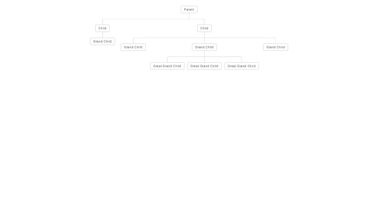
An elegant and clear hierarchical structure that automatically adapts to the number of elements and levels of nesting.
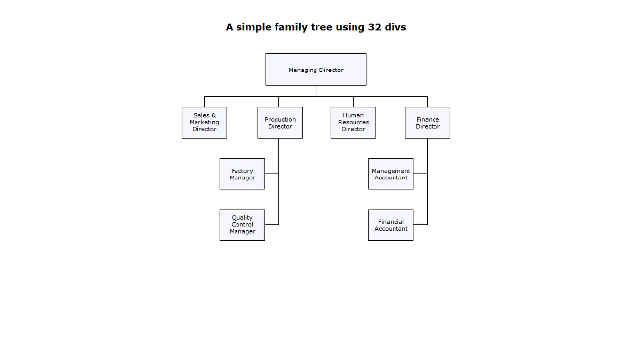
A complex responsive organizational chart constructed from nested HTML lists, employing absolute positioning and pseudo-elements to draw intricate connecting lines without SVG or Canvas.
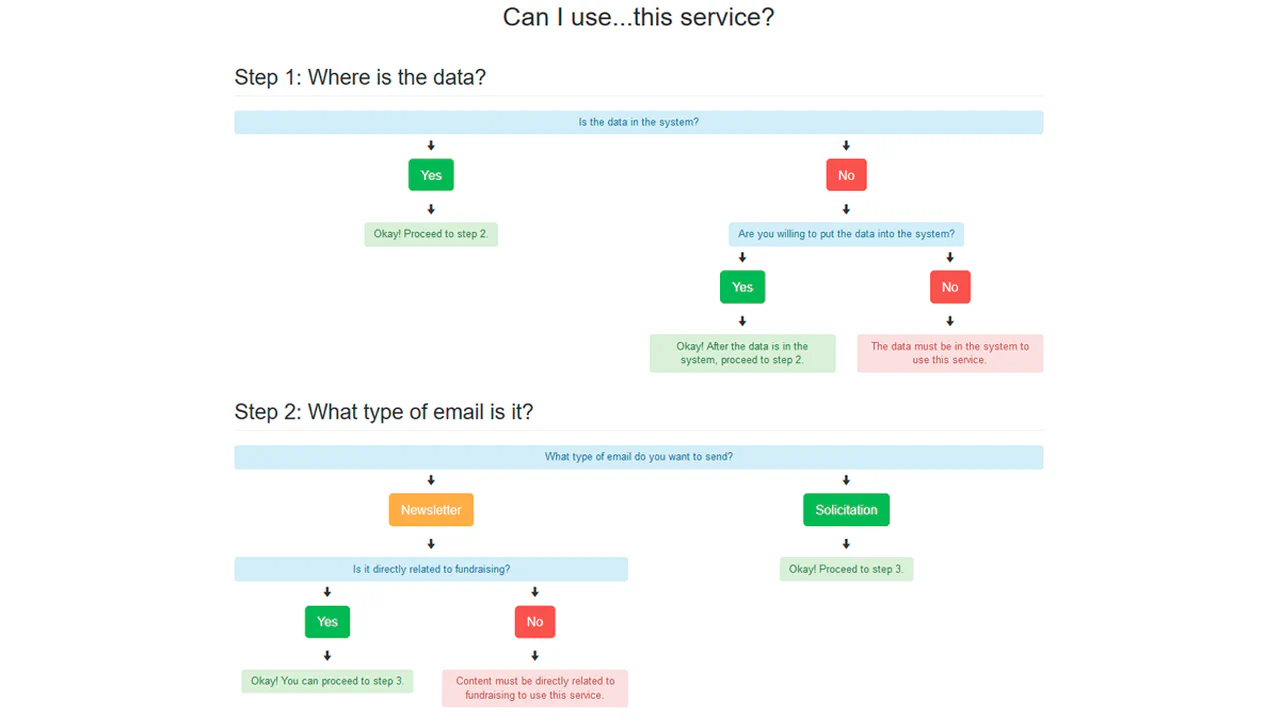
Bootstrap Determination Flowchart
A clear decision tree that helps the user determine if they can use a specific service by answering “Yes/No” questions.
See the Pen Bootstrap Determination Flowchart.
This is a CSS‑only nested menu that visually connects parent and child items with lines, like a tree diagram. Pseudo‑elements ::before and ::after draw the connectors based on list structure. Hover effects highlight the active branch. The markup is static; no JavaScript drives interactivity.
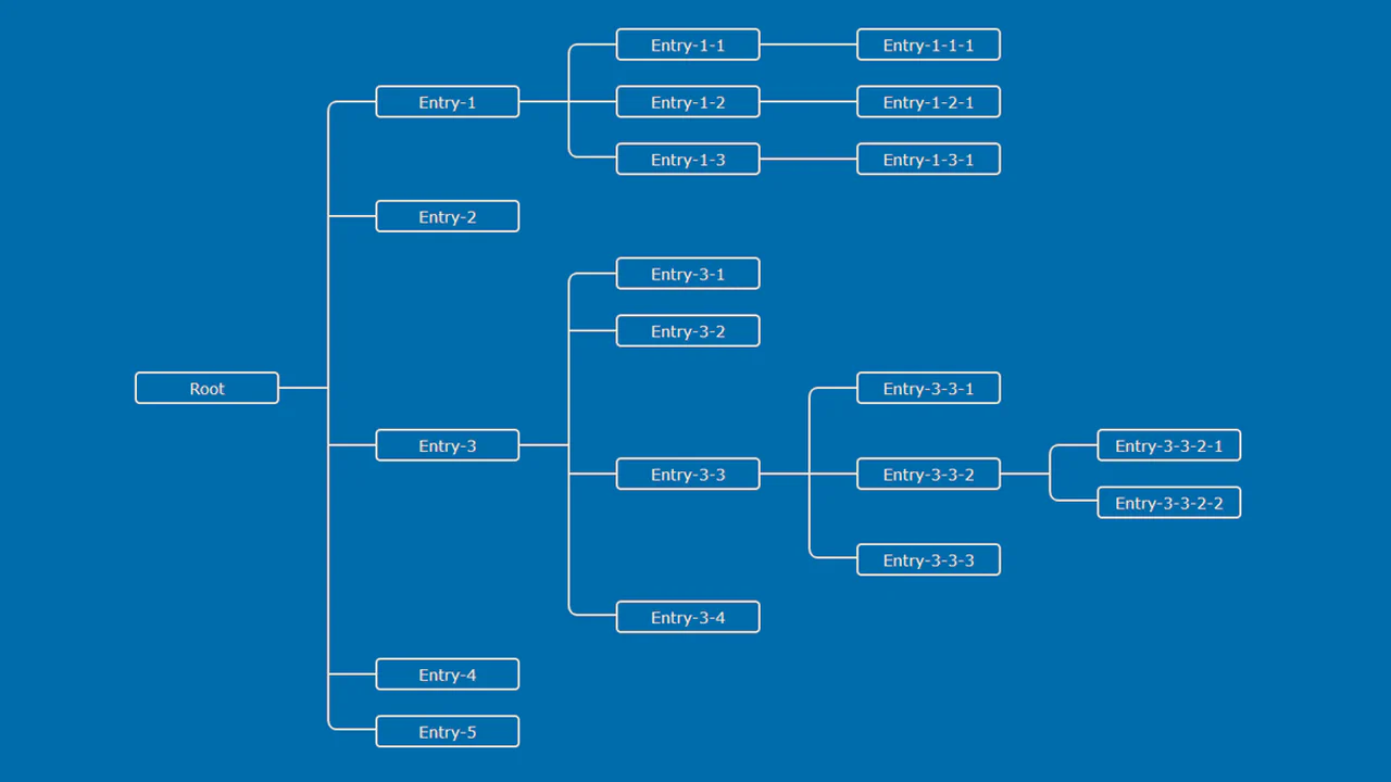
SCSS generates a tree diagram with connectors drawn by pseudo‑elements — each branch and entry has precise positioning via margins and absolute placement. The layout is fixed and static; hover effects or interactions are absent.
SCSS mixins and variables build a multi‑level org chart with connecting lines drawn by pseudo‑elements. Responsive breakpoints collapse columns into a stacked layout. The markup is static; the design is purely visual with no interactivity.
A fixed-width org chart built with absolutely positioned <div> elements — each line is a separate empty <div> with border or background. The structure is entirely static and relies on hardcoded pixel values; no flexibility or interactivity.
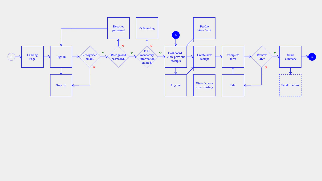
A flowchart built with CSS Grid and inline SVG — each connector is a reusable symbol, placed in grid cells to form a responsive diagram. Media queries rearrange the grid for mobile, rotating the flow from horizontal to vertical. The design is static; the “yes/no” markers and labels are decorative.
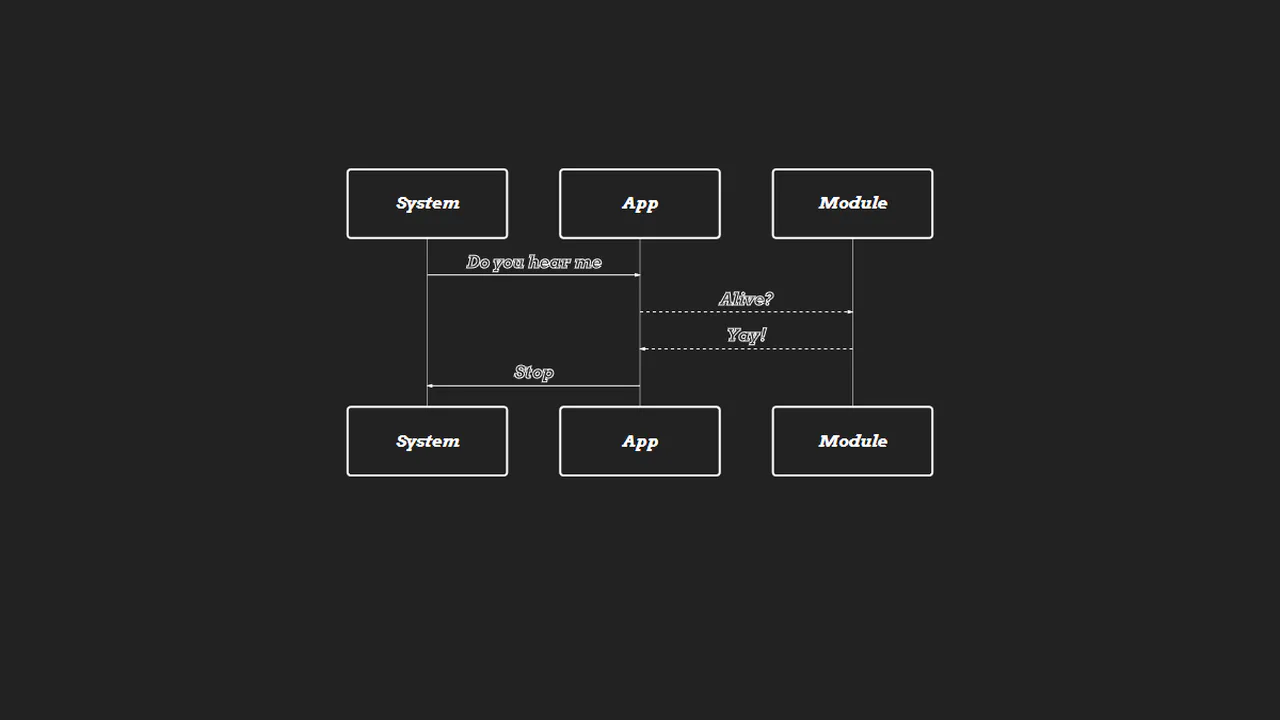
Mermaid renders a sequence diagram from plain text — the diagram describes a simple handshake between System, App, and Module. CSS customizes the look: white strokes, dark background, and italic font. No logic — just a declarative diagram embedded in HTML.
A responsive sitemap built with flexbox — JavaScript toggles a narrow class, collapsing pages to a compact view with rotated headings. SCSS mixins handle the responsive behavior, and inline SVGs create visual connectors between pages. The design adapts to screen size and button click; all markup is static.
A Vue‑powered interactive flowchart — clicking an SVG block sets a selected property, triggering a modal with detailed content. Transitions handle fade‑in/out. The static SVG defines nodes and connecting lines; all interaction logic is client‑side.

SCSS @extend unifies tooltip and card styles. Three sections (sources, build, deploy) are separated by animated SVG lines — the motion creates a flow illusion. The layout is responsive; no actual interaction.

A static SVG flowchart illustrating a 10‑step workflow — each step is a colored rectangle, start and end are circles, and connecting lines use dashed strokes. The JavaScript snippet is unused and incomplete; the diagram is purely visual.

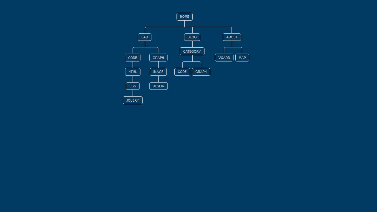
Nested unordered lists build a tree diagram using CSS pseudo‑elements to draw connecting lines. The design visually represents DOM structure or sitemap hierarchy without JavaScript — static, clean, and fully reliant on CSS positioning and outlines.


