10+ CSS Flyers: Free Code Snippets & Design Examples
CSS flyers translate classic print design aesthetics into fluid, interactive digital layouts, presenting promotional content, event invitations, and marketing brochures natively inside the browser. By combining precise dimensional proportions with dynamic grid alignments, this system organizes text, imagery, and call-to-actions into highly engaging catalog-style sheets.
- Standardized physical print ratios (like A4 or US Letter) are established natively using the CSS aspect-ratio property, ensuring layout metrics remain uniform across viewport scales.
- Interactive folding transitions and 3D leaf folds leverage transform-style: preserve-3d properties, mapping spatial angles directly to compositor-friendly translations.
- To preserve critical INP (Interaction to Next Paint) performance during hover flips, complex clipping gradients and drop shadows are promoted to dedicated GPU rendering layers.
Master these high-fidelity brochure architectures to seamlessly integrate tactile, physical layouts and modern promotional cards into your marketing platforms.
Table of Contents:
Examples
Techfood Grocery Grid Layout
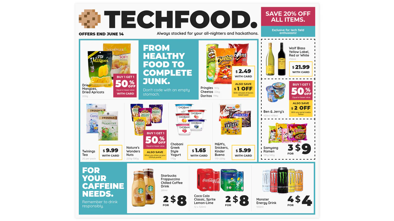
Web layouts often suffer from “boxiness” — everything aligned in predictable, uniform rows. This design breaks that monotony by adopting the chaotic energy of a supermarket flyer. It utilizes the full power of CSS Grid to create irregular spans, varied densities, and tight packing, proving that the web can be as visually dense and information-rich as print media without sacrificing structure.
 Chrome 57+
 Edge 16+
 Firefox 52+
 Safari 10.1+
See the Pen Techfood Grocery Grid Layout.
Flyer
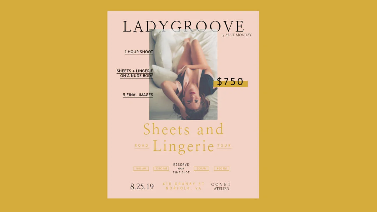
A chic, magazine-style event flyer crafted with Pug and Sass, utilizing absolute positioning to layer bold typography and graphic elements over imagery. The design features a sophisticated color palette and custom fonts to create an editorial look, mimicking print layout techniques within a responsive web container.
See the Pen Flyer.
Flyer
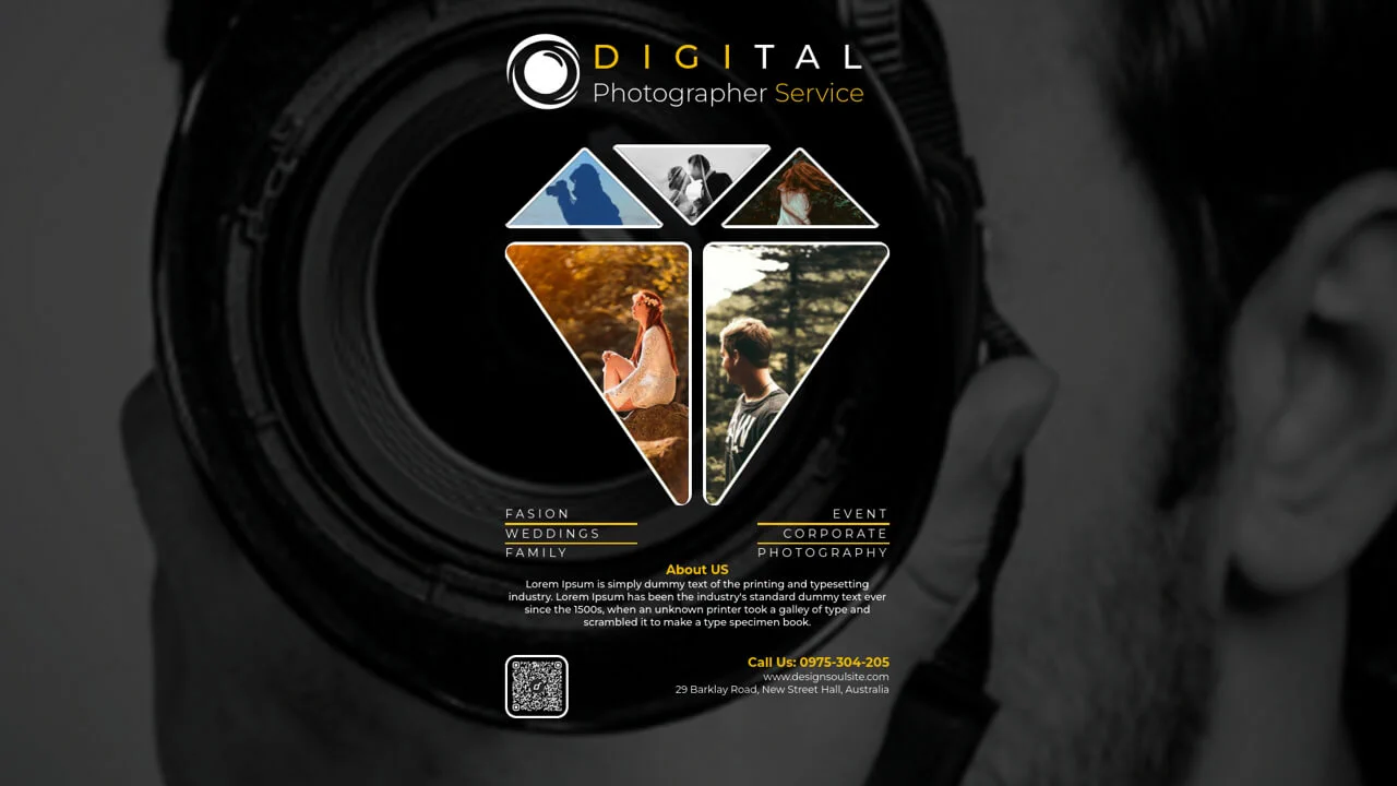
A unique, memorable design featuring broken geometry that stands out against standard rectangular grids.
See the Pen Flyer.

Flyer Design #01
A modern, corporate cover design with an emphasis on geometry and typography, fully implemented with CSS without relying on graphic editors for composition.
See the Pen Flyer Design #01.
Flyer Design #02
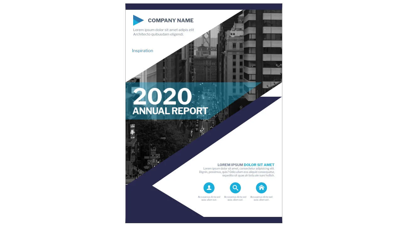
Composition of geometric shapes with clip-path and skewed elements. Left triangle, angled title over image, complex blue background shape. CSS variables control color palette, icons embedded as SVG. Clear separation into header, main part and footer.
See the Pen Flyer Design #02.
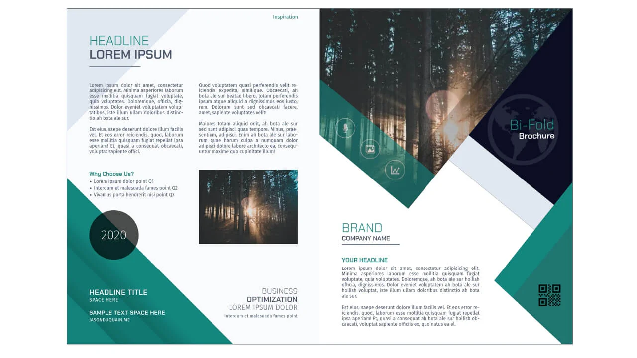
Flyer Design #03
Two-column grid with complex geometry and layered elements. Left column contains text blocks, headings and decorative triangles via clip-path. Right column — image, skewed banner, rotated social bar and geometric shapes. Multiple absolutely positioned elements create multi-layered composition.
See the Pen Flyer Design #03.
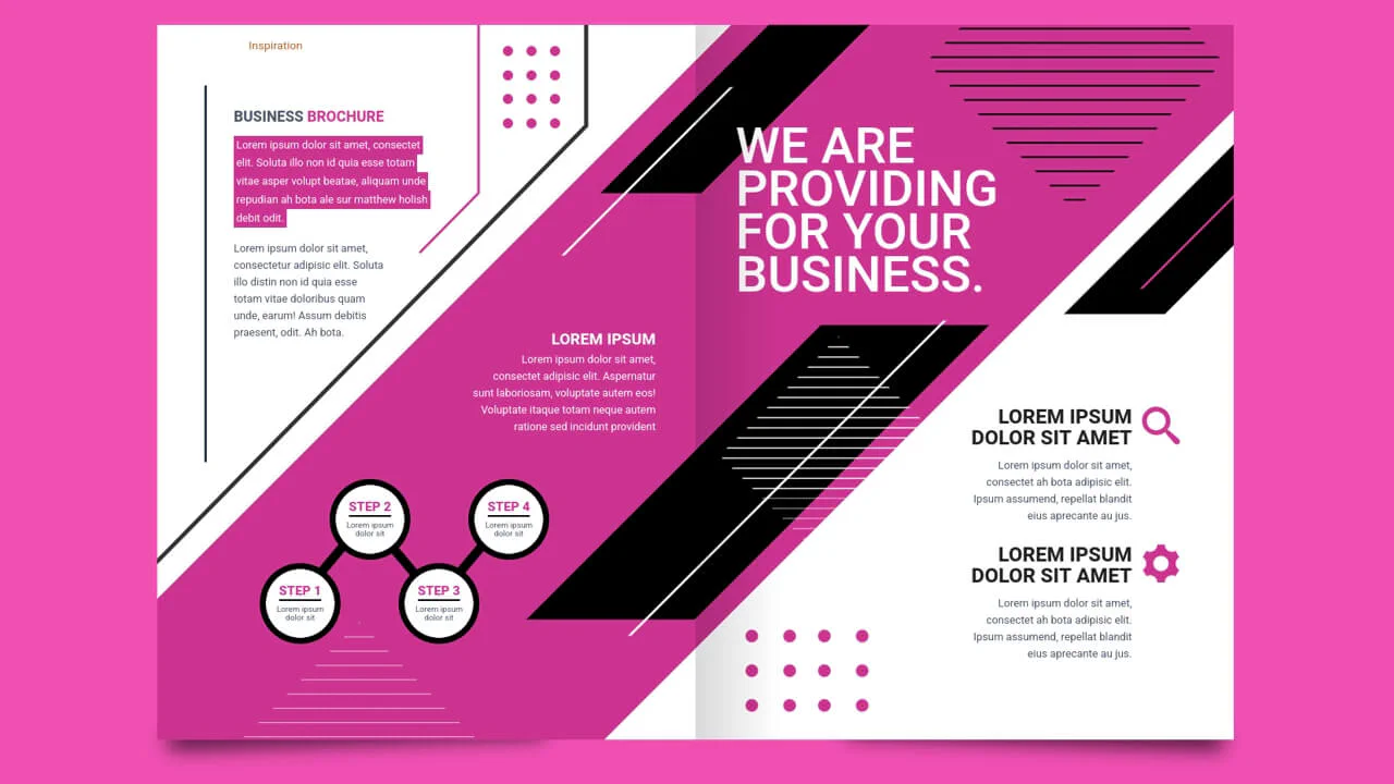
Flyer Design #04
Complex graphic composition built from layered geometric shapes and lines. CSS variables define a unified color scheme, absolute positioning and transforms (skew, rotate) create perspective and overlaps. SVG dots and polylines add rhythm and visual density.
See the Pen Flyer Design #04.

Flyer Design #05
Two-column layout with complex geometry built on clip-path and absolute positioning. Layered blocks with gradients and shadows create depth and volume. SVG icons and polylines add rhythm, CSS variables control a unified color scheme.
See the Pen Flyer Design #05.

Flyer Design #06
Fixed layout with centered container and complex geometry based on SVG and clip-path. Main image embedded in circle via pattern, decorative strokes animated with stroke-dasharray and stroke-dashoffset. Concentric circles create rhythm, angled footer and vertical link text add dynamics. CSS variables control color palette.
See the Pen Flyer Design #06.
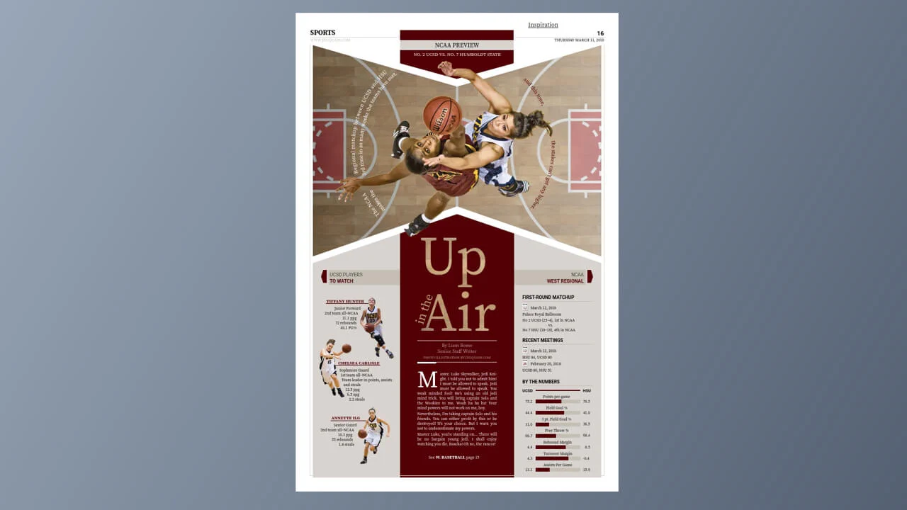
Flyer Design #07
Newspaper-style sports page layout with CSS Grid. Three-column grid with slanted panels via clip-path, nested grids for stats and schedule. Circular SVG text, shape-outside for player image wrapping. CSS variables define color scheme.
See the Pen Flyer Design #07.
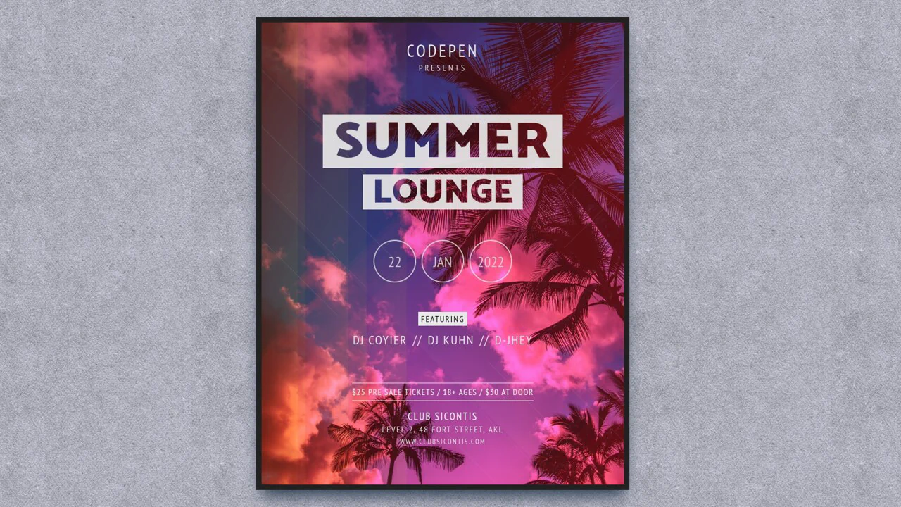
Flyer with Knockout Text
Poster with knockout text effect via SVG masks. Layered gradients and stripes create lens and depth effect. mix-blend-mode and opacity overlay colored layers on background image. Responsive via media queries.
See the Pen Flyer with Knockout Text.
Responsive Flyer
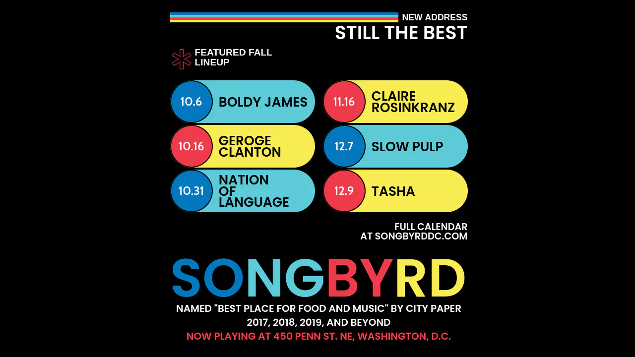
Event poster with character‑wise styling of title via JavaScript. “SONGBYRD” text split into letter pairs, each colored via :nth-child. Event list styled as “bubbles” with dates and band names, colors shift on hover. Rainbow background via repeating linear gradient.
See the Pen Responsive Flyer.