20+ CSS Font Variable Examples
CSS Font Variable Examples represent the logic of fluid typography in modern UI design. This updated collection removes the barrier of loading multiple font files, providing infinite stylistic axes within a single resource. Using these snippets ensures typographic precision without the performance debt of legacy font loading.
Technically, these examples utilize font-variation-settings and specific axis properties like wght, wdth, and slnt. The code focuses on smooth interpolation during state changes, leveraging hardware acceleration for font-weight transitions. This approach maintains high layout stability and minimizes the HTML rendering lifecycle.
Every free demo in this library is cross-browser compatible and responsive. You can instantly download the raw code or fork a project on CodePen. These assets are strictly optimized for performance, delivering a transparent typographic experience across all modern devices.
Examples
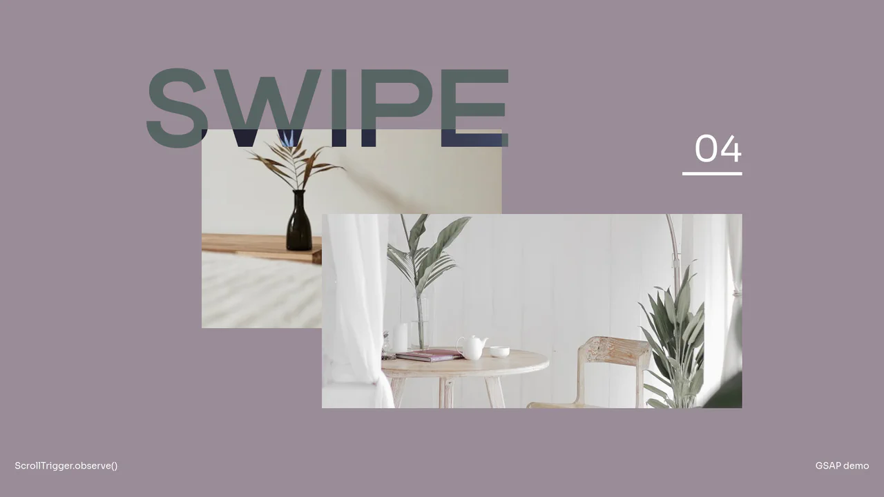
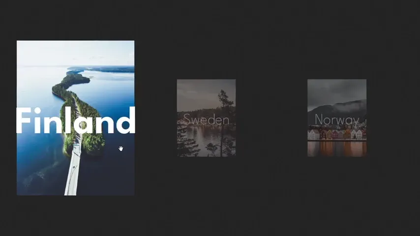
Interactive Variable Font GSAP Slideshow
This masterfully choreographed full-page slider captures wheel, swipe, and key events to drive a multi-layered transition. Utilizing GSAP Observer, the layout animates parent and child containers in opposite directions, producing a clean split-wipe reveal. Simultaneously, a custom variable font dynamically stretches its width axis (wdth) alongside parallax image transformations to create an organic, tactile sense of momentum. (Requires: gsap, gsap-observer)
 Chrome 79+
 Edge 79+
 Firefox 68+
 Safari 13+
See the Pen Interactive Variable Font GSAP Slideshow.

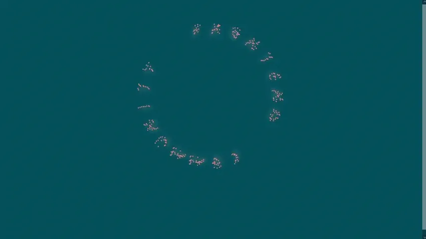
Circular Variable Font Loading Spinner
This is a Circular Variable Font Loading Spinner. It arranges individual characters into a radial path, creating a sophisticated typographic loop. Its function is to serve as a high-fidelity alternative to standard SVG or icon-based loaders, utilizing the weight-axis of variable fonts to simulate organic growth and motion.
Chrome 92+
Edge 92+
Firefox 90+
Safari 15.4+
See the Pen Circular Variable Font Loading Spinner.

Staggered Panel Curtain Menu
The Staggered Panel Curtain Menu is a creative full-screen navigation concept that breaks the traditional “fade-in” mold. It uses a series of vertical panels that drop down at slightly different intervals, creating a sophisticated “curtain” reveal. This effect is achieved by combining the precision of GSAP with the flexibility of CSS clip-path and variable fonts, making it an ideal choice for high-end creative portfolios or modern agency websites. (Requires: GSAP)
Chrome 80+
Edge 80+
Firefox 75+
Safari 13.1+
See the Pen Staggered Panel Curtain Menu.
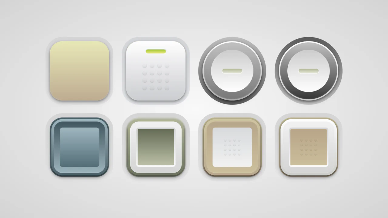
Soft Button Styling
A collection of skeuomorphic buttons rendered entirely in CSS using complex gradient layering and calc()-driven geometry variables.
<div id="bump"></div>
<button class="base" style="--slm1: #f7f504, #ffa31f">Press me!</button>
<button class="base sled bump">Press me!</button>
<button class="circ sled" style="--a: .375;
												--slo0: #bfbfbf, #616065;
												--slm1: #c0c0c0, #777;
												--slo1: #fff, #aaa">Press me!</button>
<button class="circ sled" style="--a: .35;
												--slo0: #5a5b5f, #c7c8cc;
												--slm1: #c0c1c5, #35363a;
												--slo1: #fff, #ccc">Press me!</button>
<button class="soft" style="--slm0: #05769e, #198ca9;
									 --sli1: #51c7f7, #0080af;
									 --slm1: #006494, #52c5f2;
									 --slo1: #4fc8f3, #0b6d9c">Press me!</button>
<button class="soft over" style="--slm0: #ccda82, #9eb148;
												--slo1: #a9c12d, #5b7f1b;
												--slm2: #53790c, #b6ca4f">Press me!</button>
<button class="soft bump" style="--slo1: #f6c60e, #f9a123;
												--slm1: #f6a017, #ffbe0d;
												--sli1: #d4dbe5, #eff2f3;
												--slm2: transparent, transparent">Press me!</button>
<button class="soft bump over" style="--slo1: #fdfdfd, #c8cec2;
														 --slm2: #fa9e0d, #ffbd11">Press me!</button>
<p class="box box--fail box--elem">Sorry, it appears your browser does not support the <a href="https://developer.mozilla.org/en-US/docs/Web/CSS/element" target="_blank"><code>element()</code></a> function, so it won't display the <a href="https://twitter.com/anatudor/status/1634909243370360834" target="_blank">full look</a> of the buttons. As of March 2023, this is only supported in Firefox (with the <code>-moz-</code> prefix).</p>
*, :before, :after {
  box-sizing: inherit;
  margin: 0;
  padding: 0;
  font: inherit;
}

body {
  display: grid;
  place-content: center;
  grid-template-columns: repeat(var(--n, 8), var(--w, 14em));
  grid-gap: 1.75em;
  overflow-x: hidden;
  min-height: 100vh;
  background: radial-gradient(#f9f9f9, #d4d4d4);
}
@media (max-width: 127.75em) {
  body {
    --n: 7 ;
  }
}
@media (max-width: 112em) {
  body {
    --n: 6 ;
  }
}
@media (max-width: 96.25em) {
  body {
    --n: 5 ;
  }
}
@media (max-width: 80.5em) {
  body {
    --n: 4 ;
  }
}
@media (max-width: 64.75em) {
  body {
    --n: 3 ;
  }
}
@media (max-width: 49em) {
  body {
    --n: 2 ;
  }
}
@media (max-width: 33.25em) {
  body {
    --n: 1 ;
  }
}
@media (max-width: 17.5em) {
  body {
    --w: 100% ;
  }
}

#bump {
  position: absolute;
  left: -100vmax;
  border: solid 0.875em transparent;
  width: 1.75em;
  height: 1.75em;
  border-radius: 50%;
}
#bump:before {
  position: absolute;
  top: 0;
  right: 0;
  bottom: 0;
  left: 0;
  border-radius: inherit;
  box-shadow: 0 2px 5px rgba(0, 0, 0, 0.2);
  background: linear-gradient(transparent, rgba(0, 0, 0, 0.05));
  content: "";
}

button {
  /* :after offset */
  --o2: auto;
  /* actual button padding */
  --p0: 0px;
  /* rounding factors */
  --rf0: 0;
  --rf1: calc(1 - var(--rf0));
  /* actual button border-radius */
  --r: calc(var(--rf0)*50% + var(--rf1)*3.5em);
  --r1: calc(var(--r) - var(--rf1)*(0.875em + var(--p0)));
  --r2: calc(var(--r) - var(--rf1)*(0.875em + var(--o2)));
  --a: .25;
  /* stop list outer (border-box) #0 (button itself) */
  --slo0: #d4d5d9, #e2e3e7;
  /* stop list middle (padding-box) #0 (button itself) */
  --slm0: #f0c101, #f9a123;
  /* stop list middle (padding-box) #1 (button :before) */
  --slm1: #fefefe, #cbccd0;
  /* stop list inner (content-box) #1 (button :before) */
  --sli1: #ccc, #fff;
  /* stop list middle (padding-box) #2 (button :after) */
  --slm2: #dadada, #fff;
  /* stop list inner (content-box) #2 (button :after) */
  --sli2: #a1c82d, #e8e681;
  box-sizing: border-box;
  position: relative;
  border: solid 0.875em transparent;
  width: 14em;
  height: 14em;
  border-radius: var(--r);
  background: linear-gradient(var(--slm0)) padding-box, linear-gradient(var(--slo0)) border-box;
  text-indent: -200vmax;
  filter: grayscale(0.8);
  transition: filter 0.3s;
  cursor: pointer;
}
button:hover, button:focus {
  outline: solid 0 transparent;
  filter: none;
}
button:active:before, button:active:after {
  transform: translateY(1px);
}
button.circ {
  --rf0: 1;
  --b1: .25em;
  --p1: 1.5em ;
}
button.soft {
  --p0: .3125em;
  --a: .4375;
  --b1: .5em;
  --p1: 1.25em;
}
button.over {
  --sli1: #d4d4d4, #f7f8fc;
  --slm1: #f1f1f1, #d2d5ce;
  --o2: calc(2*var(--p0) + var(--b1) + var(--p1));
}
button.over:after {
  background: linear-gradient(var(--slm2));
  content: "";
}
button.sled:after {
  top: calc(.5*(100% - 1.09375em));
  left: calc(.5*(100% - 4.375em));
  padding: 2px;
  width: 4.375em;
  height: 1.09375em;
  border-radius: 0.546875em;
  content: "";
}
@supports (background: element(#bump)) {
  button.bump.sled:before {
    padding: 35% calc(.5*(35% + 15%)) 15%;
    background: element(#bump) 50%/25% 25% space content-box, linear-gradient(var(--slm1));
  }
  button.bump.sled:after {
    top: calc(.5*(35% - 1.09375em));
  }
  button.bump.soft:after {
    --o2: calc(2*var(--p0) + var(--b1) + var(--p1));
    padding: 15%;
    background: element(#bump) 50%/25% 25% space content-box, linear-gradient(var(--slm2));
    content: "";
  }
}
button:not(.base):before {
  border: solid var(--b1) transparent;
  padding: var(--p1);
  background: linear-gradient(var(--sli1)) content-box, linear-gradient(var(--slm1)) padding-box, linear-gradient(var(--slo1)) border-box;
}
button:before, button:after {
  position: absolute;
  transform: translateY(0);
  transition: transform 0.3s;
}
button:before {
  top: var(--p0);
  right: var(--p0);
  bottom: var(--p0);
  left: var(--p0);
  border-radius: var(--r1);
  box-shadow: 0 3px 7px rgba(0, 0, 0, var(--a)), 0 5px 13px rgba(0, 0, 0, var(--a)), inset 0 -1px 2px rgba(255, 255, 255, 0.25);
  background: linear-gradient(var(--slm1));
  content: "";
}
button:after {
  top: var(--o2);
  right: var(--o2);
  bottom: var(--o2);
  left: var(--o2);
  border-radius: var(--r2);
  background: linear-gradient(var(--sli2)) content-box, linear-gradient(var(--slm2));
}

/* support info box styling */
.box {
  position: fixed;
  inset: auto 1vw 1vh;
  margin: 0;
  border-left: 5px solid #dc3055;
  padding: 0.75em;
  box-shadow: 2px 2px 5px gray;
  background: #851d40;
  color: #fff;
  font: clamp(.625em, 4vw, 1.25em)/1.25 trebuchet ms, ubuntu, verdana, arial, sans-serif;
}
@supports (mask: -moz-element(#a)) {
  .box--elem {
    display: none;
  }
}
@supports (background: element(#a)) {
  .box--elem {
    display: none;
  }
}

code {
  padding: 2px;
  background: rgba(0, 0, 0, 0.2);
  font: 1.1em/1.2 ubuntu mono, consolas, monaco, monospace;
}

a {
  color: gold;
}
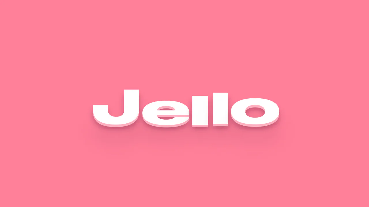
Interactive Jello Text with Variable Fonts
Interactive typography with GSAP and SplitText - when one letter is dragged, the effect elastically propagates to its neighbors, dynamically changing their font-weight and scaleY.
See the Pen Interactive Jello Text with Variable Fonts.

Variable Font Animation for 500 Infernal Error
An impressive variable font animation based on JS, using requestAnimationFrame and SplitText to per-frame change the font-variation-settings of each character, yielding vivid wave and ripple effects.
See the Pen Variable Font Animation for 500 Infernal Error.


Experimental typography utilizing variable fonts and CSS filters. Dynamic font-weight and stylistic changes via font-variation-settings are synchronized with keyframe animations, while layered imagery and gradients blended with mix-blend-mode create a textured distortion effect. The JavaScript input event provides interactivity, instantly updating attributes for seamless pseudo-element rendering.
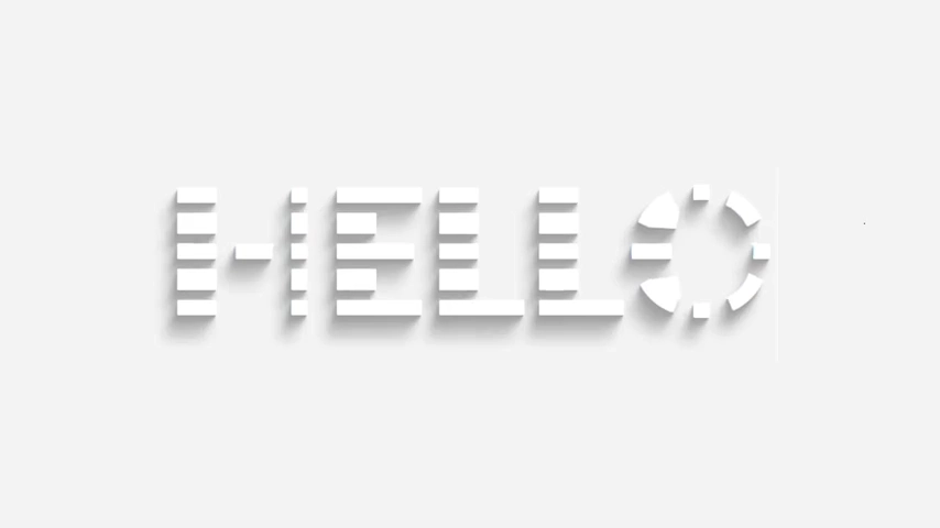
Typographic installation utilizing variable fonts and an extensive text-shadow chain to achieve a deep volumetric effect. The font-variation-settings parameter is animated to fluidly transition character weight, while JavaScript handles real-time synchronization of the data-heading attribute to ensure pseudo-elements reflect user input.
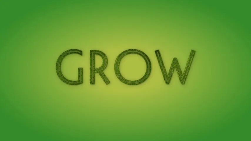
Interactive typography powered by variable fonts with texture overlays. The font-variation-settings parameters animate to smoothly transition character style, while background-clip: text masks the background imagery within the glyph contours. Pseudo-elements generate depth by duplicating the text with distinct blending and shadow effects.
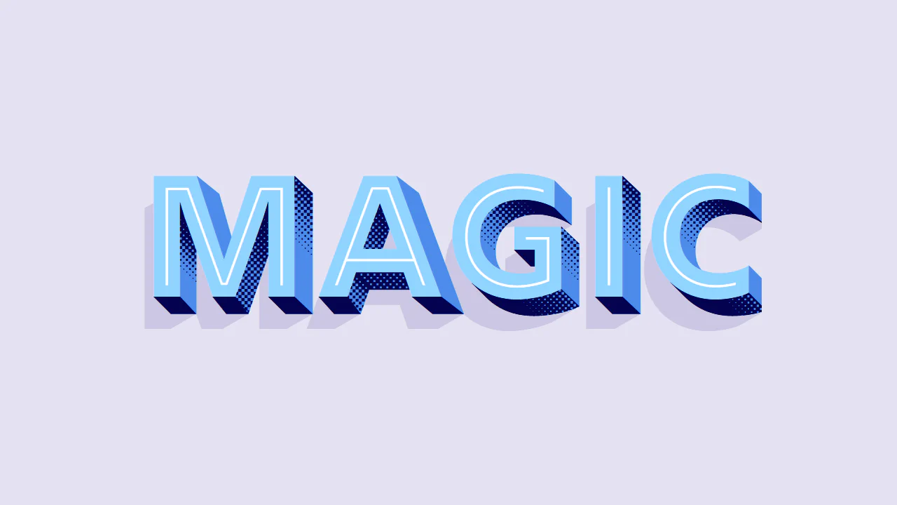
Layered Fonts in CSS
Typographic composition utilizing layering of distinct font weights and styles via pseudo-elements. The volumetric and textural effect is achieved through synchronous stacking of contours, shadows, and extrusions, where each font layer serves a specific decorative role. A JavaScript input event propagates user text to data-heading attributes, ensuring all visual layers remain synchronized during live editing.
See the Pen Layered Fonts in CSS.

Typographic composition leveraging a variable font with DRAW and RSEC axis support. A volumetric effect is achieved by layering multiple text instances via pseudo-elements and an extensive text-shadow chain. Keyframe animations fluidly modulate font variation parameters to simulate dynamic rendering, complemented by gradient-filled glyphs.
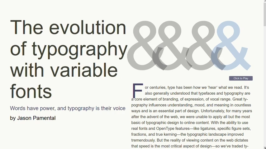
Complex typographic system leveraging Variable Fonts to ensure style flexibility while maintaining high page performance. The hierarchy of headings and text blocks is governed by CSS variables, enabling responsive calculation of sizes and weights (font-variation-settings) using calc() and media queries. The interactive ampersand demonstration utilizes stacked text layers, controlled by JavaScript events to simulate motion.
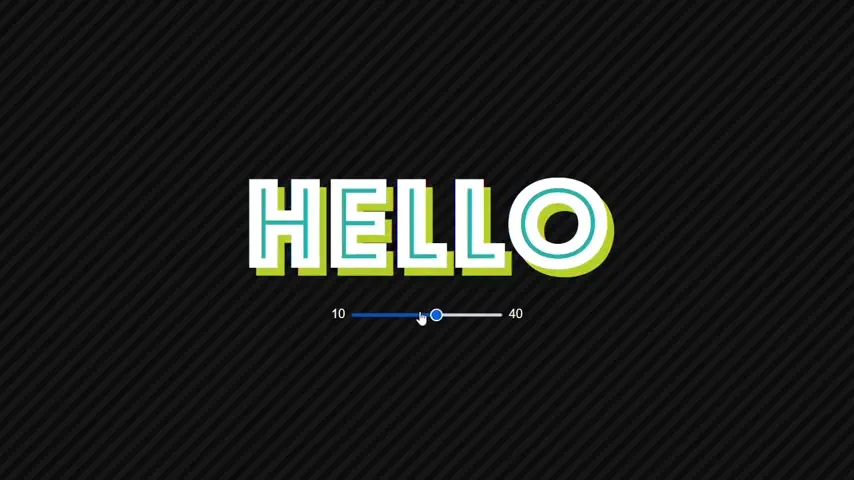
Interactive typographic composition leveraging variable fonts and font-feature-settings. Layered animations and keyframe color transitions create a dynamic “splitting” effect on hover. JavaScript controls character weight in real-time via font-variation-settings, demonstrating the fluidity of adaptive typography.
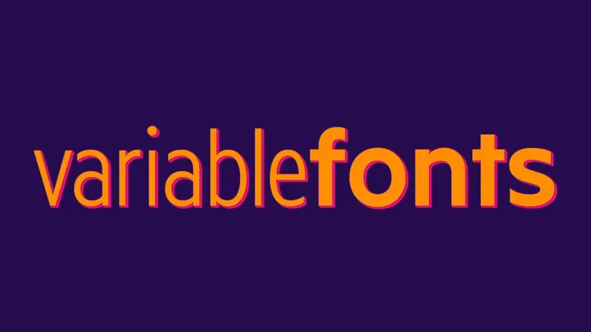
Typographic composition leveraging a variable font to manipulate glyph style via font-weight and font-stretch properties. Dynamic volume and contrast are achieved through an extensive text-shadow chain. Hover states fluidly redistribute variable parameters between the h1 and span elements, creating a stylish inversion effect.

Typographic installation simulating cookie and icing textures. The effect is achieved by stacking pseudo-elements utilizing background-clip: text with distinct raster textures. Dynamic glyph deformation is implemented via a variable font, animating font-variation-settings (CHEW, BITE, WONK) to simulate a “munching” or distorting effect. A complex multi-layered text-shadow system reinforces the volumetric and tactile quality of the composition.