20+ CSS Frames
The Pure CSS Frame Examples collection showcases how visual boundaries function through CSS alone. Borders, shadows, and gradients create depth — eliminating markup overhead between intent and aesthetic execution.
Frames use box-shadow with multiple layers to build depth and dimension, while border properties create solid, dashed, and dotted edges. Clip-path shapes frames into unconventional geometries: beveled corners, organic curves, or asymmetric cuts. Linear-gradient and conic-gradient produce decorative patterns along edges; mask-image applies texture overlays without additional elements. CSS Custom Properties control frame thickness, colors, and shadow offsets, enabling instant theme switching. Transform and perspective add 3D tilt effects; animation creates pulsing, glowing, or rotating frame movements.
Responsive design adapts frame scales via media queries and aspect-ratio preservation, maintaining proportions across devices. The collection includes free CodePen demos, downloadable code, and updated examples. Each snippet prioritizes Core Web Vitals — zero layout shift through fixed dimensions, hardware-accelerated shadows via will-change: box-shadow, minimal repaints using contain: paint.
Every example works in modern browsers (Chrome, Firefox, Safari, Edge). Download, customize, deploy.
Examples
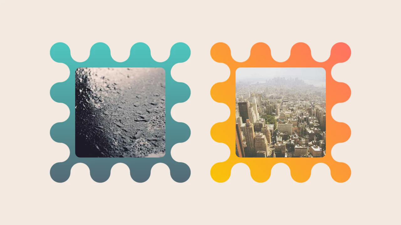
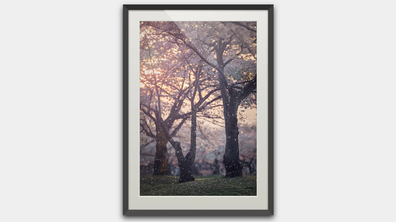
Images Inside Wiggly Boxes
A decorative image frame created entirely with CSS mask compositing. It combines radial-gradient layers with conic-gradient and the intersect composite operator to sculpt a scalloped, wavy border, while the CSS round() function ensures perfect pattern alignment along the edges.
See the Pen Images Inside Wiggly Boxes.

Art Deco Card
An elegant Art Deco style card created purely with CSS/SCSS, utilizing a sophisticated technique with pseudo-elements to construct complex, multi-layered geometric borders and corners.
See the Pen Art Deco Card.
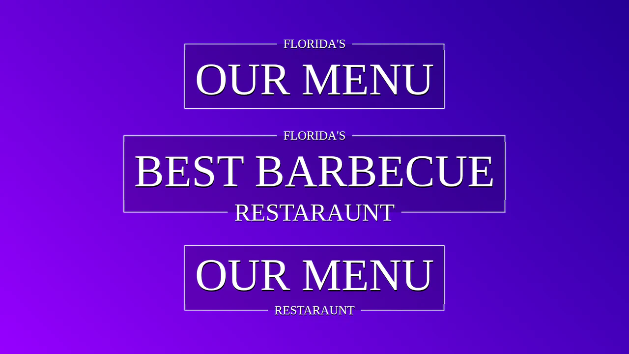
Fancy Title with CSS Responsive Frame
Creating a complex decorative title where breaks in the border are elegantly implemented using CSS Grid and pseudo-elements. Padding sizes adapt dynamically thanks to a CSS variable calculated by a mixin.
See the Pen Fancy Title with CSS Responsive Frame.
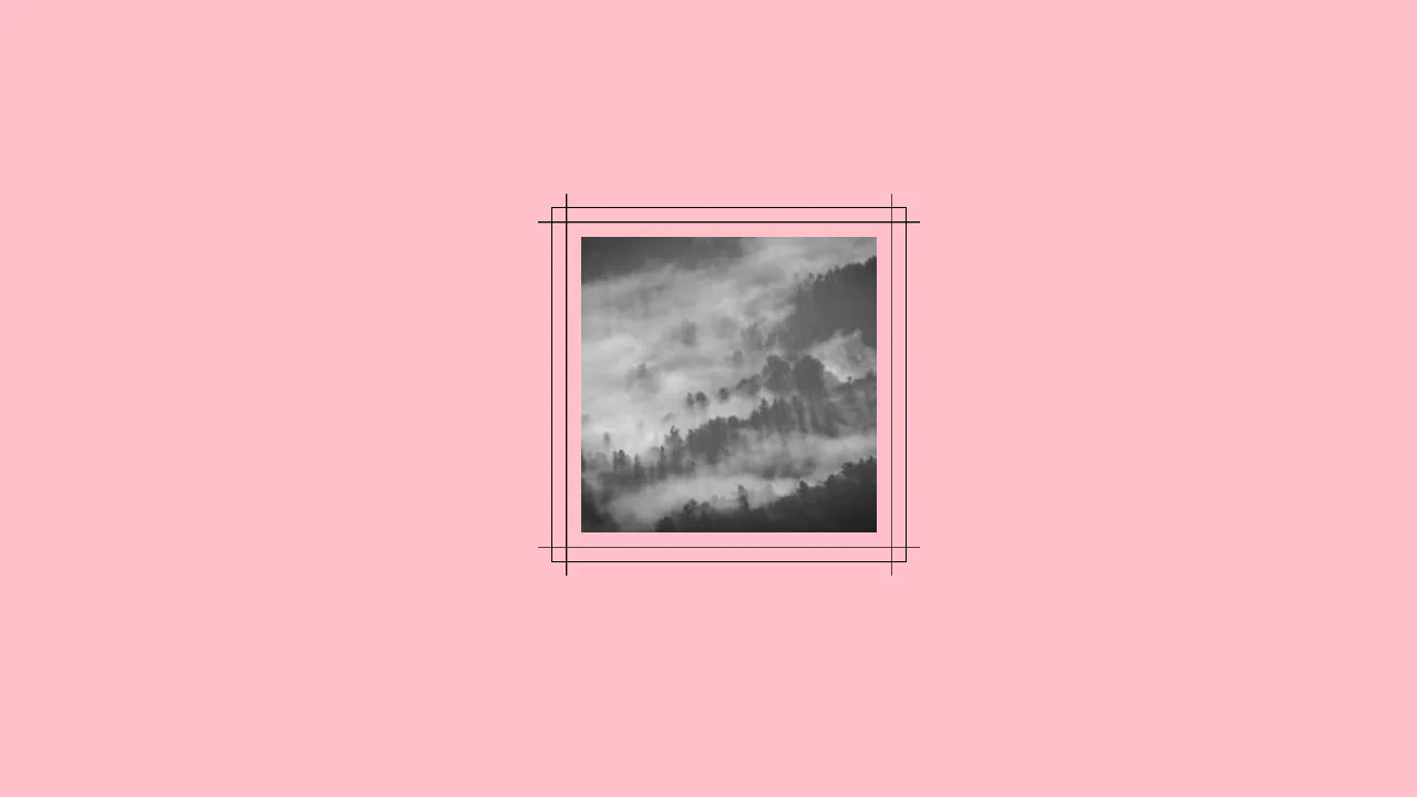
CSS3 Picture Frame
A pure CSS image styling technique that creates a realistic framed effect using concentric pseudo-elements.
See the Pen CSS3 Picture Frame.
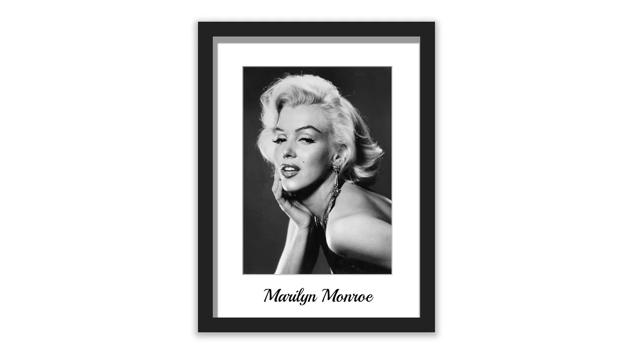
A single list item styled as a physical photo frame — gradients, shadows, and a rotated pseudo‑element create depth and a glossy reflection. The CSS is ready for multiple items, but only one is used.
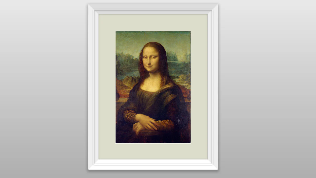
Single image with a CSS‑only picture frame — borders simulate 3D depth (light/dark sides), absolute centering keeps it in the middle. Simple, effective, no extra markup.
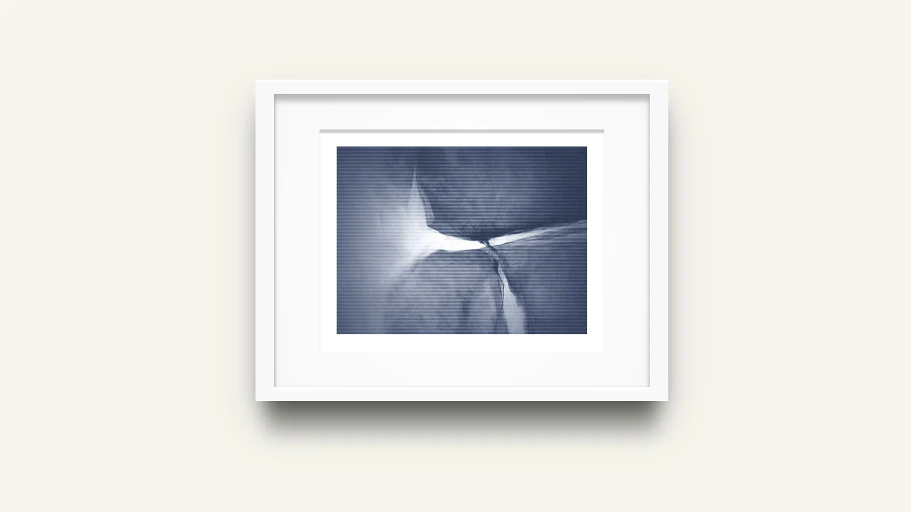
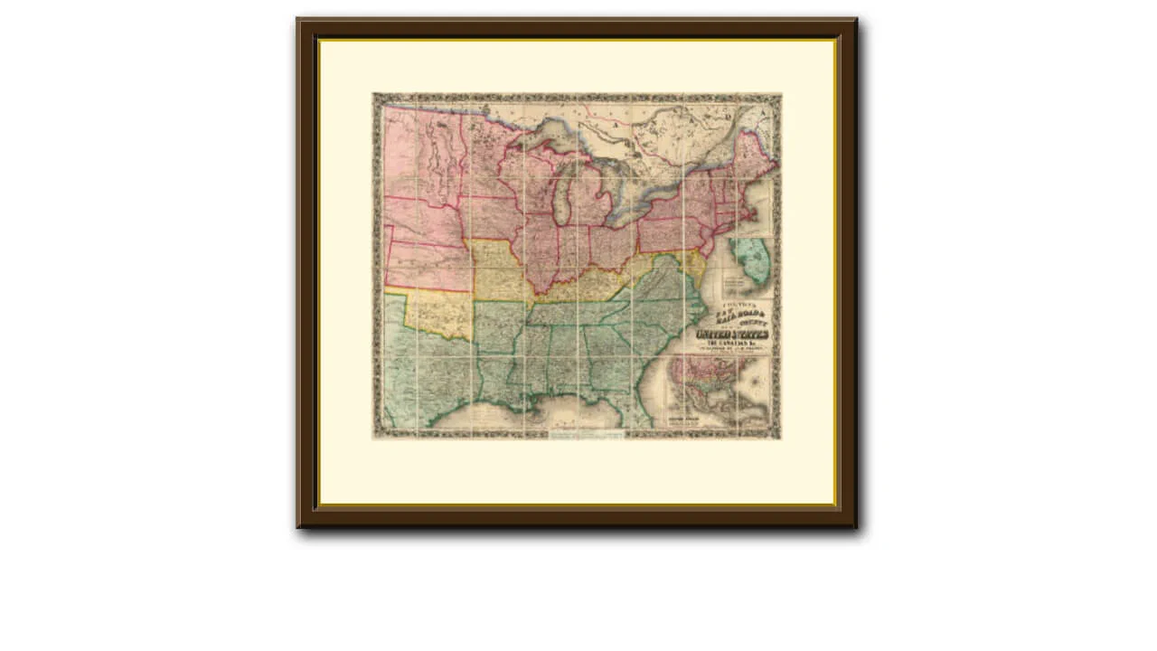
Two nested <div> elements create a double‑frame effect — an outer gray border and a thick white mat. Borders with varying lightness on each side give the illusion of a beveled edge. The image itself has a subtle inner border. The layout is fixed‑width and static.
Nested borders and shadows build a layered picture frame — the outer box has a soft drop shadow, while inner borders simulate a beveled mat. The image is a CSS background; a separate tag holds metadata. The layout is fixed‑width and purely visual.
A fixed‑size picture frame built with nested divs and inset shadows — the outer frame is dark, inner border has a white mat with a heavy inset shadow, and the image sits inside a bordered area. The caption is absolutely positioned below. The layout is rigid and purely decorative.
Nested divs with border styles and box shadows build a multi‑layered picture frame — outer/inner bevels, a flat surface, and a mat with a gold edge. The image is static; the effect is purely visual, with no interactive elements.
Responsive picture frame built with vmin units and nested pseudo‑elements. Bevels and inset shadows create a physical depth effect. The image is static; the layout adapts to viewport size.
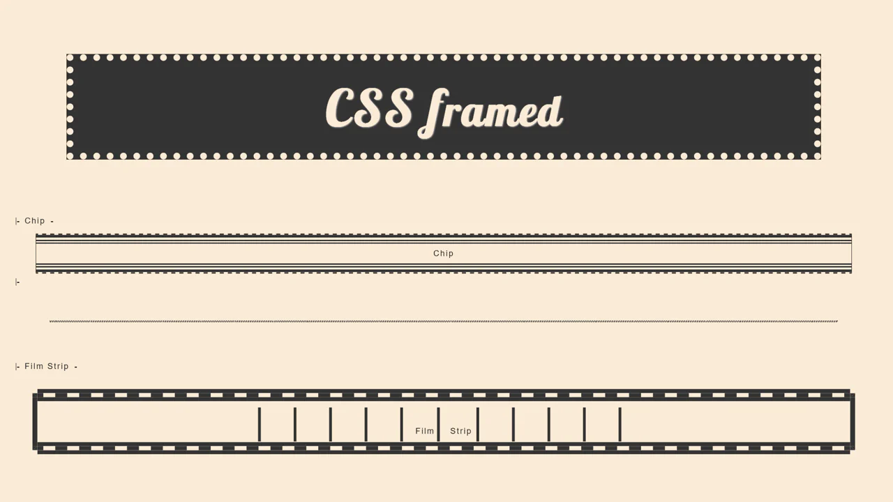
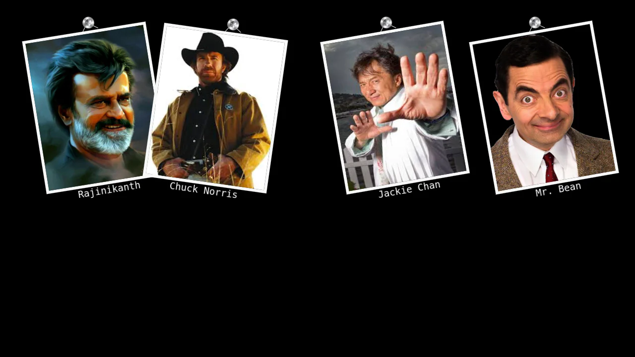
Custom properties define colors; pseudo‑elements draw decorative borders, simulating chip and film‑strip textures. The layout uses inline blocks and margins for alignment — a purely visual, non‑interactive design.
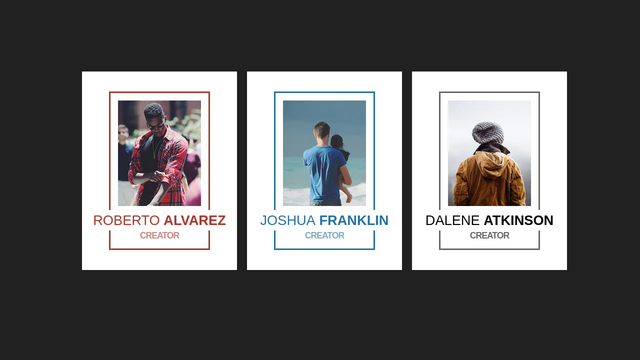
Three profile cards share a consistent structure — the image has extra bottom padding to leave space for the caption, which is absolutely positioned at the bottom. Color themes are applied via modifier classes.
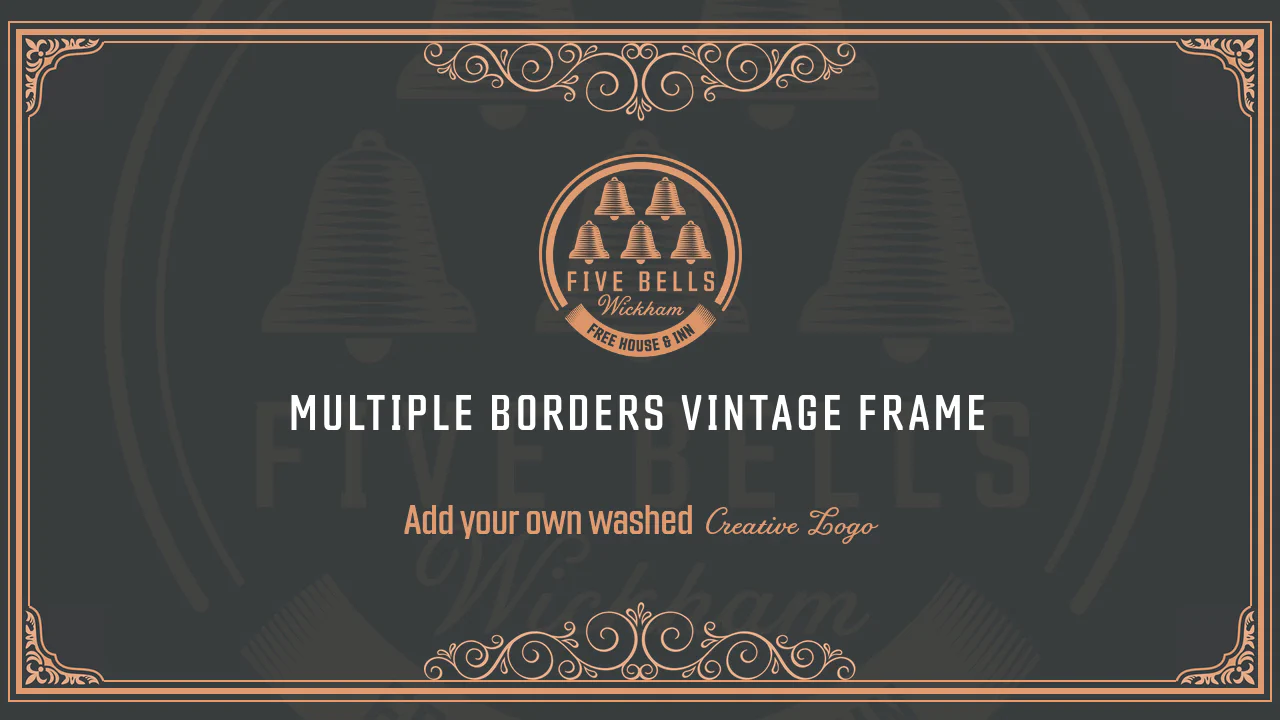
Full Screen Vintage Frame with Multiple Borders
This responsive layout constructs an ornate vintage frame around text using nested concentric borders. The .outer-border, .mid-border, and .inner-border rules stack thin and thick rules with custom paddings. Decorative corner and edge images are placed using position: absolute and flipped using simple scale() transforms.
See the Pen Full Screen Vintage Frame with Multiple Borders.