
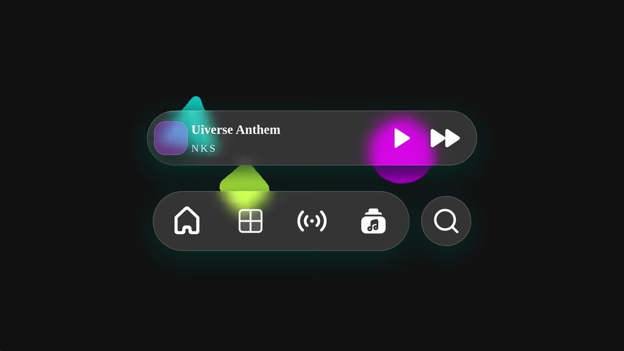
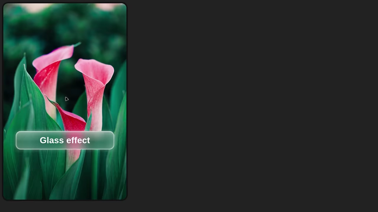
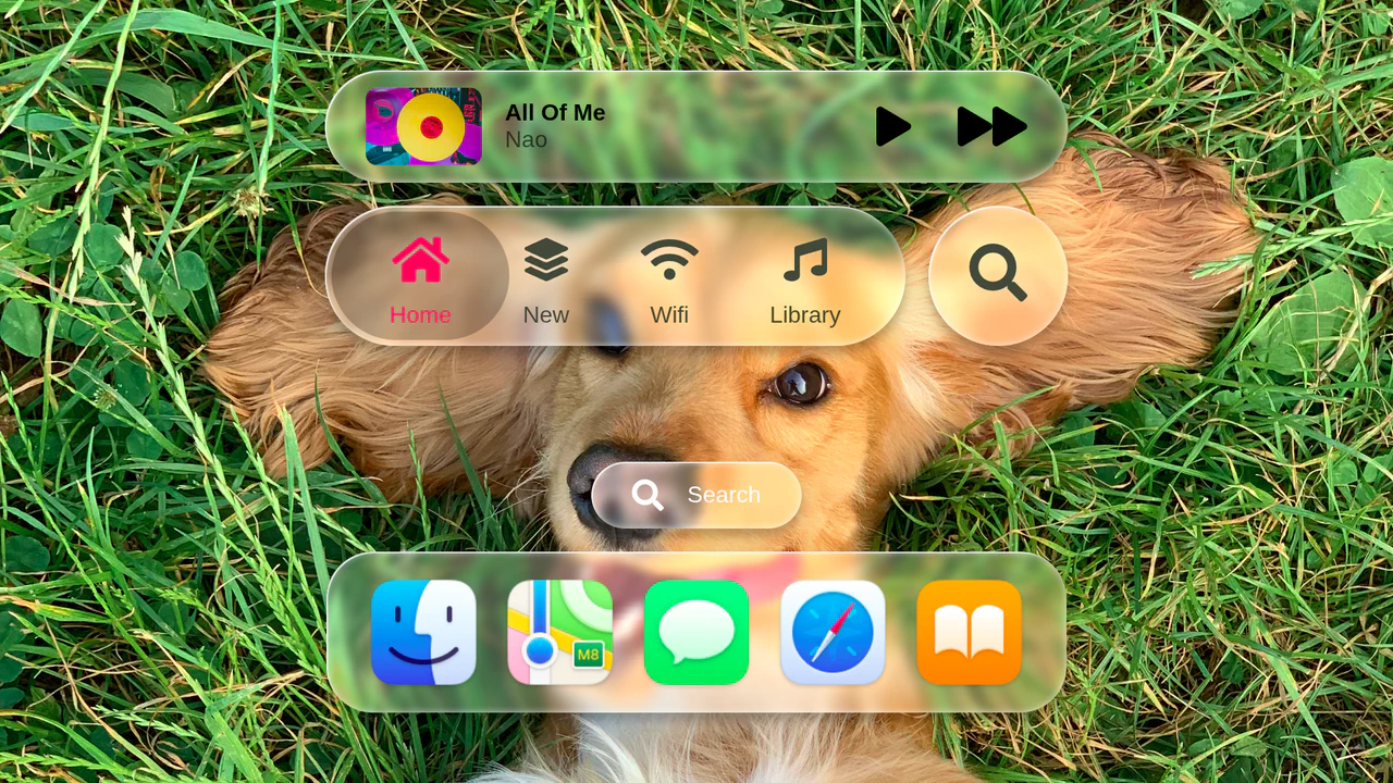
Glassmorphism Profile Info Card
This Glassmorphism Profile Info Card is a high-end UI component that replicates the sleek, frosted-glass aesthetic found in modern operating systems like iOS and macOS. It features a sophisticated interplay between background imagery and foreground content, using advanced CSS masking and backdrop filters to create a natural sense of depth and hierarchy.
 Chrome 76+
 Edge 79+
 Firefox 103+
 Safari 9.1+
See the Pen Glassmorphism Profile Info Card.


