10+ CSS Ghost Buttons: Free Examples & Code Snippets
Ghost buttons — outline-style controls with transparent backgrounds — create a clean, minimal aesthetic that pairs well with bold hero sections and image-heavy layouts. Their fill-on-hover transitions provide elegant interaction feedback.
- A ::before pseudo-element with transform: scaleX() and transform-origin: left creates the hover fill effect, scaling from zero to full width behind the text on the compositor thread.
- The border-to-fill transition uses CSS transition on both border-color and pseudo-element transform, providing a smooth visual handoff between idle outline and filled hover state.
- A subtle text-shadow on hover prevents text contrast loss during the fill transition, ensuring the label remains readable against both the transparent idle background and the colored fill state.
Browse this collection of CSS ghost buttons to master outline-to-fill interaction patterns that bring elegance to hero sections and call-to-action layouts.
Table of Contents:
Examples

Merging Pill Filter Buttons
This Merging Pill Filter Button set introduces a fluid, organic feel to standard multi-select inputs. Instead of keeping active items isolated, this component visually fuses adjacent selected buttons into a single continuous shape. It’s an excellent choice for music apps, filtering systems, or any UI where categories are related and grouping them visually adds context.
 Chrome 60+
 Edge 79+
 Firefox 50+
 Safari 10+
See the Pen Merging Pill Filter Buttons.

Expanding Buttons
A horizontal contact bar (Email, Telegram, Twitter) smoothly collapses into a small arrow button and expands back upon clicking.
See the Pen Expanding Buttons.

Up Arrow
A rectangular button smoothly shrinks into a circle, the text fades out, and an upward-pointing arrow begins to cyclically rise within it.
See the Pen Up Arrow.
Hover Effects
A dynamic hover effect in pure CSS, where the :has() pseudo-class triggers simultaneous animations: a slide-out tooltip and a smooth icon fill. The tooltip’s content is sourced from a data-tooltip attribute via attr(), and the fill color is flexibly configured with a --bg CSS Custom Property.
See the Pen Hover Effects.
Animated Ghost Button
An orchestrated pure CSS morphing button. On hover, complex transition timings compress, rotate, and round the button into a floating ghost silhouette via border-radius: 50%. Scaled radial-gradient circles emerge to form its eyes and mouth, while pseudo-elements float the text “boo” and project a soft, floating under-shadow.
See the Pen Animated Ghost Button.
Animated Ghost Button 2
The button features a complex, non-linear hover effect powered by a cubic-bezier transition curve and CSS transform: translate3d applied to the inner .mask element, creating a sweeping diagonal light wipe effect.
See the Pen Animated Ghost Button 2.
Ghost Button Animation
This SASS component defines two aesthetically consistent styles (.bttn and .bttn-dark) using centralized color variables and implements a distinctive “slide-out” hover effect by animating the ::before pseudo-element’s left and right properties from 50% to 0.
See the Pen Ghost Button Animation.
Gradient Hover Animated Ghost Button
The button animation uses SVG rect elements and CSS stroke-dasharray and stroke-dashoffset properties to create a sophisticated, drawing border effect that transitions smoothly on hover, highlighting the call-to-action.
See the Pen Gradient Hover Animated Ghost Button.
Liquid Fill Buttons
Creative Splatoon-inspired buttons featuring a liquid fill animation achieved with pure CSS and SCSS. The component leverages SCSS loops for automated color variations via hue-rotate and a smooth background-position transition to create an interactive ink-filling effect on hover.
See the Pen Liquid Fill Buttons.
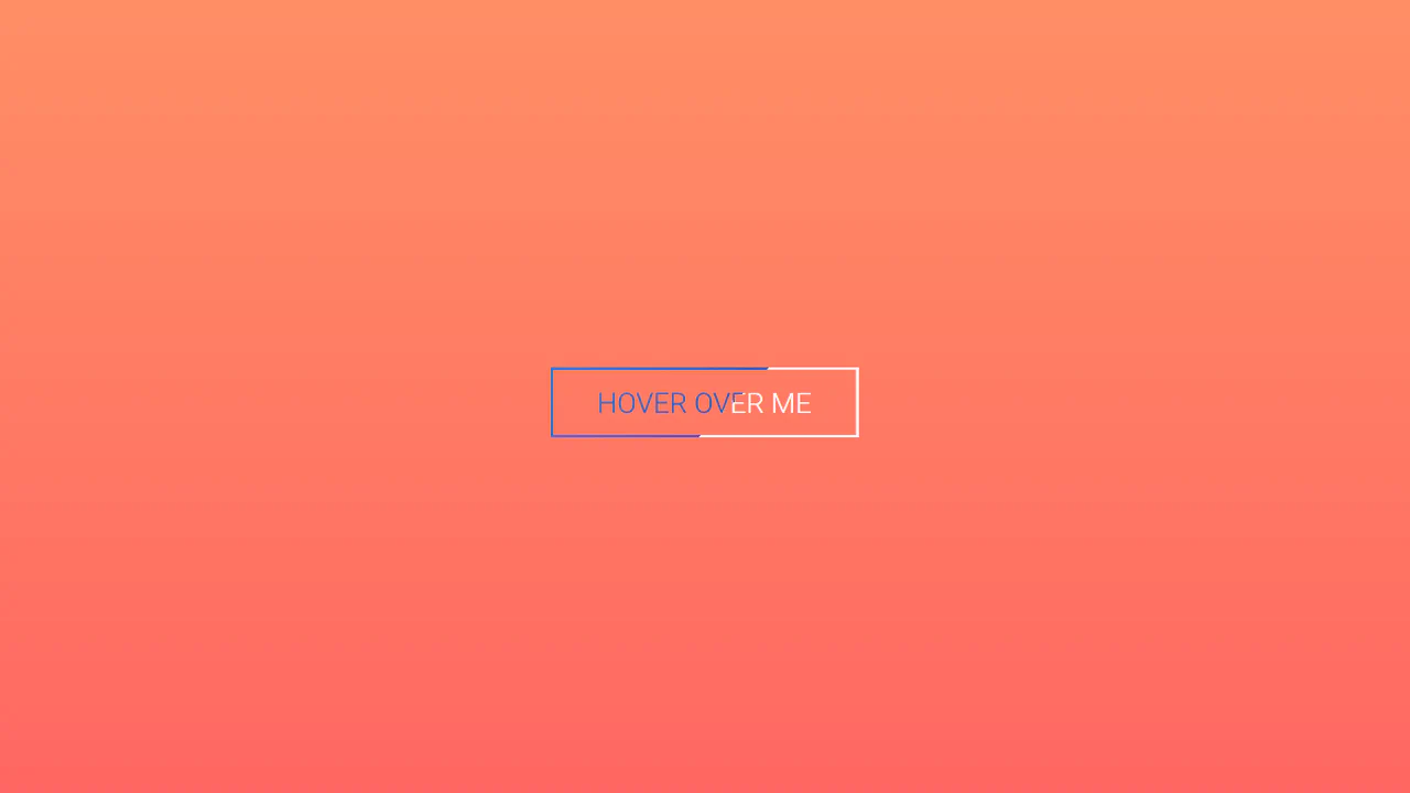
SVG Button Hover Effect With Snap.svg
An advanced SVG button built with Snap.svg featuring interactive mask transformations and vibrant gradient fill effects. The script dynamically replaces standard HTML buttons with animated SVG nodes, delivering smooth text and border transitions through complex path manipulation and high-performance JavaScript animations.
See the Pen SVG Button Hover Effect With Snap.svg.
Ghost Button
A collection of three interactive buttons built with SCSS, utilizing pseudo-elements to create unique hover effects. The set features border expansion animations, text swapping with smooth background transitions, and futuristic corner-border effects, providing ready-to-use solutions for high-impact call-to-action elements.
See the Pen Ghost Button.
Line & Direction
A collection of interactive CSS buttons featuring a unique segmented background-fill animation on hover. The component utilizes cascading transition-delay and CSS transforms to create a smooth, staggered effect, offering six distinct visual styles easily customizable via CSS variables and nth-child selectors.
See the Pen Line & Direction.
Pure CSS Ghost Buttons with Directional Awareness
Direction-aware Brutalist buttons featuring a unique hover effect implemented with pure CSS using clip-path polygons. The component offers extensive customization via CSS variables and provides responsive background-fill animations that react to the cursor’s entry direction.
See the Pen Pure CSS Ghost Buttons with Directional Awareness.
Pixel Button Hover Animation Effects
A retro-inspired button showcasing a pixelated dissolve hover effect. Upon hover, the outline border vanishes while a tiled spritesheet image is loaded. An @keyframes rule transitions background-position-y using the steps(8) timing function to produce a crisp, looping 8-frame pixelated explosion animation.
See the Pen Pixel Button Hover Animation Effects.
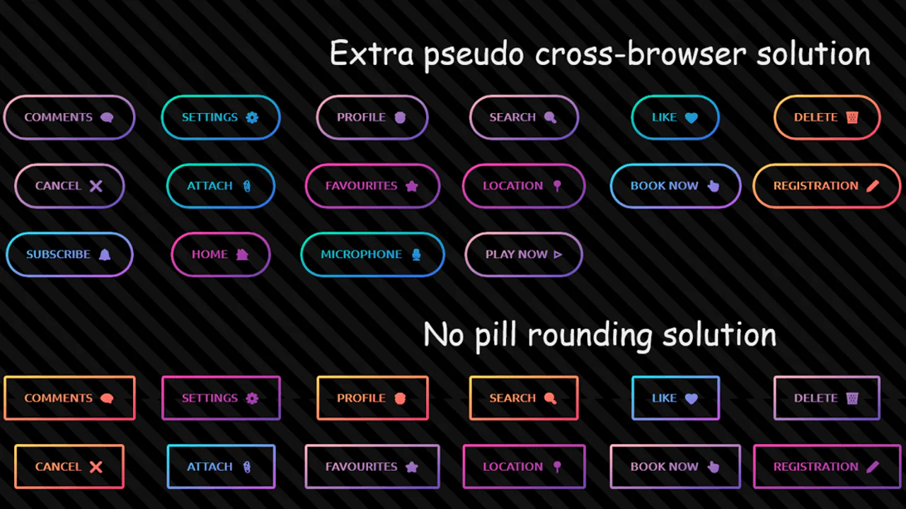
3 Techniques: Candy Ghost Buttons
Three experimental CSS techniques to render candy ghost buttons featuring unified gradient text and borders. The demos leverage advanced compositing methods including mask-composite: exclude, background-clip: text, and clip-path wrappers to clip non-standard border-image curves without any JavaScript.
See the Pen 3 Techniques: Candy Ghost Buttons.