20+ CSS Glitch Effects: Free Code Snippets & Examples
CSS glitch effects introduce dynamic, digital-distortion aesthetics into web layouts, creating high-impact visual disruption perfect for cyberpunk designs, gaming portals, and loading states. By simulating analog static, horizontal slicing, and chromatic aberration, this pattern transforms static elements into erratic, attention-grabbing interactive components.
- Precision slicing is orchestrated natively using clip-path property mutations within rapid keyframe sequences, avoiding complex structural splitting of DOM elements.
- Simulating authentic rgb splits and chromatic aberration utilizes the mix-blend-mode property across layered pseudo-elements, allowing red and cyan color channels to shift independently.
- To safeguard thread responsiveness and maintain stable INP (Interaction to Next Paint) metrics, performant glitch animations are executed as compositor-only transformations.
Dive into these chaotic digital-distortion techniques to inject raw, high-energy technological styling into your interactive UI design.
Table of Contents:
Examples

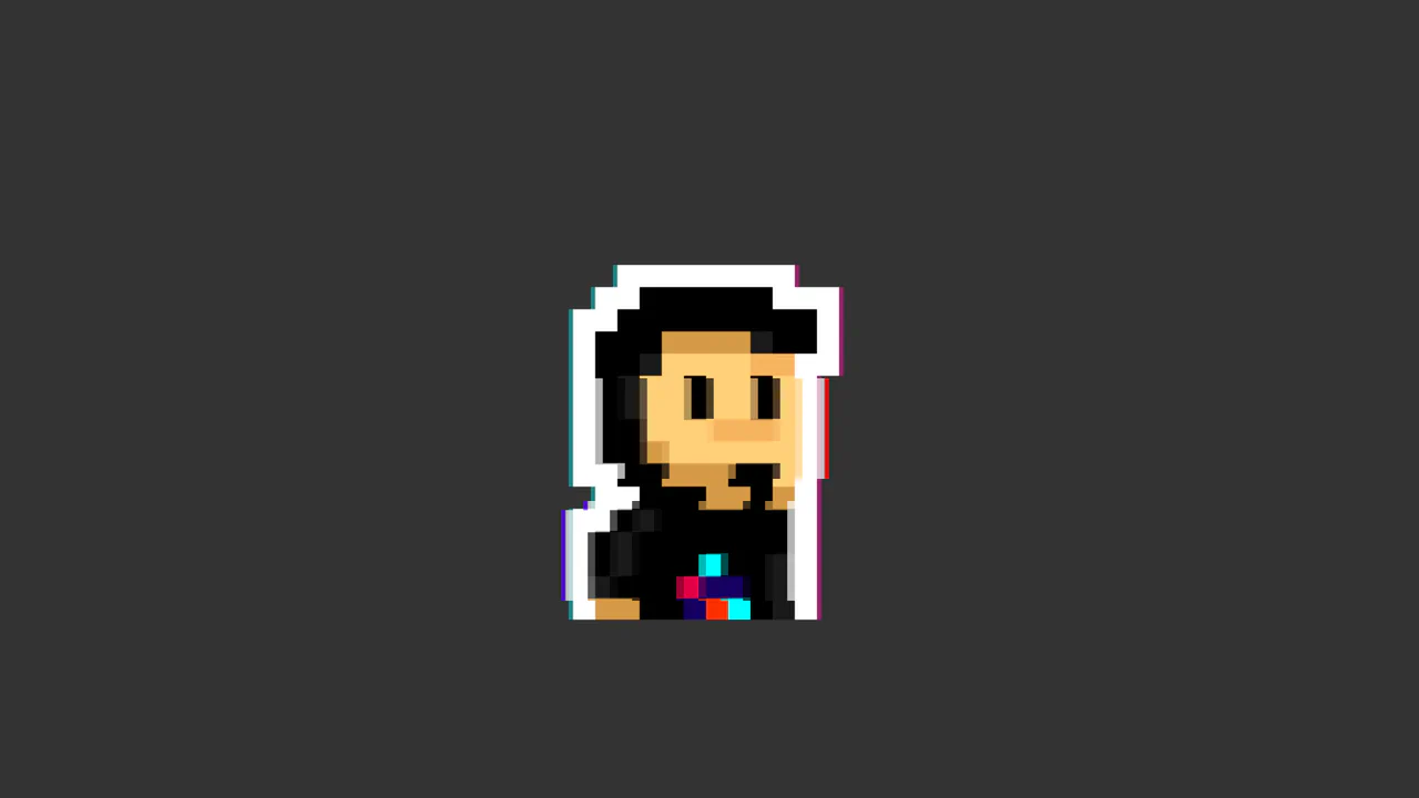
Cyberpunk Glitch Upgrade Modal
This is a Cyberpunk Glitch Upgrade Modal. It transforms a standard confirmation dialog into a highly stylized, cinematic interface. Its function is to provide explicit interaction boundaries using the native HTML Popover API, augmented with aggressive visual distortion (glitches) and integrated audio feedback for a deeply immersive user experience. (Requires: Tweakpane)
 Chrome 114+
 Edge 114+
 Firefox 125+
 Safari 17+
See the Pen Cyberpunk Glitch Upgrade Modal.

Cyberpunk Glitch Slideshow
A pure-CSS masterpiece that uses advanced perspective and @keyframes to create a striking 3D-like parallax and an automatic slideshow. The demo highlights the power of modern CSS to achieve sophisticated interactive and animated interfaces without a single line of JS.
See the Pen Cyberpunk Glitch Slideshow.
CSS Glitch Image Effect
The key feature is the control of animation parameters via CSS variables, which allows for easy changes to the speed and intensity of the glitch. The animation itself is built on three layered elements, each with unique offsets, shadows, and clipping animations (@keyframes glitch-top/bottom).
See the Pen CSS Glitch Image Effect.
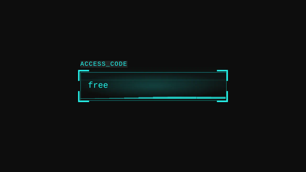
Cyberpunk Glitch Input
Here is an advanced example of an interactive UI element built entirely with CSS. The demo is technically notable for its approach to visualizing activity: it uses pseudo-elements and CSS variables to create glow effects, scanning lines, and a “data stream” that activates on input focus.
See the Pen Cyberpunk Glitch Input.
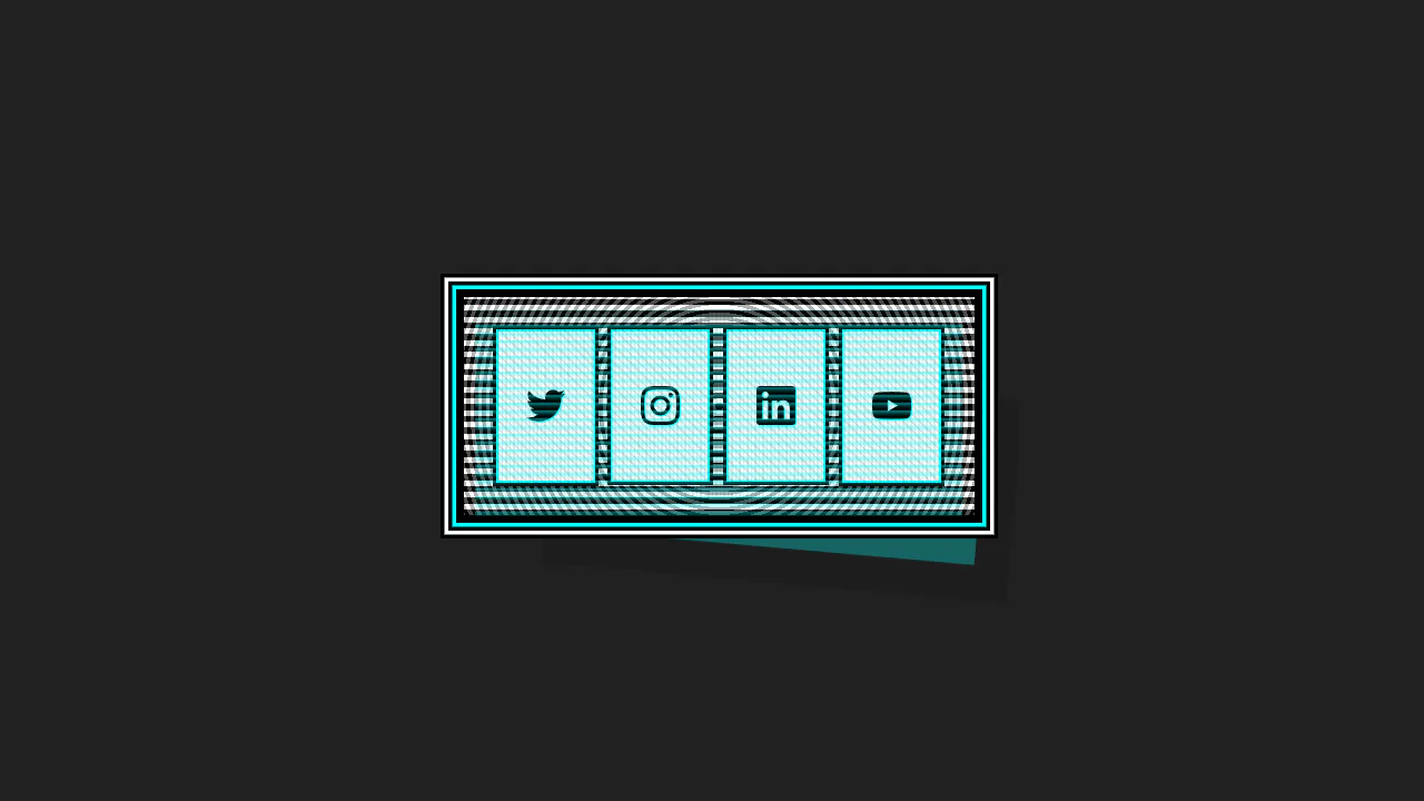
This Cyberpunk-inspired card features a complex box-shadow offset and text-shadow for the core CRT aesthetic, paired with a dynamic :hover state that uses transform to instantly swap the terminal view for a social icon grid.
CyberPopover 2025
A complex cyberpunk UI using the latest web APIs - native [popover] and View Transitions. Its intricate glitch animation and transition are controlled via JavaScript, while the clean, state-driven logic is built upon @layer and @starting-style.
See the Pen CyberPopover 2025.
Metal Gear Solid Soliton Radar States
Atmospheric, lively interface elements mimicking high-tech equipment screens with interference, scrolling data, and a countdown.
See the Pen Metal Gear Solid Soliton Radar States.
404 - Glitched Out
This object simulates analog signal interference using keyframes with opacity and transform. Text is rendered via pseudo-elements, while distortions are applied through fractional animation intervals, creating an unstable image effect. mix-blend-mode is not utilized here, as the effect is achieved through layer opacity manipulation.
See the Pen 404 - Glitched Out.
Glitch Hover
This typography piece uses text-shadow offsets and transform: skewX() to simulate a digital glitch. Triggering the wiggle animation on hover gives instant tactile feedback, breaking the static screen barrier. The CSS engine processes the deformation on the GPU, avoiding layout recalculations.
See the Pen Glitch Hover.
Glitch Hover
This typographic element uses text-shadow offsets and transform: skewX() to mimic a digital glitch. Triggering the wiggle keyframes on hover provides tactile visual feedback, erasing the static screen barrier. The CSS engine runs this on the GPU, preventing layout recalculations.
See the Pen Glitch Hover.

Glitch Pop
This asset compiles mathematical randomization directly into CSS keyframes. It coordinates filter and transform: translate() with steps(1) timing, erasing the static screen barrier. The CSS engine processes these procedural shifts on the GPU, eliminating runtime script overhead.
See the Pen Glitch Pop.
mix-blend-mode Rendering Glitch
This layout uses mix-blend-mode to blend transparent text and video files in the browser. Using a text-shadow layer and asynchronous transform keyframes, it erases the static screen barrier with kinetic glitch effects. The CSS engine renders everything on the GPU, preventing CPU overhead.
See the Pen mix-blend-mode Rendering Glitch.
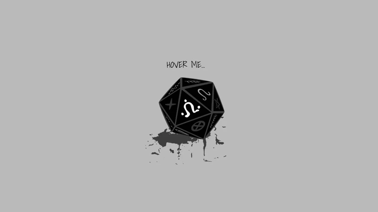
Dice Roleplay Glitch & Pulse
This vector illustration binds SVG paths with native feTurbulence filters to trigger real-time, organic glitching. By rendering procedural displacement directly, it erases the boundary of static imagery. The browser processes these filters on the GPU, avoiding CPU-heavy execution.
See the Pen Dice Roleplay Glitch & Pulse.
Glitch
This layout orchestrates a multi-stage glitch animation using pure CSS. By pairing layered duplicates with synchronized clip: rect() and filter keyframes, it runs complex procedural distortion without scripts. The browser processes these frames on the GPU, removing all performance barriers.
See the Pen Glitch.
Glitch Preloader
This geometry layout uses CSS borders and stacked layers to construct an RGB-split chromatic glitch. By animating filter: blur() and transform shifts on staggered keyframes, it erases the static screen barrier with raw analog motion. The engine runs everything on the GPU, avoiding lag.
See the Pen Glitch Preloader.
Glitch Image Effect. CSS Animation
This layout uses stacked layers and asynchronous clip-path polygons to execute a digital glitch. By shifting coordinates on the GPU with dynamic transform steps, it erases the static screen barrier with raw kinetic feedback. This pure CSS method completely eliminates runtime rendering lag.
See the Pen Glitch Image Effect. CSS Animation.
Glitch Animation with Pseudo-Element
This typographic layout coordinates a procedural glitch effect on hover. Pairing layered duplicates via ::before and data-text with high-frequency offsets, it delivers immediate tactile feedback. Utilizing CSS text-shadow on the GPU, it dissolves the static screen barrier.
See the Pen Glitch Animation with Pseudo-Element.
Glitch Effect by SVG Filter
This visual asset isolates RGB channels using feColorMatrix and composites them via mix-blend-mode: lighten. On hover, the layers shift, executing a procedurally-shaped clip-path animation. The layout processes complex distortion directly on the GPU, dissolving the static screen barrier.
See the Pen Glitch Effect by SVG Filter.
Text Glitch Animation with clip-path, text-shadow and Pseudo-Elements
This typographic component establishes a kinetic visual distortion by mapping layered text-shadows and synchronized keyframe animations to hover states, entirely offloading the rendering pipeline to CSS. By utilizing hardware-accelerated polygon clip-paths to slice pseudo-elements without DOM bloat, the architecture delivers an instantaneous, high-frequency tactile response that evokes an immersive retro-futuristic aesthetic.
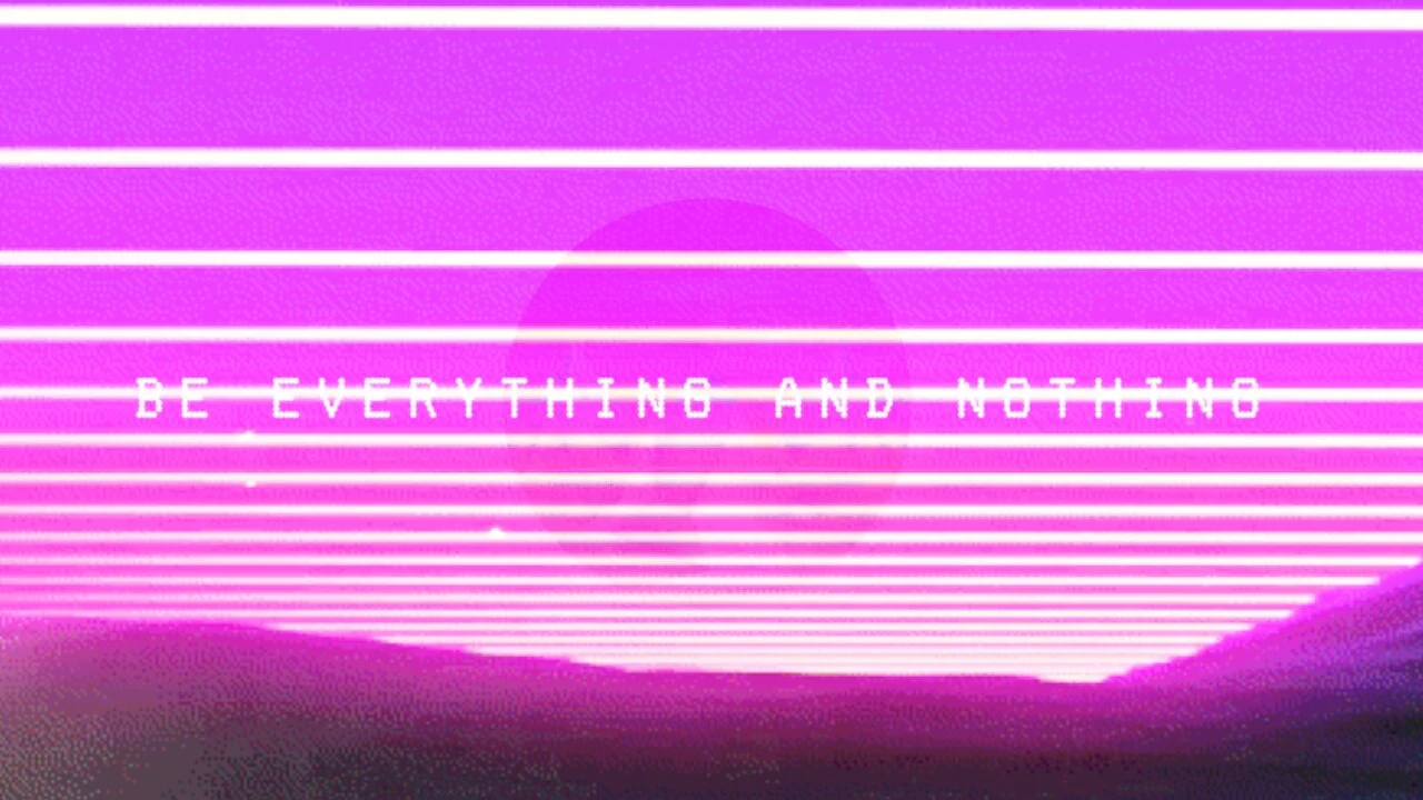
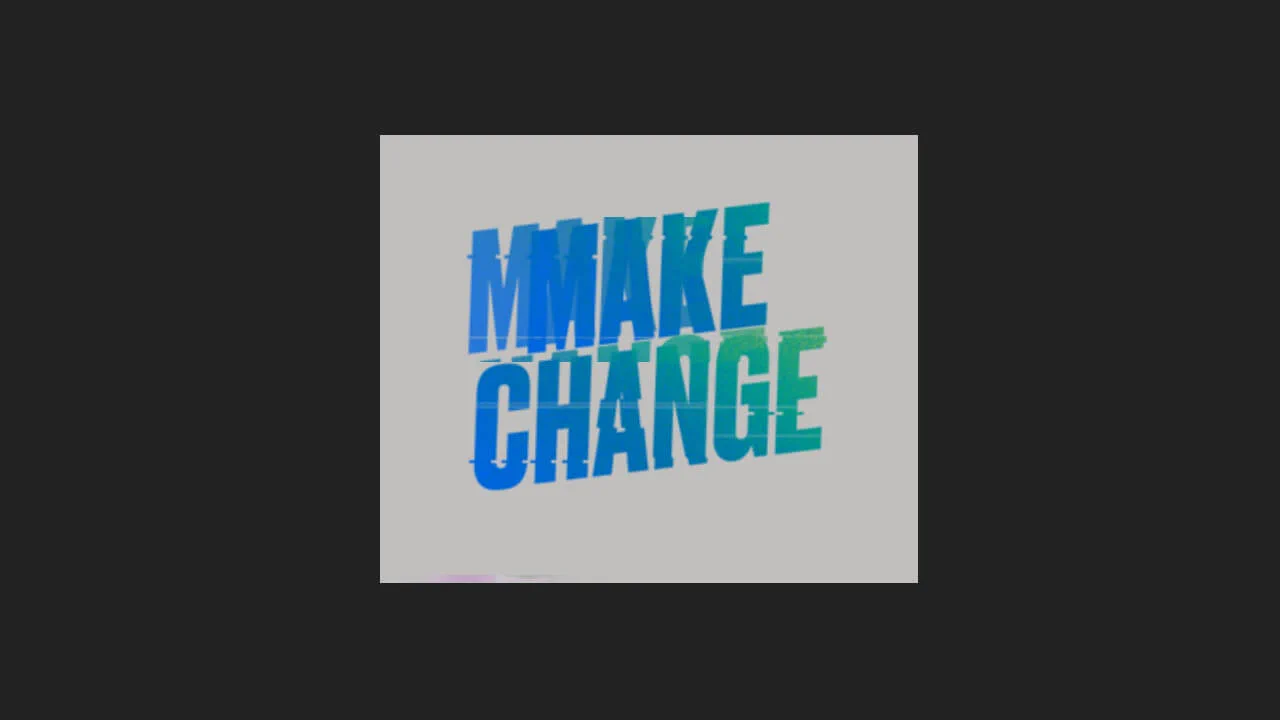
Animated Logo & Glitch Effect & Retro Look
This snippet builds a nested synthwave logo component utilizing @property for typed gradient interpolation, CSS mask-image for vector branding, and polygon clip-paths for geometric depth. The logic drives a performant glitch animation through GPU-accelerated transforms and filter-brightness spikes, delivering a raw, low-latency retro-futuristic user experience.
See the Pen Animated Logo & Glitch Effect & Retro Look.
Glitch Clock
This component pairs jQuery time-tracking with loop-generated Stylus keyframes to render a real-time glitch clock within geometric CSS mask-shapes. Structurally, the logic injects dynamic values into attr(data-time) pseudo-elements, executing RGB-split offsets via intensive clip: rect manipulation. While this design provides aggressive, high-contrast retro-digital feedback, the continuous repaint cycles and random layout skews impose heavy rendering overhead.
See the Pen Glitch Clock.
Retro Glitch Effect Colors RGB
A striking retro RGB glitch effect built with pure CSS using the mix-blend-mode: screen property. This snippet simulates chromatic aberration through cyclic keyframe animations of color layers, providing a high-performance visual punch for cyberpunk-themed UI designs.
See the Pen Retro Glitch Effect Colors RGB.