40+ CSS Glow Effects: Free Examples & Code Snippets (Page 2)
Examples
Climbing Cube
An illusion of an endlessly rolling 3D cube, achieved by synchronizing two @keyframes animations for rotation and sliding with an offset transform-origin. The complex rotation animation uses intermediate steps for a “bounce” effect, while a neon glow and -webkit-box-reflect complete the futuristic look.
See the Pen Climbing Cube.
Animated Border Gradient Glow
An animated rainbow border effect with a neon glow, implemented using @property, conic-gradient, and SVG filters. The @keyframes animation smoothly changes the --a CSS variable, which controls the hue in the conic-gradient, creating a continuous color transition.
See the Pen Animated Border Gradient Glow.
CSS Rainbow Shadow Button
Featuring a modern aesthetic, this button generates a soft aura using a blurred and offset pseudo-element whose color dynamics are precisely controlled by the oklch function and longer hue interpolation within the linear-gradient.
See the Pen CSS Rainbow Shadow Button.
The Moon. Glowing Cards
This responsive card grid implements synchronized, rotating conic-gradient borders and ambient glowing backlights using CSS Houdini @property for native angular interpolation. The structural layout uses @layer cascading order to wrap pseudo-elements that apply subtract-masked borders on ::before and blurred, synchronized neon glows on ::after alongside parallax background textures. While Houdini allows seamless, GPU-friendly variable animations, combining high-radius blurs with background-attachment: fixed over active masks introduces significant composite and repaint overhead on vertical scrolling.
See the Pen The Moon. Glowing Cards.
Animate Single img Gradient Glow Border With CSS + SVG Filter Enhancement
An animated rainbow border with a neon glow, created using @property, repeating-conic-gradient, and SVG filters. The @keyframes CSS animation continuously changes the --a CSS variable, which controls the angle of the conic-gradient, creating a rotating rainbow effect.
Eclipse Badge
An “eclipse” or running glint effect implemented in pure CSS. The @keyframes eclipse animation infinitely moves a white div from one edge to the other using transform: translateX, creating the illusion of a moving light source.
See the Pen Eclipse Badge.
80s Fonts Text Effect 4: Cyberspace Text
The ready-to-use 80s-style effect is achieved through the synergy of two key components: an SVG extrude filter for crafting the neon 3D text and a dynamic CSS starfield background animated along the Z-axis.
See the Pen 80s Fonts Text Effect 4: Cyberspace Text.
Buttons With Neon Glow
This component implements a clean row of floating button cards using highly localized, color-coded volumetric shadows beneath minimalist off-white blocks. The structural logic applies a negative-spread box-shadow to simulate soft light bleed, which dynamically intensifies as a transition scales the card upward on hover via translateY. By utilizing hardware-accelerated transforms instead of layout-disrupting properties or heavy blur filters, this static interface maintains optimal rendering performance while delivering a tactile, responsive user experience.
See the Pen Buttons With Neon Glow.
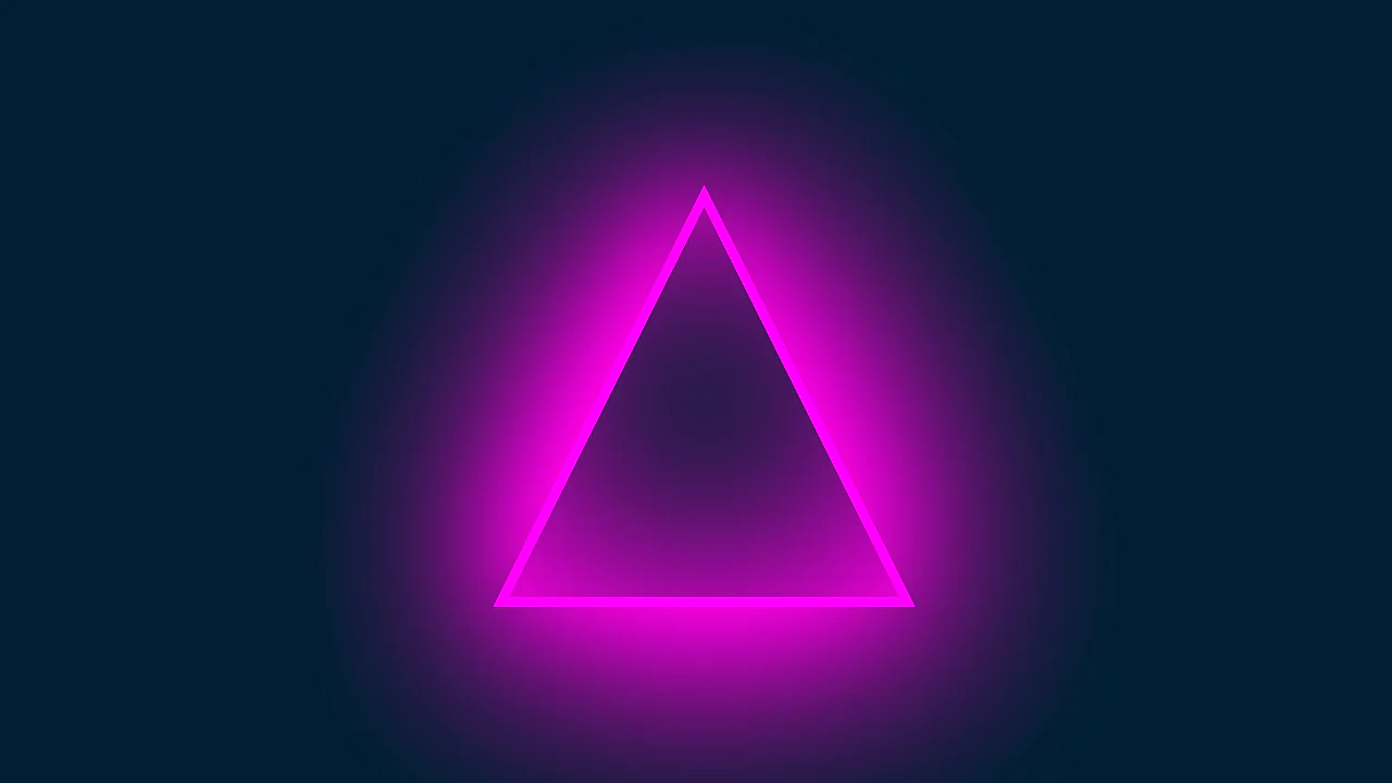
Triangle With Neon Glow Effect
This component builds a glowing, neon triangular frame by nesting masked, viewport-scaled shapes with heavy vector blur filters. The structural logic applies a geometric clip-path polygon to an outer magenta container, nesting a background-matching inner triangle to mask the center while diffusing light via offset, high-radius drop-shadows. While the static layout is lightweight, the compounding of extreme blur filters (blur(115px)) and stacked outer shadows requires significant GPU rasterization resources during window resizing.
See the Pen Triangle With Neon Glow Effect.
Button Glow
This component builds an analog neon button by nesting text elements to run asynchronous, multi-layered opacity flicker animations. The structural logic integrates parent perspective with a skewed, blurred pseudo-element reflection to project realistic light scattering onto an imaginary floor plane. While hovering provides tactile feedback by freezing the unstable flickering into solid illumination, the constant rendering of highly blurred filters and nested opacity keyframes imposes ongoing GPU compositing overhead.
See the Pen Button Glow.
Image Glow Effect Using Background
This card layout generates dynamic, color-matched ambient glows by mirroring parent background images onto blurred pseudo-elements via background: inherit. Structurally, the visual logic simulates physical light diffusion using a scaled-up, blurred replica behind each card, collapsing the glow on hover through smooth transition curves. However, applying high-radius CSS blurs to full-size image textures demands substantial GPU memory, which can cause frame drops during layout rendering or scrolling on low-power displays.
See the Pen Image Glow Effect Using Background.
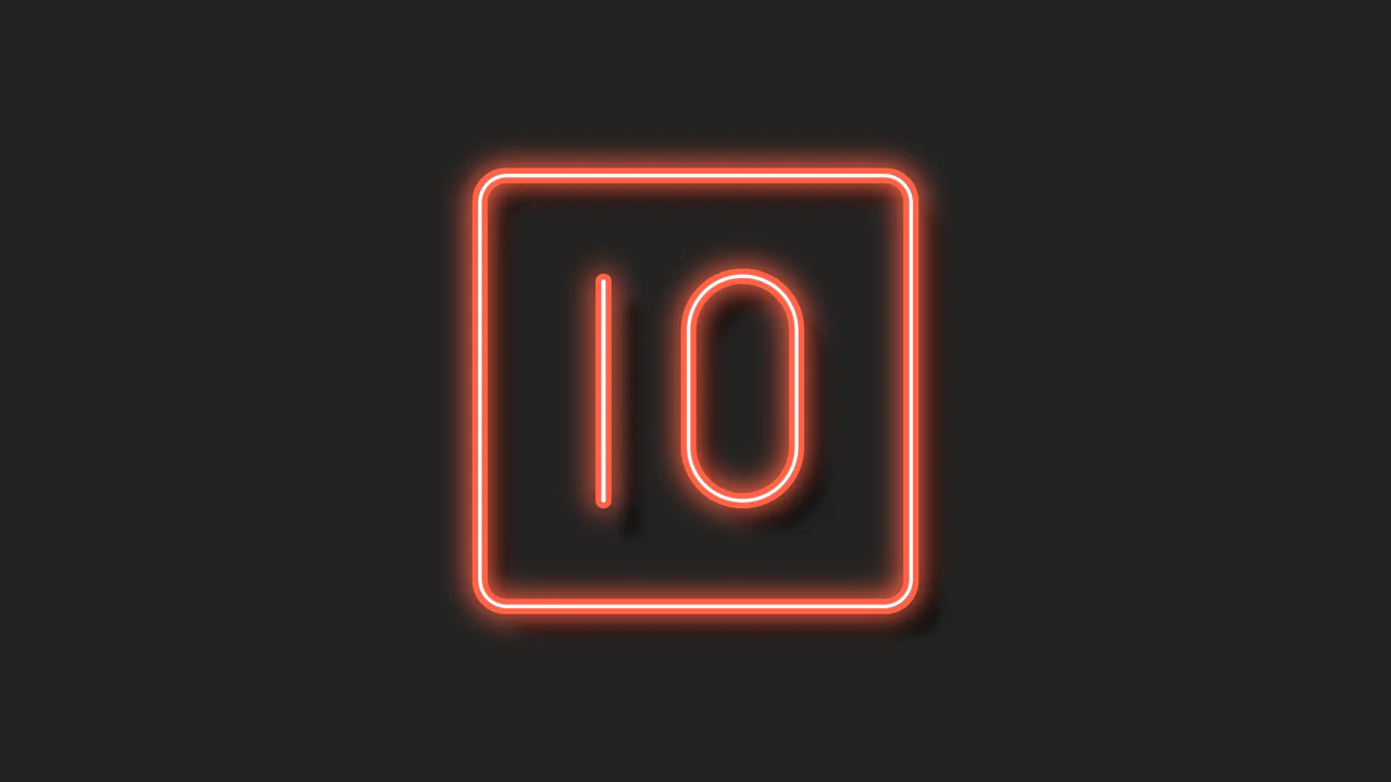
Single DIV CSS Neon 10
This single-element illustration renders a volumetric, neon-style “10” graphic within a zero-redundancy DOM footprint. Structurally, the logic splits the numeric glyphs across ::before and ::after pseudo-elements, stacking multi-layered internal and external box-shadow declarations to simulate physical glass depth, neon scattering, and ambient occlusion. By remaining static and offloading responsive resizing to GPU-friendly transform: scale(), the component maintains optimal rendering efficiency while offering a highly tactile, glowing user experience.
See the Pen Single DIV CSS Neon 10.
Animation Effects
This kinetic UI component renders three overlapping orbital rings with revolving vector glyphs injected via pseudo-elements. Structurally, the synchronized kinetic motion relies on reverse rotation keyframes paired with staggered negative animation delays. While the rotation itself uses GPU-accelerated transforms, stacking triple-layer filter: drop-shadow() operations on moving elements forces continuous canvas repaints, introducing rendering overhead on low-end hardware.
See the Pen Animation Effects.
Aurora Button
This component builds an atmospheric, tactile button by stacking nested wrappers, multi-layered gradient glows, and a jittering step-animated noise overlay. The logic drives a seamless vertical text flip using cubic-bezier translate3d transformations on pseudo-elements, while hover states simultaneously trigger a fluidly rotating linear-gradient glow. Although text and opacity animations leverage GPU acceleration, continuous rendering of the highly blurred neon gradients and the overlapping noise layer introduces ongoing paint and compositing overhead.
See the Pen Aurora Button.
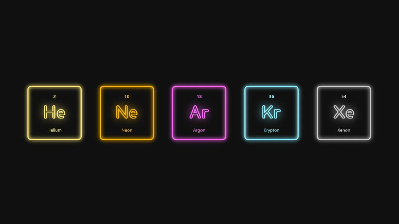
Noble Gasses / Flourescent Lights
This clean grid component simulates gas-discharge neon indicators by structuring semantic HTML with scoped custom CSS properties. The design logic couples currentColor inheritance with localized brightness and saturation filters to mathematically correct the luminance of each noble gas color. By avoiding animation loops, this static rendering architecture remains highly performant, offering a high-contrast, physical lab-instrument user experience.
See the Pen Noble Gasses / Flourescent Lights.
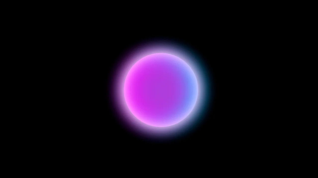
Glowing Translucent Marble
This ultra-minimalist snippet renders a volumetric, glowing glass sphere using a single HTML element. Structurally, the visual logic stacks eight inset and outset box-shadow layers with complementary neon colors to simulate physical refraction and spherical depth. While statically lightweight for browser composition, any attempt to animate these high-radius shadow blurs would immediately trigger expensive GPU rasterization cycles.
See the Pen Glowing Translucent Marble.
Glowing Meteor
This snippet builds a layered, animated vector character by stacking absolutely-positioned wrappers with pseudo-element facial features and gradient list-item trails. The animation engine uses SCSS math loops to inject randomized delays into keyframes, producing an asynchronous, organic flow. However, animating layout-disrupting properties like left and width instead of GPU-accelerated transforms causes continuous repaint cycles, degrading rendering efficiency despite the engaging visual design.
See the Pen Glowing Meteor.
Glowing Gradient Glassmorphism Card
This component builds glassmorphism card modules by nesting content panels over skewed gradient backdrops and floating, step-revealed glass blobs. The logic utilizes backdrop-filter to generate frosted-glass transparency, while hover events trigger translation animations and straighten the sheared background geometry. However, animating layout properties like width and left alongside stacked, high-radius filters causes heavy CPU paint cycles, degrading scrolling performance despite the high visual depth.
See the Pen Glowing Gradient Glassmorphism Card.