7 CSS Gooey Effects: Free Examples & Code Snippets
CSS gooey effects mimic the natural, cohesive tension of liquid substances, allowing adjacent interface elements to stick and merge organically as they move. By creating fluid transitions between digital components, this technique introduces a highly tactile, physics-based dimension to standard layout behaviors.
- The visual illusion is generated by applying a heavy blur filter to adjacent elements and instantly sharpening their outlines with a high-contrast alpha threshold.
- Advanced implementations isolate these expensive pixel manipulations inside an inline SVG feColorMatrix filter, calculating alpha-channel values natively on the GPU.
- To preserve INP (Interaction to Next Paint) responsiveness, continuous gooey animations restrict target layers to promoted composited contexts using
transformtranslations.
Dive into these liquid-distortion techniques to craft highly engaging, organic morphing menus and physics-inspired page transitions.
Table of Contents:
Examples
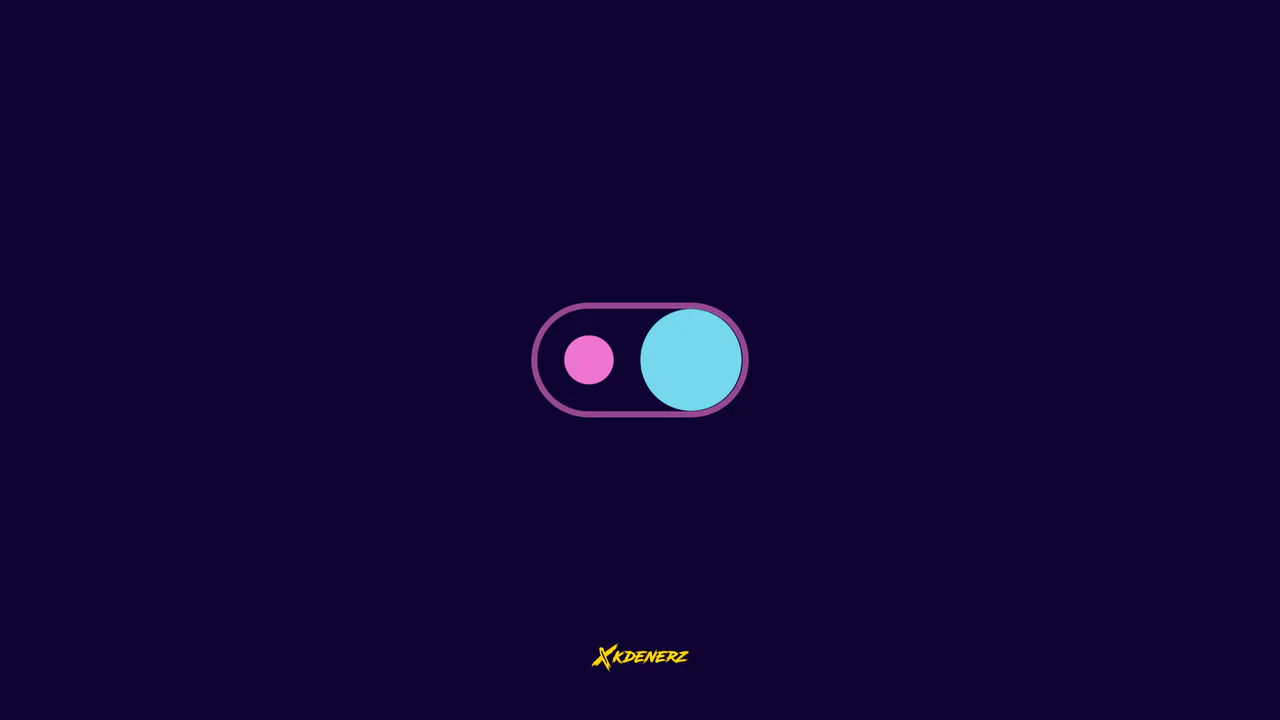
Gooey Liquid SVG Filter Toggle Switch
Gooey Liquid SVG Filter Toggle Switch uses a classic SVG filter trick — combining a blur (feGaussianBlur) with a high-contrast color matrix (feColorMatrix) — to achieve a fluid, organic morphing effect. The sliding thumb dynamically deforms and stretches before snapping into place. Built with modern CSS custom properties and individual transform properties, it includes a simple JavaScript loop for continuous demonstration.
 Chrome 111+
 Edge 111+
 Firefox 113+
 Safari 16.2+
See the Pen Gooey Liquid SVG Filter Toggle Switch.
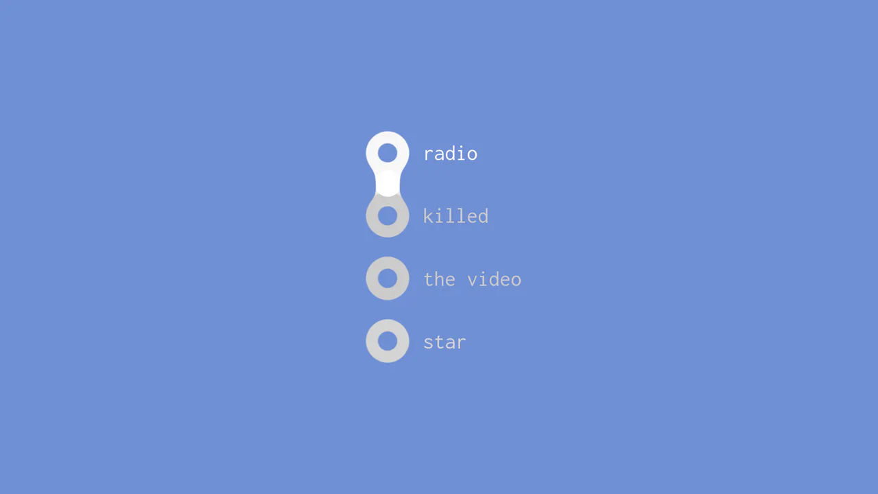
Gooey Liquid Radio Buttons
This is a Gooey Liquid Radio Button group. It overrides the default OS radio inputs with a custom SVG-filtered visual state. Its function is to provide highly tactile, liquid-like feedback when a user selects between mutually exclusive options, making data entry feel physical and alive.
Chrome 51+
Edge 79+
Firefox 54+
Safari 10+
See the Pen Gooey Liquid Radio Buttons.
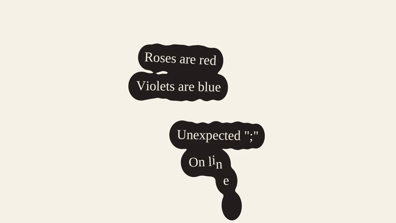
Liquid Puddle Text Reveal
This is a Liquid Puddle Text Reveal. It transforms standard typographic elements into falling droplets that merge organically into readable words. Its function is to provide a highly stylized, kinetic introduction for hero headlines, replacing standard opacity fades with a physical, fluid simulation.
Chrome 60+
Edge 79+
Firefox 55+
Safari 11+
See the Pen Liquid Puddle Text Reveal.

Gooey Clock
A functional clock face featuring a morphing, lava-lamp-like background created by filtering overlapping SVG shapes.
See the Pen Gooey Clock.

Liquid Gooey UI Elements
Explore the powerful tandem of GSAP and CSS Variables, where to/fromTo with keyframes control SVG elements inside Radio/Checkbox/Switch. The animations utilize the feColorMatrix filter (the “Gooey” effect) and SVG transforms to create smoothly “flowing” shapes and stylish toggles.
See the Pen Liquid Gooey UI Elements.
Scroll-Driven Gooey Island
Check out this cutting-edge “sticky island” effect that dynamically squishes and transforms on scroll using CSS Scroll-Timeline. The core technical feature is creating the Gooey effect by combining filter: blur() and contrast() with absolute control linked to the scroll position.
See the Pen Scroll-Driven Gooey Island.
Floating Button
A “gooey effect” menu with a cascading reveal, implemented in pure CSS and SVG filters. The animation is controlled by the “checkbox hack,” where each menu item gets its own transition-duration for sequential appearance. The “gooeyness” is achieved using an SVG filter with feGaussianBlur and feColorMatrix, where a custom matrix removes semi-transparency and creates a merging effect.
See the Pen Floating Button.