150+ CSS Gradient Examples (Page 2)
Examples
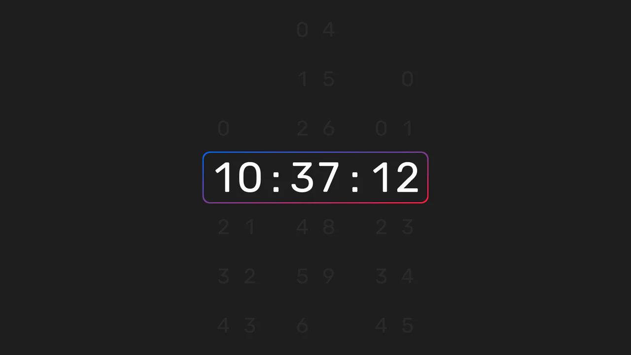
Animated Sliding Digital Clock
This is an Animated Sliding Digital Clock. It replaces instantaneous digit swapping with a vertical mechanical scrolling effect. Its function is to provide an engaging, high-fidelity timekeeping element for dashboards or hero sections, turning a passive metric into an active visual component. (Requires: React, ReactDOM, classnames)
 Chrome 60+
 Edge 79+
 Firefox 55+
 Safari 11+
See the Pen Animated Sliding Digital Clock.

Skeuomorphic Chess Pawn
This is a Skeuomorphic CSS Chess Pawn. It replaces static raster images with a resolution-independent, pure code illustration. Its function is to demonstrate high-fidelity rendering capabilities within the DOM, utilizing native styling properties to fake three-dimensional geometry, light, and mass.
Chrome 26+
Edge 12+
Firefox 16+
Safari 7+
See the Pen Skeuomorphic Chess Pawn.

Smooth Scroll Stacking Accordion
This is a Smooth Scroll Stacking Accordion. It replaces standard click-to-open accordions with a scroll-driven interaction. Its function is to pin a section of content and compress multiple information cards into a stacked deck as the user scrolls down the page. (Requires: GSAP, ScrollTrigger, ScrollSmoother)
Chrome 79+
Edge 79+
Firefox 75+
Safari 11.1+
See the Pen Smooth Scroll Stacking Accordion.
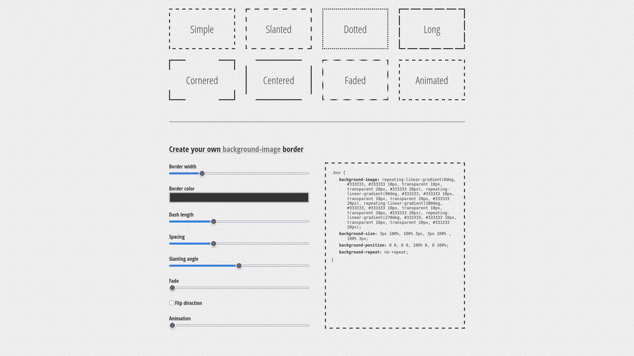
Dashed Gradient Border Generator
This is an Animated Gradient Border Generator. It bypasses standard CSS border limitations by utilizing stacked repeating-linear-gradient functions applied to the background-image. Its function is to provide developers with a visual interface to dial in specific parameters — slant, gap, fade, and velocity — while instantly outputting the required, mathematically precise CSS code.
Chrome 80+
Edge 80+
Firefox 75+
Safari 13.1+
See the Pen Dashed Gradient Border Generator.

Vibrant OKLCH Conic Hero
For too long, the web has been trapped in the dull, muddy spectrum of sRGB. We accept “gray dead zones” in our gradients as a fact of life. No more. This hero section embraces the OKLCH color space to deliver vibrance that matches the human eye’s perception. It is not just a background; it is a radiant, high-definition light source that bathes your typography in pure energy. (Requires: open-props)
Chrome 111+
Edge 111+
Firefox 113+
Safari 15.4+
See the Pen Vibrant OKLCH Conic Hero.

Sparkling Gradient Text Highlight
Typography on the web often suffers from a lack of vitality. We treat words as static information, ignoring their potential to convey wonder. This component injects a sense of “magic” into the reading experience. By combining a kinetic gradient with a randomized particle system, we create a focal point that breathes. It is not just a highlight; it is a celebration of the message, designed to captivate the user’s peripheral vision without overwhelming the content.
Chrome 84+
Edge 84+
Firefox 79+
Safari 14+See the Pen Sparkling Gradient Text Highlight.

Pure CSS Animated Scorbunny
This Pure CSS Animated Scorbunny showcases the power of CSS as an illustration tool. Without a single SVG or image file, it constructs a recognizable character using nested divs, gradients, and advanced border-radius manipulation. The character feels alive thanks to continuous idle animations (blinking eyes, wiggling ears) and a joyful reaction when the user hovers over it.
Chrome 60+
Edge 79+
Firefox 55+
Safari 11+
See the Pen Pure CSS Animated Scorbunny.

Adaptive Thumbnail Carousel
This Adaptive Thumbnail Carousel is a versatile gallery component that seamlessly bridges the gap between desktop and mobile UX. On desktop, it presents a traditional filmstrip of thumbnails. On mobile, it intelligently morphs into a dot-navigation style, where hovering (or tapping) a dot reveals a floating preview of the image. The carousel handles state synchronization, smooth scrolling, and accessibility, making it a robust choice for e-commerce product pages or portfolios.
Chrome 69+
Edge 79+
Firefox 63+
Safari 13.1+
See the Pen Adaptive Thumbnail Carousel.
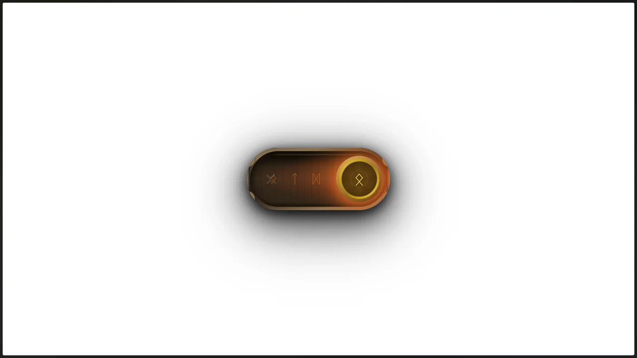
Viking Rune Wood Toggle
This Viking Rune Wood Toggle demonstrates how far CSS styling can go without JavaScript. It recreates a physical artifact - a wooden switch with bronze inlays and magical runes - perfect for RPG game interfaces or fantasy-themed websites. The switch features a “fire” state when active, complete with pulsating runes and floating ember particles, creating an immersive, tactile experience.
Chrome 60+
Edge 79+
Firefox 55+
Safari 11+
See the Pen Viking Rune Wood Toggle.

Animated CPU Circuit Loader
This Animated CPU Circuit Loader brings a hardware-inspired aesthetic to your loading states. It visualizes data processing as colorful pulses of energy traveling along printed circuit board (PCB) traces into a central processor. The effect creates a sense of high-tech activity, perfect for dashboards, tech blogs, or system status pages.
Chrome 60+
Edge 79+
Firefox 60+
Safari 11+
See the Pen Animated CPU Circuit Loader.

Hand-Drawn Retro Radio Group
This Hand-Drawn Retro Radio Group injects personality into standard forms with a nostalgic, sketchbook aesthetic. It combines a “neo-brutalist” shadow style with subtle animations - like text jitter and a bouncing selection dot - to mimic the imperfection of hand-drawn art. The background features a CSS-generated paper texture and scanline effect, making it ideal for indie game interfaces, creative blogs, or retro-themed landing pages.
Chrome 60+
Edge 79+
Firefox 60+
Safari 12+
See the Pen Hand-Drawn Retro Radio Group.

Rounded Triangle CSS Image Mask
This Rounded Triangle CSS Image Mask offers a mathematically perfect way to shape visuals into equilateral triangles with soft, professional edges. It is an ideal choice for high-end portfolio galleries, creative team sections, or landing pages where standard rectangular or circular crops feel too conventional. By leveraging modern CSS math, the shape remains perfectly symmetrical regardless of the image dimensions.
Chrome 105+
Edge 105+
Firefox 121+
Safari 15.4+
See the Pen Rounded Triangle CSS Image Mask.
Mouse-Tracking Linear Shine Button
This Mouse-Tracking Linear Shine Button adds a high-end, tactile feel to your UI. Unlike standard hover effects that simply swap colors, this component tracks the user’s cursor position to drag a realistic light reflection across the button’s surface. Built with React and Tailwind CSS, it utilizes reactive CSS variables to control gradient positions, creating a dynamic lighting effect that feels physical and responsive. (Requires: React, React DOM, Tailwind CSS)
Chrome 49+
Edge 79+
Firefox 32+
Safari 8+
See the Pen Mouse-Tracking Linear Shine Button.

Scroll-Driven Image Swapper
This Scroll-Driven Image Swapper demonstrates the bleeding edge of web animation. It uses the native CSS Scroll-driven Animations API to create a complex parallax-like effect where two columns of different heights scroll in sync. As you scroll, the images in the shorter column slide and crossfade to match the context of the taller column. Crucially, the code implements a Progressive Enhancement strategy: it checks for native browser support and falls back to GSAP ScrollTrigger for browsers that haven’t implemented the spec yet. (Requires: GSAP, ScrollTrigger)
Chrome 115+
Edge 115+. Firefox/Safari (via GSAP Polyfill)
See the Pen Scroll-Driven Image Swapper.

Semantic Custom Progress Bar Kit
This Semantic Custom Progress Bar Kit offers a robust way to display data visualization using a “semantic-first” approach. Instead of writing empty div soup, you define your data using standard HTML5 <progress> tags. The accompanying JavaScript then “hydrates” these tags, converting them into four distinct, visually rich styles ranging from simple solids to complex gradients and striped patterns, perfect for dashboards or skill portfolios.
Chrome 60+
Edge 79+
Firefox 55+
Safari 11+
See the Pen Semantic Custom Progress Bar Kit.

Holographic 3D Interactive Card
This Holographic 3D Interactive Card is a premium UI component inspired by rare physical trading cards. It features a sophisticated depth effect where the logo floats independently from the iridescent background, reacting dynamically to mouse movements or touch input. The use of modern CSS APIs ensures high-performance rendering of complex gradients and masks, creating a truly immersive “collectible” feel for digital assets.
Chrome 85+
Edge 85+
Safari 16.4+
Firefox 128+
See the Pen Holographic 3D Interactive Card.

Geometric Custom Range Sliders
These Geometric Custom Range Sliders push the boundaries of form styling by abandoning the standard “circle on a line” look. Created by CSS math wizard Ana Tudor, this set utilizes SCSS trigonometry to generate complex thumb shapes (like triangles and hollow pills) and CSS Mask Composition to carve out negative space. The result is a set of distinct, scalable inputs that rely on a single HTML <input> tag without any wrapper divs.
Chrome 84+
Edge 84+
Firefox 70+
Safari 15.4+
See the Pen Geometric Custom Range Sliders.

Twitch Style Gradient Hover Card
This Twitch Style Gradient Hover Card brings a high-energy interactive element to your UI, perfect for feature highlights or gaming profiles. It combines a sliding background gradient that utilizes responsive vmin units with a JavaScript-powered staggered text reveal. The result is a fluid animation where the background shifts dynamically while the subtitle types itself in word by word.
Chrome 88+
Edge 88+
Firefox 89+
Safari 15+See the Pen Twitch Style Gradient Hover Card.

CSS Staggered Bars Reveal Animation
This Staggered Bars Reveal Animation creates a cinematic intro for landing pages using zero JavaScript. By orchestrating a single pseudo-element (::after) with complex linear-gradient backgrounds, the component simulates seven distinct bars sliding into place. The animation cleverly shifts the background-position of each gradient strip sequentially, creating a rhythmic “wipe” effect that culminates in the text appearing.
Chrome 100+
Edge 100+
Safari 14+
Firefox 90+
See the Pen CSS Staggered Bars Reveal Animation.

Blooming Night Garden Animation
This Blooming Night Garden Animation is a delightful example of “CSS Art,” where HTML elements are shaped into complex illustrations using code. It features a complete scene with a textured night sky, procedurally blooming flowers, swaying grass, and a particle system of floating hearts, all brought to life through choreographed CSS keyframes.
Chrome 100+
Edge 100+
Safari 14+
Firefox 90+
See the Pen Blooming Night Garden Animation.

Staggered Gradient Skeleton Loader
This Staggered Gradient Skeleton Loader improves perceived performance by providing a visual structure while content fetches in the background. Unlike static placeholders, this Vue.js component utilizes a calculated delay system to create a “wave” animation across the grid, guiding the user’s eye naturally from top-left to bottom-right without using complex JavaScript animation libraries. (Requires: Tailwind CSS, Vue.js)
Chrome 100+
Edge 100+
Safari 14+
Firefox 90+
See the Pen Staggered Gradient Skeleton Loader.

Border Image Fill Gradient Overlay
The Border Image Fill Gradient Overlay is a minimalist CSS technique used to add a decorative or functional gradient over background images. Unlike traditional methods that require extra HTML markup or ::before/::after pseudo-elements, this approach uses a single, underutilized property to enhance text contrast and visual depth.
Chrome 15+
Edge 12+
Firefox 15+
Safari 6+
See the Pen Border Image Fill Gradient Overlay.

Hyperplexed Evervault Card Hover Effect
This Hyperplexed Evervault Card Hover Effect utilizes dynamic character generation and CSS masking to create a high-tech “decryption” visual. It replicates the sophisticated card interactions found on the Evervault website, blending procedural text with mouse-responsive radial gradients.
Chrome 80+
Edge 80+
Firefox 75+
Safari 13+See the Pen Hyperplexed Evervault Card Hover Effect.

Pure CSS Synthwave 80s Animation
This Pure CSS Synthwave 80s Animation captures the nostalgic aesthetic of the 1980s retrowave genre. It features a complete animated scene: an infinite neon grid, a setting sun with scanlines, shaking palm trees, and a DeLorean driving into the distance. The scene is brought to life with a driving synthwave audio track and intricate CSS-only motion.
Chrome 60+
Edge 79+
Firefox 55+
Safari 11+See the Pen Pure CSS Synthwave 80s Animation.

Watermelon Themed Analog Clock
This Watermelon CSS Analog Clock transforms a standard timekeeping UI into a playful, summery vector illustration. By leveraging SCSS pre-processing for generative design and CSS Gradients for complex shapes, it reduces HTML markup while maintaining a vibrant, flat-design aesthetic.
Chrome 60+
Edge 79+
Firefox 55+
Safari 11+
See the Pen Watermelon Themed Analog Clock.
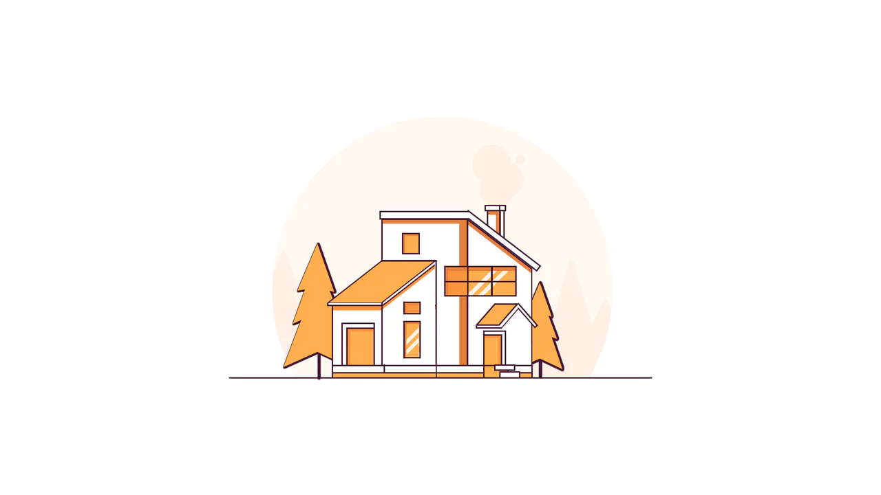
Line House
A pure CSS illustration of a house constructed from geometric primitives using clip-path for complex shapes and transform for perspective. It features a warm color palette managed via CSS variables, extensive drop-shadow usage for foliage density, and linear-gradient for detailed window reflections.
See the Pen Line House.

Moiré Psy-Dance Party VIP Access Card (CSS Only)
A psychedelic 3D VIP card animation powered by pure CSS.
See the Pen Moiré Psy-Dance Party VIP Access Card (CSS Only).

Profile CSS Drawing
A stylish, detailed vector-style portrait with depth and shadows, fully implemented using pure CSS gradients and clipping paths.
See the Pen Profile CSS Drawing.

Warrior
A pure CSS illustration of a knight constructed from geometric primitives. It employs repeating-linear-gradient for shield textures, clip-path for armor shaping, and extensive box-shadow duplication to render limbs and details efficiently, creating a stark, high-contrast monochrome aesthetic.
See the Pen Warrior.
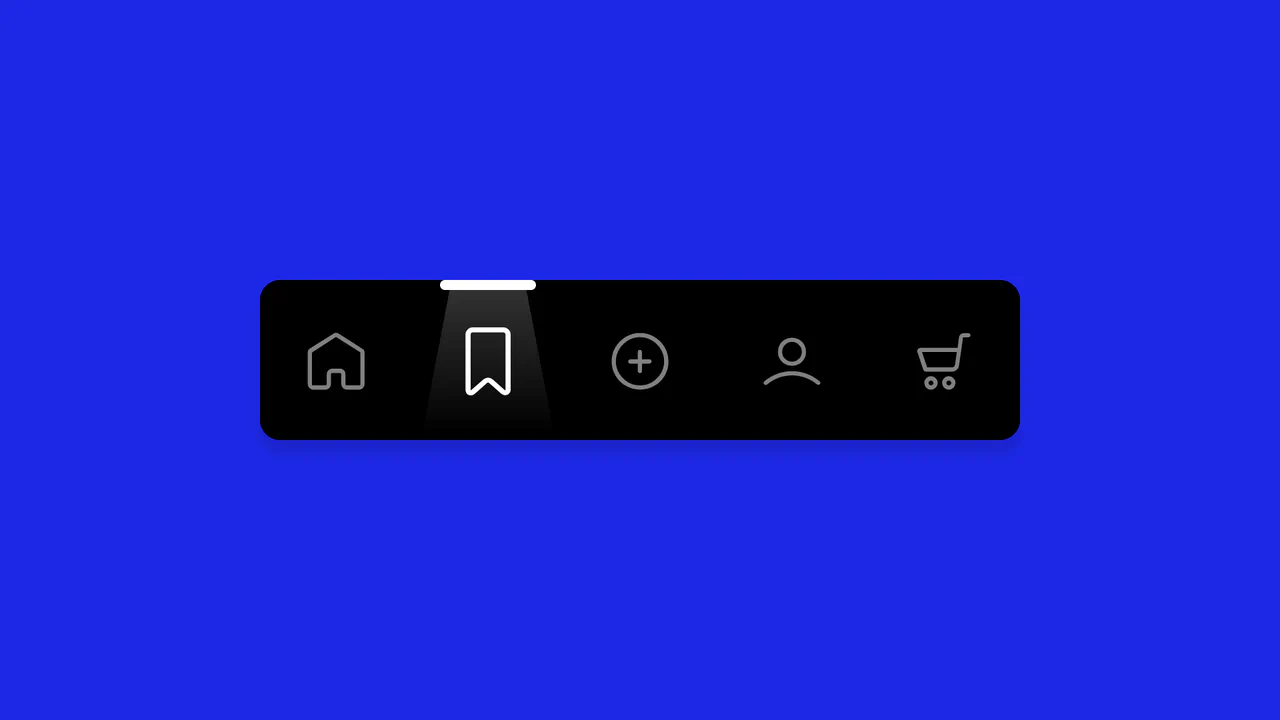
Animated Navigation
A spotlight navigation menu where the active state is highlighted by a moving “light beam” element.
See the Pen Animated Navigation.