150+ CSS Gradient Examples (Page 3)
Examples

Animated Sign-In Form with Theme Switcher
An interactive login form that performs a 360-degree 3D flip animation to seamlessly transition between vibrant, gradient-based color themes triggered by a JavaScript state manager.
See the Pen Animated Sign-In Form with Theme Switcher.

Little Details
A stylized nested to-do list employing advanced CSS pseudo-elements for custom markers and hover-based reveal logic for sub-tasks. JavaScript handles basic DOM manipulation for adding/removing items, while the dark UI features gradient borders and tooltip interactions.
See the Pen Little Details.
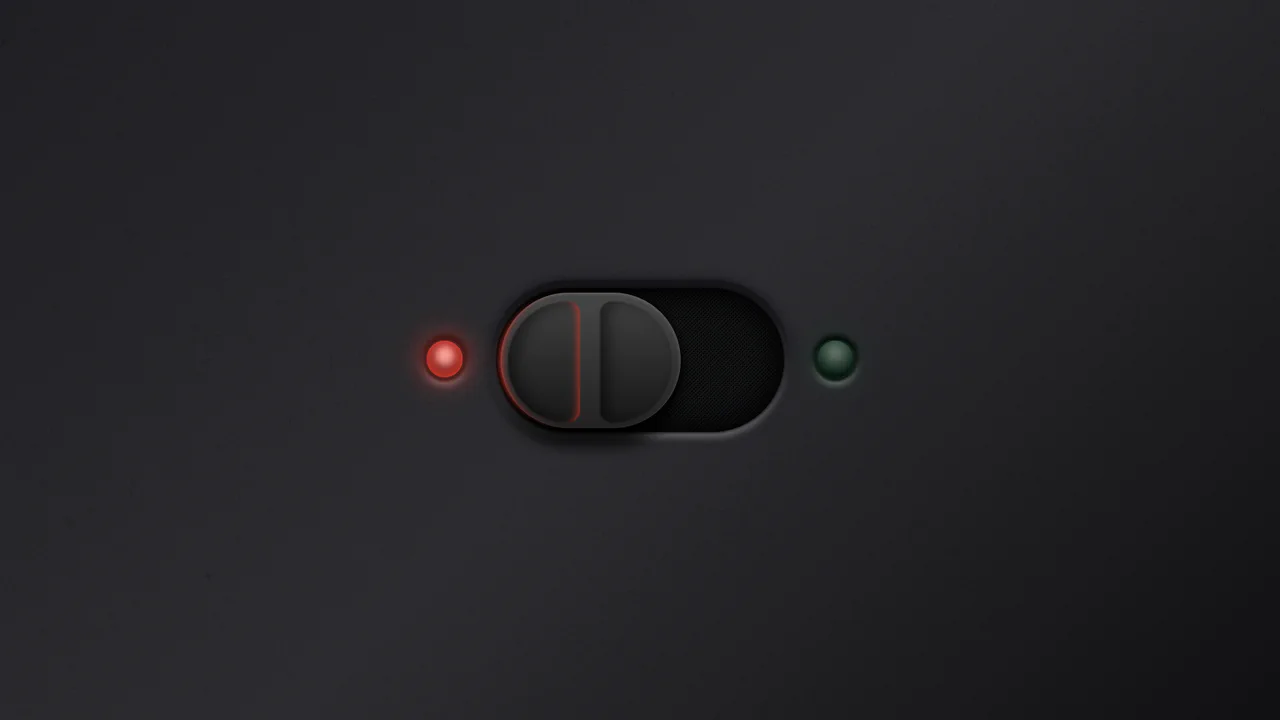
Ergonomic Toggle (CSS)
A hyper-realistic skeuomorphic toggle switch crafted entirely in CSS using advanced box-shadows and gradients to simulate depth and lighting.
See the Pen Ergonomic Toggle (CSS).

Holographic Name Card with Hover Effects
An interactive 3D holographic card where JavaScript maps pointer coordinates to scoped CSS Custom Properties like --pointer-x. The physical lighting simulation relies on complex gradient layering, mask-image, and mix-blend-mode, all dynamically driven by these calculated values to create realistic depth and glare.
See the Pen Holographic Name Card with Hover Effects.

Skull Toggle (CSS)
A playful skeleton toggle switch animated purely with CSS. The skull handle slides via @keyframes triggered by the :checked state, while a complex hand assembly - constructed from gradients and box-shadows - slides in to “push” the toggle, creating a whimsical, interactive narrative without JavaScript.
See the Pen Skull Toggle (CSS).

Metal/Glass Button
A high-quality simulation of a metallic surface that “plays” with light following the mouse cursor, creating a tactile sensation of premium material.
See the Pen Metal/Glass Button.

React Radio Player
A tactile, interactive player that looks and behaves like a real gadget, featuring smooth power-on animations and live audio streaming.
See the Pen React Radio Player.

List Styles
An aesthetically pleasing, modern todo list featuring a vibrant gradient theme and an intuitive hierarchy creation function without complex control buttons.
See the Pen List Styles.

Creative Section Design
A visually rich, animated section with cards that respond to hover (a colored border appears), creating a sense of interactivity and depth.
See the Pen Creative Section Design.

Simple HTML Charting with CSS Grid, Writing Mode, and Vue
A lightweight, colorful, and animated chart demonstrating data visualization capabilities using pure CSS and Vue without heavy dependencies.

Interactive Gooey Buttons
Interactive buttons featuring a fluid, mouse-tracking glow effect powered by CSS custom properties. JavaScript calculates cursor coordinates to dynamically position radial gradients and text shadows, while CSS filters create a ‘gooey’ liquid animation that responds organically to user interaction.
See the Pen Interactive Gooey Buttons.
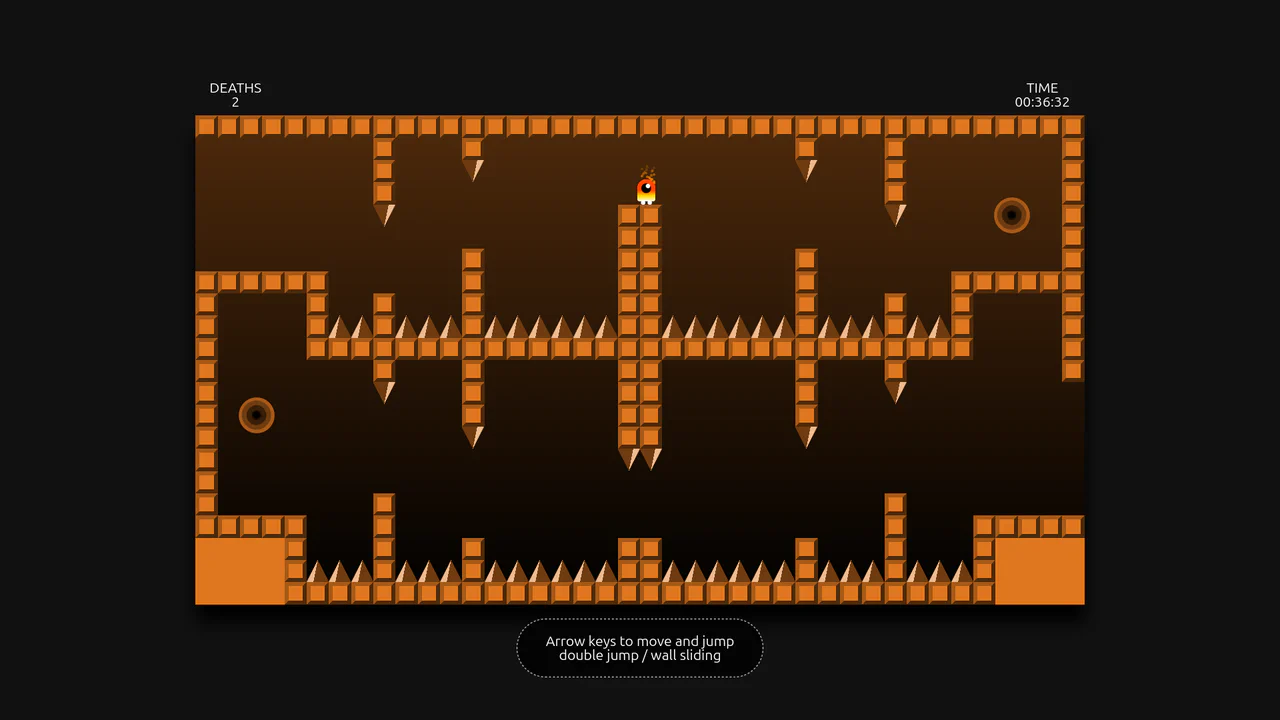
DOM-Based Platformer with Gamepad API Support
A DOM-based platformer engine that constructs levels from numeric arrays, utilizing document.elementFromPoint for real-time collision detection and physics simulation. The JavaScript game loop manages gravity, gamepad support, and level transitions, while intricate CSS gradients and animations bring the tile-based world and character to life.
See the Pen DOM-Based Platformer with Gamepad API Support.

Pure CSS Pricing Plans with Gradient Ribbons
A pricing component where complex ribbon geometry is calculated via SCSS trigonometry and sculpted using conic-gradient alongside mask-composite. The organic, fluid connections between shapes are achieved through the filter: blur() contrast() technique, creating a scalable vector-like aesthetic entirely within CSS without relying on runtime JavaScript or external SVG assets.
See the Pen Pure CSS Pricing Plans with Gradient Ribbons.

3D Neon Toggle On/Off Switch
An advanced 3D toggle switch simulating a physical button with a neon glow. The effect is implemented in pure CSS using an <input type="checkbox">, and the state transition (ON/OFF) is achieved through a complex interplay of box-shadow and 3D transforms.
See the Pen 3D Neon Toggle On/Off Switch.
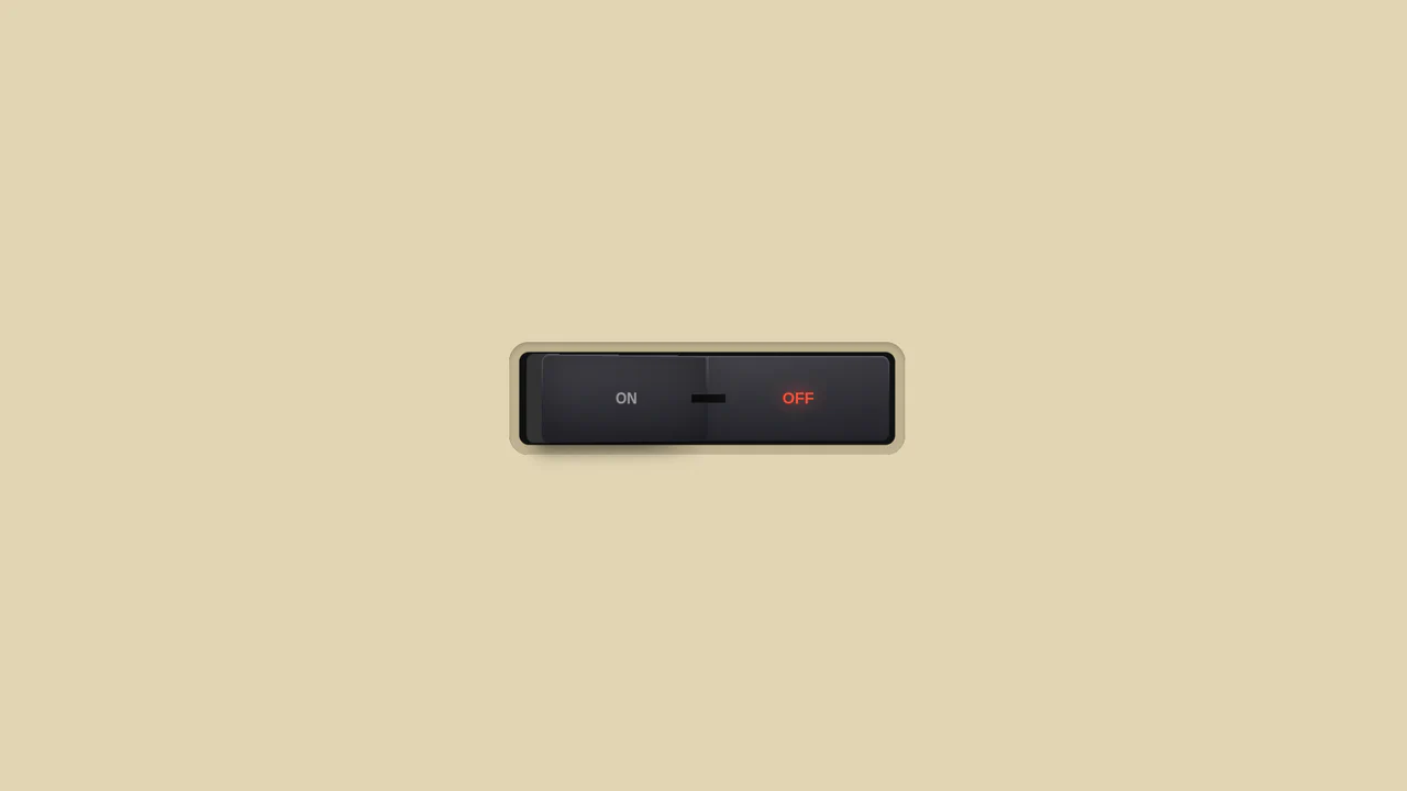
3D Toggle On/Off Switch v2
The use of gradients to create a realistic metallic effect and highlights on the button. Various types of linear-gradient and radial-gradient are applied to create a multi-layered background, and clip-path precisely clips the shapes of the pseudo-elements.
See the Pen 3D Toggle On/Off Switch v2.
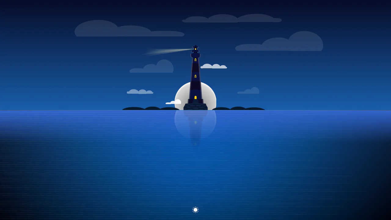
CSS Day/Night Lighthouse Illustration
A purely CSS rendering of a complex lighthouse scene at sunset/night. The “checkbox hack” is used to toggle between day and night modes. All graphics - from the lighthouse itself to the sea, clouds, and stars - are created exclusively using CSS gradients and box-shadow.
See the Pen CSS Day/Night Lighthouse Illustration.

Single Div CSS Computer
A demonstration of pixel art creation using only CSS gradients and box-shadow animation, without a single image file or extra HTML elements.
See the Pen Single Div CSS Computer.

Multi-Card Spotlight Effect
An interactive 3D card effect where JavaScript tracks pointermove, calculates the relative cursor position, and passes it to --ratio-x and --ratio-y CSS variables, while CSS uses calc() to drive rotateX and rotateY.
See the Pen Multi-Card Spotlight Effect.
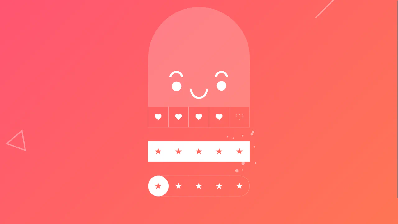
Animated Ratings Component
This interactive rating component stands out with three unique 3D effects, built using advanced Sass (loops, gradient randomization), - and showcases SVG facial animation via path morphing in pure JS.
See the Pen Animated Ratings Component.

React Color Gradient Palette
This React component library demonstrates a technically clean solution for displaying color gradients.
See the Pen React Color Gradient Palette.

Realistic MPK Mini MIDI Controller in Pure CSS
Pure CSS skeuomorphism in action - a complete replica of a MIDI controller where every knob, pad, and key is drawn by layering dozens of gradients and shadows.
See the Pen Realistic MPK Mini MIDI Controller in Pure CSS.

Cursor Following Halftone Rings with CSS @property
A cursor effect creating dynamic halftone rings is implemented using CSS Custom Properties and transition properties for smooth mouse-following, requiring minimal JavaScript to update coordinates.
See the Pen Cursor Following Halftone Rings with CSS @property.
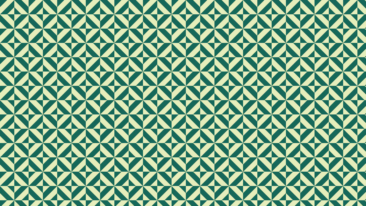
Intersecting Diagonals Pattern
A pattern generated with just one background property, showcasing advanced use of CSS gradients and background-size to create a complex, repeating texture, with flexible customization via custom CSS properties.
See the Pen Intersecting Diagonals Pattern.

Lighthouse Single-Div CSS Illustration
The entire scene is constructed from a combination of gradients (linear-gradient/radial-gradient) and precise element positioning using background-position.
See the Pen Lighthouse Single-Div CSS Illustration.
Button with Animated Gradient
Achieve a premium, vibrant glow and pulsating background with this component, which utilizes high-performance CSS animations and dynamic box-shadow effects, all orchestrated by TypeScript and the GSAP library.
See the Pen Button with Animated Gradient.

Neomorphic Calendar Card Component
A neomorphic calendar card component with SCSS-driven depth and complex CSS transformations, featuring a concise vanilla JavaScript implementation to display the live UTC date and month.
See the Pen Neomorphic Calendar Card Component.
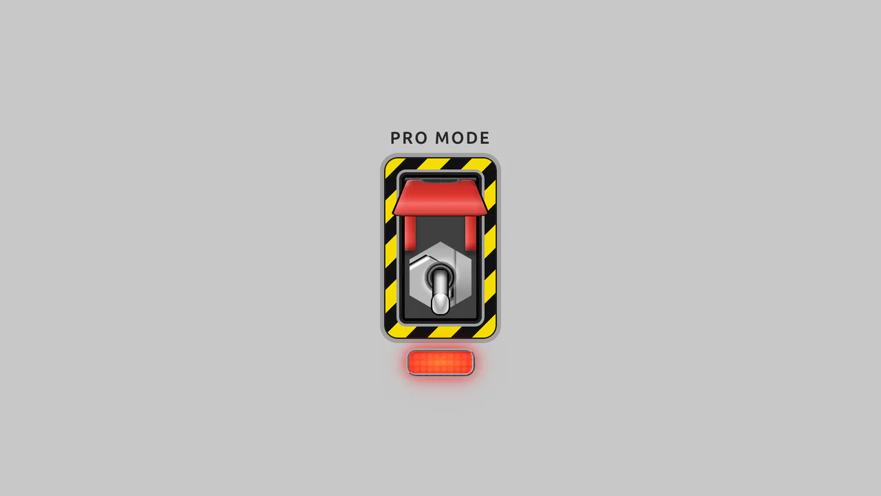
Pro-Mode Toggle Switch w/ Guard
Dual input[type="checkbox"] system for two-step activation, showcasing mastery in creating logic without JavaScript and detailed UI using a repeating-linear-gradient background and complex pseudo-elements."
See the Pen Pro-Mode Toggle Switch w/ Guard.

Color Clipping Effect with CSS Gradients and GSAP
A sleek text hover and intro animation, implemented using GSAP to smoothly transition CSS gradient stops via modern CSS variables, ensuring high performance and clean, maintainable code.
See the Pen Color Clipping Effect with CSS Gradients and GSAP.

Spotlight Cursor on Responsive Image
A unique, zero-dependency “flashlight” UI effect achieved by dynamically positioning a large, transparent-to-radial-gradient element via Vanilla JavaScript mousemove, and using the powerful CSS mix-blend-mode: exclusion to create the inverted color effect over the background image.
See the Pen Spotlight Cursor on Responsive Image.

Pure CSS Loader #10/2020 - No SVG Arcs
An elegant loader built purely with CSS/SASS that leverages CSS Houdini’s @property to define and smoothly animate custom numeric properties, enabling a high-performance rotation and hue-shifting loop.
See the Pen Pure CSS Loader #10/2020 - No SVG Arcs.