180+ CSS Grid Examples
CSS Grid Examples provide the structural foundation for complex web layouts. Utilizing this updated collection eliminates the friction of traditional positioning methods, allowing content to dictate the spatial logic of the UI. Curated snippets bridge the gap between abstract data and the screen, ensuring every element has a defined purpose without visual noise. Using pre-built patterns accelerates development while maintaining professional standards.
Technically, these snippets leverage native grid-template-areas, fr units, and gap properties within semantic HTML. The code is optimized for layout stability, ensuring predictable rendering without the overhead of heavy frameworks. By utilizing CSS Grid, the browser handles complex alignments natively, maintaining high performance and clear logic. Transitions within grid structures are handled via the GPU to prevent Main Thread lag.
Every free demo is cross-browser compatible and responsive by default. Users can instantly download the raw code or fork an interactive project on CodePen. This design approach prioritizes transparency, delivering a fast and logical user experience across all modern mobile and desktop devices.
Examples
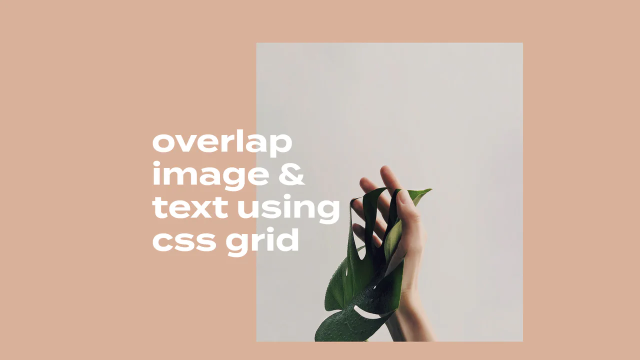
Overlapping Grid Editorial Reveal Cards
This elegant, magazine-style layout features overlapping typography and image blocks on a multi-column CSS grid. By integrating the Intersection Observer API with GSAP and Splitting.js, the component monitors viewport scroll. Once in view, each text line and image executes a staggered reveal transition, sliding up, fading in, and un-skewing smoothly. (Requires: gsap.js, splitting.js)
 Chrome 57+
 Edge 16+
 Firefox 55+
 Safari 12.1+
See the Pen Overlapping Grid Editorial Reveal Cards.
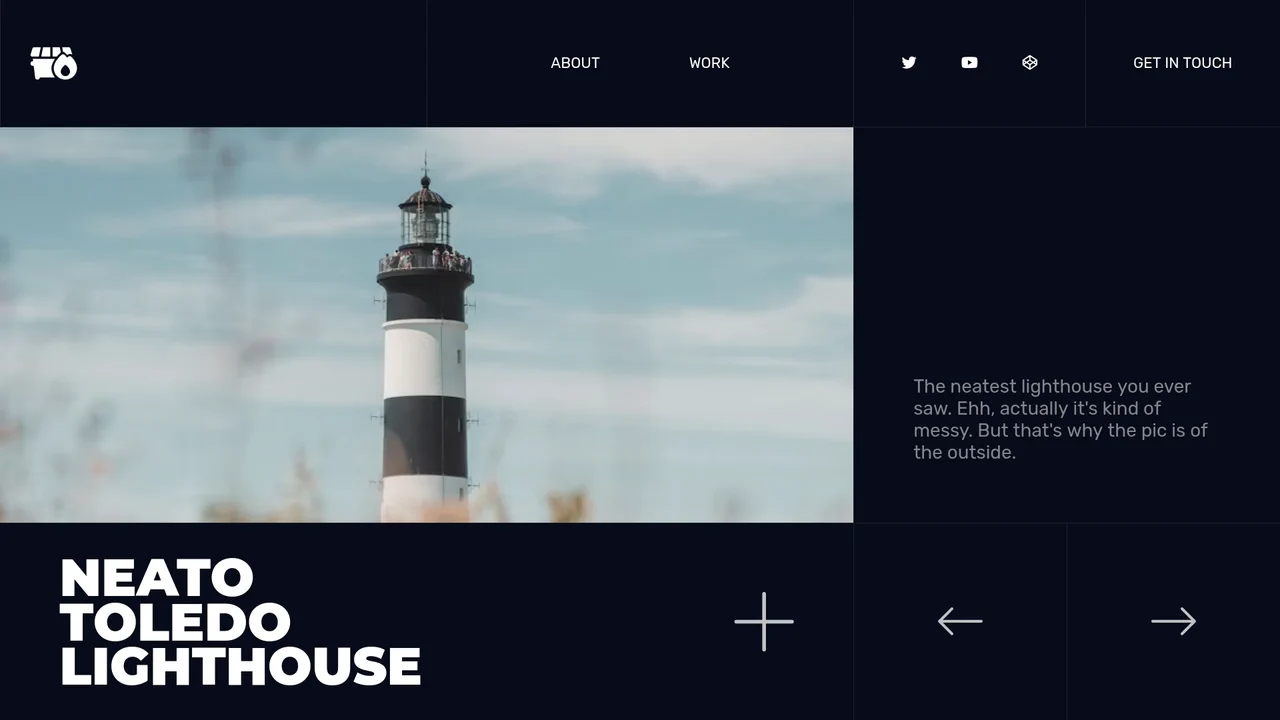
Responsive Grid Slide-Carousel Gallery
This responsive portfolio presentation showcases a multi-state sliding grid gallery. Built with vanilla JS and pure CSS, the layout converts dynamically from a structured multi-column grid into a single-column vertical stack at narrow media breakpoints. A lightweight script toggles custom status attributes, enabling seamless, direction-aware horizontal sliding animations without layout flickering.
Chrome 57+
Edge 16+
Firefox 52+
Safari 10.1+
See the Pen Responsive Grid Slide-Carousel Gallery.
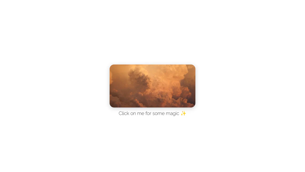
Rounded Inset Clip-Path Image Reveal
This interactive image gallery showcases an organic full-screen grid transition powered by clipping bounds. By masking a multi-column CSS grid of photographs with clip-path: inset(), the initial state reveals only a rounded, centered viewport window. A simple JavaScript click toggle expands the mask boundaries to full scale, transforming the thumbnail window into a comprehensive gallery.
Chrome 55+
Edge 79+
Firefox 54+
Safari 9.1+
See the Pen Rounded Inset Clip-Path Image Reveal.
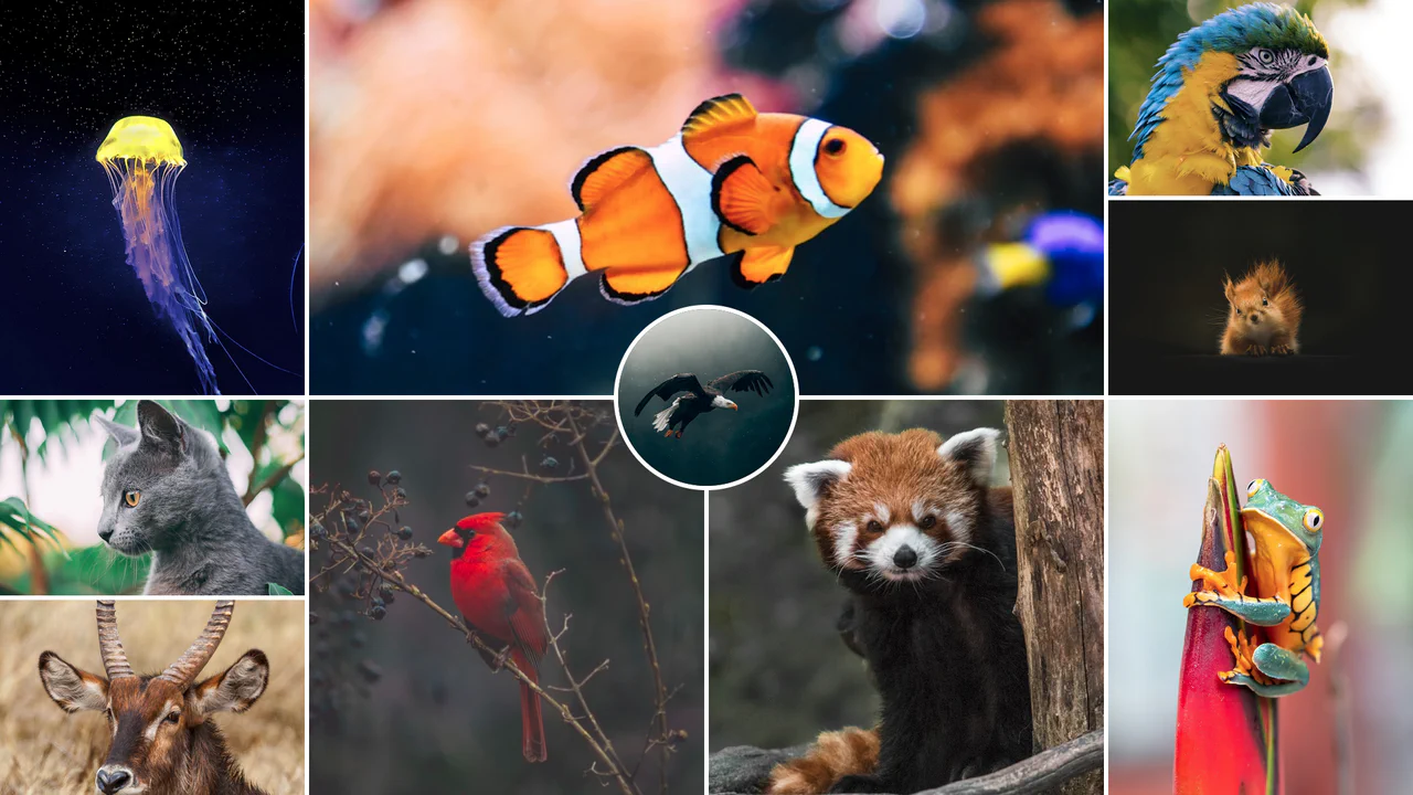
Responsive CSS Grid Mosaic Gallery
A zero-JavaScript responsive mosaic gallery built entirely on native CSS Grid. The grid system adapts dynamically through CSS Custom Variables and column-span mappings across responsive breakpoints, utilizing performance containment properties (contain: size) to prevent layout shifting. Features a centered, overlapping circular highlight portrait.
Chrome 57+
Edge 79+
Firefox 69+
Safari 15.4+
See the Pen Responsive CSS Grid Mosaic Gallery.
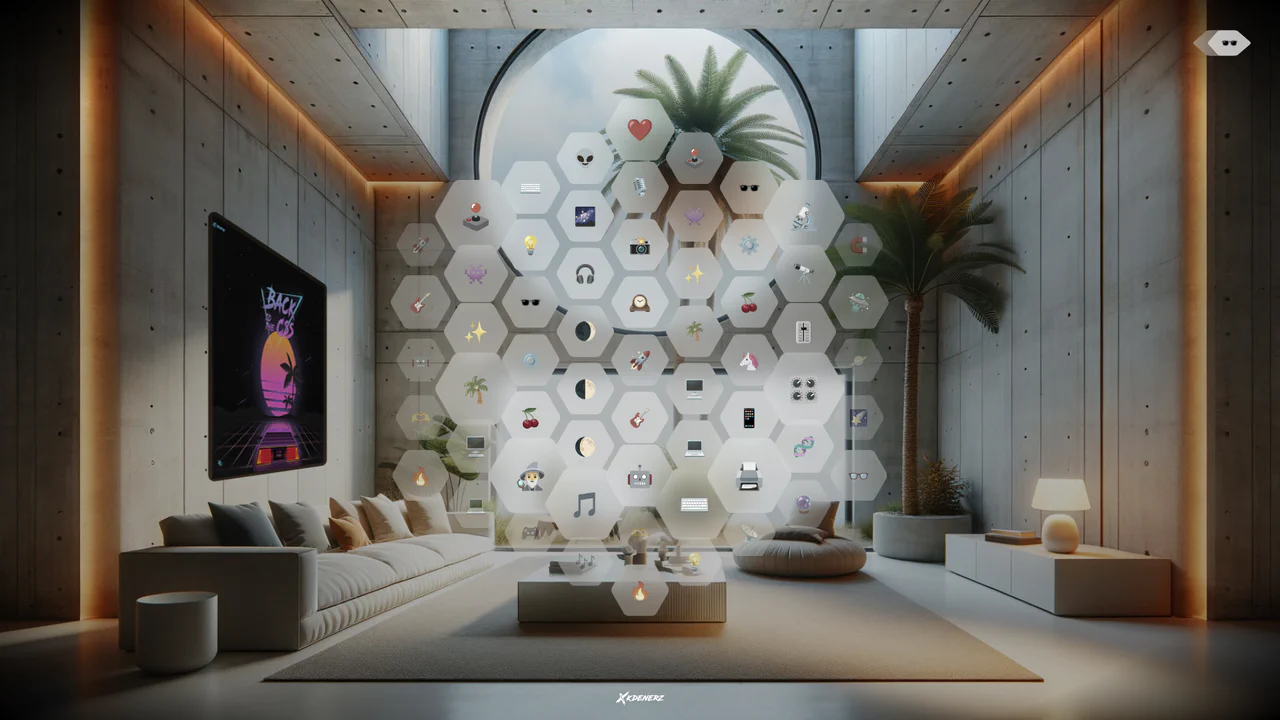
VisionOS Hexagonal App Grid Ripple
VisionOS Hexagonal App Grid Ripple recreates the spatial UI aesthetic of Apple VisionOS. It uses complex clip-path polygons to form the hexagons and backdrop-filter for the glassmorphism effect. The standout feature is the JavaScript-calculated ripple animation: on click, JS measures the distance from the target to every other hexagon, updating a CSS custom property (--ripple-factor) to stagger the CSS @keyframes delay radially.
Chrome 111+
Edge 111+
Firefox 113+
Safari 16.2+
See the Pen VisionOS Hexagonal App Grid Ripple.
Geometric Glowing Triangle Mask Grid
Geometric Glowing Triangle Mask Grid creates an interactive mesh overlay by dynamically calculating and appending CSS border triangles to mask a neon background. The layout binds a mouse-tracking #glow radial gradient to the cursor, while modern CSS @property interpolates color shifts directly in keyframe animations. However, running heavy JS-based DOM recalculations on window.onresize combined with moving massive layout-disrupting absolute positions like top/left on every mousemove can cause paint pipeline bottlenecks, which are easily alleviated by transforming with hardware-accelerated translate3d instead.
Chrome 85+
Edge 85+
Firefox 128+
Safari 16.4+
See the Pen Geometric Glowing Triangle Mask Grid.
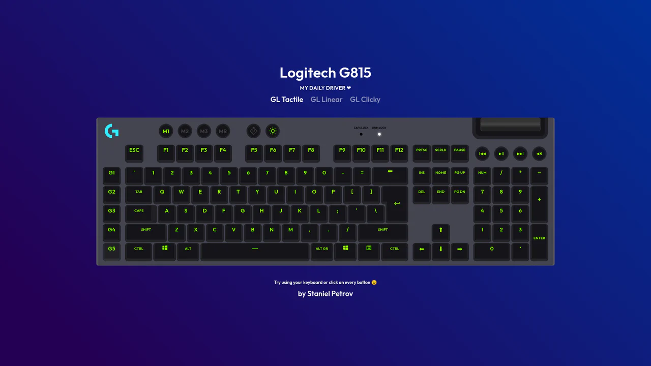
Interactive Mechanical Keyboard Audio Simulation
Interactive Mechanical Keyboard Audio Simulation utilizes a highly detailed CSS grid structure to align complex multi-row vector keys and simulate a physical G815 layout. A central event listener handles key interaction by mapping event.code to correspond with data-key attributes on target DOM nodes, simultaneously triggering dedicated audio samples of tactile, linear, or clicky switch sounds. While the visual depth is elegantly achieved with layered CSS shadow offsets and custom hex shading, firing unthrottled HTML5 audio playback on rapid typings can lead to output buffer congestion or slight audio delays on standard browsers.
Chrome 57+
Edge 16+
Firefox 52+
Safari 10.1+
See the Pen Interactive Mechanical Keyboard Audio Simulation.
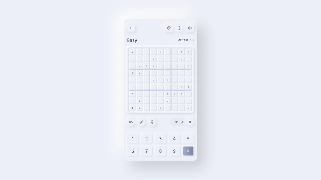
Neumorphic React Sudoku Interface
This is a Neumorphic React Sudoku Interface. It renders a fully interactive 9x9 puzzle grid using soft, extruded UI elements (neumorphism) combined with smart cross-axis highlighting. Its function is to provide a highly tactile, visually clean environment for complex data entry, reducing cognitive load during gameplay by automatically tracking the user’s focal point. (Requires: react.js, react-dom.js)
Chrome 60+
Edge 79+
Firefox 55+
Safari 11+
See the Pen Neumorphic React Sudoku Interface.
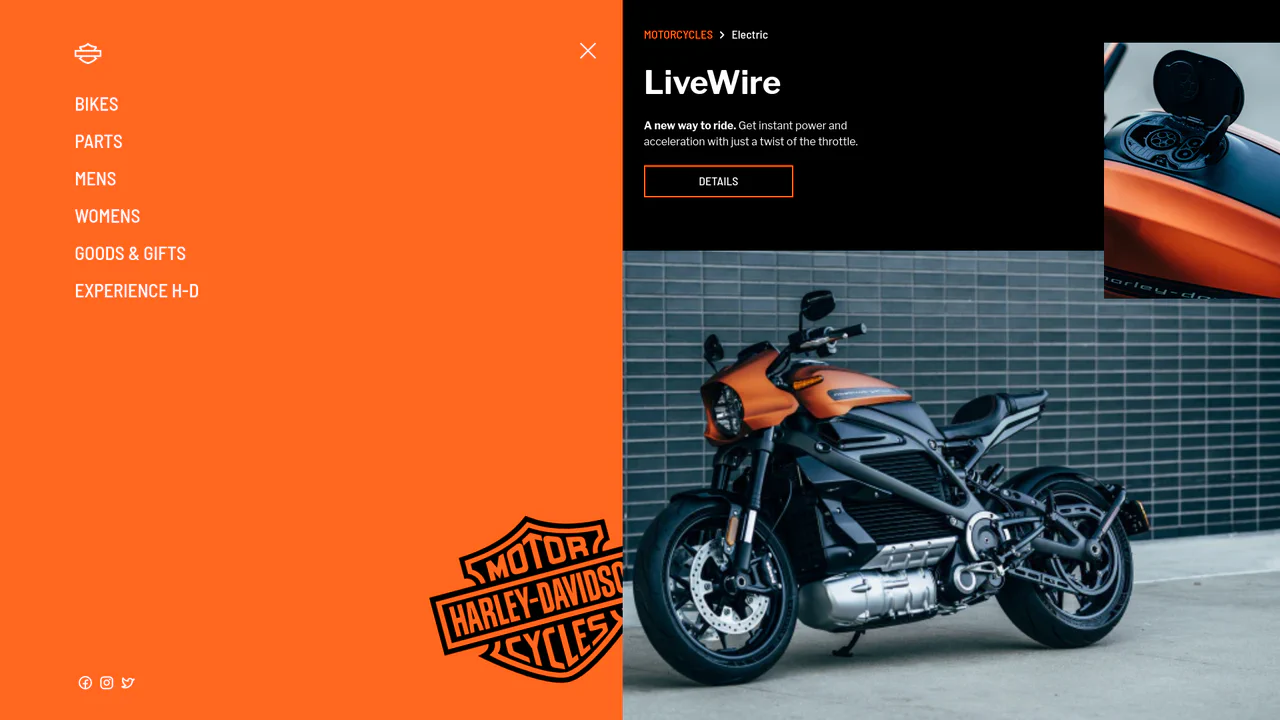
Smooth GSAP Slide-Out Sidebar Navigation
This is a full-viewport e-commerce layout featuring a GSAP-powered off-canvas sidebar navigation. It resolves the conflict between showcasing high-density visual content and maintaining a complex navigation structure. The layout hides primary links off-screen, revealing them through a staggered, hardware-accelerated slide sequence only when requested. (Requires: gsap.js, cssruleplugin.js)
Chrome 80+
Edge 80+
Firefox 75+
Safari 13+
See the Pen Smooth GSAP Slide-Out Sidebar Navigation.
Interlocking Wavy Image Grid
This is an Interlocking Wavy Image Grid. It applies procedural scalloped edges to raster images and shifts them into a tight, puzzle-like masonry formation. Its function is to break rigid, rectangular bounds in visual galleries, converting standard blocks into an organic, cohesive texture.
Chrome 111+
Edge 111+
Firefox 112+
Safari 15.4+
See the Pen Interlocking Wavy Image Grid.

Spatial Grid Image Explorer
This is a Spatial Grid Image Explorer. It maps a collection of high-resolution images onto an infinite 2D canvas, allowing users to pan spatially rather than scrolling linearly. Its function is to provide an immersive, map-like navigation experience for visual portfolios, shifting the paradigm from vertical feeds to omnidirectional exploration.
Chrome 80+
Edge 80+
Firefox 75+
Safari 13.1+
See the Pen Spatial Grid Image Explorer.

Semantic Grid Bar Chart
This is a Semantic Grid Bar Chart. It translates raw HTML data-* attributes directly into visual grid spans using bleeding-edge CSS functions. Its function is to render accessible data visualizations without relying on heavy JavaScript charting libraries or complex canvas setups.
Chrome 57+
Edge 16+
Firefox 52+ (via fallback)
Safari 10.1+ (via fallback)
See the Pen Semantic Grid Bar Chart.

Mission Control Grid Exposé
This is a Mission Control Grid Exposé. It scales overlapping full-screen views into a unified spatial grid. Its function is to provide absolute structural context, replacing linear tab switching with a macro-level physical interface.
Chrome 114+
Edge 114+
Safari 17+
Firefox 125+
See the Pen Mission Control Grid Exposé.

Interactive Drag-and-Drop Jigsaw Puzzle
This is an Interactive Drag-and-Drop Jigsaw Puzzle. It dissects a single raster image into an interlocking grid of movable pieces without relying on a single line of JavaScript. Its function is to gamify visual content, converting passive image consumption into a tactile, logic-driven interaction.
Chrome 84+
Edge 84+
Firefox 90+
Safari 15.4+See the Pen Interactive Drag-and-Drop Jigsaw Puzzle.

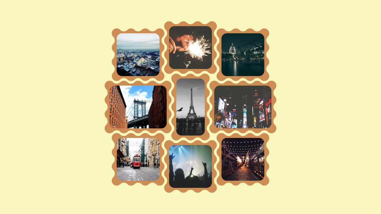
Asymmetric SVG Mask Grid Gallery
This is an Asymmetric SVG Mask Grid Gallery. It builds a complex, interlocking masonry-style mosaic using CSS Grid areas, applying organic SVG masks to each thumbnail. Its primary function is to break free from rigid, boxy layouts, offering a highly stylized, interactive photo showcase complete with a native JavaScript lightbox modal.
Chrome 120+
Edge 120+
Firefox 53+
Safari 15.4+
See the Pen Asymmetric SVG Mask Grid Gallery.

Editorial Grid Magazine Layout
This is an Editorial CSS Grid Magazine Layout. It translates the overlapping, asymmetrical structures of print media into the browser. Its function is to break rigid top-to-bottom reading patterns, utilizing layered images and multi-column typography to construct visual tension and content hierarchy without relying on JavaScript.
Chrome 57+
Edge 16+
Firefox 52+
Safari 10.1+
See the Pen Editorial Grid Magazine Layout.

Responsive Grid Restaurant Menu Layout
This is a Responsive Grid Restaurant Menu Layout. It structures dense textual information using fluid CSS grid columns and semantic HTML definition lists. Its function is to organize complex data into a highly readable, adaptable format, removing the need for rigid breakpoints and ensuring absolute clarity across all devices.
Chrome 76+
Edge 79+
Firefox 103+
Safari 10.1+See the Pen Responsive Grid Restaurant Menu Layout.

Grid Lightbox Gallery Effect
This is a CSS Grid Lightbox Gallery Effect. It structures an asymmetric image grid that expands individual photos into a full-screen, blurred overlay upon interaction. Its primary function is to focus user attention on a single visual asset while maintaining the context of the underlying page through transparency.
Chrome 76+
Edge 79+
Firefox 103+
Safari 13+
See the Pen Grid Lightbox Gallery Effect.

Interactive Physics-Based Dot Grid
This is an Interactive Physics-Based Dot Grid. It transforms a static matrix of circular DOM elements into a reactive, liquid-like surface. Its function is to provide an engaging, high-end visual toy or background element where the dots elastically pull toward the user’s cursor on hover, and dramatically explode outward with gravity-based physics upon clicking. (Requires: GSAP, Physics2DPlugin)
Chrome 60+
Edge 79+
Firefox 55+
Safari 11+
See the Pen Interactive Physics-Based Dot Grid.

Interactive Sidebar Tree Navigation
This is an Interactive Sidebar Tree Navigation. It acts as a custom Web Component (<sidebar-tree>) that generates and manages a complex, multi-level navigation structure from a JSON data object. Its primary function is to provide a highly accessible, keyboard-navigable document outline with built-in real-time search filtering and smooth expand/collapse animations. (Requires: Tweakpane, GSAP)
Chrome 80+
Edge 80+
Firefox 75+
Safari 13.1+See the Pen Interactive Sidebar Tree Navigation.

Mouse-Reactive Floating Image Gallery
This is a Mouse-Reactive Floating Image Gallery. It places an oversized grid of visual assets behind the viewport, hidden by the overflow. Its function is to provide an immersive, explorative navigation experience where the user’s cursor physically steers the scene across a scattered landscape of content.
Chrome 36+
Edge 12+
Firefox 48+
Safari 9+See the Pen Mouse-Reactive Floating Image Gallery.

FLIP Animated Responsive Grid Switcher
This is an Animated FLIP Grid Switcher. It bridges the gap between two distinct visual states — Card and List — by mathematically calculating the delta of motion. The component ensures that interface elements do not simply “jump” during a layout change but glide organically into their new coordinates, maintaining spatial continuity for the user.
Chrome 60+
Edge 79+
Firefox 55+
Safari 11+
See the Pen FLIP Animated Responsive Grid Switcher.

Minimalist Grid Editorial Layout
This is a Minimalist Grid Editorial Layout built for digital publishing. It translates traditional Swiss print design into a responsive web format using CSS Grid. The layout utilizes asymmetric columns and deliberate negative space to establish a clear hierarchy for long-form reading.
Chrome 88+
Edge 88+
Firefox 85+
Safari 14.1+
See the Pen Minimalist Grid Editorial Layout.

Modern Container Query Product Cards
This snippet showcases Modern Container Query Product Cards. It represents the bleeding edge of CSS architecture, utilizing @scope, @layer, and @property to create highly encapsulated, fluid components. Its function is to provide a robust e-commerce card layout that automatically adjusts its internal styling and grid distribution based on the physical size of its container, not the viewport. (Requires: kiso.css)
Chrome 118+
Edge 118+
Firefox 128+
Safari 17.4+
See the Pen Modern Container Query Product Cards.

Responsive Two-Column Timeline
This is a Responsive Two-Column Timeline. It transforms list-based historical data into a structured, alternating visual path. Its function is to allow users to navigate chronological content with ease, using a centralized vertical bar to guide the eye while images and text blocks oscillate between left and right columns.
Chrome 80+
Edge 80+
Firefox 75+
Safari 13+See the Pen Responsive Two-Column Timeline.

CSS :has() Character Select Screen
This is a CSS :has() Character Select Screen. It replicates the classic user interface of a fighting game’s selection menu, using modern CSS to handle all state logic. Its function is to demonstrate how the :has() pseudo-class can completely replace JavaScript for managing visibility in a selection-based UI, triggering changes in the main content area based on the state of a radio button group. (Requires: Vue)
Chrome 105+
Edge 105+
Firefox 121+
Safari 15.4+See the Pen CSS :has() Character Select Screen.

Clipping Quadrant Image Gallery
This is a Clipping Quadrant Image Gallery. It segments a full-screen display into four interactive quadrants, each housing a unique photograph. Upon clicking any segment, the component utilizes the clip-path property to instantly expand that specific quadrant to cover the entire viewport, transitioning from a mosaic-style grid into a singular, immersive view.
Chrome 55+
Edge 79+
Firefox 52+
Safari 11+
See the Pen Clipping Quadrant Image Gallery.
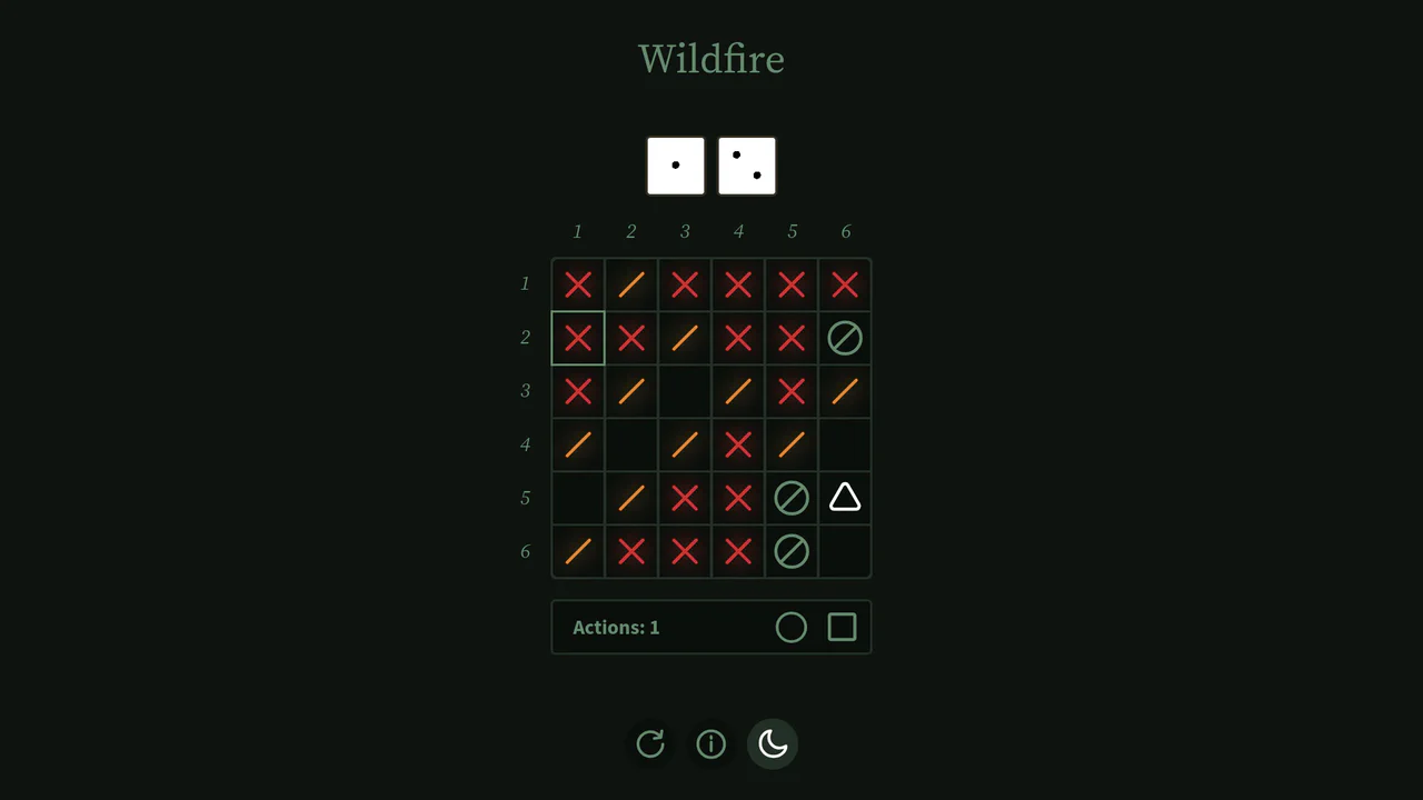
Interactive Board Game Prototype
This is an Interactive Board Game Prototype (“Wildfire”). It is a standalone, browser-based puzzle game where the player defends a “home” tile from procedurally generated “fire” tiles spreading across a 6x6 grid. It functions as an excellent study in grid mathematics, DOM-based state management, and turn-based game loops built entirely without canvas rendering or heavy game engine frameworks.
Chrome 60+
Safari 11+
Firefox 55+
Edge 79+
See the Pen Interactive Board Game Prototype.

Animated Fluid Grid Product Filter
This is an Animated Fluid Grid Product Filter. It structures a dynamic catalog where elements don’t just disappear but physically slide into their new positions. Its function is to solve the jarring layout shifts common in standard filtering by using the Web Animations API to interpolate container height and element coordinates simultaneously.
Chrome 75+
Edge 79+
Firefox 67+
Safari 13.1+
See the Pen Animated Fluid Grid Product Filter.

Interactive Glowing Grid Cards
This snippet presents Interactive Glowing Grid Cards. It transforms a static grid of content into an immersive, tactile interface by having a soft, localized glow follow the user’s cursor. This effect illuminates both the background of the hovered card and the borders of adjacent cards, providing continuous, spatial feedback that enhances the premium feel of a dark-mode dashboard or feature list.
Chrome 60+
Safari 11+
Firefox 55+
Edge 79+See the Pen Interactive Glowing Grid Cards.