180+ CSS Grid Examples (Page 2)
Examples

Tilt Grid Content Reveal
This is a Tilt Grid Content Reveal. It transforms a standard masonry image gallery into a highly interactive, spatial experience. Its function is to provide an engaging browsing interface where hovering induces physical 3D tilt, and clicking smoothly expands the thumbnail into a full-screen presentation, completely immersing the user in the selected content. (Requires: GSAP, charming.js, masonry.js, imagesloaded.js)
 Chrome 60+
 Edge 79+
 Firefox 55+
 Safari 11+
See the Pen Tilt Grid Content Reveal.

Auto-Generated Anchor Positioned TOC
This is an Auto-Generated Anchor Positioned TOC. It parses an article’s heading structure on the fly and constructs a sticky navigation menu. Its primary function is to replace heavy JavaScript scroll-spies (Intersection Observers) with native CSS Anchor Positioning and Scroll Targeting, moving an animated highlight alongside the active content section. (Requires: Tweakpane, GSAP)
Chrome 125+
Edge 125+
See the Pen Auto-Generated Anchor Positioned TOC.

Pure CSS Responsive Hexagon Grid
This is a Pure CSS Responsive Hexagon Grid. It replaces complex SVG or Javascript-driven honeycomb layouts with a purely mathematical CSS approach. Its function is to automatically tile and nest geometric shapes in a tight honeycomb pattern that recalculates rows and offsets on the fly as the parent container resizes.
Chrome 119+
Edge 119+
See the Pen Pure CSS Responsive Hexagon Grid.

Animated Movie Schedule Blocks
This is an Animated Movie Schedule Block component. It structures chronological event data (like cinema showtimes) into a visual grid. Its function is to condense information using a pure CSS hover interaction, where an image poster slides away to reveal structured metadata (genre, time, title) through intersecting animated panels.
Chrome 36+
Edge 12+
Firefox 16+
Safari 9+
See the Pen Animated Movie Schedule Blocks.

E-commerce Product Filter
This is a Pure CSS E-commerce Product Filter. It replaces JavaScript-based array filtering with native CSS relationship selectors. Its function is to toggle product visibility based on multiple checkbox states within a sidebar, offering an instant, script-free sorting mechanism for catalog grids.
Chrome 105+
Edge 105+
Firefox 121+
Safari 15.4+
See the Pen E-commerce Product Filter.

Interactive Sliding Grid Puzzle Game
This is an Interactive Sliding Grid Puzzle Game. It structures a multi-level spatial logic challenge entirely within the DOM. Its function is to demonstrate complex 2D state management, collision detection, and procedural grid generation without relying on the HTML Canvas API, utilizing standard HTML elements for interactive entertainment.
Chrome 60+
Edge 79+
Firefox 55+
Safari 11+
See the Pen Interactive Sliding Grid Puzzle Game.

Smooth View Transition Grid Cards
This is a Smooth View Transition Grid Cards component. It transforms a standard CSS Grid of cards into an interactive, animated gallery. Its function is to elegantly expand a selected item to full width, smoothly reflowing the remaining siblings using native browser rendering instead of complex JavaScript math.
Chrome 111+
Edge 111+
Firefox 128+
Safari 18+
See the Pen Smooth View Transition Grid Cards.

Animated Ripple Dot Grid Loader
This is an Animated Ripple Dot Grid Loader. It utilizes pure CSS and complex keyframe choreography to render a highly synchronized loading state. Its function is to communicate background processing while maintaining visual engagement. The effect is continuous and self-contained, requiring zero user interaction.
Chrome 123+
Edge 123+
Firefox 121+
Safari 17.4+
See the Pen Animated Ripple Dot Grid Loader.
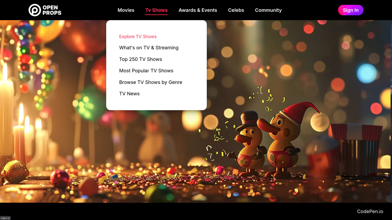
Dropdown Navigation
Navigation is the backbone of usability, but traditional dropdowns can feel cramped and elusive. This component expands the concept of a menu into a panoramic dashboard. It is not just a list of links; it is a structured map of your application’s architecture. (Requires: open-props, remixicon, normalize-css)
Chrome 99+
Edge 99+
Firefox 97+
Safari 15.4+
See the Pen Dropdown Navigation.
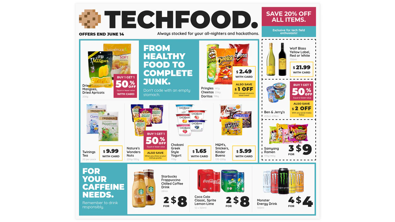
Techfood Grocery Grid Layout
Web layouts often suffer from “boxiness” — everything aligned in predictable, uniform rows. This design breaks that monotony by adopting the chaotic energy of a supermarket flyer. It utilizes the full power of CSS Grid to create irregular spans, varied densities, and tight packing, proving that the web can be as visually dense and information-rich as print media without sacrificing structure.
Chrome 57+
Edge 16+
Firefox 52+
Safari 10.1+
See the Pen Techfood Grocery Grid Layout.

Dynamic Article Hover Cursor
The mouse cursor is the primary bridge between user and interface, yet it often remains a passive arrow. This component reimagines the cursor as an active participant in the narrative. By morphing the pointer into a contextual “Read” badge that reacts to specific content, we reduce cognitive load and create a more intent-driven browsing experience. It feels less like clicking links and more like exploring a curated magazine.
Chrome 105+
Edge 105+
Firefox 121+
Safari 15.4+See the Pen Dynamic Article Hover Cursor.

RGB Mechanical Keyboard Grid
Digital interfaces often feel flat and lifeless. This component brings the tactile satisfaction of high-end mechanical hardware to the web. By simulating physical properties like keycap depth, under-glow, and randomized RGB lighting, we create an object that begs to be touched. It is a study in skeuomorphic revival, blending modern CSS capabilities with the gamer aesthetic to produce a UI element that feels solid, expensive, and reactive.
Chrome 105+
Edge 105+
Firefox 110+
Safari 16+
See the Pen RGB Mechanical Keyboard Grid.

Mouse-Driven Split Reveal
Static content is a relic. We don’t just want to show information; we want the user to uncover it. This component transforms the cursor into a tool of discovery, creating a tactile connection between the user and the interface. By removing the friction of clicking or dragging handles, we achieve a fluidity that feels less like software and more like a physical extension of the hand. It is simple, unapologetic, and immediate.
Chrome 60+
Edge 79+
Firefox 52+
Safari 10+
See the Pen Mouse-Driven Split Reveal.
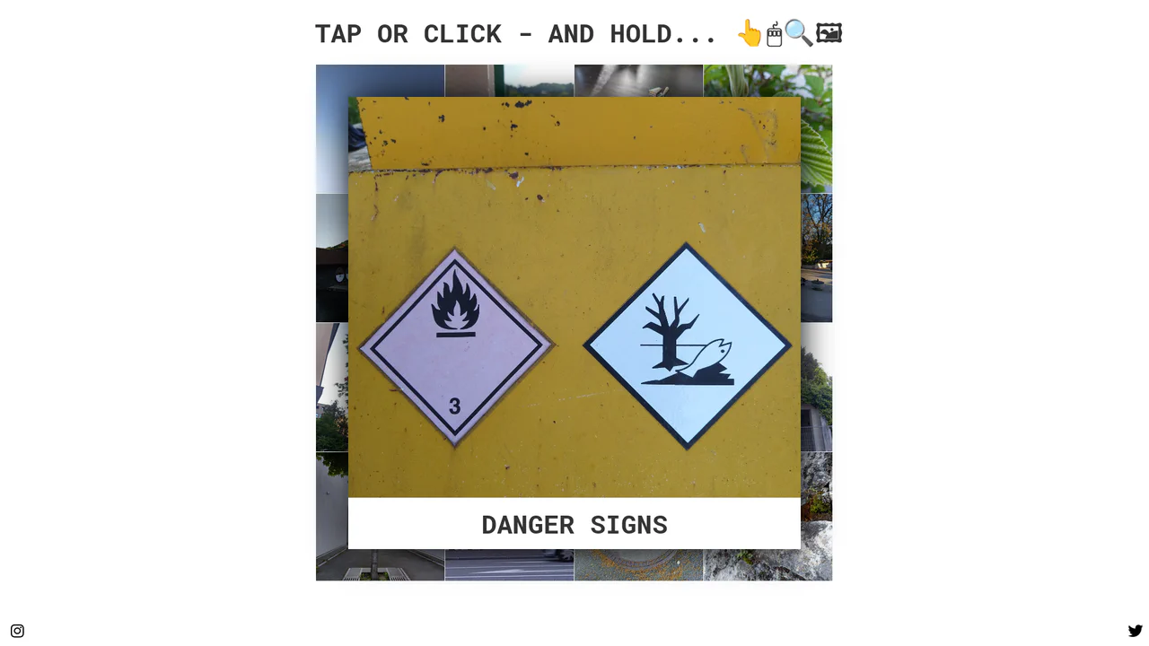
Tactile Long Press Image Grid
In a world obsessed with speed, we often forget the power of distinct intent. The standard “click” is binary and abrupt. This component introduces a moment of pause — a “breath” — allowing the user to peek into content without committing to a navigation event. By utilizing the “long press” (or click-and-hold) mechanic, we bridge the gap between desktop precision and mobile intuition, creating a gallery experience that feels organic and responsive to the user’s curiosity.
Chrome 57+
Edge 16+
Firefox 52+
Safari 10.1+
See the Pen Tactile Long Press Image Grid.

Kinetic 144-Clock Digital Display
This Kinetic 144-Clock Digital Display is a stunning example of procedural animation. Inspired by physical kinetic art installations (like those by Humans Since 1982), it uses a grid of 144 individual analog clocks to form digital numbers. React manages the “target state” of every single clock hand, while CSS transitions handle the smooth, synchronized movement, creating a mesmerizing flow of time. (Requires: React, react-dom)
Chrome 60+
Edge 79+
Firefox 60+
Safari 12+
See the Pen Kinetic 144-Clock Digital Display.

CSS Scroll-Driven Masonry Reveal
This Scroll-Driven Masonry Reveal creates a playful, tactile experience where content cards appear to be “dealt” onto the screen as the user scrolls. By leveraging the native CSS Scroll-driven Animations API, it achieves smooth, main-thread-free entrance effects without a single line of JavaScript. The layout adapts intelligently from 2 to 8 columns, making it a robust solution for image galleries or blog archives. (Requires: Open Props (CSS Library))
Chrome 115+
Edge 115+
Safari 26+
Firefox (flag/polyfill)
See the Pen CSS Scroll-Driven Masonry Reveal.

Nike Product Card Interaction
This Nike Product Card Interaction is a dynamic UI component designed for e-commerce listings. It transforms a standard static product grid into an engaging experience. When a user hovers over a card, the product image rotates and shifts to make room for a vertical brand label that slides in from the side. This clever use of space allows for a clean initial view while revealing branding details on demand.
Chrome 57+
Edge 16+
Firefox 52+
Safari 10.1+
See the Pen Nike Product Card Interaction.

React Filterable Image Gallery
This React Filterable Image Gallery is a clean, component-based solution for organizing visual content. Unlike simple “show/hide” scripts, it uses React’s state management to handle complex multi-criteria filtering. Users can toggle multiple categories (e.g., “Food” AND “Plants”) simultaneously, or reset everything with an “All” button. The UI is polished with pastel colors and smooth hover animations. (Requires: React, ReactDOM)
Chrome 80+
Edge 80+
Safari 13+
Firefox 75+
See the Pen React Filterable Image Gallery.

Vue FLIP Image Gallery
This Vue FLIP Image Gallery showcases a high-performance way to animate layout changes that are typically expensive for the browser. When a user selects an image, it expands to fill a larger portion of the grid, while surrounding items gracefully rearrange themselves. This is achieved not by simple CSS transitions, but by the FLIP technique (First, Last, Invert, Play), ensuring buttery smooth 60fps animations even during complex DOM reflows. (Requires: Vue.js)
Chrome 80+
Edge 80+
Safari 14+
Firefox 90+
See the Pen Vue FLIP Image Gallery.

Glassmorphism Profile Info Card
This Glassmorphism Profile Info Card is a high-end UI component that replicates the sleek, frosted-glass aesthetic found in modern operating systems like iOS and macOS. It features a sophisticated interplay between background imagery and foreground content, using advanced CSS masking and backdrop filters to create a natural sense of depth and hierarchy.
Chrome 76+
Edge 79+
Firefox 103+
Safari 9.1+
See the Pen Glassmorphism Profile Info Card.

Stripe-Inspired Cards Hover Effect
This Stripe-Inspired Cards Hover Effect replicates the sophisticated “flashlight” border interaction seen on modern SaaS websites. Instead of a simple color change, a soft radial gradient follows the user’s mouse cursor across a grid of cards. This creates a cohesive, lighting-aware interface where elements seem to illuminate as you interact with them.
Chrome 49+
Edge 15+
Firefox 31+
Safari 9.1+
See the Pen Stripe-Inspired Cards Hover Effect.
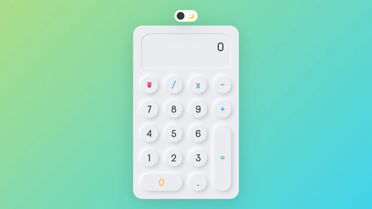
Neumorphic Dark Mode Calculator
This Neumorphic Dark Mode Calculator brings the “Soft UI” trend to life with a fully functional mathematical tool. It features a realistic, extruded plastic look achieved through complex CSS box-shadows. A prominent toggle allows users to switch between a clean light theme and a high-contrast dark mode, instantly updating the shadow physics to maintain the illusion of depth.
Chrome 60+
Edge 79+
Firefox 55+
Safari 11+
See the Pen Neumorphic Dark Mode Calculator.
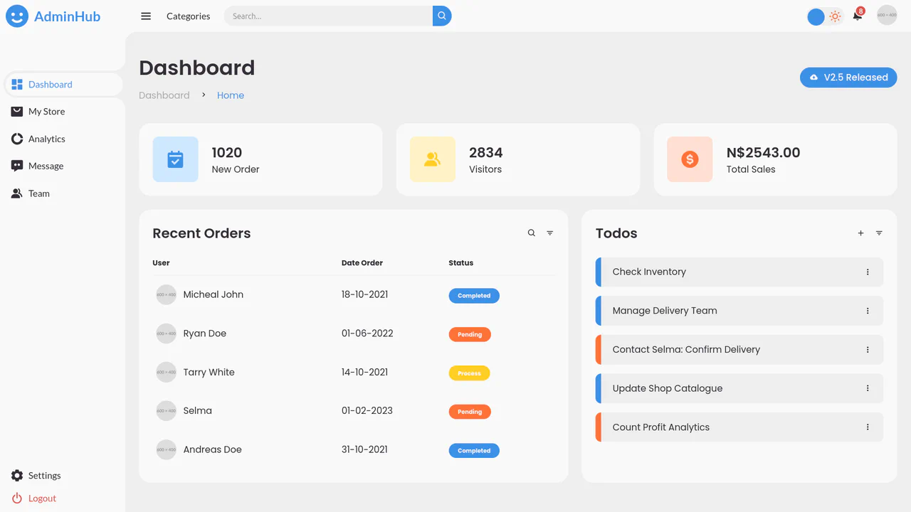
AdminHub Admin Dashboard v2.1
A responsive admin dashboard built with CSS Grid and Flexbox, featuring a collapsible sidebar, dark mode toggle, and interactive widgets.
See the Pen AdminHub Admin Dashboard v2.1.
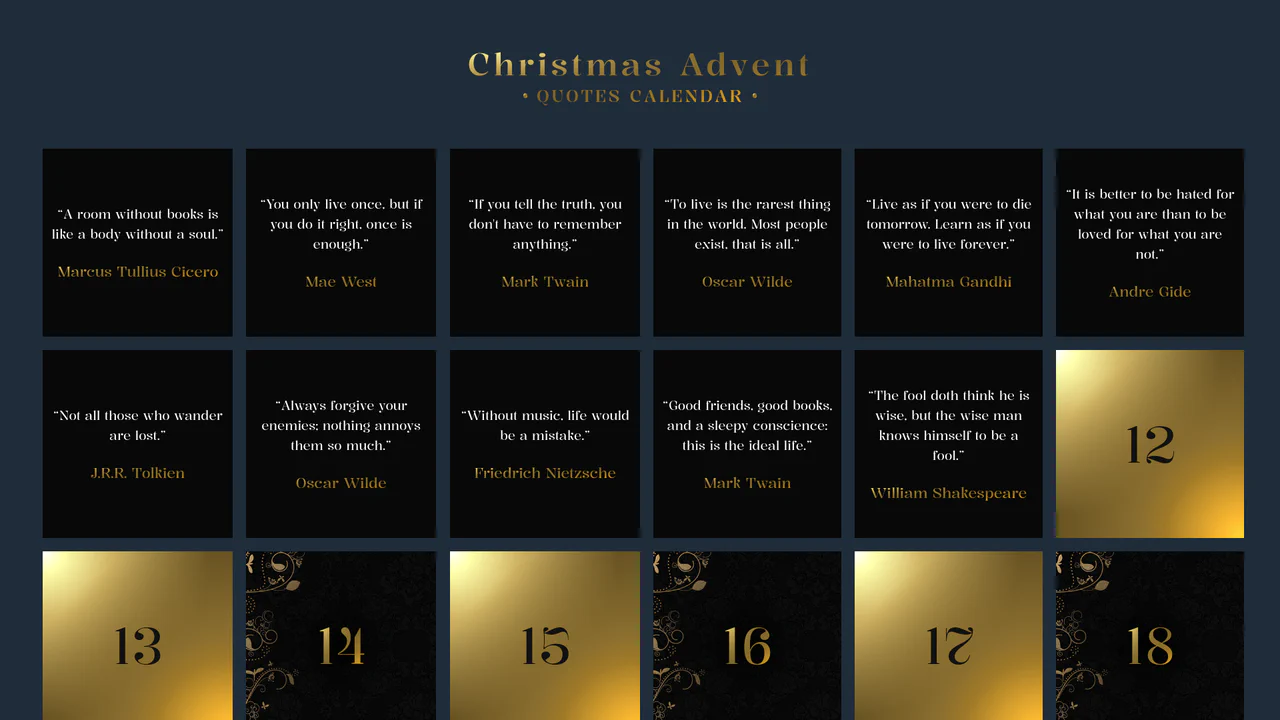
Advent Calendar with Quotes
An interactive Advent Calendar featuring 25 flip-cards generated via JavaScript.
See the Pen Advent Calendar with Quotes.

Always Great Grid
An interactive, “living” grid that smoothly morphs and adapts layout upon adding/removing items or resizing the container, maintaining a harmonious bento-style structure.
See the Pen Always Great Grid.

Responsive Dashboard with Sliders and Music Player
A fully-featured modern music app web interface featuring glassmorphic panels, smooth animations, and functional music playback with a rotating vinyl-style cover art.
See the Pen Responsive Dashboard with Sliders and Music Player.
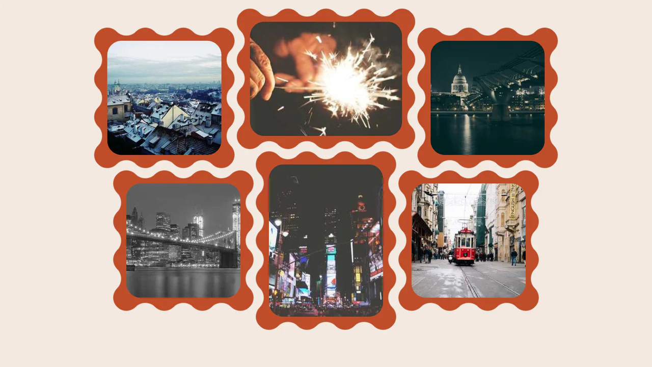
Wavy Image Gallery
Images appear as jigsaw puzzle pieces with interlocking edges that can visually fit together.
See the Pen Wavy Image Gallery.

List Styles 2
An interactive grid of task cards where clicking a counter button triggers a card-swap animation, revealing a hidden sub-list from behind the main item using z-index manipulation and CSS transforms.
See the Pen List Styles 2.
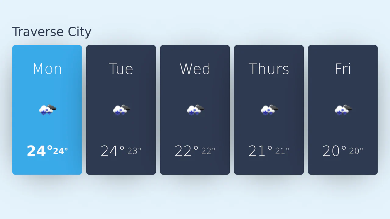
React Weather API Card
A responsive 5-day weather forecast widget fetching live data via OpenWeatherMap API, rendered dynamically with React and styled using CSS Grid.
See the Pen React Weather API Card.

Scroll UI Animation
As you scroll down, a large image of a field shrinks and gets cropped by white blocks to focus attention, while a heading on the left counts up the percentage of water saved, changing color for emphasis. This creates the feel of a dynamic infographic.
See the Pen Scroll UI Animation.