180+ CSS Grid Examples (Page 3)
Examples
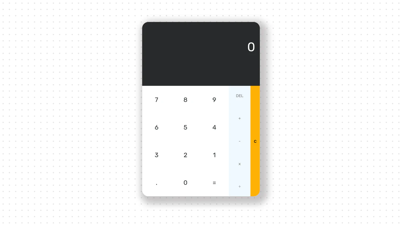
Calculator
A responsive calculator interface with distinct functional zones powered by CSS Grid and immediate string evaluation.
See the Pen Calculator.

Infinite Mondrian Image Gallery
A visually unique web application that continuously expands its content upon scrolling, demonstrating the synergy between a reactive framework and modern browser APIs for procedural design.
See the Pen Infinite Mondrian Image Gallery.
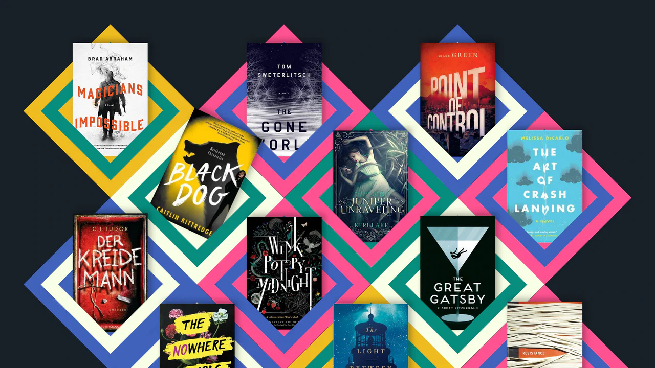
Responsive CSS Grid: Books
A unique, dynamic, and responsive collage of images that uses advanced CSS techniques to create a 3D-like geometric pattern.
See the Pen Responsive CSS Grid: Books.

Checkout Radios
A modern checkout form component utilizing the powerful CSS :has() selector to style parent containers based on the state of nested radio inputs.
See the Pen Checkout Radios.

Flat Sales Dashboard UI
Interactive sales dashboard built with React using pure ES modules and no build step. Features dynamic SVG charts, leverages Intl.API for data formatting, and uses Tailwind CSS for a responsive layout with dark mode support.
See the Pen Flat Sales Dashboard UI.
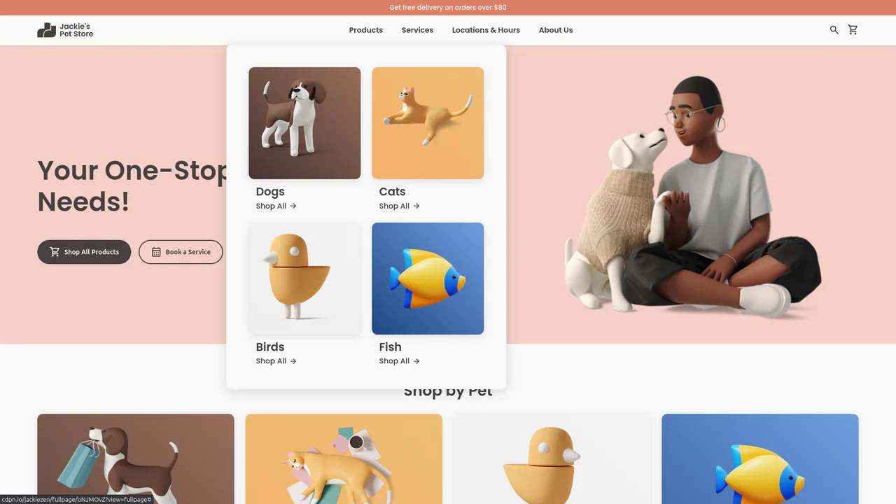
Jackie's Pet Store
A responsive pet store landing page built with CSS Grid and Flexbox. It features a dynamic navigation system with hover-triggered mega-menus, gradient-styled product cards with scale transitions, and a comprehensive use of CSS variables for consistent theming across breakpoints.
See the Pen Jackie's Pet Store.
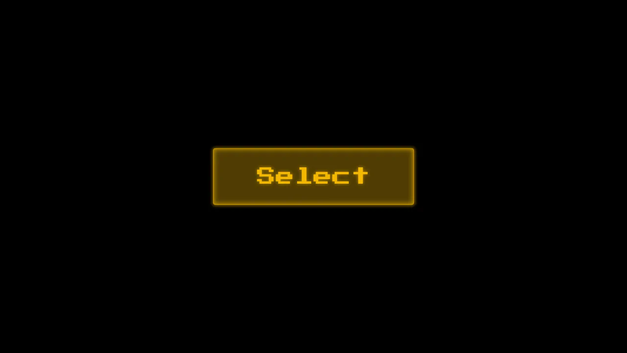
Choose Your Megafauna
A high-tech, atmospheric interface that immerses the user in a retro-futuristic environment, reminiscent of 80s arcade selection screens or cyberpunk movies.
See the Pen Choose Your Megafauna.
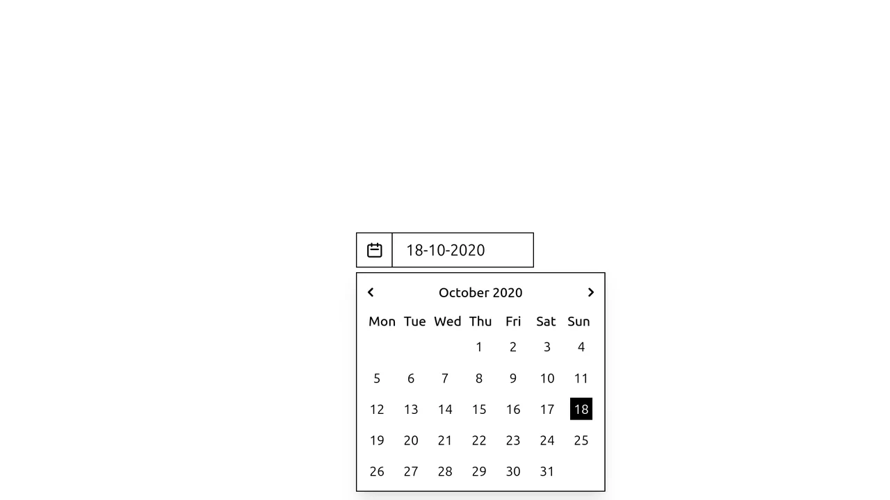
Lo-Fi Tailwind CSS Calendar Select
A stylish, strict date picker prototype that easily integrates into any Tailwind project and is ready to be “brought to life” with JavaScript.
See the Pen Lo-Fi Tailwind CSS Calendar Select.

React Infinite Scrolling with IntersectionObserver
An infinite scroll gallery built with React, fetching images from the Unsplash API. It leverages the native Intersection Observer API via a useCallback ref to detect when the user reaches the bottom of the grid, automatically triggering the next page fetch and state update for a seamless browsing experience.
See the Pen React Infinite Scrolling with IntersectionObserver.

Responsive Image Grid with Slider and Search
A convenient, fast, and visually pleasing interface for searching and viewing image collections that works seamlessly without page reloads.
See the Pen Responsive Image Grid with Slider and Search.

Neu Times!
A neumorphic digital clock featuring a vertical sliding mechanism reminiscent of slot machines.
See the Pen Neu Times!.

Simple HTML Charting with CSS Grid, Writing Mode, and Vue
A lightweight, colorful, and animated chart demonstrating data visualization capabilities using pure CSS and Vue without heavy dependencies.

Full Viewport Gallery: Pure CSS
A pure CSS image gallery that leverages the advanced :has() pseudo-class and radio input hacks to orchestrate state changes without JavaScript. The layout utilizes CSS Grid variables to dynamically translate the viewport, creating a smooth, easing-based transition between full-screen images controlled entirely by sibling combinators and checked states.
See the Pen Full Viewport Gallery: Pure CSS.

Round Cards
An aesthetic, minimalist gallery of circular elements where each card is uniquely composed (image on top, bottom, left, or right), creating visual variety within a strict grid.
See the Pen Round Cards.

Open Props Bento Grid
A modern, visually appealing content grid that smoothly assembles on scroll, adapting seamlessly to any screen size.
See the Pen Open Props Bento Grid.

Inertial Scroll Gallery with 3D Transforms
A sophisticated scroll-hijacking gallery that emulates inertia using a virtual scroll container and requestAnimationFrame. JavaScript orchestrates complex 3D transforms - calculating rotation and translation based on intersection ratios - while the layout relies on a fixed CSS grid.
See the Pen Inertial Scroll Gallery with 3D Transforms.

Product Plan Cards with CSS Ribbons
A pure CSS pricing component that creates a dimensional ‘ribbon’ aesthetic solely through ::after pseudo-elements and clip-path geometry. The layout leverages CSS Custom Properties for distinct color themes and calc with negative margins to extend elements beyond the parent container, creating a folded paper effect without any JavaScript dependencies.
See the Pen Product Plan Cards with CSS Ribbons.

Animated Portfolio with SVG ClipPath Hover Effect
This interactive portfolio showcases a masonry-style layout built with two overlapping CSS Grids, where grid-row: span and grid-column: span create the complex pattern. The key interaction is a unique “spotlight” reveal effect on hover, powered by a JavaScript-controlled SVG <clipPath> that dynamically updates the position of a <circle> mask to follow the mouse.
See the Pen Animated Portfolio with SVG ClipPath Hover Effect.

CATS Pets Store Hero Section
This cinematic hero section employs Vue.js reactivity to orchestrate a continuous background image rotation system, where cat photos dynamically swap with sequenced enter/exit animations while geometric typography skews dramatically above.
See the Pen CATS Pets Store Hero Section.

Infinite Scrolling with Image Cards
This infinitely scrolling image grid employs an IntersectionObserver with baton-passing observation to dynamically load content from the Pixabay API, creating cards through DOM manipulation as the user scrolls. JavaScript manages the paginated requests while CSS Grid provides responsive layout adaptation, with custom properties enabling seamless dark/light theme switching and clip-path animations.
See the Pen Infinite Scrolling with Image Cards.

Interactive Profile Card with Canvas
Canvas-powered dot grid with interactive profile components. Responsive card design featuring smooth transitions, gradient accents, and scalable SVG avatars.
See the Pen Interactive Profile Card with Canvas.

Simple Full-Screen Slideshow With Vanilla JavaScript
A slideshow employing a CSS Grid stack for a fade transition, toggled by an .is-active class. JavaScript drives navigation via nextElementSibling and powers a custom cursor by updating its style.left/top properties based on mousemove events for fluid tracking.
See the Pen Simple Full-Screen Slideshow With Vanilla JavaScript.
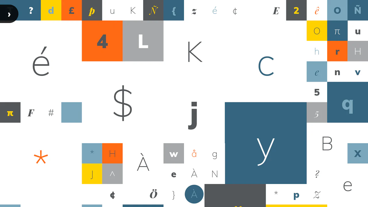
Variable Font Generative Letter Grid
Interactive typography generator with responsive grid system. Customizable character sets, weighted randomness, and smooth hover/click animations.
See the Pen Variable Font Generative Letter Grid.

100-Year Clock Wheel
This demo showcases a multi-ring clock with rotating elements where each date/time value is generated and positioned using trigonometry. A key feature is the dynamic localization of month and day names using the Intl.DateTimeFormat API and language selection via the native <dialog> element.
See the Pen 100-Year Clock Wheel.

CSS Blockquote with Gradient Drop Cap
A unique drop cap is created with modern CSS techniques - its complex background is generated by layering linear-gradient and repeating-conic-gradient, while its responsive size is managed by calc().
See the Pen CSS Blockquote with Gradient Drop Cap.
Ghost Ships Sticky Header
This demo features a responsive navigation block with sticky behavior and a jQuery based scroll animation for the header. The main technical feature is the dynamic style switching between normal and “lightmode” using localStorage to persist the state.
See the Pen Ghost Ships Sticky Header.

CSS List Filtering with :has()
A comprehensive demonstration of CSS :has() selector and Container Queries capabilities. :has() is used to toggle between light/dark themes and to dynamically filter cards by category without using JavaScript.
See the Pen CSS List Filtering with :has().
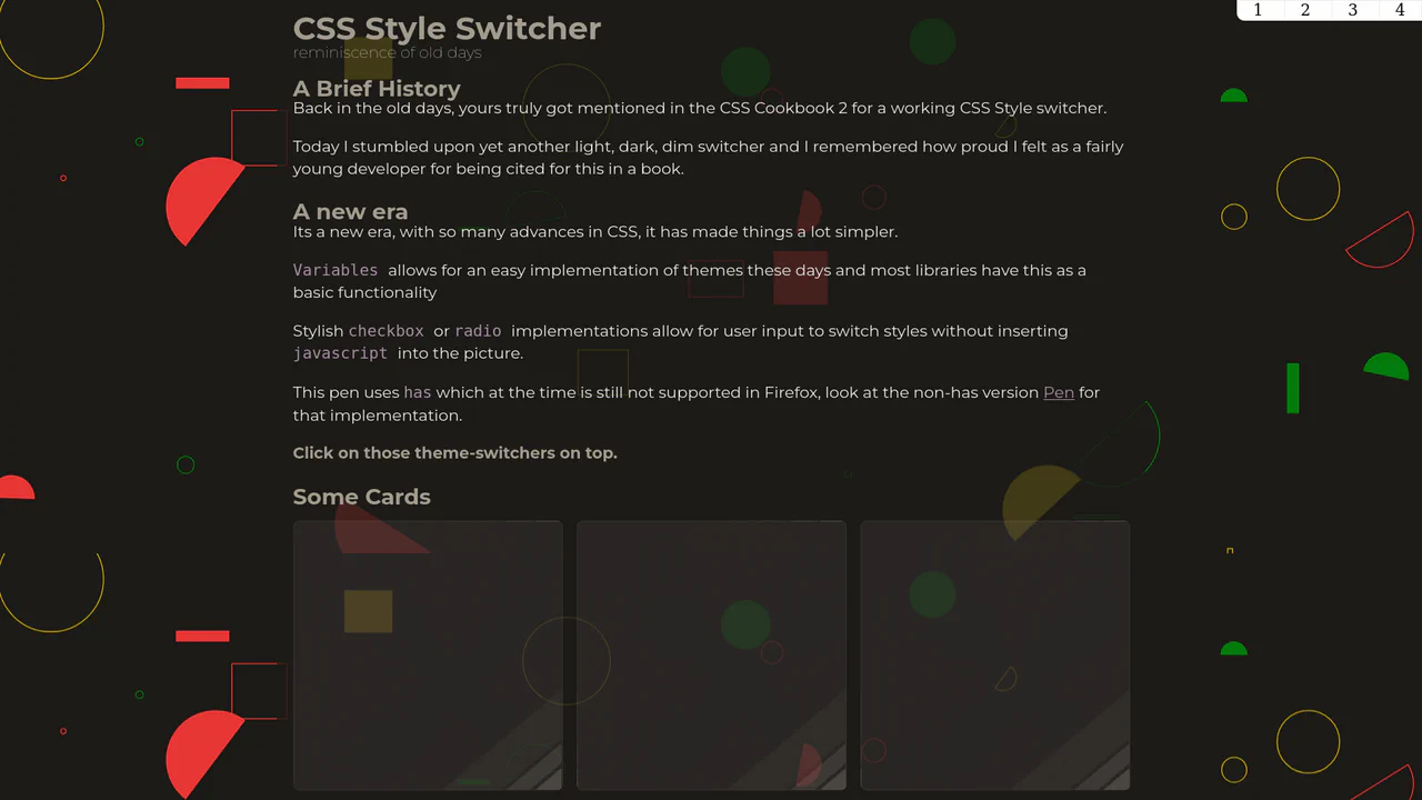
CSS Style Switcher with :has()
An example of powerful reactivity with :has() - theme switching not only changes colors but also radically reworks the layout, adds stylized shadows, and even changes fonts and background SVG patterns.
See the Pen CSS Style Switcher with :has().

Filter Items in Subgrid with :has()
A multi-faceted demonstration that implements dynamic card filtering in pure CSS using the :has() selector and radio buttons. CSS Subgrid is used for perfect vertical alignment, and :has() is also leveraged for contextual styling - cards with a special element automatically change their appearance without JS.
See the Pen Filter Items in Subgrid with :has().

Responsive Modal Popup Box
A responsive share modal pop-up that appears from the bottom on mobile devices and centers on the screen on desktop. The display logic is entirely tied to toggling the .show-modal class using vanilla JS.
See the Pen Responsive Modal Popup Box.