180+ CSS Grid Examples (Page 4)
Examples

Click-to-Zoom Calendar
Explore responsive calendar design featuring a detailed hover and click zoom effect, implemented through precise coordinate calculations to manipulate CSS transform based on the selected date’s index.
See the Pen Click-to-Zoom Calendar.
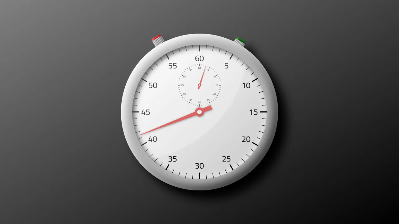
Skeuomorphic Stopwatch
A skeuomorphic stopwatch built with modern CSS features - CSS Grid for the dial layout, linear-gradient and box-shadow for a realistic look, and animation control managed through CSS variables.
See the Pen Skeuomorphic Stopwatch.

Ticket
A ticket layout where data (date, code) is generated on the fly with vanilla JS and inserted into the HTML - styling is done using CSS Grid, drop-shadow, and reusable SVG symbols via the <use> tag.
See the Pen Ticket.
Interactive Fireworks with Babylon.js and CSS nth-child
An example of efficient resource management in Babylon.js - completed particle systems are tracked and completely removed from the scene with the dispose() method, preventing memory leaks.

React Color Gradient Palette
This React component library demonstrates a technically clean solution for displaying color gradients.
See the Pen React Color Gradient Palette.
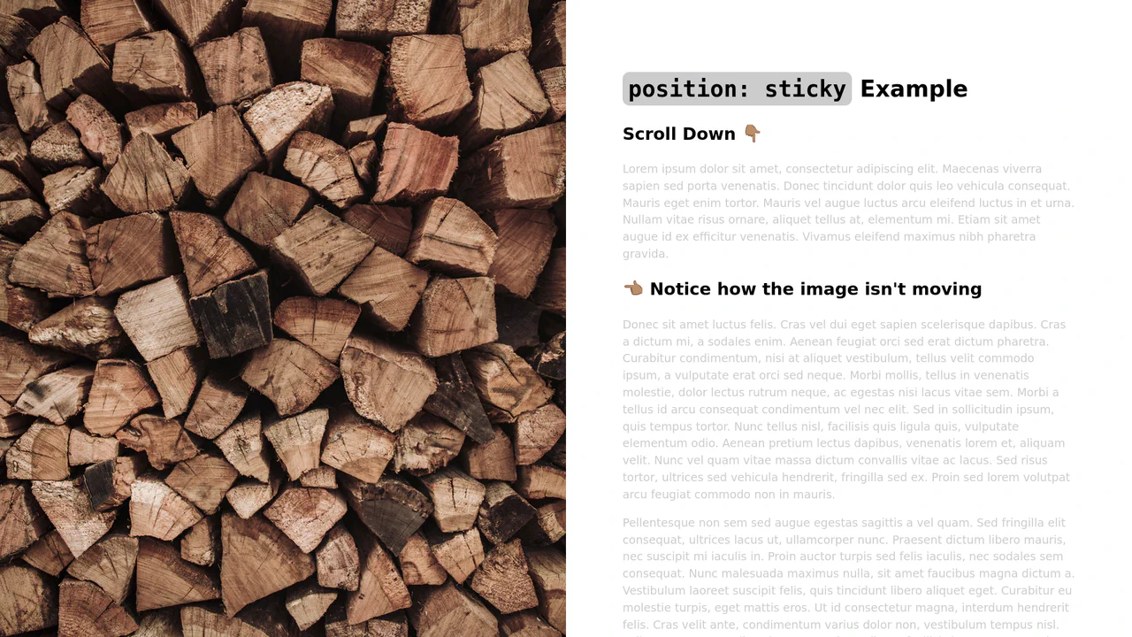
Sticky Sidebar with CSS position: sticky
A pure CSS method to fix one block on the screen while its neighbor scrolls - a clear demonstration of how position: sticky works within a parent container.
See the Pen Sticky Sidebar with CSS position: sticky.
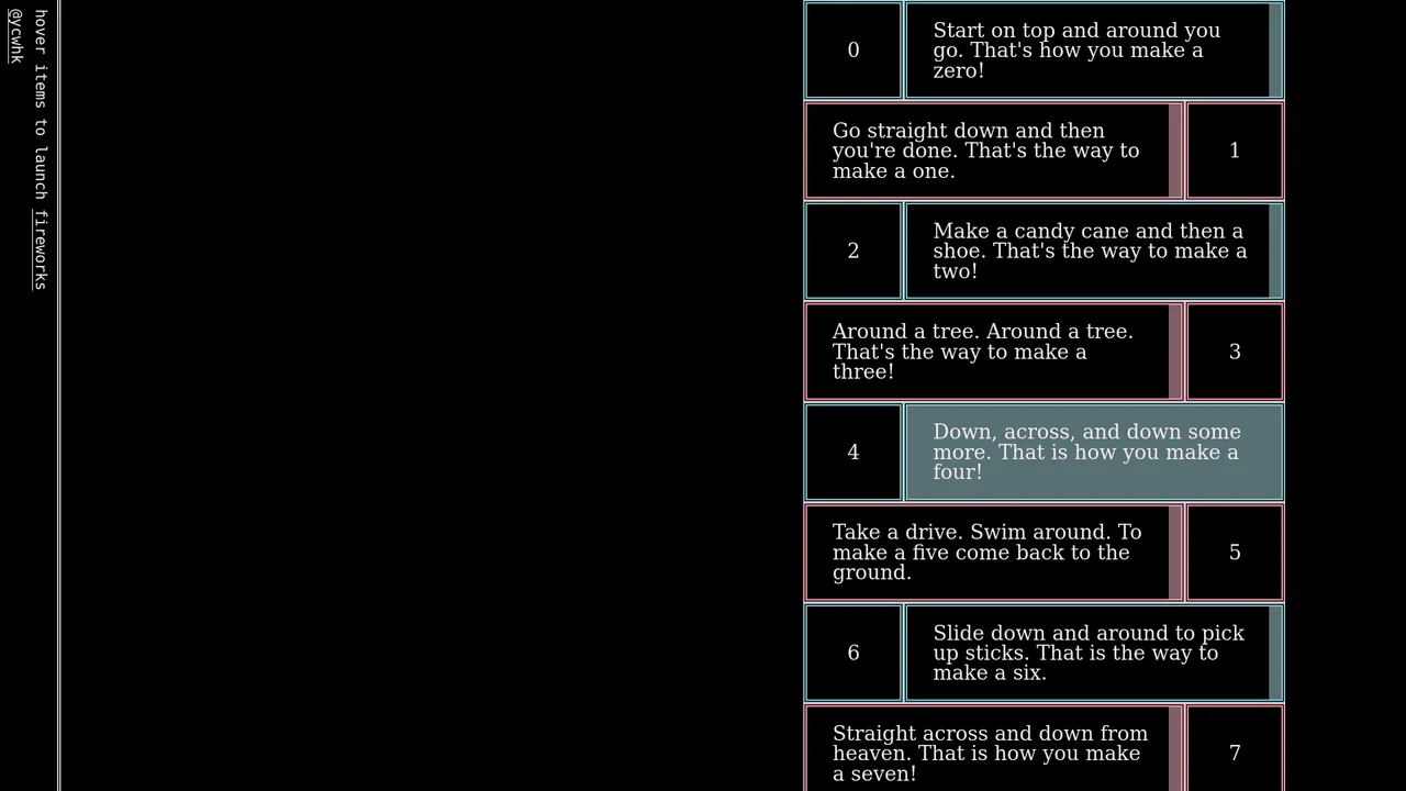
Blocks Clock with Pixel Art Digits
This retro-style clock leverages CSS Grid for its 3x5 matrix display, dynamically updating the digit structure by manipulating the parent element’s class, while setInterval(setTime, 500) ensures a responsive time refresh.
See the Pen Blocks Clock with Pixel Art Digits.

Layout Switcher with :has()
Discover a pure CSS solution for dynamic layout switching between List and Grid views. It leverages the powerful CSS :has() selector to conditionally apply grid-template-columns based on the state of a radio input, all without a single line of JavaScript.
See the Pen Layout Switcher with :has().
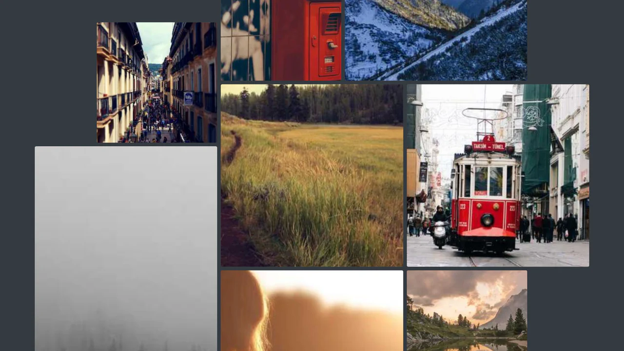
Scroll-Driven Gallery
A demonstration of the new CSS Scroll-Driven Animations (SDA) API, where the scroll position of the entire page directly drives a complex, scaling, and rotating grid of images, achieving a high-performance, engaging visual effect purely with CSS.
See the Pen Scroll-Driven Gallery.
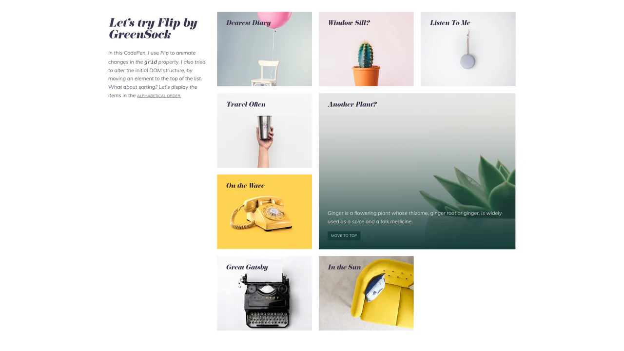
Animate Grid Layout with FLIP
Showcasing the power of GreenSock’s FLIP technique to smoothly animate CSS Grid layout changes, including alphabetical sorting and DOM element manipulation.
See the Pen Animate Grid Layout with FLIP.
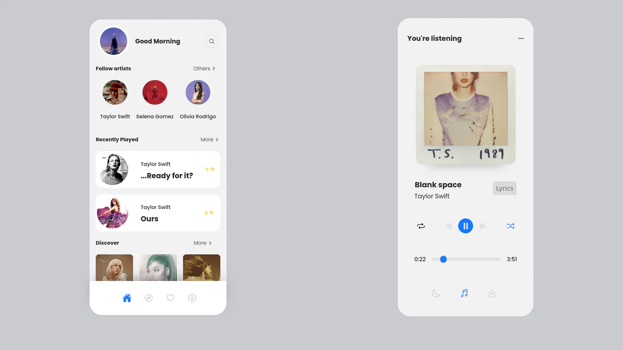
Responsive Music Player UI with Flexbox and Grid
A sleek, dual-screen music player UI built with clean CSS/SCSS and a responsive Flexbox/Grid layout, featuring custom JavaScript logic for dynamic track time updates via a range input.
See the Pen Responsive Music Player UI with Flexbox and Grid.

Flip Grid Size with GSAP
A demonstration of how GSAP Flip achieves flawless element repositioning: the layout switch is done by simply adding/removing a CSS class, while all complex transition logic (position, size) is delegated to the library.
See the Pen Flip Grid Size with GSAP.
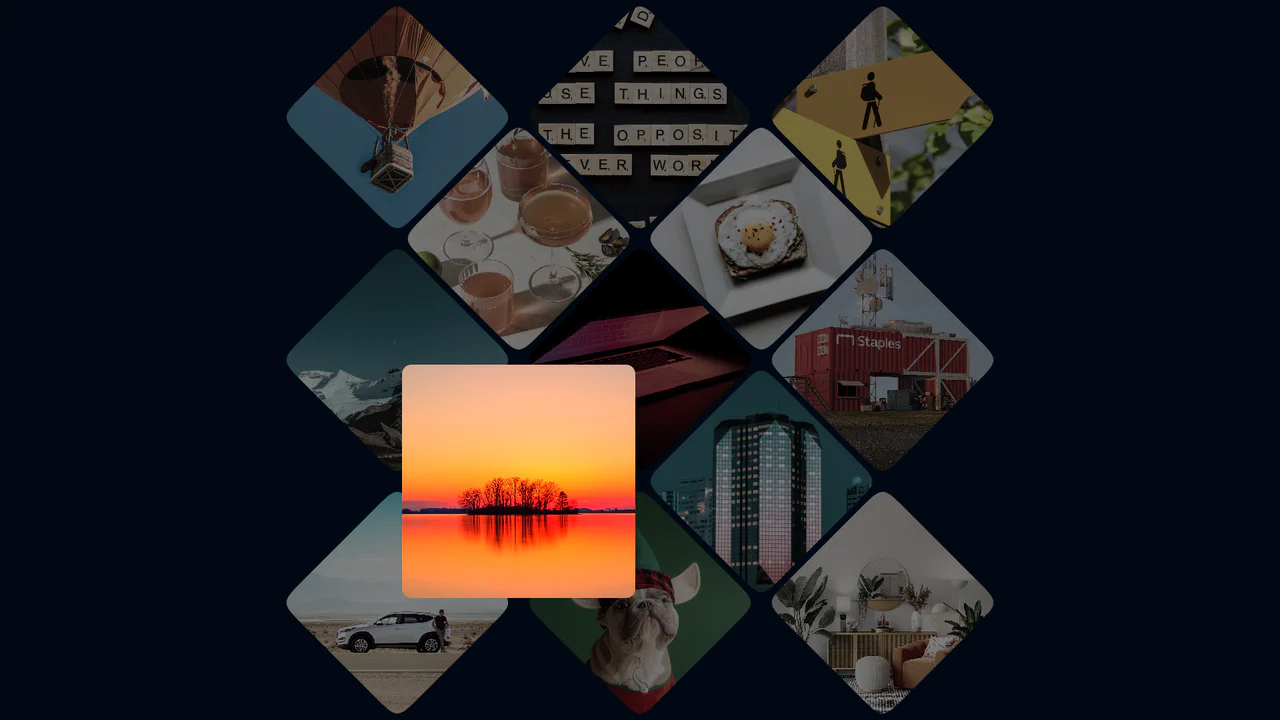
Photo Gallery Grid Animation with CSS Clip-Path
A showcase of the creative application of clip-path to create an “unfolding” image effect on hover, where the interaction not only changes the shape but also uses z-index to elevate the element and overlap neighboring tiles.
See the Pen Photo Gallery Grid Animation with CSS Clip-Path.

CSS-Only Dots World Map
A technical demo of geodata visualization using pure CSS/Sass to create a grid-based world map. The core feature is the animation control of numerous cells using @each and individual animation-delay: random(...), which makes the pulsing unique to each continent.
See the Pen CSS-Only Dots World Map.
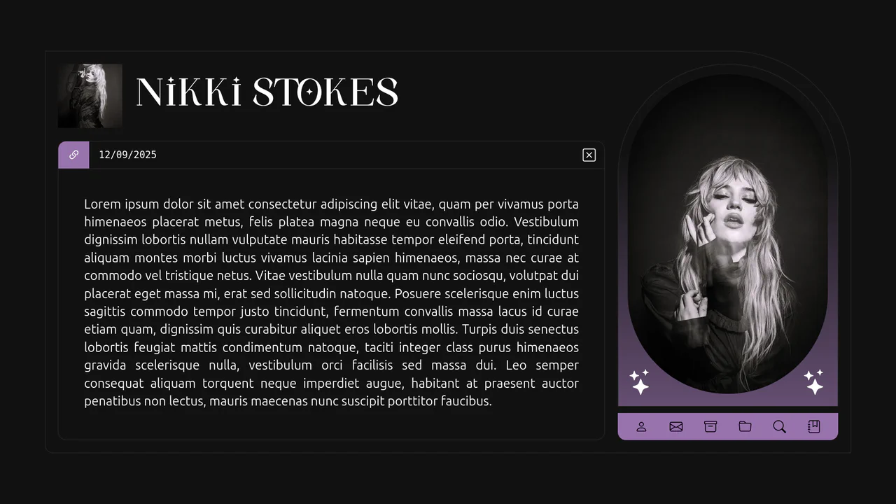
Just Bored Vol. 3 - Creative Post UI
A visually complex component focusing on non-standard geometry (border-radius: 0 150px 0 10px) and an impressive avatar hover effect (gradient shift, filter: brightness(), and information blur/fade-out) implemented purely with CSS.
See the Pen Just Bored Vol. 3 - Creative Post UI.
Single Image with Squircle Shape and Inner Shadow
Explore the power of CSS Grid with auto-fit for a responsive layout and SVG filtering techniques to give images a trendy squircle outline and unique shadow effect.
See the Pen Single Image with Squircle Shape and Inner Shadow.
Corner-shape Hexagon Avatars
This demo creates a responsive hexagonal grid using CSS Grid and the powerful, lesser-known corner-shape: bevel property. It uses negative margin-block for smooth overlaps, and a unique linear() easing function for a bouncy, fluid hover animation.
See the Pen Corner-shape Hexagon Avatars.
Toggle Cards with Inverted Border-Radius
A simple yet effective implementation of interactive cards using pure JavaScript for click handling. Visual effects, including the checkbox animation, are done entirely in CSS, while the responsive design is built with Sass.
See the Pen Toggle Cards with Inverted Border-Radius.
Vertical Slider with CSS Only
A simple, yet effective image gallery using CSS Grid and native browser features like scroll-snap and :target. This approach creates a smooth, fully accessible slideshow without any JavaScript, relying on pure CSS for both layout and navigation.
See the Pen Vertical Slider with CSS Only.

Editorial Layout: Andy Warhol
A demonstration of a classic editorial layout realized with modern CSS, combining the power of Grid for structure with fine typographic controls like multi-column text and ::first-letter pseudo-elements.
See the Pen Editorial Layout: Andy Warhol.
Responsive Front Page Article Layout with CSS Grid
This demo showcases a powerful responsive technique: a sophisticated CSS Grid layout for large screens gracefully degrades to a simple Flexbox-driven block flow on mobile devices, completely altering the structure for better readability.
See the Pen Responsive Front Page Article Layout with CSS Grid.

Splitting.js Image Hover Effect
This demo shows how modern CSS can power rich interactions. It combines Splitting.js and advanced CSS Grid with dynamic custom properties to create a complex, performant, and responsive image hover effect.
See the Pen Splitting.js Image Hover Effect.
Scroll-Driven Grid Animation with CSS-Doodle
A mesmerizing scroll-driven image grid powered by the cutting-edge animation-timeline: view() CSS property and the <css-doodle> web component.
See the Pen Scroll-Driven Grid Animation with CSS-Doodle.
Skateboard Product Grid
This demo showcases a responsive grid built on modern CSS technologies: CSS Grid for layout, Custom Properties for centralized theme management, and Fluid Typography using clamp() for ’elastic’ font sizes. The key feature is a complex animation system, including a staggered appearance of cards and advanced :hover effects using animated SVG.
See the Pen Skateboard Product Grid.
Fanned Cards with Hover Effect
This component implements an interactive playing card fan simulator by combining CSS grid column resizing with index-based custom properties. The structural logic collapses container nodes via zero-width columns, while fanning out pseudo-elements radially using bottom-anchored rotations and a CSS auto-increment counter to generate card values. On hover, the grid columns expand to separate the cards, while targeting a card resets its angle and translates it upward. This interaction is highly performant since the primary hover dynamics rely on GPU-accelerated transforms, delivering tactile and physically natural feedback.
See the Pen Fanned Cards with Hover Effect.
CSS Shimmer Loading Effect
A classic skeleton loader pattern implemented via pure CSS. The shimmer effect utilizes a wide linear-gradient and animates background-position to simulate a passing wave of light indicating active data fetching.
See the Pen CSS Shimmer Loading Effect.
Squircles Gallery with View-Transition
A dynamic CSS Grid gallery featuring SVG squircle masking and advanced animations via the @starting-style property. This snippet showcases a responsive layout with sophisticated transition effects using the linear() easing function, providing a high-end frontend UI solution with optimal performance.
See the Pen Squircles Gallery with View-Transition.
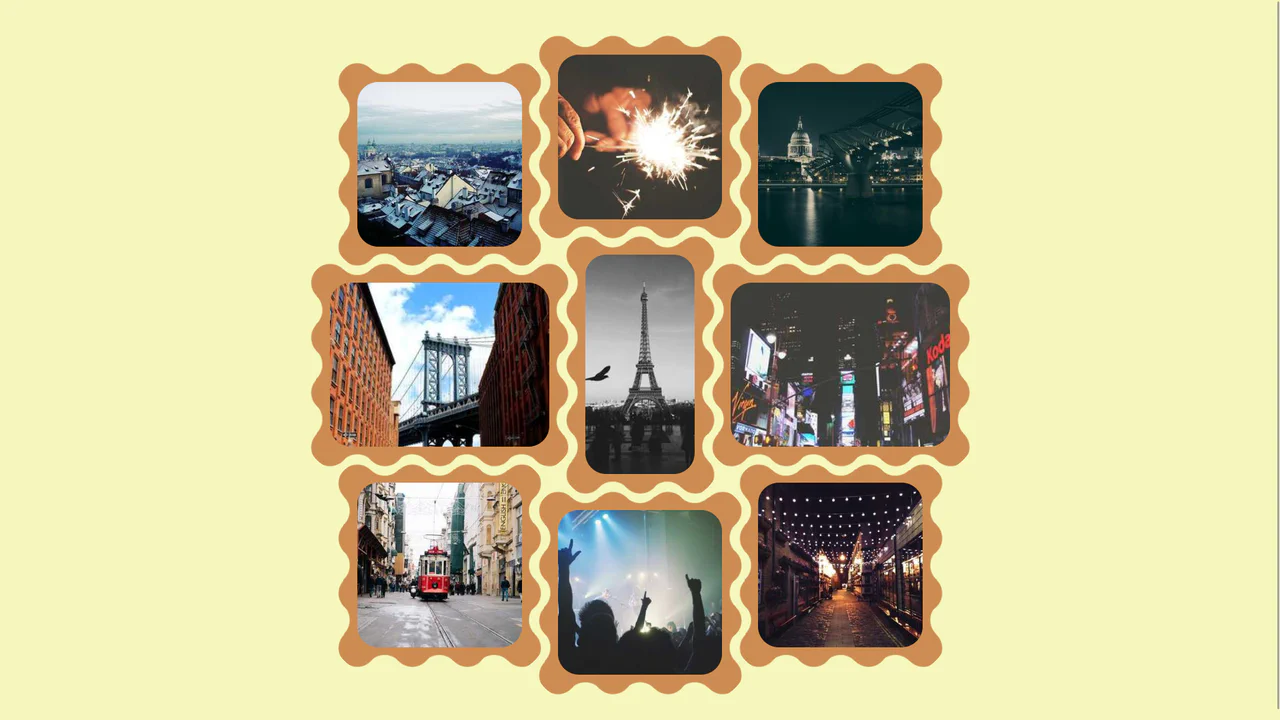
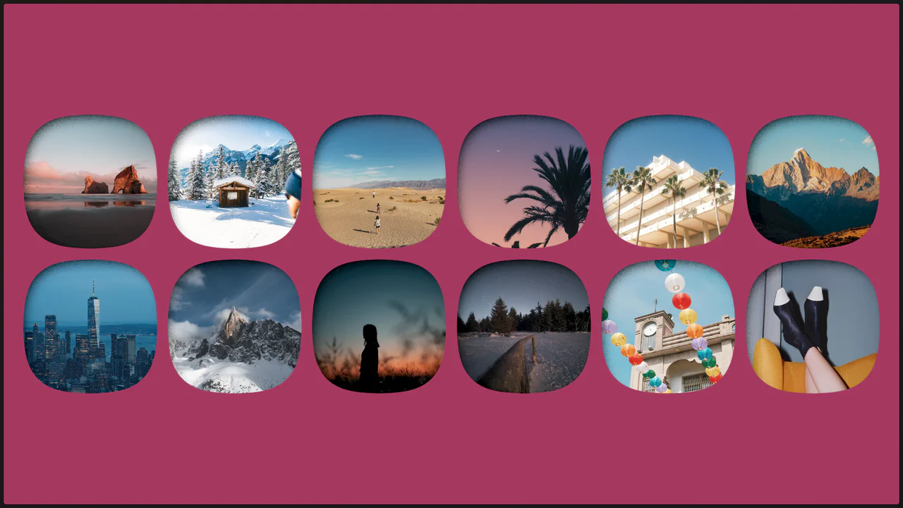
CSS Grid creates a 3‑column base, then each image is individually shifted with translate to break the alignment — resulting in a scattered, organic layout. The wave‑shaped border is drawn using mask with repeating radial gradients; the design is purely visual and static.

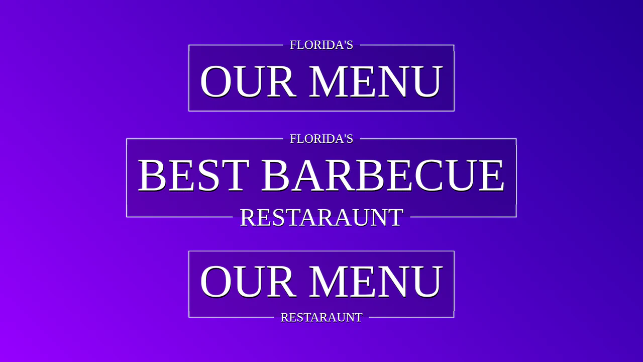
Fancy Title with CSS Responsive Frame
Creating a complex decorative title where breaks in the border are elegantly implemented using CSS Grid and pseudo-elements. Padding sizes adapt dynamically thanks to a CSS variable calculated by a mixin.
See the Pen Fancy Title with CSS Responsive Frame.